- Published on
Ultimate Guide: Make A CARDS With Tailwind CSS
- What is Tailwind CSS?
- The description of CARDS ui component
- Why use Tailwind CSS to create a CARDS ui component?
- The preview of CARDS ui component
- The source code of CARDS ui component
- How to create a CARDS with Tailwind CSS?
- Conclusion
What is Tailwind CSS?
Tailwind CSS is a utility-first CSS framework that helps you create custom designs quickly. It provides a set of pre-defined CSS classes that you can use to style your HTML elements. With Tailwind CSS, you can create complex layouts and responsive designs without writing any custom CSS.
The description of CARDS ui component
CARDS are a popular UI component used in web design. They are used to display information in a visually appealing way. CARDS can contain text, images, and other media. They are often used in e-commerce websites to display products, in social media websites to display posts, and in news websites to display articles.
Why use Tailwind CSS to create a CARDS ui component?
Tailwind CSS provides a set of pre-defined classes that you can use to create CARDS quickly and easily. You don't need to write any custom CSS, which saves you time and effort. Tailwind CSS also provides responsive classes that you can use to create CARDS that look great on all devices.
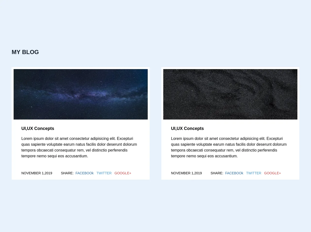
The preview of CARDS ui component
CARDS are a great way to display information in a visually appealing way. They can contain text, images, and other media. With Tailwind CSS, you can create CARDS quickly and easily. Here is a preview of what a CARDS component might look like:
Free download of the CARDS's source code
The source code of CARDS ui component
To create a CARDS component with Tailwind CSS, you need to use a combination of HTML and Tailwind CSS classes. Here is an example of what the source code for a CARDS component might look like:
<section class="py-12">
        <div class="container mx-auto">
            <div>
                <h1 class="text-2xl font-black text-gray-900 pb-6 px-6 md:px-12">
                    MY BLOG
                </h1>
            </div>
            <div class="flex flex-wrap px-6">
                <div class="w-full lg:w-1/2   md:px-4 lg:px-6 py-5">
                    <div class="bg-white hover:shadow-xl">
                        <div class="">
                            <img src="https://images.pexels.com/photos/956999/milky-way-starry-sky-night-sky-star-956999.jpeg?auto=compress&cs=tinysrgb&dpr=1&w=500" alt=""
                                class="h-56 w-full border-white border-8 hover:opacity-25">
                        </div>
                        <div class="px-4 py-4 md:px-10">
                            <h1 class="font-bold text-lg">
                                UI,UX Concepts
                            </h1>
                            <p class="py-4">
                                Lorem ipsum dolor sit amet consectetur adipisicing elit. Excepturi quas sapiente
                                voluptate
                                earum natus facilis dolor deserunt dolorum tempora obcaecati consequatur rem, vel
                                distinctio
                                perferendis tempore nemo sequi eos accusantium.
                            </p>
                            <div class="flex flex-wrap pt-8">
                                <div class="w-full md:w-1/3 text-sm font-medium">
                                    NOVEMBER 1,2019
                                </div>
                                <div class="2/3">
                                    <div class="text-sm font-medium">
                                        SHARE:
                                        <a href="" class="text-blue-700 px-1 ">
                                            FACEBOOk
                                        </a>
                                        <a href="" class="text-blue-500 px-1 ">
                                            TWITTER
                                        </a>
                                        <a href="" class="text-red-600 px-1 ">
                                            GOOGLE+
                                        </a>
                                    </div>
                                </div>
                            </div>
                        </div>
                    </div>
                </div>
                <div class="w-full lg:w-1/2  md:px-4 lg:px-6 py-5">
                    <div class="bg-white hover:shadow-xl">
                        <div class="">
                            <img src="https://images.pexels.com/photos/952670/pexels-photo-952670.jpeg?auto=compress&cs=tinysrgb&dpr=2&h=750&w=1260" alt=""
                                class="h-56 w-full border-white border-8 hover:opacity-25">
                        </div>
                        <div class="px-4 py-4 md:px-10">
                            <h1 class="font-bold text-lg">
                                UI,UX Concepts
                            </h1>
                            <p class="py-4">
                                Lorem ipsum dolor sit amet consectetur adipisicing elit. Excepturi quas sapiente
                                voluptate
                                earum natus facilis dolor deserunt dolorum tempora obcaecati consequatur rem, vel
                                distinctio
                                perferendis tempore nemo sequi eos accusantium.
                            </p>
                            <div class="flex flex-wrap pt-8">
                                <div class="w-full md:w-1/3 text-sm font-medium">
                                    NOVEMBER 1,2019
                                </div>
                                <div class="md:2/3">
                                    <div class="text-sm font-medium">
                                        SHARE:
                                        <a href="" class="text-blue-700 px-1 ">
                                            FACEBOOk
                                        </a>
                                        <a href="" class="text-blue-500 px-1 ">
                                            TWITTER
                                        </a>
                                        <a href="" class="text-red-600 px-1 ">
                                            GOOGLE+
                                        </a>
                                    </div>
                                </div>
                            </div>
                        </div>
                    </div>
                </div>
            </div>

        </div>
    </section>
How to create a CARDS with Tailwind CSS?
To create a CARDS component with Tailwind CSS, follow these steps:
- Create a new HTML file and add the necessary HTML structure for your CARDS component.
- Add the Tailwind CSS stylesheet to your HTML file.
- Create a container for your CARDS component using the
flexandflex-wrapclasses. - Create a CARDS element using the
w-full,md:w-1/2, andlg:w-1/3classes. - Add the necessary content to your CARDS element using HTML tags and Tailwind CSS classes.
- Repeat steps 4 and 5 for each CARDS element in your component.
Here is an example of what the HTML code for a CARDS component might look like:
<div class="flex flex-wrap">
  <div class="w-full md:w-1/2 lg:w-1/3 p-4">
    <div class="bg-white shadow-lg rounded-lg overflow-hidden">
      <img class="w-full h-48 object-cover" src="https://source.unsplash.com/random/800x600" alt="Article">
      <div class="p-4">
        <h3 class="text-gray-800 font-bold text-xl mb-2">Article Title</h3>
        <p class="text-gray-600 text-base">Lorem ipsum dolor sit amet, consectetur adipiscing elit, sed do eiusmod tempor incididunt ut labore et dolore magna aliqua.</p>
      </div>
    </div>
  </div>
</div>
Conclusion
In conclusion, CARDS are a popular UI component used in web design to display information in a visually appealing way. With Tailwind CSS, you can create CARDS quickly and easily without writing any custom CSS. By following the steps outlined in this guide, you can create your own CARDS component using Tailwind CSS.