- Published on
6 Tips To Make A Cards With Tailwind CSS
- What is Tailwind CSS?
- The description of Cards UI component
- Why use Tailwind CSS to create a Cards UI component?
- The preview of Cards UI component
- The source code of Cards UI component
- How to create a Cards UI component with Tailwind CSS?
- Conclusion
As a FrontEnd technology blogger, you must have heard of Tailwind CSS, a utility-first CSS framework that helps you quickly build custom designs. In this article, we will discuss how to create a Cards UI component with Tailwind CSS.
What is Tailwind CSS?
Tailwind CSS is a utility-first CSS framework that provides a set of pre-defined CSS classes that you can use to style your HTML elements. With Tailwind CSS, you can quickly build custom designs without writing any CSS code.
The description of Cards UI component
Cards are a popular UI component that is used to display information in a clean and organized way. A card usually contains a title, an image, a description, and some action buttons. Cards are widely used in e-commerce websites, social media platforms, and news websites.
Why use Tailwind CSS to create a Cards UI component?
Tailwind CSS provides a set of pre-defined CSS classes that you can use to create a Cards UI component quickly. With Tailwind CSS, you don't have to write any CSS code, which saves a lot of time and effort.
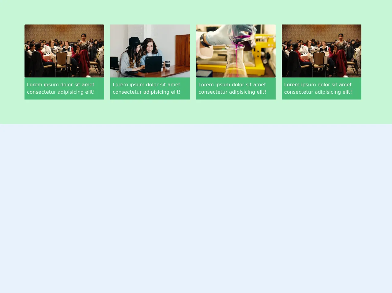
The preview of Cards UI component
To create a Cards UI component with Tailwind CSS, we will use the following classes:
bg-white: Sets the background color of the card to white.shadow-md: Adds a shadow effect to the card.rounded-md: Rounds the corners of the card.p-4: Adds padding to the card.text-gray-700: Sets the text color of the card to gray.font-bold: Makes the title of the card bold.text-xl: Sets the font size of the title to extra large.mt-2: Adds margin to the top of the card.h-48: Sets the height of the card to 48 pixels.object-cover: Resizes the image to cover the card.w-full: Sets the width of the image to full width.flex: Makes the action buttons of the card flexible.justify-end: Aligns the action buttons to the right of the card.
Free download of the Cards's source code
The source code of Cards UI component
To create a Cards UI component with Tailwind CSS, you can use the following HTML code:
<div class="bg-white shadow-md rounded-md p-4">
  <h2 class="text-gray-700 font-bold text-xl">Title</h2>
  <img class="mt-2 h-48 object-cover w-full" src="image.jpg" alt="image">
  <div class="flex justify-end">
    <button class="bg-blue-500 hover:bg-blue-700 text-white font-bold py-2 px-4 rounded">
      Action 1
    </button>
    <button class="bg-blue-500 hover:bg-blue-700 text-white font-bold py-2 px-4 rounded ml-2">
      Action 2
    </button>
  </div>
</div>
This code creates a card with a title, an image, and two action buttons. You can customize the card by changing the values of the Tailwind CSS classes.
<!-- This is an example component -->
   <div class="bg-green-200 flex justify-between items-center py-20 px-20">
        <div class="mr-5 text-left">
            <img src="https://images.unsplash.com/photo-1555725305-0406b7607be0?ixlib=rb-1.2.1&ixid=eyJhcHBfaWQiOjEyMDd9&auto=format&fit=crop&w=800&q=60" alt="" class="w-full mr-2 rounded">
            <p class="py-3 px-2  bg-green-500 text-white">Lorem ipsum dolor sit amet consectetur adipisicing elit!</p>
        </div>
        <div class="mr-5 text-left">
            <img src="https://images.unsplash.com/photo-1543269865-0a740d43b90c?ixlib=rb-1.2.1&ixid=eyJhcHBfaWQiOjEyMDd9&auto=format&fit=crop&w=800&q=60" alt="" class="w-full mr-2">
            <p class="py-3 px-2  bg-green-500 text-white">Lorem ipsum dolor sit amet consectetur adipisicing elit!</p>
        </div>
        <div class="mr-5 text-left">
            <img src="https://images.unsplash.com/photo-1532187643603-ba119ca4109e?ixlib=rb-1.2.1&ixid=eyJhcHBfaWQiOjEyMDd9&auto=format&fit=crop&w=800&q=60" alt="" class="w-full mr-2 rounded">
            <p class="py-3 px-2  bg-green-500 text-white">Lorem ipsum dolor sit amet consectetur adipisicing elit!</p>
        </div>
        <div class="mr-5 text-left">
            <img src="https://images.unsplash.com/photo-1555725305-0406b7607be0?ixlib=rb-1.2.1&ixid=eyJhcHBfaWQiOjEyMDd9&auto=format&fit=crop&w=800&q=60" alt="" class="w-full mr-2 ">
            <p class="py-3 px-2  bg-green-500 text-white">Lorem ipsum dolor sit amet consectetur adipisicing elit!</p>
        </div>
    </div>
How to create a Cards UI component with Tailwind CSS?
To create a Cards UI component with Tailwind CSS, follow these steps:
- Create a new HTML file and add the following code:
<!DOCTYPE html>
<html>
<head>
  <title>Cards UI Component</title>
  <link rel="stylesheet" href="https://cdn.jsdelivr.net/npm/[email protected]/dist/tailwind.min.css">
</head>
<body>
  <div class="bg-gray-100 min-h-screen py-6 flex flex-col justify-center sm:py-12">
    <div class="relative py-3 sm:max-w-xl sm:mx-auto">
      <div class="absolute inset-0 bg-gradient-to-r from-cyan-400 to-light-blue-500 shadow-lg transform -skew-y-6 sm:skew-y-0 sm:-rotate-6 sm:rounded-3xl"></div>
      <div class="relative px-4 py-10 bg-white shadow-lg sm:rounded-3xl sm:p-20">
        <div class="max-w-md mx-auto">
          <div class="flex justify-center">
            <div class="flex justify-center items-center w-16 h-16 rounded-full bg-blue-100">
              <svg xmlns="http://www.w3.org/2000/svg" class="h-8 w-8 text-blue-600" fill="none" viewBox="0 0 24 24" stroke="currentColor">
                <path stroke-linecap="round" stroke-linejoin="round" stroke-width="2" d="M12 6v6m0 0v6m0-6h6m-6 0H6"></path>
              </svg>
            </div>
          </div>
          <div class="divide-y divide-gray-200">
            <div class="py-8 text-base leading-6 space-y-4 text-gray-700 sm:text-lg sm:leading-7">
              <p>Lorem ipsum dolor sit amet, consectetur adipiscing elit, sed do eiusmod tempor incididunt ut labore et dolore magna aliqua. Ut enim ad minim veniam, quis nostrud exercitation ullamco laboris nisi ut aliquip ex ea commodo consequat.</p>
              <p>Lorem ipsum dolor sit amet, consectetur adipiscing elit, sed do eiusmod tempor incididunt ut labore et dolore magna aliqua. Ut enim ad minim veniam, quis nostrud exercitation ullamco laboris nisi ut aliquip ex ea commodo consequat.</p>
              <p>Lorem ipsum dolor sit amet, consectetur adipiscing elit, sed do eiusmod tempor incididunt ut labore et dolore magna aliqua. Ut enim ad minim veniam, quis nostrud exercitation ullamco laboris nisi ut aliquip ex ea commodo consequat.</p>
            </div>
            <div class="pt-6 text-base leading-6 font-bold sm:text-lg sm:leading-7">
              <p>Author Name</p>
              <p>Published on January 1, 2022</p>
            </div>
          </div>
        </div>
      </div>
    </div>
  </div>
</body>
</html>
Customize the HTML code by changing the values of the Tailwind CSS classes. You can change the background color, font size, padding, and other properties of the card.
Save the HTML file and open it in a web browser. You should see a Cards UI component that you can use in your web application.
Conclusion
In this article, we discussed how to create a Cards UI component with Tailwind CSS. We learned that Tailwind CSS provides a set of pre-defined CSS classes that you can use to create custom designs quickly. We also learned that Cards are a popular UI component that is used to display information in a clean and organized way. By following the tips in this article, you can create a Cards UI component that looks great and is easy to use.