- Published on
How To Create A Card Profile With Tailwind CSS In 6 Easy Steps?
- What is Tailwind CSS?
- The description of Card Profile ui component
- Why use Tailwind CSS to create a Card Profile ui component?
- The preview of Card Profile ui component
- The source code of Card Profile ui component
- How to create a Card Profile with Tailwind CSS?
- Step 1: Create the HTML structure
- Step 2: Add the profile picture
- Step 3: Add the name and job title
- Step 4: Add the description
- Step 5: Style the Card Profile
- Step 6: Make the Card Profile responsive
- Conclusion
What is Tailwind CSS?
Tailwind CSS is a utility-first CSS framework that provides a comprehensive set of pre-defined classes to build responsive and customizable user interfaces. It allows developers to create complex layouts and designs with minimal effort, making it a popular choice for front-end development.
The description of Card Profile ui component
A Card Profile is a user interface component that displays information about a person or entity in a visually appealing way. It typically includes a profile picture, name, job title, and other relevant details. Card Profiles are commonly used in social media platforms, online directories, and e-commerce websites.
Why use Tailwind CSS to create a Card Profile ui component?
Tailwind CSS provides a wide range of pre-defined classes that can be used to create a Card Profile with ease. It also offers responsive design capabilities, which means that the Card Profile will adjust its layout and size depending on the screen size and device type. Additionally, Tailwind CSS allows for customization of the Card Profile's appearance, making it easy to match the design of your website or application.
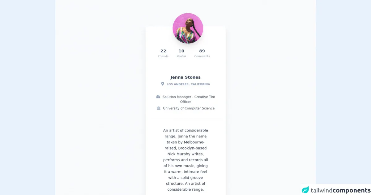
The preview of Card Profile ui component
To create a Card Profile with Tailwind CSS, we will use a combination of pre-defined classes to style the various elements of the component. The final result will be a visually appealing Card Profile that is responsive and customizable.
Free download of the Card Profile's source code
The source code of Card Profile ui component
The source code for the Card Profile ui component is relatively simple and easy to understand. We will use HTML and Tailwind CSS classes to create the Card Profile.
<link rel="stylesheet" href="https://demos.creative-tim.com/notus-js/assets/styles/tailwind.css">
<link rel="stylesheet" href="https://demos.creative-tim.com/notus-js/assets/vendor/@fortawesome/fontawesome-free/css/all.min.css">

<section class="pt-16 bg-blueGray-50">
<div class="w-full lg:w-4/12 px-4 mx-auto">
  <div class="relative flex flex-col min-w-0 break-words bg-white w-full mb-6 shadow-xl rounded-lg mt-16">
    <div class="px-6">
      <div class="flex flex-wrap justify-center">
        <div class="w-full px-4 flex justify-center">
          <div class="relative">
            <img alt="..." src="https://demos.creative-tim.com/notus-js/assets/img/team-2-800x800.jpg" class="shadow-xl rounded-full h-auto align-middle border-none absolute -m-16 -ml-20 lg:-ml-16 max-w-150-px">
          </div>
        </div>
        <div class="w-full px-4 text-center mt-20">
          <div class="flex justify-center py-4 lg:pt-4 pt-8">
            <div class="mr-4 p-3 text-center">
              <span class="text-xl font-bold block uppercase tracking-wide text-blueGray-600">
                22
              </span>
              <span class="text-sm text-blueGray-400">Friends</span>
            </div>
            <div class="mr-4 p-3 text-center">
              <span class="text-xl font-bold block uppercase tracking-wide text-blueGray-600">
                10
              </span>
              <span class="text-sm text-blueGray-400">Photos</span>
            </div>
            <div class="lg:mr-4 p-3 text-center">
              <span class="text-xl font-bold block uppercase tracking-wide text-blueGray-600">
                89
              </span>
              <span class="text-sm text-blueGray-400">Comments</span>
            </div>
          </div>
        </div>
      </div>
      <div class="text-center mt-12">
        <h3 class="text-xl font-semibold leading-normal mb-2 text-blueGray-700 mb-2">
          Jenna Stones
        </h3>
        <div class="text-sm leading-normal mt-0 mb-2 text-blueGray-400 font-bold uppercase">
          <i class="fas fa-map-marker-alt mr-2 text-lg text-blueGray-400"></i>
          Los Angeles, California
        </div>
        <div class="mb-2 text-blueGray-600 mt-10">
          <i class="fas fa-briefcase mr-2 text-lg text-blueGray-400"></i>
          Solution Manager - Creative Tim Officer
        </div>
        <div class="mb-2 text-blueGray-600">
          <i class="fas fa-university mr-2 text-lg text-blueGray-400"></i>
          University of Computer Science
        </div>
      </div>
      <div class="mt-10 py-10 border-t border-blueGray-200 text-center">
        <div class="flex flex-wrap justify-center">
          <div class="w-full lg:w-9/12 px-4">
            <p class="mb-4 text-lg leading-relaxed text-blueGray-700">
              An artist of considerable range, Jenna the name taken
              by Melbourne-raised, Brooklyn-based Nick Murphy
              writes, performs and records all of his own music,
              giving it a warm, intimate feel with a solid groove
              structure. An artist of considerable range.
            </p>
            <a href="javascript:void(0);" class="font-normal text-pink-500">
              Show more
            </a>
          </div>
        </div>
      </div>
    </div>
  </div>
</div>
<footer class="relative  pt-8 pb-6 mt-8">
  <div class="container mx-auto px-4">
    <div class="flex flex-wrap items-center md:justify-between justify-center">
      <div class="w-full md:w-6/12 px-4 mx-auto text-center">
        <div class="text-sm text-blueGray-500 font-semibold py-1">
          Made with <a href="https://www.creative-tim.com/product/notus-js" class="text-blueGray-500 hover:text-gray-800" target="_blank">Notus JS</a> by <a href="https://www.creative-tim.com" class="text-blueGray-500 hover:text-blueGray-800" target="_blank"> Creative Tim</a>.
        </div>
      </div>
    </div>
  </div>
</footer>
</section>
How to create a Card Profile with Tailwind CSS?
Creating a Card Profile with Tailwind CSS is a straightforward process that can be completed in six easy steps. Let's get started.
Step 1: Create the HTML structure
The first step is to create the HTML structure for the Card Profile. We will use the div element to wrap the entire Card Profile and use other HTML elements to display the various details.
<div class="bg-white rounded-lg shadow-lg overflow-hidden">
  <img src="profile.jpg" alt="Profile Picture" class="w-full h-64 object-cover">
  <div class="p-4">
    <h2 class="text-2xl font-bold text-gray-800">John Doe</h2>
    <p class="text-gray-600">Web Developer</p>
    <p class="text-gray-600">Lorem ipsum dolor sit amet, consectetur adipiscing elit. Sed euismod, nulla vel lacinia tristique, odio tellus bibendum arcu, vel bibendum ante enim eu lorem.</p>
  </div>
</div>
In the above code, we have created a div element with the bg-white, rounded-lg, shadow-lg, and overflow-hidden classes. These classes provide a white background, rounded corners, a shadow effect, and hide any overflow content.
Inside the div element, we have added an img element with the w-full, h-64, and object-cover classes. These classes set the width to 100%, the height to 64, and the object-fit to cover, making the image fill the entire container.
Finally, we have added a div element with the p-4 class, which sets the padding to 1rem. Inside this div, we have added a h2 element with the text-2xl, font-bold, and text-gray-800 classes, which set the font size to 2rem, the font weight to bold, and the text color to gray-800. We have also added two p elements with the text-gray-600 class, which sets the text color to gray-600.
Step 2: Add the profile picture
The next step is to add the profile picture to the Card Profile. We will use the img element and the object-cover class to make the image fill the entire container.
<img src="profile.jpg" alt="Profile Picture" class="w-full h-64 object-cover">
Step 3: Add the name and job title
The next step is to add the name and job title to the Card Profile. We will use the h2 and p elements with appropriate classes to style the text.
<h2 class="text-2xl font-bold text-gray-800">John Doe</h2>
<p class="text-gray-600">Web Developer</p>
Step 4: Add the description
The next step is to add a description of the person or entity to the Card Profile. We will use the p element with the text-gray-600 class to style the text.
<p class="text-gray-600">Lorem ipsum dolor sit amet, consectetur adipiscing elit. Sed euismod, nulla vel lacinia tristique, odio tellus bibendum arcu, vel bibendum ante enim eu lorem.</p>
Step 5: Style the Card Profile
The next step is to style the Card Profile using Tailwind CSS classes. We will use the bg-white, rounded-lg, and shadow-lg classes to provide a white background, rounded corners, and a shadow effect. We will also use the p-4 class to set the padding to 1rem.
<div class="bg-white rounded-lg shadow-lg overflow-hidden p-4">
  <!-- Card Profile content -->
</div>
Step 6: Make the Card Profile responsive
The final step is to make the Card Profile responsive using Tailwind CSS classes. We will use the sm, md, and lg classes to adjust the layout and size of the Card Profile depending on the screen size.
<div class="bg-white rounded-lg shadow-lg overflow-hidden p-4 sm:w-full md:w-1/2 lg:w-1/3">
  <!-- Card Profile content -->
</div>
In the above code, we have used the sm:w-full class to make the Card Profile fill the entire width of the screen on small devices. On medium devices, we have used the md:w-1/2 class to make the Card Profile take up half of the screen width. On large devices, we have used the lg:w-1/3 class to make the Card Profile take up one-third of the screen width.
Conclusion
In this article, we have learned how to create a Card Profile with Tailwind CSS in six easy steps. We have seen how Tailwind CSS provides a wide range of pre-defined classes that can be used to create complex user interfaces with minimal effort. We have also seen how Tailwind CSS allows for customization and responsiveness, making it a popular choice for front-end development. With these skills, you can create visually appealing and responsive Card Profiles for your website or application.