- Published on
The 5 Really Obvious Ways To Make A Card Product With Tailwind CSS Better That You Ever Did
- What is Tailwind CSS?
- The description of Card product UI component
- Why use Tailwind CSS to create a Card product UI component?
- The preview of Card product UI component
- The source code of Card product UI component
- How to create a Card product with Tailwind CSS?
- Conclusion
Are you looking for a way to create a beautiful and responsive Card product UI component for your website? Look no further than Tailwind CSS. In this article, we'll explore the benefits of using Tailwind CSS to create a Card product UI component and provide you with the tools and knowledge you need to create one yourself.
What is Tailwind CSS?
Tailwind CSS is a utility-first CSS framework that provides you with a set of pre-defined classes that you can use to style your HTML elements. It's designed to be highly customizable, allowing you to create unique designs quickly and easily. With Tailwind CSS, you can create responsive designs that work on all devices without writing any custom CSS.
The description of Card product UI component
A Card product UI component is a design element that displays a product or service along with its details. It's commonly used on e-commerce websites to showcase products and encourage users to make a purchase. A Card product UI component typically includes an image of the product, a title, a description, and a price.
Why use Tailwind CSS to create a Card product UI component?
Tailwind CSS provides several benefits when creating a Card product UI component:
Customizability: Tailwind CSS provides you with a wide range of pre-defined classes that you can use to customize your Card product UI component. You can easily change the colors, fonts, and spacing of your component to match your website's design.
Responsiveness: Tailwind CSS makes it easy to create responsive designs that work on all devices. You can use the built-in responsive classes to adjust the layout of your Card product UI component based on the screen size.
Ease of use: Tailwind CSS is easy to use, even for beginners. You don't need to have a deep understanding of CSS to create a beautiful Card product UI component.
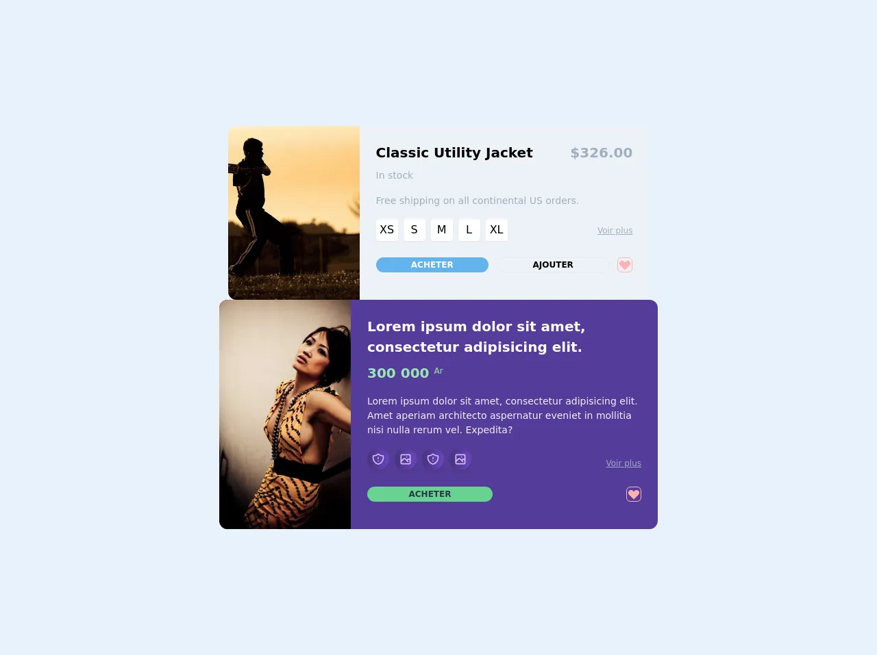
The preview of Card product UI component
To create a Card product UI component with Tailwind CSS, you'll need to use a combination of HTML and CSS classes. Here's a preview of what your Card product UI component could look like:
Free download of the Card product's source code
The source code of Card product UI component
To create a Card product UI component with Tailwind CSS, you'll need to use a combination of HTML and CSS classes. Here's an example of what the HTML code for your Card product UI component could look like:
<div class="flex flex-col gap-6 items-center h-screen w-full bg-gray-50 flex items-center justify-center">
  <div class="w-3/2 bg-gray-200 overflow-hidden rounded-xl">
    <div class="flex">
      <div class="flex-none w-48 relative">
        <img src="http://lorempixel.com/500/500/sports/1/Dummy-Text/" alt="" class="absolute inset-0 w-full h-full object-cover" />
      </div>
      <form class="flex-auto p-6">
        <div class="flex flex-wrap">
          <h1 class="text-blue font-bold flex-auto text-xl font-semibold">
            Classic Utility Jacket
          </h1>

          <div class="text-xl font-semibold text-gray-500">
            $326.00
          </div>
          <div class="w-full flex-none text-sm font-medium text-gray-500 mt-2">
            In stock
          </div>
        </div>
        <p class="mt-4 text-sm text-gray-500">
          Free shipping on all continental US orders.
        </p>
        <div class="flex items-baseline mt-4 mb-6">
          <div class="space-x-2 flex">
            <label class="w-8 h-8 rounded shadow-sm text-center flex items-center justify-center bg-white">
              <input class="hidden focus-within:w-6 h-6 flex items-center justify-center bg-gray-100 rounded-lg" name="size" type="radio" value="xs" checked>
              XS
            </label>
            <label class="w-8 h-8 rounded shadow-sm text-center flex items-center justify-center bg-white">
              <input class="hidden focus-within:w-6 h-6 flex items-center justify-center bg-gray-100 rounded-lg" name="size" type="radio" value="xs" checked>
              S
            </label>
            <label class="w-8 h-8 rounded shadow-sm text-center flex items-center justify-center bg-white">
              <input class="hidden focus-within:w-6 h-6 flex items-center justify-center bg-gray-100 rounded-lg" name="size" type="radio" value="xs" checked>
              M
            </label>
            <label class="w-8 h-8 rounded shadow-sm text-center flex items-center justify-center bg-white">
              <input class="hidden focus-within:w-6 h-6 flex items-center justify-center bg-gray-100 rounded-lg" name="size" type="radio" value="xs" checked>
              L
            </label>
            <label class="w-8 h-8 rounded shadow-sm text-center flex items-center justify-center bg-white">
              <input class="hidden focus-within:w-6 h-6 flex items-center justify-center bg-gray-100 rounded-lg" name="size" type="radio" value="xs" checked>
              XL
            </label>
          </div>
          <div class="ml-auto text-xs text-gray-500 underline">Voir plus</div>
        </div>
        <div class="flex space-x-3 mb-4 text-sm font-medium">
          <div class="flex-auto flex space-x-3">
            <button class="uppercase text-xs font-bold w-1/2 flex items-center justify-center rounded-full bg-blue-400 text-white" type="submit">
            Acheter</button>
            <button class="uppercase text-xs font-bold w-1/2 flex items-center justify-center rounded-full border border-gray-300" type="button">Ajouter</button>
          </div>
          <button class="flex-none flex items-center justify-center w-9 h-9 rounded-md text-gray-400 border border-red-300 hover:animate-ping" type="button" aria-label="like">
            <svg width="20" height="20" fill="currentColor" class="fill-current text-red-300">
              <path fill-rule="evenodd" clip-rule="evenodd" d="M3.172 5.172a4 4 0 015.656 0L10 6.343l1.172-1.171a4 4 0 115.656 5.656L10 17.657l-6.828-6.829a4 4 0 010-5.656z" />
            </svg>
          </button>
        </div>

      </form>
    </div>
  </div>

  <div class="max-w-screen-sm bg-purple-800 overflow-hidden rounded-xl">
    <div class="flex">
      <div class="flex-none w-48 relative">
        <img src="http://lorempixel.com/output/fashion-h-c-301-499-7.jpg" alt="" class="absolute inset-0 w-full h-full object-cover" />
      </div>
      <form class="flex-auto p-6">
        <div class="flex flex-wrap">
          <h1 class="text-white font-bold flex-auto text-xl font-semibold">
            Lorem ipsum dolor sit amet, consectetur adipisicing elit.
          </h1>

          <div class="w-full flex-none text-sm font-bold text-green-300 mt-2 text-xl">
            300 000 <sup class="font-light text-xs">Ar</sup>
          </div>
        </div>
        <p class="mt-4 text-sm text-gray-200">
          Lorem ipsum dolor sit amet, consectetur adipisicing elit. Amet aperiam architecto aspernatur eveniet in mollitia nisi nulla rerum vel. Expedita?
        </p>
        <div class="flex items-baseline mt-4 mb-6">
          <div class="space-x-2 flex">
            <label class="w-8 h-8 rounded-full shadow-sm bg-gradient-to-r from-purple-900 to-purple-700 shadow-md text-center-2 flex items-center justify-center bg-none bg-purple-700">
              <svg height="20" width="20" xmlns="http://www.w3.org/2000/svg" fill="none" viewBox="0 0 24 24" class="stroke-current text-purple-300">
                <path stroke-linecap="round" stroke-linejoin="round" stroke-width="2" d="M20.618 5.984A11.955 11.955 0 0112 2.944a11.955 11.955 0 01-8.618 3.04A12.02 12.02 0 003 9c0 5.591 3.824 10.29 9 11.622 5.176-1.332 9-6.03 9-11.622 0-1.042-.133-2.052-.382-3.016zM12 9v2m0 4h.01" />
              </svg>
            </label>
            <label class="w-8 h-8 rounded-full shadow-sm bg-gradient-to-r from-purple-900 to-purple-700 shadow-md text-center-2 flex items-center justify-center bg-none bg-purple-700">
              <svg xmlns="http://www.w3.org/2000/svg" fill="none" viewBox="0 0 24 24" stroke="currentColor" height="20" width="20" class="strocke-current text-purple-300">
                <path stroke-linecap="round" stroke-linejoin="round" stroke-width="2" d="M4 16l4.586-4.586a2 2 0 012.828 0L16 16m-2-2l1.586-1.586a2 2 0 012.828 0L20 14m-6-6h.01M6 20h12a2 2 0 002-2V6a2 2 0 00-2-2H6a2 2 0 00-2 2v12a2 2 0 002 2z" />
              </svg>
            </label>
            <label class="w-8 h-8 rounded-full shadow-sm bg-gradient-to-r from-purple-900 to-purple-700 shadow-md text-center-2 flex items-center justify-center bg-none bg-purple-700">
              <svg height="20" width="20" xmlns="http://www.w3.org/2000/svg" fill="none" viewBox="0 0 24 24" class="stroke-current text-purple-300">
                <path stroke-linecap="round" stroke-linejoin="round" stroke-width="2" d="M20.618 5.984A11.955 11.955 0 0112 2.944a11.955 11.955 0 01-8.618 3.04A12.02 12.02 0 003 9c0 5.591 3.824 10.29 9 11.622 5.176-1.332 9-6.03 9-11.622 0-1.042-.133-2.052-.382-3.016zM12 9v2m0 4h.01" />
              </svg>
            </label>
            <label class="w-8 h-8 rounded-full shadow-sm bg-gradient-to-r from-purple-900 to-purple-700 shadow-md text-center-2 flex items-center justify-center bg-none bg-purple-700">
              <svg xmlns="http://www.w3.org/2000/svg" fill="none" viewBox="0 0 24 24" stroke="currentColor" height="20" width="20" class="strocke-current text-purple-300">
                <path stroke-linecap="round" stroke-linejoin="round" stroke-width="2" d="M4 16l4.586-4.586a2 2 0 012.828 0L16 16m-2-2l1.586-1.586a2 2 0 012.828 0L20 14m-6-6h.01M6 20h12a2 2 0 002-2V6a2 2 0 00-2-2H6a2 2 0 00-2 2v12a2 2 0 002 2z" />
              </svg>
            </label>
          </div>
          <div class="ml-auto text-xs text-gray-500 underline">Voir plus</div>
        </div>
        <div class="flex space-x-3 mb-4 text-sm font-medium">
          <div class="flex-auto flex space-x-3">
            <button class="uppercase text-xs text-gray-800 font-bold w-1/2 flex items-center justify-center rounded-full bg-green-400 text-white" type="submit">
            Acheter</button></div>
          <button class="flex-none flex items-center justify-center w-9 h-9 rounded-md text-gray-400 border border-red-300 hover:animate-ping" type="button" aria-label="like">
            <svg width="20" height="20" fill="currentColor" class="fill-current text-red-300">
              <path fill-rule="evenodd" clip-rule="evenodd" d="M3.172 5.172a4 4 0 015.656 0L10 6.343l1.172-1.171a4 4 0 115.656 5.656L10 17.657l-6.828-6.829a4 4 0 010-5.656z" />
            </svg>
          </button>
        </div>

      </form>
    </div>
  </div>
</div>
How to create a Card product with Tailwind CSS?
Now that you understand the benefits of using Tailwind CSS to create a Card product UI component, let's dive into the steps you need to follow to create one yourself:
Set up your environment: Before you can start creating your Card product UI component, you'll need to set up your development environment. You can use a code editor like Visual Studio Code or Sublime Text to write your code.
Create the HTML structure: The first step in creating your Card product UI component is to create the HTML structure. You'll need to create a container element that will hold your Card product UI component, as well as the individual elements that make up your component.
Add the Tailwind CSS classes: Once you've created the HTML structure for your Card product UI component, you can start adding the Tailwind CSS classes. You'll need to add classes to style the container element, the image, the title, the description, and the price.
Customize your Card product UI component: After you've added the basic Tailwind CSS classes, you can start customizing your Card product UI component. You can change the colors, fonts, and spacing to match your website's design.
Test your Card product UI component: Once you've finished creating your Card product UI component, it's important to test it on different devices to ensure that it's responsive and looks good on all screen sizes.
Conclusion
Creating a Card product UI component with Tailwind CSS is a great way to showcase your products and services on your website. With its customizability, responsiveness, and ease of use, Tailwind CSS makes it easy to create beautiful and functional Card product UI components. Follow the steps outlined in this article to create your own Card product UI component and take your website to the next level.