- Published on
A Complete Guide To Build A Card Register With Tailwind CSS
- What is Tailwind CSS?
- The description of Card Register UI component
- Why use Tailwind CSS to create a Card Register UI component?
- The preview of Card Register UI component
- The source code of Card Register UI component
- How to create a Card Register with Tailwind CSS?
- Step 1: Create a new HTML file
- Step 2: Add the Tailwind CSS CDN link
- Step 3: Add the required Tailwind CSS classes
- Step 4: Preview the Card Register UI component and make any necessary changes
- Conclusion
As a FrontEnd technology blogger, it's always exciting to discover new ways to create beautiful and responsive UI components. In this article, we will explore how to build a Card Register UI component using Tailwind CSS. We will cover the basics of Tailwind CSS, the description of the Card Register UI component, why we should use Tailwind CSS to create the Card Register UI component, the preview and source code of the Card Register UI component, and finally, how to create the Card Register with Tailwind CSS.
What is Tailwind CSS?
Tailwind CSS is a utility-first CSS framework that allows you to quickly design and customize your UI components. It provides a set of pre-defined classes that you can use to style your HTML elements. Tailwind CSS is designed to be highly customizable and allows you to create unique designs by combining different classes.
The description of Card Register UI component
A Card Register UI component is a form that allows users to enter their credit card information. It usually consists of several input fields, such as card number, expiration date, and CVV code. The Card Register UI component is an essential part of any e-commerce website that accepts credit card payments.
Why use Tailwind CSS to create a Card Register UI component?
Tailwind CSS provides a set of pre-defined classes that can be used to style the Card Register UI component quickly. It allows you to create a responsive and customizable UI component without writing any custom CSS. Tailwind CSS also provides a consistent design language that can be used across your entire website.
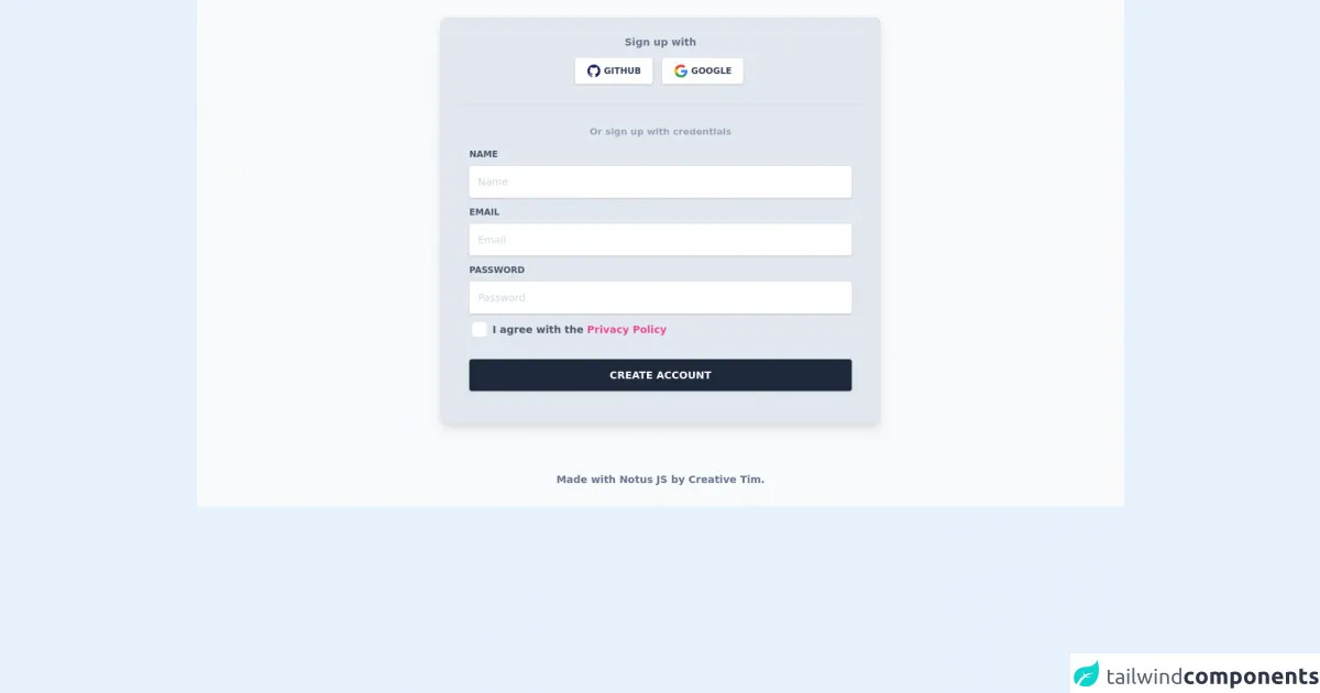
The preview of Card Register UI component
To create the Card Register UI component, we will use Tailwind CSS classes to style our HTML elements. The final result will look something like this:
Free download of the Card Register's source code
The source code of Card Register UI component
To create the Card Register UI component, we will use HTML and Tailwind CSS classes. The source code will look something like this:
<link rel="stylesheet" href="https://demos.creative-tim.com/notus-js/assets/styles/tailwind.css">
<link rel="stylesheet" href="https://demos.creative-tim.com/notus-js/assets/vendor/@fortawesome/fontawesome-free/css/all.min.css">

<section class=" bg-blueGray-50">
<div class="w-full lg:w-6/12 px-4 mx-auto pt-6">
  <div class="relative flex flex-col min-w-0 break-words w-full mb-6 shadow-lg rounded-lg bg-blueGray-200 border-0">
    <div class="rounded-t mb-0 px-6 py-6">
      <div class="text-center mb-3">
        <h6 class="text-blueGray-500 text-sm font-bold">
          Sign up with
        </h6>
      </div>
      <div class="btn-wrapper text-center">
        <button class="bg-white active:bg-blueGray-50 text-blueGray-700 font-normal px-4 py-2 rounded outline-none focus:outline-none mr-2 mb-1 uppercase shadow hover:shadow-md inline-flex items-center font-bold text-xs ease-linear transition-all duration-150" type="button">
          <img alt="..." class="w-5 mr-1" src="https://demos.creative-tim.com/notus-js/assets/img/github.svg">Github </button>
        <button class="bg-white active:bg-blueGray-50 text-blueGray-700 font-normal px-4 py-2 rounded outline-none focus:outline-none mr-1 mb-1 uppercase shadow hover:shadow-md inline-flex items-center font-bold text-xs ease-linear transition-all duration-150" type="button">
          <img alt="..." class="w-5 mr-1" src="https://demos.creative-tim.com/notus-js/assets/img/google.svg">Google</button>

      </div>
      <hr class="mt-6 border-b-1 border-blueGray-300">
    </div>
    <div class="flex-auto px-4 lg:px-10 py-10 pt-0">
      <div class="text-blueGray-400 text-center mb-3 font-bold">
        <small>Or sign up with credentials</small>
      </div>
      <form>
        <div class="relative w-full mb-3">
          <label class="block uppercase text-blueGray-600 text-xs font-bold mb-2" htmlfor="grid-password"> Name</label>
          <input type="email" class="border-0 px-3 py-3 placeholder-blueGray-300 text-blueGray-600 bg-white rounded text-sm shadow focus:outline-none focus:ring w-full ease-linear transition-all duration-150" placeholder="Name">
        </div>

        <div class="relative w-full mb-3">
          <label class="block uppercase text-blueGray-600 text-xs font-bold mb-2" htmlfor="grid-password">Email</label>
          <input type="email" class="border-0 px-3 py-3 placeholder-blueGray-300 text-blueGray-600 bg-white rounded text-sm shadow focus:outline-none focus:ring w-full ease-linear transition-all duration-150" placeholder="Email">
        </div>

        <div class="relative w-full mb-3">
          <label class="block uppercase text-blueGray-600 text-xs font-bold mb-2" htmlfor="grid-password">Password</label>
          <input type="password" class="border-0 px-3 py-3 placeholder-blueGray-300 text-blueGray-600 bg-white rounded text-sm shadow focus:outline-none focus:ring w-full ease-linear transition-all duration-150" placeholder="Password">
        </div>

        <div>
          <label class="inline-flex items-center cursor-pointer">
            <input id="customCheckLogin" type="checkbox" class="form-checkbox border-0 rounded text-blueGray-700 ml-1 w-5 h-5 ease-linear transition-all duration-150">
            <span class="ml-2 text-sm font-semibold text-blueGray-600">
              I agree with the
              <a href="javascript:void(0)" class="text-pink-500">
                Privacy Policy
              </a>
            </span>
          </label>
        </div>

        <div class="text-center mt-6">
          <button class="bg-blueGray-800 text-white active:bg-blueGray-600 text-sm font-bold uppercase px-6 py-3 rounded shadow hover:shadow-lg outline-none focus:outline-none mr-1 mb-1 w-full ease-linear transition-all duration-150" type="button">
            Create Account
          </button>
        </div>
      </form>
    </div>
  </div>
</div>
<footer class="relative  pt-8 pb-6 mt-8">
  <div class="container mx-auto px-4">
    <div class="flex flex-wrap items-center md:justify-between justify-center">
      <div class="w-full md:w-6/12 px-4 mx-auto text-center">
        <div class="text-sm text-blueGray-500 font-semibold py-1">
          Made with <a href="https://www.creative-tim.com/product/notus-js" class="text-blueGray-500 hover:text-gray-800" target="_blank">Notus JS</a> by <a href="https://www.creative-tim.com" class="text-blueGray-500 hover:text-blueGray-800" target="_blank"> Creative Tim</a>.
        </div>
      </div>
    </div>
  </div>
</footer>
</section>
How to create a Card Register with Tailwind CSS?
To create the Card Register UI component, we will follow these steps:
- Create a new HTML file and add the necessary input fields for the Card Register UI component.
- Add the Tailwind CSS CDN link to the head section of the HTML file.
- Add the required Tailwind CSS classes to the HTML elements to style them.
- Preview the Card Register UI component and make any necessary changes.
Let's dive into the code and see how we can create the Card Register UI component step-by-step.
Step 1: Create a new HTML file
Create a new HTML file and add the necessary input fields for the Card Register UI component. The HTML code will look something like this:
<div class="max-w-md mx-auto mt-10">
  <form class="bg-white shadow-md rounded px-8 pt-6 pb-8 mb-4">
    <div class="mb-4">
      <label class="block text-gray-700 font-bold mb-2" for="card-number">
        Card Number
      </label>
      <input
        class="shadow appearance-none border rounded w-full py-2 px-3 text-gray-700 leading-tight focus:outline-none focus:shadow-outline"
        id="card-number"
        type="text"
        placeholder="**** **** **** ****"
      />
    </div>
    <div class="mb-4">
      <label class="block text-gray-700 font-bold mb-2" for="expiration-date">
        Expiration Date
      </label>
      <input
        class="shadow appearance-none border rounded w-full py-2 px-3 text-gray-700 leading-tight focus:outline-none focus:shadow-outline"
        id="expiration-date"
        type="text"
        placeholder="MM / YY"
      />
    </div>
    <div class="mb-4">
      <label class="block text-gray-700 font-bold mb-2" for="cvv-code">
        CVV Code
      </label>
      <input
        class="shadow appearance-none border rounded w-full py-2 px-3 text-gray-700 leading-tight focus:outline-none focus:shadow-outline"
        id="cvv-code"
        type="text"
        placeholder="***"
      />
    </div>
    <div class="flex items-center justify-between">
      <button class="bg-blue-500 hover:bg-blue-700 text-white font-bold py-2 px-4 rounded focus:outline-none focus:shadow-outline" type="button">
        Register Card
      </button>
    </div>
  </form>
</div>
In this code, we have added the necessary input fields for the Card Register UI component. We have also added some Tailwind CSS classes to style the input fields and the form.
Step 2: Add the Tailwind CSS CDN link
Add the Tailwind CSS CDN link to the head section of the HTML file. The link will look something like this:
<head>
  <link
    href="https://cdn.tailwindcss.com"
    rel="stylesheet"
  />
</head>
This link will load the necessary Tailwind CSS stylesheets for our Card Register UI component.
Step 3: Add the required Tailwind CSS classes
Add the required Tailwind CSS classes to the HTML elements to style them. We have already added some classes in the HTML code in Step 1. Let's go through them one by one:
max-w-md: This class sets the maximum width of the container tomd(medium) size.mx-auto: This class centers the container horizontally.mt-10: This class adds a margin-top of10units to the container.bg-white: This class sets the background color of the form to white.shadow-md: This class adds a shadow effect to the form.rounded: This class rounds the corners of the form.px-8: This class adds a padding of8units to the left and right sides of the form.pt-6: This class adds a padding of6units to the top of the form.pb-8: This class adds a padding of8units to the bottom of the form.mb-4: This class adds a margin-bottom of4units to the input fields.block: This class sets the display property of the label to block.text-gray-700: This class sets the text color of the label to gray-700.font-bold: This class sets the font weight of the label to bold.leading-tight: This class sets the line-height of the input fields to tight.focus:outline-none: This class removes the outline when the input field is in focus.focus:shadow-outline: This class adds a shadow effect when the input field is in focus.bg-blue-500: This class sets the background color of the button to blue-500.hover:bg-blue-700: This class sets the background color of the button to blue-700 when the button is hovered.text-white: This class sets the text color of the button to white.font-bold: This class sets the font weight of the button to bold.py-2: This class adds a padding of2units to the top and bottom of the button.px-4: This class adds a padding of4units to the left and right sides of the button.rounded: This class rounds the corners of the button.focus:outline-none: This class removes the outline when the button is in focus.focus:shadow-outline: This class adds a shadow effect when the button is in focus.
Step 4: Preview the Card Register UI component and make any necessary changes
Preview the Card Register UI component in your browser and make any necessary changes. You can adjust the Tailwind CSS classes to customize the design of the Card Register UI component further.
Conclusion
In this article, we have explored how to build a Card Register UI component using Tailwind CSS. We have covered the basics of Tailwind CSS, the description of the Card Register UI component, why we should use Tailwind CSS to create the Card Register UI component, the preview and source code of the Card Register UI component, and finally, how to create the Card Register with Tailwind CSS. With Tailwind CSS, you can create beautiful and responsive UI components quickly and easily.