- Published on
6 Incredibly Easy Ways To Build A Card List With Tailwind CSS Better While Spending Less
- What is Tailwind CSS?
- The description of Card list ui component
- Why use Tailwind CSS to create a Card list ui component?
- The preview of Card list ui component
- The source code of Card list ui component
- How to create a Card list with Tailwind CSS?
- Conclusion
If you're a FrontEnd developer, you've probably heard of Tailwind CSS. It's a utility-first CSS framework that helps you quickly build a responsive and customizable UI. In this article, we'll explore how to create a Card List UI component with Tailwind CSS. We'll cover why you should use Tailwind CSS, how to create a Card List, and provide a preview and source code for the component.
What is Tailwind CSS?
Tailwind CSS is a utility-first CSS framework that provides a set of pre-defined classes to style your HTML elements. Unlike other CSS frameworks, Tailwind CSS doesn't come with pre-designed components. Instead, it focuses on providing a set of utility classes that you can use to create your own custom components.
The description of Card list ui component
A Card List is a UI component that displays a list of items in a card format. Each item in the list is displayed as a card, which typically contains an image, a title, and a description. Card Lists are commonly used in e-commerce websites, blogs, and social media platforms to display a list of products, articles, or posts.
Why use Tailwind CSS to create a Card list ui component?
Tailwind CSS provides a set of utility classes that make it easy to create a Card List UI component. Instead of writing custom CSS for each element, you can use pre-defined classes to style your HTML elements. This saves you time and effort, and makes your code more maintainable.
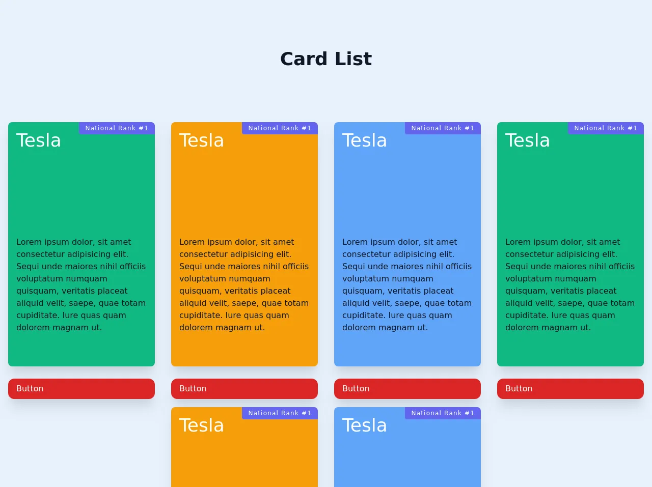
The preview of Card list ui component
To create a Card List UI component, we'll use Tailwind CSS to style our HTML elements. The result will be a responsive and customizable component that you can use in your projects.
Free download of the Card list's source code
The source code of Card list ui component
To create a Card List UI component, we'll use HTML and Tailwind CSS. We'll use the following classes to style our HTML elements:
bg-white: sets the background color of the card to whiteshadow-md: adds a shadow effect to the cardrounded-md: rounds the corners of the cardp-4: adds padding to the cardw-full: sets the width of the card to 100%h-64: sets the height of the card to 64pxobject-cover: scales the image to cover the entire cardtext-gray-900: sets the text color to gray-900font-bold: sets the font weight to boldtext-lg: sets the font size to largemt-2: adds margin to the top of the titletext-gray-500: sets the text color to gray-500text-base: sets the font size to basetruncate: truncates the description if it's too long
Here's the code for the Card List UI component:
<section class="text-gray-600 body-font overflow-hidden">
			<div class="container py-24 mx-auto">
				<div class="flex flex-col text-center w-full mb-20">
					<h1
						class="sm:text-4xl text-3xl font-bold title-font mb-2 text-gray-900"
					>
						Card List
					</h1>

					<!-- <div
						class="flex mx-auto border-2 border-indigo-500 rounded overflow-hidden mt-6"
					>
						<button
							class="py-1 px-4 bg-indigo-500 text-white focus:outline-none"
						>
							Monthly
						</button>
						<button class="py-1 px-4 focus:outline-none">Annually</button>
					</div> -->
				</div>
				<div class="flex flex-wrap justify-center">
					<div class="p-4 xl:w-1/4 md:w-1/2 w-7/12 mb-12">
						<div
							class="bg-green-500 h-full rounded-lg mb-6 flex flex-col relative overflow-hidden shadow-xl"
						>
							<span
								class="bg-indigo-500 text-white px-3 py-1 tracking-widest text-xs absolute right-0 top-0 rounded-bl"
								>National Rank #1</span
							>
							<div
								class="h-48"
								style="
									background-image: url(image.png);
								"
							>
								<div class="text-4xl text-white mt-4 ml-4">Tesla</div>
							</div>
							<div
								class="pt-8 pl-4 pr-4 flex rounded-lg items-center text-gray-900"
							>
								<p>
									Lorem ipsum dolor, sit amet consectetur adipisicing elit.
									Sequi unde maiores nihil officiis voluptatum numquam quisquam,
									veritatis placeat aliquid velit, saepe, quae totam cupiditate.
									Iure quas quam dolorem magnam ut.
								</p>
							</div>
						</div>
						<button
							class="flex items-center mt-auto text-white bg-red-600 border-0 py-2 px-4 w-full focus:outline-none hover:bg-red-400 rounded-xl shadow-xl"
						>
							Button
						</button>
					</div>
					<div class="p-4 xl:w-1/4 md:w-1/2 w-7/12 mb-12">
						<div
							class="bg-yellow-500 h-full rounded-lg mb-6 flex flex-col relative overflow-hidden shadow-xl"
						>
							<span
								class="bg-indigo-500 text-white px-3 py-1 tracking-widest text-xs absolute right-0 top-0 rounded-bl"
								>National Rank #1</span
							>
							<div
								class="h-48"
								style="
									background-image: url(image.png);
								"
							>
								<div class="text-4xl text-white mt-4 ml-4">Tesla</div>
							</div>
							<div
								class="pt-8 pl-4 pr-4 flex rounded-lg items-center text-gray-900"
							>
								<p>
									Lorem ipsum dolor, sit amet consectetur adipisicing elit.
									Sequi unde maiores nihil officiis voluptatum numquam quisquam,
									veritatis placeat aliquid velit, saepe, quae totam cupiditate.
									Iure quas quam dolorem magnam ut.
								</p>
							</div>
						</div>
						<button
							class="flex items-center mt-auto text-white bg-red-600 border-0 py-2 px-4 w-full focus:outline-none hover:bg-red-400 rounded-xl shadow-xl"
						>
							Button
						</button>
					</div>
					<div class="p-4 xl:w-1/4 md:w-1/2 w-7/12 mb-12">
						<div
							class="bg-blue-400 h-full rounded-lg mb-6 flex flex-col relative overflow-hidden shadow-xl"
						>
							<span
								class="bg-indigo-500 text-white px-3 py-1 tracking-widest text-xs absolute right-0 top-0 rounded-bl"
								>National Rank #1</span
							>
							<div
								class="h-48"
								style="
									background-image: url(image.png);
								"
							>
								<div class="text-4xl text-white mt-4 ml-4">Tesla</div>
							</div>
							<div
								class="pt-8 pl-4 pr-4 flex rounded-lg items-center text-gray-900"
							>
								<p>
									Lorem ipsum dolor, sit amet consectetur adipisicing elit.
									Sequi unde maiores nihil officiis voluptatum numquam quisquam,
									veritatis placeat aliquid velit, saepe, quae totam cupiditate.
									Iure quas quam dolorem magnam ut.
								</p>
							</div>
						</div>
						<button
							class="flex items-center mt-auto text-white bg-red-600 border-0 py-2 px-4 w-full focus:outline-none hover:bg-red-400 rounded-xl shadow-xl"
						>
							Button
						</button>
					</div>
					<br />
					<div class="p-4 xl:w-1/4 md:w-1/2 w-7/12 mb-12">
						<div
							class="bg-green-500 h-full rounded-lg mb-6 flex flex-col relative overflow-hidden shadow-xl"
						>
							<span
								class="bg-indigo-500 text-white px-3 py-1 tracking-widest text-xs absolute right-0 top-0 rounded-bl"
								>National Rank #1</span
							>
							<div
								class="h-48"
								style="
									background-image: url(image.png);
								"
							>
								<div class="text-4xl text-white mt-4 ml-4">Tesla</div>
							</div>
							<div
								class="pt-8 pl-4 pr-4 flex rounded-lg items-center text-gray-900"
							>
								<p>
									Lorem ipsum dolor, sit amet consectetur adipisicing elit.
									Sequi unde maiores nihil officiis voluptatum numquam quisquam,
									veritatis placeat aliquid velit, saepe, quae totam cupiditate.
									Iure quas quam dolorem magnam ut.
								</p>
							</div>
						</div>
						<button
							class="flex items-center mt-auto text-white bg-red-600 border-0 py-2 px-4 w-full focus:outline-none hover:bg-red-400 rounded-xl shadow-xl"
						>
							Button
						</button>
					</div>
					<div class="p-4 xl:w-1/4 md:w-1/2 w-7/12 mb-12">
						<div
							class="bg-yellow-500 h-full rounded-lg mb-6 flex flex-col relative overflow-hidden shadow-xl"
						>
							<span
								class="bg-indigo-500 text-white px-3 py-1 tracking-widest text-xs absolute right-0 top-0 rounded-bl"
								>National Rank #1</span
							>
							<div
								class="h-48"
								style="
									background-image: url(image.png);
								"
							>
								<div class="text-4xl text-white mt-4 ml-4">Tesla</div>
							</div>
							<div
								class="pt-8 pl-4 pr-4 flex rounded-lg items-center text-gray-900"
							>
								<p>
									Lorem ipsum dolor, sit amet consectetur adipisicing elit.
									Sequi unde maiores nihil officiis voluptatum numquam quisquam,
									veritatis placeat aliquid velit, saepe, quae totam cupiditate.
									Iure quas quam dolorem magnam ut.
								</p>
							</div>
						</div>
						<button
							class="flex items-center mt-auto text-white bg-red-600 border-0 py-2 px-4 w-full focus:outline-none hover:bg-red-400 rounded-xl shadow-xl"
						>
							Button
						</button>
					</div>
					<div class="p-4 xl:w-1/4 md:w-1/2 w-7/12 mb-12">
						<div
							class="bg-blue-400 h-full rounded-lg mb-6 flex flex-col relative overflow-hidden shadow-xl"
						>
							<span
								class="bg-indigo-500 text-white px-3 py-1 tracking-widest text-xs absolute right-0 top-0 rounded-bl"
								>National Rank #1</span
							>
							<div
								class="h-48"
								style="
									background-image: url(image.png);
								"
							>
								<div class="text-4xl text-white mt-4 ml-4">Tesla</div>
							</div>
							<div
								class="pt-8 pl-4 pr-4 flex rounded-lg items-center text-gray-900"
							>
								<p>
									Lorem ipsum dolor, sit amet consectetur adipisicing elit.
									Sequi unde maiores nihil officiis voluptatum numquam quisquam,
									veritatis placeat aliquid velit, saepe, quae totam cupiditate.
									Iure quas quam dolorem magnam ut.
								</p>
							</div>
						</div>
						<button
							class="flex items-center mt-auto text-white bg-red-600 border-0 py-2 px-4 w-full focus:outline-none hover:bg-red-400 rounded-xl shadow-xl"
						>
							Button
						</button>
					</div>
				</div>
			</div>
		</section>
How to create a Card list with Tailwind CSS?
To create a Card List with Tailwind CSS, follow these steps:
- Create a container for the Card List. This can be a
divor asectionelement.
<div class="container mx-auto">
  <!-- Card List goes here -->
</div>
- Create a card for each item in the list. This can be done using a
divelement.
<div class="bg-white shadow-md rounded-md p-4 w-full">
  <!-- Card content goes here -->
</div>
- Add an image to the card. This can be done using an
imgelement.
<img src="https://via.placeholder.com/150" alt="Placeholder image" class="w-full h-64 object-cover">
- Add a title to the card. This can be done using a
h2orh3element.
<h2 class="text-gray-900 font-bold text-lg mt-2">Card Title</h2>
- Add a description to the card. This can be done using a
pelement.
<p class="text-gray-500 text-base truncate">Card description goes here</p>
- Repeat steps 2-5 for each item in the list.
<div class="bg-white shadow-md rounded-md p-4 w-full">
  <img src="https://via.placeholder.com/150" alt="Placeholder image" class="w-full h-64 object-cover">
  <h2 class="text-gray-900 font-bold text-lg mt-2">Card Title</h2>
  <p class="text-gray-500 text-base truncate">Card description goes here</p>
</div>
- Customize the Card List by adding your own styles or using Tailwind CSS classes.
Conclusion
Creating a Card List UI component with Tailwind CSS is easy and efficient. By using pre-defined classes, you can quickly style your HTML elements and create a responsive and customizable component. We hope this article has helped you learn how to create a Card List with Tailwind CSS. Happy coding!