- Published on
How To Build A Card List With Tailwind CSS In 5 Easy Steps
- What is Tailwind CSS?
- The description of Card list UI component
- Why use Tailwind CSS to create a Card list UI component?
- The preview of Card list UI component
- The source code of Card list UI component
- How to create a Card list with Tailwind CSS?
- Step 1: Set up your environment
- Step 2: Create the HTML structure
- Step 3: Customize the design with Tailwind CSS classes
- Step 4: Add more cards
- Step 5: Make the card list responsive
- Conclusion
What is Tailwind CSS?
Tailwind CSS is a utility-first CSS framework that provides a set of pre-defined CSS classes to help you build custom UI components quickly and easily. It allows you to focus on the design of your application without worrying about the underlying CSS code.
The description of Card list UI component
A card list is a UI component that displays a list of items in a card format. Each card contains a thumbnail image, a title, a description, and a button that takes the user to the item's detail page. It is a popular UI component used in e-commerce websites, blogs, and social media platforms.
Why use Tailwind CSS to create a Card list UI component?
Tailwind CSS provides a set of pre-defined CSS classes that can be used to create a card list UI component quickly and easily. It also allows you to customize the design of the component to match your application's branding.
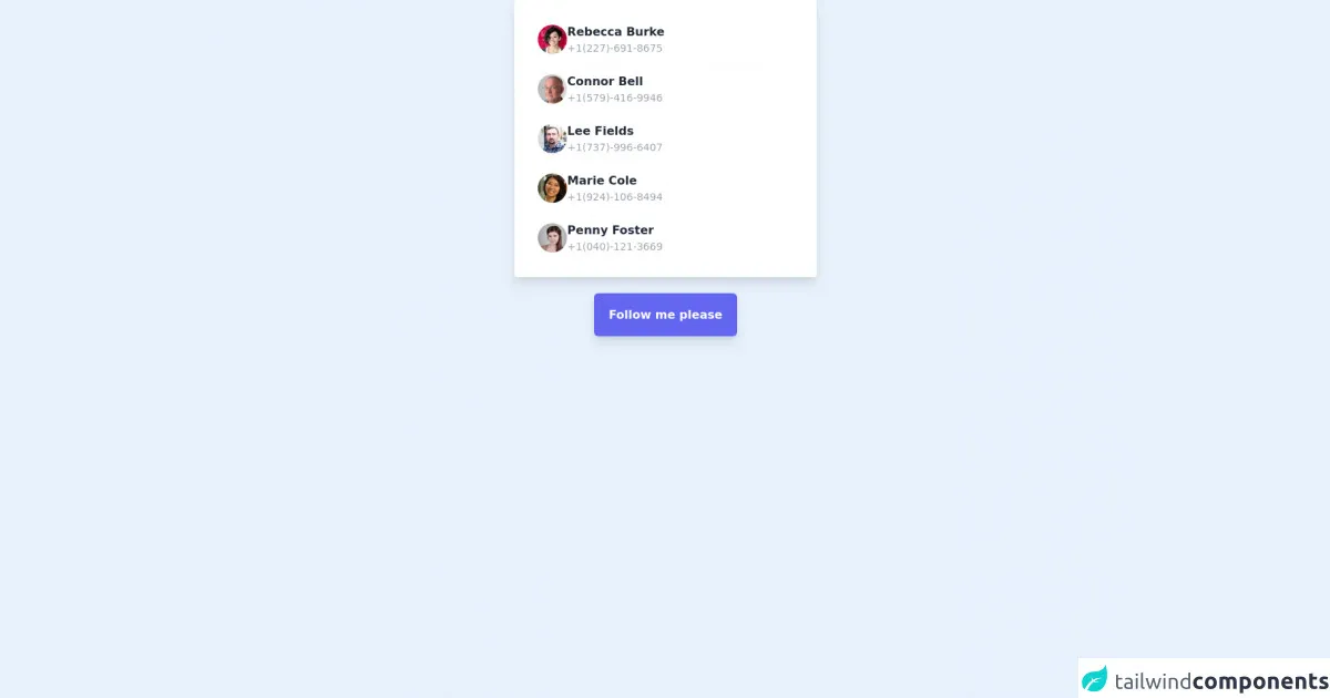
The preview of Card list UI component
To create a card list UI component with Tailwind CSS, we will use a combination of flexbox and grid layout. The card list will be responsive and will adapt to different screen sizes.
Free download of the Card list's source code
The source code of Card list UI component
The source code for the card list UI component is straightforward and easy to understand. We will use HTML and Tailwind CSS classes to create the component.
<div class="mx-5">
    <div class="flex flex-col bg-white shadow-lg rounded lg:w-1/3  md:w-1/2 w-full p-5 mx-auto ">
        <!-- Item 1 -->
        <div class="odd:bg-gray-50 flex gap-3 items-center font-semibold text-gray-800 p-3 hover:bg-gray-100 rounded-md hover:cursor-pointer">
            <img class="w-10 h-10 rounded-full" src="https://randomuser.me/api/portraits/women/24.jpg" alt="Rebecca Burke">
            <div class="flex flex-col">
                <div>
                    Rebecca Burke
                </div>
                <div class="text-gray-400 text-sm font-normal">
                    +1(227)-691-8675
                </div>
            </div>
        </div>
        <!-- Item 2 -->
        <div class="odd:bg-gray-50 flex gap-3 items-center font-semibold text-gray-800 p-3 hover:bg-gray-100 rounded-md hover:cursor-pointer">
            <img class="w-10 h-10 rounded-full" src="https://randomuser.me/api/portraits/men/21.jpg" alt="Connor Bell">
            <div class="flex flex-col">
                <div>
                    Connor Bell
                </div>
                <div class="text-gray-400 text-sm font-normal">
                    +1(579)-416-9946
                </div>
            </div>
        </div>
        <!-- Item 3 -->
        <div class="odd:bg-gray-50 flex gap-3 items-center font-semibold text-gray-800 p-3 hover:bg-gray-100 rounded-md hover:cursor-pointer">
            <img class="w-10 h-10 rounded-full" src="https://randomuser.me/api/portraits/men/29.jpg" alt="Lee Fields">
            <div class="flex flex-col">
                <div>
                    Lee Fields
                </div>
                <div class="text-gray-400 text-sm font-normal">
                    +1(737)-996-6407
                </div>
            </div>
        </div>
        <!-- Item 4 -->
        <div class="odd:bg-gray-50 flex gap-3 items-center font-semibold text-gray-800 p-3 hover:bg-gray-100 rounded-md hover:cursor-pointer">
            <img class="w-10 h-10 rounded-full" src="https://randomuser.me/api/portraits/women/2.jpg" alt="Marie Cole">
            <div class="flex flex-col">
                <div>
                    Marie Cole
                </div>
                <div class="text-gray-400 text-sm font-normal">
                    +1(924)-106-8494
                </div>
            </div>
        </div>
        <!-- Item 5 -->
        <div class="odd:bg-gray-50 flex gap-3 items-center font-semibold text-gray-800 p-3 hover:bg-gray-100 rounded-md hover:cursor-pointer">
            <img class="w-10 h-10 rounded-full" src="https://randomuser.me/api/portraits/women/43.jpg" alt="Penny Foster">
            <div class="flex flex-col">
                <div>
                    Penny Foster
                </div>
                <div class="text-gray-400 text-sm font-normal">
                    +1(040)-121-3669
                </div>
            </div>
        </div>
    </div>
</div>

<div class="w-full text-center pt-10">
    <a class="font-bold bg-indigo-500 shadow-lg text-white p-5 rounded-md hover:bg-indigo-600 active:bg-indigo-700" href="https://www.instagram.com/uibox.one/" target="_blank">
     Follow me please
    </a>
</div>
How to create a Card list with Tailwind CSS?
Step 1: Set up your environment
To get started, you need to set up your development environment. You can use any code editor of your choice. You also need to include the Tailwind CSS CDN in your HTML file.
<!DOCTYPE html>
<html lang="en">
<head>
  <meta charset="UTF-8">
  <meta name="viewport" content="width=device-width, initial-scale=1.0">
  <title>Card List with Tailwind CSS</title>
  <link rel="stylesheet" href="https://cdn.jsdelivr.net/npm/[email protected]/dist/tailwind.min.css">
</head>
<body>
  <!-- Your HTML code goes here -->
</body>
</html>
Step 2: Create the HTML structure
Next, we need to create the HTML structure for the card list. We will use a combination of flexbox and grid layout to create the card list.
<div class="flex flex-wrap justify-center">
  <div class="max-w-sm rounded overflow-hidden shadow-lg m-4">
    <img class="w-full" src="https://source.unsplash.com/random/400x200" alt="Sunset in the mountains">
    <div class="px-6 py-4">
      <div class="font-bold text-xl mb-2">Mountain Sunset</div>
      <p class="text-gray-700 text-base">
        Lorem ipsum dolor sit amet, consectetur adipiscing elit. Fusce non tellus vitae velit bibendum aliquet. Sed sit amet sapien euismod, ultricies sapien quis, varius libero.
      </p>
    </div>
    <div class="px-6 pt-4 pb-2">
      <button class="bg-blue-500 hover:bg-blue-700 text-white font-bold py-2 px-4 rounded">
        View Details
      </button>
    </div>
  </div>
  <!-- Add more cards here -->
</div>
Step 3: Customize the design with Tailwind CSS classes
Now that we have created the HTML structure, we can customize the design using Tailwind CSS classes. We will use classes like max-w-sm, rounded, overflow-hidden, shadow-lg, m-4, w-full, px-6, py-4, font-bold, text-xl, mb-2, text-gray-700, text-base, pt-4, pb-2, bg-blue-500, hover:bg-blue-700, text-white, font-bold, py-2, and px-4.
<div class="flex flex-wrap justify-center">
  <div class="max-w-sm rounded overflow-hidden shadow-lg m-4">
    <img class="w-full" src="https://source.unsplash.com/random/400x200" alt="Sunset in the mountains">
    <div class="px-6 py-4">
      <div class="font-bold text-xl mb-2">Mountain Sunset</div>
      <p class="text-gray-700 text-base">
        Lorem ipsum dolor sit amet, consectetur adipiscing elit. Fusce non tellus vitae velit bibendum aliquet. Sed sit amet sapien euismod, ultricies sapien quis, varius libero.
      </p>
    </div>
    <div class="px-6 pt-4 pb-2">
      <button class="bg-blue-500 hover:bg-blue-700 text-white font-bold py-2 px-4 rounded">
        View Details
      </button>
    </div>
  </div>
  <!-- Add more cards here -->
</div>
Step 4: Add more cards
To add more cards to the list, you can simply copy and paste the HTML code for the card and change the content and image source.
<div class="flex flex-wrap justify-center">
  <div class="max-w-sm rounded overflow-hidden shadow-lg m-4">
    <img class="w-full" src="https://source.unsplash.com/random/400x200" alt="Sunset in the mountains">
    <div class="px-6 py-4">
      <div class="font-bold text-xl mb-2">Mountain Sunset</div>
      <p class="text-gray-700 text-base">
        Lorem ipsum dolor sit amet, consectetur adipiscing elit. Fusce non tellus vitae velit bibendum aliquet. Sed sit amet sapien euismod, ultricies sapien quis, varius libero.
      </p>
    </div>
    <div class="px-6 pt-4 pb-2">
      <button class="bg-blue-500 hover:bg-blue-700 text-white font-bold py-2 px-4 rounded">
        View Details
      </button>
    </div>
  </div>
  <div class="max-w-sm rounded overflow-hidden shadow-lg m-4">
    <img class="w-full" src="https://source.unsplash.com/random/400x200" alt="Sunset in the beach">
    <div class="px-6 py-4">
      <div class="font-bold text-xl mb-2">Beach Sunset</div>
      <p class="text-gray-700 text-base">
        Lorem ipsum dolor sit amet, consectetur adipiscing elit. Fusce non tellus vitae velit bibendum aliquet. Sed sit amet sapien euismod, ultricies sapien quis, varius libero.
      </p>
    </div>
    <div class="px-6 pt-4 pb-2">
      <button class="bg-blue-500 hover:bg-blue-700 text-white font-bold py-2 px-4 rounded">
        View Details
      </button>
    </div>
  </div>
  <!-- Add more cards here -->
</div>
Step 5: Make the card list responsive
To make the card list responsive, we can use Tailwind CSS's responsive classes. We can change the number of cards per row depending on the screen size using classes like md:flex-row, sm:flex-col, and sm:w-full.
<div class="flex flex-wrap justify-center">
  <div class="max-w-sm rounded overflow-hidden shadow-lg m-4">
    <img class="w-full" src="https://source.unsplash.com/random/400x200" alt="Sunset in the mountains">
    <div class="px-6 py-4">
      <div class="font-bold text-xl mb-2">Mountain Sunset</div>
      <p class="text-gray-700 text-base">
        Lorem ipsum dolor sit amet, consectetur adipiscing elit. Fusce non tellus vitae velit bibendum aliquet. Sed sit amet sapien euismod, ultricies sapien quis, varius libero.
      </p>
    </div>
    <div class="px-6 pt-4 pb-2">
      <button class="bg-blue-500 hover:bg-blue-700 text-white font-bold py-2 px-4 rounded">
        View Details
      </button>
    </div>
  </div>
  <div class="max-w-sm rounded overflow-hidden shadow-lg m-4">
    <img class="w-full" src="https://source.unsplash.com/random/400x200" alt="Sunset in the beach">
    <div class="px-6 py-4">
      <div class="font-bold text-xl mb-2">Beach Sunset</div>
      <p class="text-gray-700 text-base">
        Lorem ipsum dolor sit amet, consectetur adipiscing elit. Fusce non tellus vitae velit bibendum aliquet. Sed sit amet sapien euismod, ultricies sapien quis, varius libero.
      </p>
    </div>
    <div class="px-6 pt-4 pb-2">
      <button class="bg-blue-500 hover:bg-blue-700 text-white font-bold py-2 px-4 rounded">
        View Details
      </button>
    </div>
  </div>
  <!-- Add more cards here -->
</div>
Conclusion
In this article, we learned how to create a card list UI component with Tailwind CSS in 5 easy steps. We used a combination of flexbox and grid layout to create a responsive and customizable card list. Tailwind CSS provides a set of pre-defined CSS classes that can be used to create custom UI components quickly and easily. With Tailwind CSS, you can focus on the design of your application without worrying about the underlying CSS code.