- Published on
Surprisingly Effective Ways To Make A Button Styles With Tailwind CSS
- What is Tailwind CSS?
- The description of Button Styles UI component
- Why use Tailwind CSS to create a Button Styles UI component?
- The preview of Button Styles UI component
- The source code of Button Styles UI component
- How to create a Button Styles with Tailwind CSS?
- Step 1: Install Tailwind CSS
- Step 2: Create a CSS file
- Step 3: Configure Tailwind CSS
- Step 4: Write your button styles
- Step 5: Apply your button styles
- Conclusion
As a FrontEnd technology blogger, it's important to stay up to date with the latest tools and techniques. One tool that has gained popularity in recent years is Tailwind CSS. In this article, we'll explore how to use Tailwind CSS to create effective button styles for your UI components.
What is Tailwind CSS?
Tailwind CSS is a utility-first CSS framework that allows you to quickly build custom user interfaces. It provides a set of pre-defined classes that you can use to style your HTML elements. Unlike traditional CSS frameworks, Tailwind CSS does not provide pre-built components. Instead, it provides a set of utility classes that you can use to create your own custom components.
The description of Button Styles UI component
Buttons are a common UI component used in web development. They are used to trigger an action or navigate to a different page. Button styles can vary depending on the design of the website or application. Common button styles include primary, secondary, success, warning, and danger.
Why use Tailwind CSS to create a Button Styles UI component?
Tailwind CSS provides a set of utility classes that make it easy to create custom button styles. These classes allow you to quickly apply styles such as background color, text color, padding, and border radius to your buttons. Using Tailwind CSS can save you time and effort when creating custom button styles.
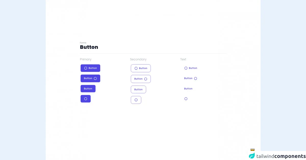
The preview of Button Styles UI component
Free download of the Button Styles's source code
In this section, we'll preview some of the button styles that we'll create using Tailwind CSS.
- Primary Button
- Secondary Button
- Success Button
- Warning Button
- Danger Button
The source code of Button Styles UI component
In this section, we'll provide the source code for the button styles that we previewed in the previous section.
<style>
@import url(https://cdnjs.cloudflare.com/ajax/libs/MaterialDesign-Webfont/5.3.45/css/materialdesignicons.min.css);
@import url('https://fonts.googleapis.com/css2?family=Poppins:wght@300;500;800&display=swap');
body {
    font-family: 'Poppins', sans-serif;
}
.active\:bg-grey-900:active {
    --tw-bg-opacity: 1;
    background-color: rgba(17, 24, 39,var(--tw-bg-opacity));
}
.hover\:border-4:hover {
    border-width: 4px;
}
.hover\:m-0:hover {
    margin: 0;
}
.focus\:border-4:focus {
    border-width: 4px;
}
.focus\:m-0:focus {
    margin: 0;
}
.active\:border-grey-900:active {
    --tw-bg-opacity: 1;
    border-color: rgba(17, 24, 39,var(--tw-bg-opacity));
}
.active\:text-grey-900:active {
    --tw-bg-opacity: 1;
    color: rgba(17, 24, 39,var(--tw-bg-opacity));
}
.active\:border-transparent:active {
    border-color: transparent;
}
</style>

<div class="min-w-screen min-h-screen bg-white flex items-center justify-center px-5 pt-5 pb-24">
    <div class="w-full max-w-4xl mx-auto px-3">
        <h6 class="text-gray-400 font-medium text-xs">Forms</h6>
        <h1 class="text-gray-900 font-extrabold text-3xl">Button</h1>
        <hr class="my-5">
        <div class="-mx-3 flex flex-wrap">
            <div class="w-1/2 md:w-1/3 px-3">
                <h3 class="text-gray-400 font-light text-lg mb-3">Primary</h3>
                <div class="mb-2"><button class="px-5 py-3 rounded-xl text-sm font-medium text-white bg-indigo-600 hover:bg-indigo-800 active:bg-grey-900 focus:outline-none border-4 border-white focus:border-purple-200 transition-all"><i class="mdi mdi-circle-outline mr-2 text-xl align-middle leading-none"></i>Button</button></div>
                <div class="mb-2"><button class="px-5 py-3 rounded-xl text-sm font-medium text-white bg-indigo-600 hover:bg-indigo-800 active:bg-grey-900 focus:outline-none border-4 border-white focus:border-purple-200 transition-all">Button<i class="mdi mdi-circle-outline ml-2 text-xl align-middle leading-none"></i></button></div>
                <div class="mb-2"><button class="px-5 py-3 rounded-xl text-sm font-medium text-white bg-indigo-600 hover:bg-indigo-800 active:bg-grey-900 focus:outline-none border-4 border-white focus:border-purple-200 transition-all">Button</button></div>
                <div class="mb-2"><button class="px-5 py-3 rounded-xl text-sm font-medium text-white bg-indigo-600 hover:bg-indigo-800 active:bg-grey-900 focus:outline-none border-4 border-white focus:border-purple-200 transition-all"><i class="mdi mdi-circle-outline text-xl align-middle leading-none"></i></button></div>
            </div>
            <div class="w-1/2 md:w-1/3 px-3">
                <h3 class="text-gray-400 font-light text-lg mb-3">Secondary</h3>
                <div class="mb-2"><button class="px-5 py-3 rounded-xl text-sm font-medium text-indigo-600 bg-white outline-none focus:outline-none m-1 hover:m-0 focus:m-0 border border-indigo-600 hover:border-4 focus:border-4 hover:border-indigo-800 hover:text-indigo-800 focus:border-purple-200 active:border-grey-900 active:text-grey-900 transition-all"><i class="mdi mdi-circle-outline mr-2 text-xl align-middle leading-none"></i>Button</button></div>
                <div class="mb-2"><button class="px-5 py-3 rounded-xl text-sm font-medium text-indigo-600 bg-white outline-none focus:outline-none m-1 hover:m-0 focus:m-0 border border-indigo-600 hover:border-4 focus:border-4 hover:border-indigo-800 hover:text-indigo-800 focus:border-purple-200 active:border-grey-900 active:text-grey-900 transition-all">Button<i class="mdi mdi-circle-outline ml-2 text-xl align-middle leading-none"></i></button></div>
                <div class="mb-2"><button class="px-5 py-3 rounded-xl text-sm font-medium text-indigo-600 bg-white outline-none focus:outline-none m-1 hover:m-0 focus:m-0 border border-indigo-600 hover:border-4 focus:border-4 hover:border-indigo-800 hover:text-indigo-800 focus:border-purple-200 active:border-grey-900 active:text-grey-900 transition-all">Button</button></div>
                <div class="mb-2"><button class="px-5 py-3 rounded-xl text-sm font-medium text-indigo-600 bg-white outline-none focus:outline-none m-1 hover:m-0 focus:m-0 border border-indigo-600 hover:border-4 focus:border-4 hover:border-indigo-800 hover:text-indigo-800 focus:border-purple-200 active:border-grey-900 active:text-grey-900 transition-all"><i class="mdi mdi-circle-outline text-xl align-middle leading-none"></i></button></div>
            </div>
            <div class="w-1/2 md:w-1/3 px-3">
                <h3 class="text-gray-400 font-light text-lg mb-3">Text</h3>
                <div class="mb-2"><button class="px-5 py-3 rounded-xl text-sm font-medium text-indigo-600 bg-white outline-none focus:outline-none border-4 border-transparent hover:text-indigo-800 focus:border-purple-200 active:border-transparent active:text-grey-900 transition-all"><i class="mdi mdi-circle-outline mr-2 text-xl align-middle leading-none"></i>Button</button></div>
                <div class="mb-2"><button class="px-5 py-3 rounded-xl text-sm font-medium text-indigo-600 bg-white outline-none focus:outline-none border-4 border-transparent hover:text-indigo-800 focus:border-purple-200 active:border-transparent active:text-grey-900 transition-all">Button<i class="mdi mdi-circle-outline ml-2 text-xl align-middle leading-none"></i></button></div>
                <div class="mb-2"><button class="px-5 py-3 rounded-xl text-sm font-medium text-indigo-600 bg-white outline-none focus:outline-none border-4 border-transparent hover:text-indigo-800 focus:border-purple-200 active:border-transparent active:text-grey-900 transition-all">Button</button></div>
                <div class="mb-2"><button class="px-5 py-3 rounded-xl text-sm font-medium text-indigo-600 bg-white outline-none focus:outline-none border-4 border-transparent hover:text-indigo-800 focus:border-purple-200 active:border-transparent active:text-grey-900 transition-all"><i class="mdi mdi-circle-outline text-xl align-middle leading-none"></i></button></div>
            </div>
        </div>
    </div>
</div>

<!-- BUY ME A BEER AND HELP SUPPORT OPEN-SOURCE RESOURCES -->
<div class="flex items-end justify-end fixed bottom-0 right-0 mb-4 mr-4 z-10">
    <div>
        <a title="Buy me a beer" href="https://www.buymeacoffee.com/scottwindon" target="_blank" class="block w-16 h-16 rounded-full transition-all shadow hover:shadow-lg transform hover:scale-110 hover:rotate-12">
            <img class="object-cover object-center w-full h-full rounded-full" src="https://i.pinimg.com/originals/60/fd/e8/60fde811b6be57094e0abc69d9c2622a.jpg"/>
        </a>
    </div>
</div>
How to create a Button Styles with Tailwind CSS?
Now that we've covered the basics of Tailwind CSS and button styles, let's dive into how to create custom button styles using Tailwind CSS.
Step 1: Install Tailwind CSS
The first step is to install Tailwind CSS. You can do this by running the following command in your terminal:
npm install tailwindcss
Step 2: Create a CSS file
Next, create a CSS file where you'll write your custom button styles. You can name this file anything you like. In this example, we'll call it button-styles.css.
Step 3: Configure Tailwind CSS
Tailwind CSS provides a configuration file where you can customize the utility classes that it provides. You can generate a default configuration file by running the following command:
npx tailwindcss init
This will generate a tailwind.config.js file in your project directory. You can customize this file to suit your needs.
Step 4: Write your button styles
To create a custom button style, you can use the utility classes provided by Tailwind CSS. Here's an example of how to create a primary button style:
.primary-btn {
  background-color: blue;
  color: white;
  padding: 8px 16px;
  border-radius: 4px;
}
In this example, we've applied a blue background color, white text color, 8px padding on the top and bottom, 16px padding on the left and right, and a 4px border radius to our button.
Step 5: Apply your button styles
To apply your button styles, you can add the class name to your HTML button element. Here's an example:
<button class="primary-btn">Click me</button>
This will apply the primary button style that we defined in our CSS file.
Conclusion
Tailwind CSS provides a powerful set of utility classes that make it easy to create custom button styles. By following the steps outlined in this article, you can create your own custom button styles in no time. Happy coding!