- Published on
6 Easy Ways To Build A Card Image With Tailwind CSS
- What is Tailwind CSS?
- The description of Card image UI component
- Why use Tailwind CSS to create a Card image UI component?
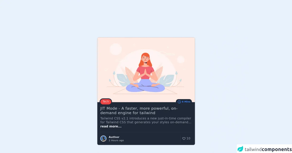
- The preview of Card image UI component
- The source code of Card image UI component
- How to create a Card image with Tailwind CSS?
- Conclusion
What is Tailwind CSS?
Tailwind CSS is a utility-first CSS framework that allows you to create custom designs without having to write any CSS code. It provides a set of pre-defined CSS classes that you can use to style your HTML elements. Tailwind CSS is a popular choice among developers because it saves time and effort in designing and styling web pages.
The description of Card image UI component
A card image UI component is a popular design element used in web development. It is a container that holds an image and some text content. Card images are commonly used to display products, services, or blog posts. They are visually appealing and can help improve the user experience on a website.
Why use Tailwind CSS to create a Card image UI component?
Tailwind CSS provides a set of pre-defined CSS classes that you can use to create a card image UI component quickly. It saves time and effort in designing and styling web pages. Moreover, Tailwind CSS is highly customizable, so you can easily modify the styles to fit your needs.
The preview of Card image UI component
To create a card image with Tailwind CSS, you can use the following HTML structure:
<div class="max-w-sm rounded overflow-hidden shadow-lg">
  <img class="w-full" src="https://source.unsplash.com/random" alt="Sunset in the mountains">
  <div class="px-6 py-4">
    <div class="font-bold text-xl mb-2">The Coldest Sunset</div>
    <p class="text-gray-700 text-base">
      Lorem ipsum dolor sit amet, consectetur adipisicing elit. Voluptatibus quia, nulla! Maiores et perferendis eaque, exercitationem praesentium nihil.
    </p>
  </div>
</div>
{{__placeholder1__}}
The above HTML code creates a card image UI component with an image, title, and description. The max-w-sm class sets the maximum width of the card, while the rounded class rounds the corners of the card. The overflow-hidden class hides any content that overflows the card's boundaries. The shadow-lg class adds a shadow effect to the card.
The w-full class sets the width of the image to 100%, while the px-6 and py-4 classes add padding to the card's content. The font-bold and text-xl classes set the font weight and size of the title, respectively. The text-gray-700 and text-base classes set the color and size of the description.
Free download of the Card image's source code
The source code of Card image UI component
To create a card image UI component with Tailwind CSS, you can use the following CSS classes:
.max-w-sm {
  max-width: 640px;
}

.rounded {
  border-radius: 0.25rem;
}

.overflow-hidden {
  overflow: hidden;
}

.shadow-lg {
  box-shadow: 0 10px 15px -3px rgba(0, 0, 0, 0.1), 0 4px 6px -2px rgba(0, 0, 0, 0.05);
}

.w-full {
  width: 100%;
}

.px-6 {
  padding-left: 1.5rem;
  padding-right: 1.5rem;
}

.py-4 {
  padding-top: 1rem;
  padding-bottom: 1rem;
}

.font-bold {
  font-weight: 700;
}

.text-xl {
  font-size: 1.25rem;
  line-height: 1.75rem;
}

.text-gray-700 {
  --text-opacity: 1;
  color: #4a5568;
  color: rgba(74, 85, 104, var(--text-opacity));
}

.text-base {
  font-size: 1rem;
  line-height: 1.5rem;
}
{{__placeholder2__}}
The above CSS code defines the styles for the card image UI component. The max-w-sm class sets the maximum width of the card, while the rounded class rounds the corners of the card. The overflow-hidden class hides any content that overflows the card's boundaries. The shadow-lg class adds a shadow effect to the card.
The w-full class sets the width of the image to 100%, while the px-6 and py-4 classes add padding to the card's content. The font-bold and text-xl classes set the font weight and size of the title, respectively. The text-gray-700 and text-base classes set the color and size of the description.
<div class="flex justify-between m-6">
  <div class="flex flex-col h-full max-w-lg mx-auto bg-gray-800 rounded-lg">
          <img
            class="rounded-lg rounded-b-none"
            src="http://www.3forty.media/ruki/wp-content/uploads/2020/06/meditation-yoga-1024x682.jpg"
            alt="thumbnail"
            loading="lazy"
          />
          <div class="flex justify-between -mt-4 px-4">
            <span
              class="inline-block ring-4 bg-red-500 ring-gray-800 rounded-full text-sm font-medium tracking-wide text-gray-100 px-3 pt-0.5"
              >Tech</span
            >
            <span
              class="flex h-min space-x-1 items-center rounded-full text-gray-400 bg-gray-800 py-1 px-2 text-xs font-medium"
            >
              <svg
                xmlns="http://www.w3.org/2000/svg"
                class="h-5 w-5 text-blue-500"
                fill="none"
                viewBox="0 0 24 24"
                stroke="currentColor"
              >
                <path
                  stroke-linecap="round"
                  stroke-linejoin="round"
                  stroke-width="2"
                  d="M12 8v4l3 3m6-3a9 9 0 11-18 0 9 9 0 0118 0z"
                />
              </svg>
              <p class="text-blue-500 font-semibold text-xs">
                6 Mins
              </p>
            </span>
          </div>
          <div class="py-2 px-4">
            <h1
              class="text-xl font-medium leading-6 tracking-wide text-gray-300 hover:text-blue-500 cursor-pointer"
            >
              <a href="blog/detail">JIT Mode - A faster, more powerful, on-demand engine for tailwind</a>
            </h1>
          </div>
          <div class="px-4 space-y-2">
            <p class="text-gray-400 font-normal leading-5 tracking-wide">
              Tailwind CSS v2.1 introduces a new just-in-time compiler for Tailwind CSS that generates your styles on-demand...
            </p>
            <router-link
              to="blog/detail"
              class="font-bold hover:text-blue-400 text-gray-100"
              >read more...</router-link
            >
          </div>
          <div class="flex flex-row items-end h-full w-full px-4 mt-4">
            <div class="flex border-t border-gray-700 w-full py-4">
              <div
                class="flex items-center space-x-3 border-r border-gray-700 w-full"
              >
                <img
                  class="object-cover w-8 h-8 border-2 border-white rounded-full"
                  src="https://storageapi.fleek.co/kamaludin21-team-bucket/portfolio/avatar.jpg"
                  alt="profile users"
                  loading="lazy"
                />
                <div class="">
                  <p class="text-sm font-semibold tracking-wide text-gray-200">
                    Author
                  </p>
                  <p class="text-xs font-light tracking-wider text-gray-300">
                    2 Hours ago
                  </p>
                </div>
              </div>
              <div class="flex items-center flex-shrink-0 px-2">
                <div class="flex items-center space-x-1 text-gray-400">
                  <svg
                    xmlns="http://www.w3.org/2000/svg"
                    class="h-5 w-5"
                    fill="none"
                    viewBox="0 0 24 24"
                    stroke="currentColor"
                  >
                    <path
                      stroke-linecap="round"
                      stroke-linejoin="round"
                      stroke-width="2"
                      d="M4.318 6.318a4.5 4.5 0 000 6.364L12 20.364l7.682-7.682a4.5 4.5 0 00-6.364-6.364L12 7.636l-1.318-1.318a4.5 4.5 0 00-6.364 0z"
                    />
                  </svg>
                  <p class="font-medium">10</p>
                </div>
              </div>
            </div>
          </div>
        </div>
</div>
How to create a Card image with Tailwind CSS?
To create a card image with Tailwind CSS, follow these steps:
- Create a new HTML file and add the HTML structure for the card image UI component.
- Add the Tailwind CSS CDN link to the
headsection of your HTML file. - Add the CSS classes to your HTML elements to style them.
- Preview your card image UI component in a web browser.
Here's an example of how to create a card image UI component with Tailwind CSS:
<!DOCTYPE html>
<html lang="en">
  <head>
    <meta charset="UTF-8" />
    <meta name="viewport" content="width=device-width, initial-scale=1.0" />
    <meta http-equiv="X-UA-Compatible" content="ie=edge" />
    <title>Card Image UI Component</title>
    <link rel="stylesheet" href="https://cdn.jsdelivr.net/npm/[email protected]/dist/tailwind.min.css" />
  </head>
  <body>
    <div class="max-w-sm rounded overflow-hidden shadow-lg">
      <img class="w-full" src="https://source.unsplash.com/random" alt="Sunset in the mountains">
      <div class="px-6 py-4">
        <div class="font-bold text-xl mb-2">The Coldest Sunset</div>
        <p class="text-gray-700 text-base">
          Lorem ipsum dolor sit amet, consectetur adipisicing elit. Voluptatibus quia, nulla! Maiores et perferendis eaque, exercitationem praesentium nihil.
        </p>
      </div>
    </div>
  </body>
</html>
Conclusion
In this article, we have discussed how to create a card image UI component with Tailwind CSS. We have seen that Tailwind CSS provides a set of pre-defined CSS classes that you can use to style your HTML elements quickly. We have also seen that creating a card image UI component with Tailwind CSS is easy and straightforward. By following the steps outlined in this article, you can create a visually appealing card image UI component for your website.