- Published on
The Ultimate Guide To Help You Make A Card Image For Headline With Tailwind CSS
- What is Tailwind CSS?
- The description of Card image for headline UI component
- Why use Tailwind CSS to create a Card image for headline UI component?
- The preview of Card image for headline UI component
- The source code of Card image for headline UI component
- How to create a Card image for headline with Tailwind CSS?
- Step 1: Set up the HTML structure
- Step 2: Add the image
- Step 3: Add the headline text
- Conclusion
What is Tailwind CSS?
Tailwind CSS is a utility-first CSS framework that provides a set of pre-defined CSS classes to make the development process faster and more efficient. It allows developers to create custom designs without writing any CSS code from scratch.
The description of Card image for headline UI component
A Card image for headline UI component is a design element that combines a text headline with an image in a card layout. It is commonly used in websites and applications to showcase articles, news, or other types of content.
Why use Tailwind CSS to create a Card image for headline UI component?
Tailwind CSS provides a set of pre-defined CSS classes that make it easy to create a Card image for headline UI component without writing any custom CSS code. It also allows developers to customize the design by adding their own CSS classes or modifying the existing ones.
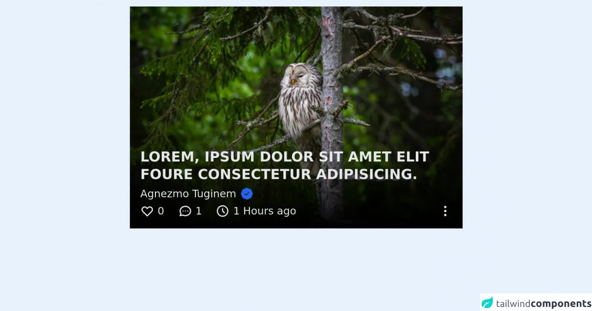
The preview of Card image for headline UI component
To create a Card image for headline UI component, we will use Tailwind CSS classes to style the card layout, the image, and the headline text. Here is a preview of what the final design will look like:
Free download of the Card image for headline's source code
The source code of Card image for headline UI component
To create a Card image for headline UI component, we will use HTML and Tailwind CSS classes. Here is the source code:
<div class="bg-gray-100 m-auto w-96 h-64 mt-5" style="background-image:url('https://images.pexels.com/photos/3738673/pexels-photo-3738673.jpeg?auto=compress&cs=tinysrgb&h=350'); background-position: center; background-repeat: no-repeat; background-size: cover;">
  <div class="flex flex-row items-end h-full w-full">
    <div class="flex flex-col w-full pb-3 pt-10 px-3 bg-gradient-to-t from-black text-gray-200">
      <h3 class="text-base font-bold leading-5 uppercase">Lorem, ipsum dolor sit amet elit foure consectetur adipisicing.</h3>
      <div class="inline-flex items-center">
        <span class="capitalize font-base text-xs my-1 mr-1">Agnezmo Tuginem</span>
        <svg class="stroke-current stroke-1 text-blue-600 w-4" xmlns="http://www.w3.org/2000/svg" viewBox="0 0 20 20" fill="currentColor">
          <path fill-rule="evenodd" d="M6.267 3.455a3.066 3.066 0 001.745-.723 3.066 3.066 0 013.976 0 3.066 3.066 0 001.745.723 3.066 3.066 0 012.812 2.812c.051.643.304 1.254.723 1.745a3.066 3.066 0 010 3.976 3.066 3.066 0 00-.723 1.745 3.066 3.066 0 01-2.812 2.812 3.066 3.066 0 00-1.745.723 3.066 3.066 0 01-3.976 0 3.066 3.066 0 00-1.745-.723 3.066 3.066 0 01-2.812-2.812 3.066 3.066 0 00-.723-1.745 3.066 3.066 0 010-3.976 3.066 3.066 0 00.723-1.745 3.066 3.066 0 012.812-2.812zm7.44 5.252a1 1 0 00-1.414-1.414L9 10.586 7.707 9.293a1 1 0 00-1.414 1.414l2 2a1 1 0 001.414 0l4-4z" clip-rule="evenodd" />
        </svg>
      </div>
      <div class="flex flex-row justify-between">
        <div class="flex flex-row">
          <div class="w-max inline-flex items-center">
            <svg class="w-4" xmlns="http://www.w3.org/2000/svg" fill="none" viewBox="0 0 24 24" stroke="currentColor">
              <path stroke-linecap="round" stroke-linejoin="round" stroke-width="2" d="M4.318 6.318a4.5 4.5 0 000 6.364L12 20.364l7.682-7.682a4.5 4.5 0 00-6.364-6.364L12 7.636l-1.318-1.318a4.5 4.5 0 00-6.364 0z" />
            </svg>
            <span class="text-xs ml-1 antialiased">0</span>
          </div>
          <div class="w-max inline-flex ml-4 items-center">
            <svg class="w-4" xmlns="http://www.w3.org/2000/svg" fill="none" viewBox="0 0 24 24" stroke="currentColor">
              <path stroke-linecap="round" stroke-linejoin="round" stroke-width="2" d="M8 12h.01M12 12h.01M16 12h.01M21 12c0 4.418-4.03 8-9 8a9.863 9.863 0 01-4.255-.949L3 20l1.395-3.72C3.512 15.042 3 13.574 3 12c0-4.418 4.03-8 9-8s9 3.582 9 8z" />
            </svg>
            <span class="text-xs ml-1 antialiased">1</span>
          </div>
          <div class="w-max inline-flex ml-4 items-center">
            <svg class="w-4" xmlns="http://www.w3.org/2000/svg" fill="none" viewBox="0 0 24 24" stroke="currentColor">
              <path stroke-linecap="round" stroke-linejoin="round" stroke-width="2" d="M12 8v4l3 3m6-3a9 9 0 11-18 0 9 9 0 0118 0z" />
            </svg>
            <span class="text-xs ml-1 antialiased">1 Hours ago</span>
          </div>
        </div>
        <div class="w-max">
          <svg class="w-4" xmlns="http://www.w3.org/2000/svg" fill="none" viewBox="0 0 24 24" stroke="currentColor">
            <path stroke-linecap="round" stroke-linejoin="round" stroke-width="2" d="M12 5v.01M12 12v.01M12 19v.01M12 6a1 1 0 110-2 1 1 0 010 2zm0 7a1 1 0 110-2 1 1 0 010 2zm0 7a1 1 0 110-2 1 1 0 010 2z" />
          </svg>
        </div>
      </div>
    </div>
  </div>
</div>
How to create a Card image for headline with Tailwind CSS?
To create a Card image for headline UI component with Tailwind CSS, follow these steps:
Step 1: Set up the HTML structure
First, we need to create the HTML structure for the card layout, image, and headline text. Here is the HTML code:
<div class="max-w-sm rounded overflow-hidden shadow-lg">
  <img class="w-full" src="img/card-image.jpg" alt="Card image">
  <div class="px-6 py-4">
    <div class="font-bold text-xl mb-2">Headline text</div>
    <p class="text-gray-700 text-base">
      Lorem ipsum dolor sit amet, consectetur adipiscing elit. Sed do eiusmod tempor incididunt ut labore et dolore magna aliqua.
    </p>
  </div>
</div>
In this code, we have used the max-w-sm class to set the maximum width of the card to sm (small) size, rounded class to add rounded corners to the card, overflow-hidden class to hide any overflow content, and shadow-lg class to add a shadow effect to the card.
Step 2: Add the image
Next, we need to add the image to the card. We will use the w-full class to set the width of the image to 100% of the card width. Here is the modified HTML code:
<div class="max-w-sm rounded overflow-hidden shadow-lg">
  <img class="w-full" src="img/card-image.jpg" alt="Card image">
  <div class="px-6 py-4">
    <div class="font-bold text-xl mb-2">Headline text</div>
    <p class="text-gray-700 text-base">
      Lorem ipsum dolor sit amet, consectetur adipiscing elit. Sed do eiusmod tempor incididunt ut labore et dolore magna aliqua.
    </p>
  </div>
</div>
Step 3: Add the headline text
Finally, we need to add the headline text to the card. We will use the font-bold class to make the headline text bold, text-xl class to set the font size to extra-large, and mb-2 class to add a margin-bottom of 2 to the headline text. Here is the final HTML code:
<div class="max-w-sm rounded overflow-hidden shadow-lg">
  <img class="w-full" src="img/card-image.jpg" alt="Card image">
  <div class="px-6 py-4">
    <div class="font-bold text-xl mb-2">Headline text</div>
    <p class="text-gray-700 text-base">
      Lorem ipsum dolor sit amet, consectetur adipiscing elit. Sed do eiusmod tempor incididunt ut labore et dolore magna aliqua.
    </p>
  </div>
</div>
Conclusion
In this article, we have learned how to create a Card image for headline UI component with Tailwind CSS. We have seen how Tailwind CSS provides a set of pre-defined CSS classes that make it easy to create custom designs without writing any CSS code from scratch. We have also seen how to customize the design by adding our own CSS classes or modifying the existing ones. With this knowledge, you can now create your own Card image for headline UI component and enhance the user experience of your website or application.