- Published on
Beginners Guide: Create A Card Like Kanban With Tailwind CSS
- What is Tailwind CSS?
- The description of Card like Kanban ui component
- Why use Tailwind CSS to create a Card like Kanban ui component?
- The preview of Card like Kanban ui component.
- The source code of Card like Kanban ui component.
- How to create a Card like Kanban with Tailwind CSS?
- Step 1: Create the HTML structure
- Step 2: Style the card with Tailwind CSS
- Step 3: Add the card to the Kanban board
- Conclusion
What is Tailwind CSS?
Tailwind CSS is a utility-first CSS framework that provides a set of pre-defined CSS classes to style HTML elements. It allows developers to quickly create custom designs without writing any CSS code. Tailwind CSS is highly customizable and can be easily integrated into any project.
The description of Card like Kanban ui component
A card like Kanban is a user interface component that is used to visualize and manage tasks in a project. It is a simple and effective way to organize tasks and track their progress. Each card represents a task and can be moved between columns to indicate its current status.
Why use Tailwind CSS to create a Card like Kanban ui component?
Tailwind CSS provides a set of pre-defined CSS classes that can be used to create a card like Kanban with ease. It eliminates the need for writing custom CSS code and saves a lot of time. Tailwind CSS is highly customizable and provides a lot of flexibility to developers.
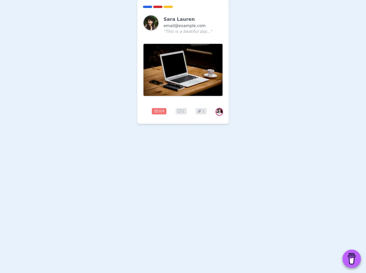
The preview of Card like Kanban ui component.
To create a card like Kanban with Tailwind CSS, we will use a combination of HTML and CSS. The HTML code will define the structure of the card, and the CSS code will style it. Here is a preview of what the final product will look like:
Free download of the Card like Kanban's source code
The source code of Card like Kanban ui component.
To create a card like Kanban with Tailwind CSS, we will use a combination of HTML and CSS. The HTML code will define the structure of the card, and the CSS code will style it. Here is the source code for the card:
<!-- This is an example component -->
<div class="w-full h-full mx-auto">
<style>
@import url("https://cdnjs.cloudflare.com/ajax/libs/font-awesome/5.15.2/css/all.min.css")
</style>
<div class='flex max-w-sm w-80 bg-white shadow-md rounded-lg overflow-hidden mx-auto'>
<div class='flex items-center w-full px-2 py-3'>
<div class='mx-3 w-full'>
<div class="flex flex-row mb-6 mt-2">
<div class="mr-1 h-2 w-8 bg-blue-600 rounded-full cursor-pointer"></div>
<div class="mr-1 h-2 w-8 bg-red-600 rounded-full cursor-pointer"></div>
<div class="mr-1 h-2 w-8 bg-yellow-400 rounded-full cursor-pointer"></div>
</div>
<div class="flex flex-row mb-4">
<img class='w-14 h-14 object-cover rounded-full border-2 shadow' alt='User avatar' src='https://images.unsplash.com/photo-1477118476589-bff2c5c4cfbb?ixlib=rb-1.2.1&ixid=eyJhcHBfaWQiOjEyMDd9&auto=format&fit=crop&w=200&q=200'>
<div class="flex flex-col mb-4 ml-4 mt-1">
<div class='text-gray-600 font-semibold'>Sara Lauren</div>
<div class='text-gray-600 font-base text-sm'>[email protected] </div>
<div class='text-gray-400 font-base text-sm italic'>"This is a beatiful day..."</div>
</div>
</div>
<div class='text-gray-400 font-medium text-sm border-2 border-gray-300 rounded-md cursor-pointer mb-10'><img class="rounded" src="https://picsum.photos/536/354"></div>
<div class="flex justify-start mb-4">
<div class="flex w-full justify-evenly mt-1">
<div class='font-medium text-xs'><span class="bg-red-400 px-2 py-1 text-center rounded text-gray-100 cursor-pointer"><i class="fas fa-tasks"></i> 0/4</span></div>
<div class='font-medium text-xs'><span class="bg-gray-200 px-2 py-1 text-center rounded text-gray-400 cursor-pointer"><i class="far fa-comment-alt"></i> 2</span></div>
<div class='font-medium text-xs'><span class="bg-gray-200 px-2 py-1 text-center rounded text-gray-400 cursor-pointer"><i class="fas fa-paperclip"></i> 1</span></div>
</div>
<div class='text-gray-400 font-medium text-sm border-2 rounded-full border-pink-600 cursor-pointer'><img class="h-6 w-6 rounded-full" src="https://images.unsplash.com/photo-1464863979621-258859e62245?ixlib=rb-1.2.1&ixid=eyJhcHBfaWQiOjEyMDd9&auto=format&fit=crop&w=333&q=80"></div>
</div>
</div>
</div>
</div>
<div class="w-full flex justify-center">
<script data-name="BMC-Widget" data-cfasync="false" src="https://cdnjs.buymeacoffee.com/1.0.0/widget.prod.min.js" data-id="matheusgongo" data-description="Support me on Buy me a coffee!" data-message="" data-color="#BD5FFF" data-position="Right" data-x_margin="18" data-y_margin="18"></script> </div>
</div>
How to create a Card like Kanban with Tailwind CSS?
To create a card like Kanban with Tailwind CSS, follow these steps:
Step 1: Create the HTML structure
The first step is to create the HTML structure for the card. We will use a div element to represent the card and add some child elements to it. Here is the HTML code:
<div class="bg-white rounded-lg shadow-md p-4">
  <h2 class="text-lg font-medium mb-2">Task Title</h2>
  <p class="text-gray-600 mb-4">Task Description</p>
  <div class="flex justify-between items-center">
    <p class="text-gray-500">Assigned to John Doe</p>
    <button class="bg-blue-500 hover:bg-blue-600 text-white px-4 py-2 rounded">
      Edit
    </button>
  </div>
</div>
In this code, we have created a div element with some child elements. The h2 element represents the title of the task, the p element represents the description, and the div element represents the footer of the card.
Step 2: Style the card with Tailwind CSS
The next step is to style the card using Tailwind CSS. We will use a combination of pre-defined CSS classes to style the card. Here is the CSS code:
/* Card container */
.bg-white {
  background-color: #fff;
}

.rounded-lg {
  border-radius: 0.5rem;
}

.shadow-md {
  box-shadow: 0 4px 6px -1px rgba(0, 0, 0, 0.1),
    0 2px 4px -1px rgba(0, 0, 0, 0.06);
}

.p-4 {
  padding: 1rem;
}

/* Card title */
.text-lg {
  font-size: 1.125rem;
  line-height: 1.75rem;
}

.font-medium {
  font-weight: 500;
}

.mb-2 {
  margin-bottom: 0.5rem;
}

/* Card description */
.text-gray-600 {
  color: #718096;
}

.mb-4 {
  margin-bottom: 1rem;
}

/* Card footer */
.flex {
  display: flex;
}

.justify-between {
  justify-content: space-between;
}

.items-center {
  align-items: center;
}

.text-gray-500 {
  color: #a0aec0;
}

/* Edit button */
.bg-blue-500 {
  background-color: #4299e1;
}

.hover\:bg-blue-600:hover {
  background-color: #3182ce;
}

.text-white {
  color: #fff;
}

.px-4 {
  padding-left: 1rem;
  padding-right: 1rem;
}

.py-2 {
  padding-top: 0.5rem;
  padding-bottom: 0.5rem;
}

.rounded {
  border-radius: 0.25rem;
}
In this code, we have used a combination of pre-defined CSS classes to style the card. We have used classes like bg-white, rounded-lg, shadow-md, p-4, text-lg, font-medium, mb-2, text-gray-600, mb-4, flex, justify-between, items-center, text-gray-500, bg-blue-500, hover:bg-blue-600, text-white, px-4, py-2, and rounded.
Step 3: Add the card to the Kanban board
The final step is to add the card to the Kanban board. We can create multiple cards and add them to different columns to represent different stages of the project. Here is an example of a Kanban board with three columns:
<div class="flex">
  <div class="w-1/3 p-4">
    <h1 class="text-xl font-medium mb-4">To Do</h1>
    <div class="mb-4">
      <!-- Card 1 -->
    </div>
    <div>
      <!-- Card 2 -->
    </div>
  </div>
  <div class="w-1/3 p-4">
    <h1 class="text-xl font-medium mb-4">In Progress</h1>
    <div class="mb-4">
      <!-- Card 3 -->
    </div>
    <div>
      <!-- Card 4 -->
    </div>
  </div>
  <div class="w-1/3 p-4">
    <h1 class="text-xl font-medium mb-4">Done</h1>
    <div class="mb-4">
      <!-- Card 5 -->
    </div>
    <div>
      <!-- Card 6 -->
    </div>
  </div>
</div>
In this code, we have created three columns using the flex class. Each column has a width of one-third of the screen and contains multiple cards.
Conclusion
In this article, we have learned how to create a card like Kanban with Tailwind CSS. We have seen how Tailwind CSS provides a set of pre-defined CSS classes that can be used to style HTML elements. We have also seen how to create a Kanban board with multiple columns and cards. With Tailwind CSS, creating custom designs has never been easier.