- Published on
6 Critical Skills To Make A Card Carousel With Tailwind CSS Remarkably Well
- What is Tailwind CSS?
- The description of Card Carousel UI component
- Why use Tailwind CSS to create a Card Carousel UI component?
- The preview of Card Carousel UI component
- The source code of Card Carousel UI component
- How to create a Card Carousel with Tailwind CSS?
- Step 1: Install Tailwind CSS and Swiper
- Step 2: Create HTML markup
- Step 3: Add Tailwind CSS classes
- Step 4: Initialize Swiper
- Conclusion
What is Tailwind CSS?
Tailwind CSS is a utility-first CSS framework that provides a set of pre-defined CSS classes to quickly build user interfaces. It allows developers to create responsive and customizable designs without writing custom CSS. Tailwind CSS is gaining popularity among developers due to its simplicity, flexibility, and ease of use.
The description of Card Carousel UI component
A Card Carousel is a UI component that displays a set of items in a horizontal or vertical carousel. Each item in the carousel is represented by a card that contains an image, title, and description. Users can navigate through the carousel by clicking on the navigation arrows or swiping left or right on mobile devices.
Why use Tailwind CSS to create a Card Carousel UI component?
Tailwind CSS provides a set of pre-defined CSS classes that can be used to create a Card Carousel UI component quickly. It also offers responsive design classes that allow developers to create a mobile-friendly and responsive UI component without writing custom CSS.
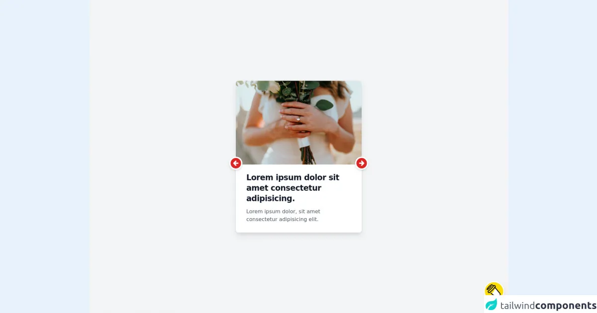
The preview of Card Carousel UI component
To create a Card Carousel UI component with Tailwind CSS, we need to use the swiper library. The swiper library is a touch-enabled jQuery plugin that allows developers to create responsive and customizable carousels. We can use the swiper library with Tailwind CSS to create a Card Carousel UI component that looks like this:
Free download of the Card Carousel's source code
The source code of Card Carousel UI component
To create a Card Carousel UI component with Tailwind CSS and swiper library, we need to add the following code to our HTML file:
<html>
   <head>
      <!-- JIT SUPPORT, for using peer-* below -->
      <script src="https://unpkg.com/tailwindcss-jit-cdn"></script>
   </head>
   <body>
      <div class="min-h-screen bg-gray-100 p-3 relative">
         <div class="w-96 mx-auto" style="scroll-snap-type: x mandatory;">
            <!-- first -->
            <div class="">
               <input class="sr-only peer" type="radio" name="carousel" id="carousel-1" checked />
               <!-- content #1 -->
               <div
                  class="w-96 absolute top-1/2 left-1/2 transform -translate-x-1/2 -translate-y-1/2 bg-white rounded-lg shadow-lg transition-all duration-300 opacity-0 peer-checked:opacity-100 peer-checked:z-10 z-0">
                  <img class="rounded-t-lg w-96 h-64" src="https://images.unsplash.com/photo-1628788835388-415ee2fa9576?ixid=MnwxMjA3fDB8MHxwaG90by1wYWdlfHx8fGVufDB8fHx8&ixlib=rb-1.2.1&auto=format&fit=crop&w=384&q=80" alt="" />
                  <div class="py-4 px-8">
                     <h1 class="hover:cursor-pointer mt-2 text-gray-900 font-bold text-2xl tracking-tight">Lorem
                        ipsum dolor sit amet consectetur adipisicing.
                     </h1>
                     <p class="hover:cursor-pointer py-3 text-gray-600 leading-6">Lorem ipsum dolor, sit amet
                        consectetur adipisicing elit.
                     </p>
                  </div>
                  <!-- controls -->
                  <div class="absolute top-1/2 w-full flex justify-between z-20">
                     <label for="carousel-3" class="inline-block text-red-600 cursor-pointer -translate-x-5 bg-white rounded-full shadow-md active:translate-y-0.5">
                        <svg xmlns="http://www.w3.org/2000/svg" class="h-10 w-10" viewBox="0 0 20 20" fill="currentColor">
                           <path fill-rule="evenodd" d="M10 18a8 8 0 100-16 8 8 0 000 16zm.707-10.293a1 1 0 00-1.414-1.414l-3 3a1 1 0 000 1.414l3 3a1 1 0 001.414-1.414L9.414 11H13a1 1 0 100-2H9.414l1.293-1.293z" clip-rule="evenodd" />
                        </svg>
                     </label>
                     <label for="carousel-2" class="inline-block text-red-600 cursor-pointer translate-x-5 bg-white rounded-full shadow-md active:translate-y-0.5">
                        <svg xmlns="http://www.w3.org/2000/svg" class="h-10 w-10" viewBox="0 0 20 20" fill="currentColor">
                           <path fill-rule="evenodd" d="M10 18a8 8 0 100-16 8 8 0 000 16zm3.707-8.707l-3-3a1 1 0 00-1.414 1.414L10.586 9H7a1 1 0 100 2h3.586l-1.293 1.293a1 1 0 101.414 1.414l3-3a1 1 0 000-1.414z" clip-rule="evenodd" />
                        </svg>
                     </label>
                  </div>
               </div>
            </div>
            <!-- second -->
            <div class="">
               <input class="sr-only peer" type="radio" name="carousel" id="carousel-2" />
               <!-- content #2 -->
               <div
                  class="w-96 absolute top-1/2 left-1/2 transform -translate-x-1/2 -translate-y-1/2 bg-white rounded-lg shadow-lg transition-all duration-300 opacity-0 peer-checked:opacity-100 peer-checked:z-10 z-0">
                  <img class="rounded-t-lg w-96 h-64" src="https://images.unsplash.com/photo-1628191139360-4083564d03fd?ixid=MnwxMjA3fDF8MHxwaG90by1wYWdlfHx8fGVufDB8fHx8&ixlib=rb-1.2.1&auto=format&fit=crop&w=384&q=80" alt="" />
                  <div class="py-4 px-8">
                     <h1 class="hover:cursor-pointer mt-2 text-gray-900 font-bold text-2xl tracking-tight">
                        Scelerisque eleifend donec pretium vulputate sapien.
                     </h1>
                     <p class="hover:cursor-pointer py-3 text-gray-600 leading-6">Egestas diam in arcu cursus euismod
                        quis. Fusce id velit ut tortor. Congue quisque egestas diam in arcu cursus euismod quis.
                     </p>
                  </div>
                  <!-- controls -->
                  <div class="absolute top-1/2 w-full flex justify-between z-20">
                     <label for="carousel-1" class="inline-block text-blue-600 cursor-pointer -translate-x-5 bg-white rounded-full shadow-md active:translate-y-0.5">
                        <svg xmlns="http://www.w3.org/2000/svg" class="h-10 w-10" viewBox="0 0 20 20" fill="currentColor">
                           <path fill-rule="evenodd" d="M10 18a8 8 0 100-16 8 8 0 000 16zm.707-10.293a1 1 0 00-1.414-1.414l-3 3a1 1 0 000 1.414l3 3a1 1 0 001.414-1.414L9.414 11H13a1 1 0 100-2H9.414l1.293-1.293z" clip-rule="evenodd" />
                        </svg>
                     </label>
                     <label for="carousel-3" class="inline-block text-blue-600 cursor-pointer translate-x-5 bg-white rounded-full shadow-md active:translate-y-0.5">
                        <svg xmlns="http://www.w3.org/2000/svg" class="h-10 w-10" viewBox="0 0 20 20" fill="currentColor">
                           <path fill-rule="evenodd" d="M10 18a8 8 0 100-16 8 8 0 000 16zm3.707-8.707l-3-3a1 1 0 00-1.414 1.414L10.586 9H7a1 1 0 100 2h3.586l-1.293 1.293a1 1 0 101.414 1.414l3-3a1 1 0 000-1.414z" clip-rule="evenodd" />
                        </svg>
                     </label>
                  </div>
               </div>
            </div>
            <!-- three -->
            <div class="">
               <input class="sr-only peer" type="radio" name="carousel" id="carousel-3" />
               <!-- content #3 -->
               <div
                  class="w-96 absolute top-1/2 left-1/2 transform -translate-x-1/2 -translate-y-1/2 bg-white rounded-lg shadow-lg transition-all duration-300 opacity-0 peer-checked:opacity-100 peer-checked:z-10 z-0">
                  <img class="rounded-t-lg w-96 h-64" src="https://images.unsplash.com/photo-1628718120482-07e03fe361dd?ixid=MnwxMjA3fDB8MHxwaG90by1wYWdlfHx8fGVufDB8fHx8&ixlib=rb-1.2.1&auto=format&fit=crop&w=384&q=80" alt="" />
                  <div class="py-4 px-8">
                     <h1 class="hover:cursor-pointer mt-2 text-gray-900 font-bold text-2xl tracking-tight">
                        Consectetur purus ut faucibus pulvinar elementum.
                     </h1>
                     <p class="hover:cursor-pointer py-3 text-gray-600 leading-6">Aliquam ultrices sagittis orci a
                        scelerisque purus semper. Quisque id diam vel quam elementum pulvinar. Facilisis magna etiam
                        tempor orci eu lobortis elementum.
                     </p>
                  </div>
                  <!-- controls -->
                  <div class="absolute top-1/2 w-full flex justify-between z-20">
                     <label for="carousel-2" class="inline-block text-yellow-600 cursor-pointer -translate-x-5 bg-white rounded-full shadow-md active:translate-y-0.5">
                        <svg xmlns="http://www.w3.org/2000/svg" class="h-10 w-10" viewBox="0 0 20 20" fill="currentColor">
                           <path fill-rule="evenodd" d="M10 18a8 8 0 100-16 8 8 0 000 16zm.707-10.293a1 1 0 00-1.414-1.414l-3 3a1 1 0 000 1.414l3 3a1 1 0 001.414-1.414L9.414 11H13a1 1 0 100-2H9.414l1.293-1.293z" clip-rule="evenodd" />
                        </svg>
                     </label>
                     <label for="carousel-1" class="inline-block text-yellow-600 cursor-pointer translate-x-5 bg-white rounded-full shadow-md active:translate-y-0.5">
                        <svg xmlns="http://www.w3.org/2000/svg" class="h-10 w-10" viewBox="0 0 20 20" fill="currentColor">
                           <path fill-rule="evenodd" d="M10 18a8 8 0 100-16 8 8 0 000 16zm3.707-8.707l-3-3a1 1 0 00-1.414 1.414L10.586 9H7a1 1 0 100 2h3.586l-1.293 1.293a1 1 0 101.414 1.414l3-3a1 1 0 000-1.414z" clip-rule="evenodd" />
                        </svg>
                     </label>
                  </div>
               </div>
            </div>
         </div>
      </div>
      <a href="https://www.buymeacoffee.com/dgauderman" target="_blank" class="md:absolute bottom-0 right-0 p-4 float-right animate-bounce">
      <img src="https://www.buymeacoffee.com/assets/img/guidelines/logo-mark-3.svg" alt="Buy Me A Coffee" class="transition-all rounded-full w-14 -rotate-45 hover:shadow-sm shadow-lg ring hover:ring-4 ring-white">
    </a>
   </body>
</html>
How to create a Card Carousel with Tailwind CSS?
To create a Card Carousel UI component with Tailwind CSS, we need to follow these steps:
Step 1: Install Tailwind CSS and Swiper
First, we need to install Tailwind CSS and Swiper libraries using npm. We can install them by running the following command:
npm install tailwindcss swiper
Step 2: Create HTML markup
Next, we need to create the HTML markup for our Card Carousel UI component. We can use the following code as a starting point:
<div class="swiper-container">
  <div class="swiper-wrapper">
    <div class="swiper-slide">
      <div class="card">
        <img src="https://via.placeholder.com/150" alt="image">
        <div class="card-body">
          <h5 class="card-title">Card title</h5>
          <p class="card-text">Card description</p>
        </div>
      </div>
    </div>
    <!-- Add more slides here -->
  </div>
  <div class="swiper-button-next"></div>
  <div class="swiper-button-prev"></div>
</div>
In this code, we have created a div element with a class of swiper-container that contains a div element with a class of swiper-wrapper. Inside the swiper-wrapper element, we have added a div element with a class of swiper-slide that contains a card element.
We can add more swiper-slide elements to create more cards in the carousel.
Step 3: Add Tailwind CSS classes
Next, we need to add Tailwind CSS classes to our HTML markup to style our Card Carousel UI component. We can add the following classes to our HTML markup:
<div class="swiper-container mx-auto">
  <div class="swiper-wrapper">
    <div class="swiper-slide">
      <div class="card rounded-lg shadow-md">
        <img src="https://via.placeholder.com/150" alt="image" class="w-full h-48 object-cover">
        <div class="card-body">
          <h5 class="card-title text-lg font-medium mb-2">Card title</h5>
          <p class="card-text text-gray-600">Card description</p>
        </div>
      </div>
    </div>
    <!-- Add more slides here -->
  </div>
  <div class="swiper-button-next ml-2"></div>
  <div class="swiper-button-prev mr-2"></div>
</div>
In this code, we have added Tailwind CSS classes to our HTML markup to style our Card Carousel UI component. We have added classes like mx-auto to center the carousel horizontally, rounded-lg and shadow-md to style the card, w-full and h-48 to set the image size, text-lg and font-medium to style the card title, and text-gray-600 to style the card description.
Step 4: Initialize Swiper
Finally, we need to initialize the Swiper library to create our Card Carousel UI component. We can add the following JavaScript code to our HTML file:
<script>
  var swiper = new Swiper('.swiper-container', {
    slidesPerView: 1,
    spaceBetween: 20,
    loop: true,
    navigation: {
      nextEl: '.swiper-button-next',
      prevEl: '.swiper-button-prev',
    },
  });
</script>
In this code, we have created a new instance of the Swiper class and passed the swiper-container class as a parameter. We have also set the slidesPerView property to 1 to show one slide at a time, set the spaceBetween property to 20 to add space between the slides, and set the loop property to true to enable looping.
We have also added navigation buttons by setting the navigation property to an object with nextEl and prevEl properties that contain the classes of the navigation buttons.
Conclusion
Creating a Card Carousel UI component with Tailwind CSS is easy and straightforward. By using the Swiper library and Tailwind CSS classes, we can create a responsive and customizable Card Carousel UI component in no time. With these six critical skills, you can make a Card Carousel UI component with Tailwind CSS remarkably well.