- Published on
6 Tips To Create A Card Call To Action With Tailwind CSS
- What is Tailwind CSS?
- The description of Card Call to Action UI component
- Why use Tailwind CSS to create a Card Call to Action UI component?
- The preview of Card Call to Action UI component
- The source code of Card Call to Action UI component
- How to create a Card Call to Action with Tailwind CSS?
- Conclusion
As a FrontEnd technology blogger, you must be familiar with Tailwind CSS. Tailwind CSS is a utility-first CSS framework that helps you quickly build custom designs. In this article, we will discuss how to create a Card Call to Action UI component with Tailwind CSS.
What is Tailwind CSS?
Tailwind CSS is a utility-first CSS framework that provides low-level utility classes for building custom designs. It provides a set of pre-defined classes that you can use to style your HTML elements. Tailwind CSS is highly customizable and allows you to create your own utility classes.
The description of Card Call to Action UI component
A Card Call to Action is a UI component that is commonly used on websites and applications. It is a card that contains a call-to-action button that encourages users to take a specific action. The Card Call to Action UI component is used to highlight important information and encourage users to take action.
Why use Tailwind CSS to create a Card Call to Action UI component?
Tailwind CSS provides a set of pre-defined classes that you can use to create a Card Call to Action UI component quickly. It also allows you to customize the component to match your website or application's design. Tailwind CSS is easy to use and provides a lot of flexibility in design.
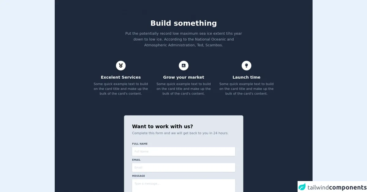
The preview of Card Call to Action UI component
To create a Card Call to Action UI component with Tailwind CSS, we will use the following classes:
- bg-white: sets the background color of the card to white.
- shadow-md: adds a box-shadow to the card.
- rounded-lg: rounds the corners of the card.
- p-6: adds padding to the card.
- text-gray-700: sets the text color to gray.
- font-bold: makes the text bold.
- border-b-2: adds a 2px border to the bottom of the card.
- border-blue-500: sets the border color to blue.
- hover:bg-blue-500: changes the background color of the card on hover.
- hover:text-white: changes the text color of the card on hover.
- hover:border-blue-700: changes the border color of the card on hover.
- py-2: adds padding to the top and bottom of the button.
- px-4: adds padding to the left and right of the button.
- bg-blue-500: sets the background color of the button to blue.
- text-white: sets the text color of the button to white.
- rounded: rounds the corners of the button.
Free download of the Card Call to Action's source code
The source code of Card Call to Action UI component
To create a Card Call to Action UI component with Tailwind CSS, you can use the following HTML code:
<div class="bg-white shadow-md rounded-lg p-6">
  <h2 class="text-gray-700 font-bold">Title</h2>
  <p class="text-gray-700">Description</p>
  <button class="border-b-2 border-blue-500 hover:bg-blue-500 hover:text-white hover:border-blue-700 py-2 px-4 bg-blue-500 text-white rounded">Call to Action</button>
</div>
<link rel="stylesheet" href="https://demos.creative-tim.com/notus-js/assets/styles/tailwind.css">
<link rel="stylesheet" href="https://demos.creative-tim.com/notus-js/assets/vendor/@fortawesome/fontawesome-free/css/all.min.css">

<section class="pb-20 relative block bg-blueGray-800">
        <div class="container mx-auto px-4 lg:pt-24 lg:pb-64">
          <div class="flex flex-wrap text-center justify-center">
            <div class="w-full lg:w-6/12 px-4">
              <h2 class="text-4xl font-semibold text-white">Build something</h2>
              <p class="text-lg leading-relaxed mt-4 mb-4 text-blueGray-400">
                Put the potentially record low maximum sea ice extent tihs year
                down to low ice. According to the National Oceanic and
                Atmospheric Administration, Ted, Scambos.
              </p>
            </div>
          </div>
          <div class="flex flex-wrap mt-12 justify-center">
            <div class="w-full lg:w-3/12 px-4 text-center">
              <div class="text-lightBlue-300 p-3 w-12 h-12 shadow-lg rounded-full bg-white inline-flex items-center justify-center">
                <i class="fas fa-medal text-xl"></i>
              </div>
              <h6 class="text-xl mt-5 font-semibold text-white">
                Excelent Services
              </h6>
              <p class="mt-2 mb-4 text-blueGray-400">
                Some quick example text to build on the card title and make up
                the bulk of the card's content.
              </p>
            </div>
            <div class="w-full lg:w-3/12 px-4 text-center">
              <div class="text-blueGray-800 p-3 w-12 h-12 shadow-lg rounded-full bg-white inline-flex items-center justify-center">
                <i class="fas fa-poll text-xl"></i>
              </div>
              <h5 class="text-xl mt-5 font-semibold text-white">
                Grow your market
              </h5>
              <p class="mt-2 mb-4 text-blueGray-400">
                Some quick example text to build on the card title and make up
                the bulk of the card's content.
              </p>
            </div>
            <div class="w-full lg:w-3/12 px-4 text-center">
              <div class="text-blueGray-800 p-3 w-12 h-12 shadow-lg rounded-full bg-white inline-flex items-center justify-center">
                <i class="fas fa-lightbulb text-xl"></i>
              </div>
              <h5 class="text-xl mt-5 font-semibold text-white">Launch time</h5>
              <p class="mt-2 mb-4 text-blueGray-400">
                Some quick example text to build on the card title and make up
                the bulk of the card's content.
              </p>
            </div>
          </div>
        </div>
      </section>
      <section class="relative block pt-24 lg:pt-0 bg-blueGray-800">
        <div class="container mx-auto px-4">
          <div class="flex flex-wrap justify-center lg:-mt-64 -mt-48">
            <div class="w-full lg:w-6/12 px-4">
              <div class="relative flex flex-col min-w-0 break-words w-full mb-6 shadow-lg rounded-lg bg-blueGray-200">
                <div class="flex-auto p-5 lg:p-10">
                  <h4 class="text-2xl font-semibold">Want to work with us?</h4>
                  <p class="leading-relaxed mt-1 mb-4 text-blueGray-500">
                    Complete this form and we will get back to you in 24 hours.
                  </p>
                  <div class="relative w-full mb-3 mt-8">
                    <label class="block uppercase text-blueGray-600 text-xs font-bold mb-2" for="full-name">Full Name</label><input type="text" class="border-0 px-3 py-3 placeholder-blueGray-300 text-blueGray-600 bg-white rounded text-sm shadow focus:outline-none focus:ring w-full ease-linear transition-all duration-150" placeholder="Full Name">
                  </div>
                  <div class="relative w-full mb-3">
                    <label class="block uppercase text-blueGray-600 text-xs font-bold mb-2" for="email">Email</label><input type="email" class="border-0 px-3 py-3 placeholder-blueGray-300 text-blueGray-600 bg-white rounded text-sm shadow focus:outline-none focus:ring w-full ease-linear transition-all duration-150" placeholder="Email">
                  </div>
                  <div class="relative w-full mb-3">
                    <label class="block uppercase text-blueGray-600 text-xs font-bold mb-2" for="message">Message</label><textarea rows="4" cols="80" class="border-0 px-3 py-3 placeholder-blueGray-300 text-blueGray-600 bg-white rounded text-sm shadow focus:outline-none focus:ring w-full" placeholder="Type a message..."></textarea>
                  </div>
                  <div class="text-center mt-6">
                    <button class="bg-blueGray-800 text-white active:bg-blueGray-600 text-sm font-bold uppercase px-6 py-3 rounded shadow hover:shadow-lg outline-none focus:outline-none mr-1 mb-1 ease-linear transition-all duration-150" type="button">
                      Send Message
                    </button>
                  </div>
                </div>
              </div>
            </div>
          </div>
        </div>
<footer class="relative bg-blueGray-800 pt-8 pb-6 mt-1">
  <div class="container mx-auto px-4">
    <div class="flex flex-wrap items-center md:justify-between justify-center">
      <div class="w-full md:w-6/12 px-4 mx-auto text-center">
        <div class="text-sm text-white font-semibold py-1">
          Made with <a href="https://www.creative-tim.com/product/notus-js" class="text-white hover:text-gray-600" target="_blank">Notus JS</a> by <a href="https://www.creative-tim.com" class="text-white hover:text-blueGray-600" target="_blank"> Creative Tim</a>.
        </div>
      </div>
    </div>
  </div>
</footer>
      </section>
How to create a Card Call to Action with Tailwind CSS?
Here are the steps to create a Card Call to Action with Tailwind CSS:
- Create a new HTML file and add the above HTML code.
- Add the Tailwind CSS CDN to your HTML file.
- Save the file and open it in your browser.
You should now see a Card Call to Action UI component on your screen.
Conclusion
In this article, we discussed how to create a Card Call to Action UI component with Tailwind CSS. We also discussed why Tailwind CSS is an excellent choice for creating UI components. By following the steps outlined in this article, you can create a Card Call to Action UI component quickly and easily.