- Published on
Best Ways To Make A Card With Tailwind CSS
- What is Tailwind CSS?
- The description of Card UI component
- Why use Tailwind CSS to create a Card UI component?
- The preview of Card UI component
- The source code of Card UI component
- How to create a Card with Tailwind CSS?
- Conclusion
What is Tailwind CSS?
Tailwind CSS is a utility-first CSS framework that allows developers to rapidly build custom user interfaces. It provides a set of pre-defined CSS classes that can be used to style HTML elements. Tailwind CSS is gaining popularity among developers because it allows them to write less CSS code and focus more on the functionality of their application.
The description of Card UI component
A card is a UI component that is used to display information in a structured manner. It is a container that can hold text, images, and other UI elements. Cards are commonly used in web applications to display product information, user profiles, and news articles.
Why use Tailwind CSS to create a Card UI component?
Tailwind CSS provides a set of pre-defined CSS classes that can be used to create a card UI component. These classes can be used to style the card's background color, border radius, shadow, and padding. Using Tailwind CSS to create a card UI component can save developers a lot of time and effort.
The preview of Card UI component
To create a card UI component with Tailwind CSS, we can use the following CSS classes:
<div class="bg-white rounded-lg shadow-lg p-6">
  <!-- Card content goes here -->
</div>
Free download of the Card's source code
The source code of Card UI component
To create a card UI component with Tailwind CSS, we can use the following CSS classes:
<div class="bg-white rounded-lg shadow-lg p-6">
  <!-- Card content goes here -->
</div>
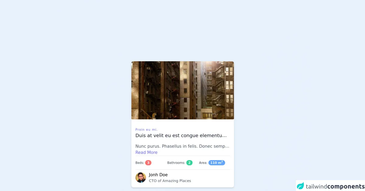
<div class="xl:w-1/3 md:w-1/2 p-4">
    <div
      class="
        c-card
        block
        bg-white
        shadow-md
        hover:shadow-xl
        rounded-lg
        overflow-hidden
      "
    >
      <img
        class="
          lg:h-60
          xl:h-56
          md:h-64
          sm:h-72
          xs:h-72
          h-72
          rounded
          w-full
          object-cover object-center
          mb-4
        "
        src="https://picsum.photos/720/400"
        alt="Image Size 720x400"
      />
      <div class="p-4">
        <h3
          class="tracking-widest text-indigo-500 text-xs font-medium title-font"
        >
          Proin eu mi.
        </h3>
        <h2
          class="
            text-lg text-gray-900
            font-medium
            title-font
            mb-4
            whitespace-nowrap
            truncate
            ...
          "
        >
          Duis at velit eu est congue elementum. In hac habitasse platea dictumst.
        </h2>
        <p
          class="
            text-gray-600
            font-light
            text-md
            whitespace-nowrap
            truncate
            ...
          "
        >
          Nunc purus. Phasellus in felis. Donec semper sapien a libero. Nam dui. Proin leo odio, porttitor id, consequat in, consequat ut, nulla. Sed accumsan felis.
          <br />
          <a class="inline-flex text-indigo-500" href="#">Read More</a>
        </p>

        <div class="py-4 border-t border-b text-xs text-gray-700">
          <div class="grid grid-cols-6 gap-1">
            <div class="col-span-2">
              Beds:
              <span
                class="
                  inline-flex
                  items-center
                  justify-center
                  px-2
                  py-1
                  text-xs
                  font-bold
                  leading-none
                  text-white
                  bg-red-400
                  rounded-full
                "
                >3</span
              >
            </div>

            <div class="col-span-2">
              Bathrooms:
              <span
                class="
                  inline-flex
                  items-center
                  justify-center
                  px-2
                  py-1
                  text-xs
                  font-bold
                  leading-none
                  text-white
                  bg-green-400
                  rounded-full
                "
                >2</span
              >
            </div>

            <div class="col-span-2">
              Area:
              <span
                class="
                  inline-flex
                  items-center
                  justify-center
                  px-2
                  py-1
                  text-xs
                  font-bold
                  leading-none
                  text-white
                  bg-blue-400
                  rounded-full
                "
                >110 m <sup>2</sup></span
              >
            </div>
          </div>
        </div>

        <div class="flex items-center mt-2">
          <img
            class="w-10 h-10 object-cover rounded-full"
            alt="User avatar"
            src="https://i.pravatar.cc/200"
          />

          <div class="pl-3">
            <div class="font-medium">Jonh Doe</div>
            <div class="text-gray-600 text-sm">CTO of Amazing Places</div>
          </div>
        </div>
      </div>
    </div>
  </div>
How to create a Card with Tailwind CSS?
To create a card with Tailwind CSS, follow these steps:
- Create a new HTML file and add the following code:
<div class="bg-white rounded-lg shadow-lg p-6">
  <!-- Card content goes here -->
</div>
Replace the "Card content goes here" placeholder with the content you want to display in the card. This can include text, images, and other UI elements.
Customize the card's appearance by adding or modifying the Tailwind CSS classes. For example, you can change the card's background color by adding the "bg-blue-500" class.
<div class="bg-blue-500 rounded-lg shadow-lg p-6">
  <!-- Card content goes here -->
</div>
- Save the HTML file and open it in a web browser to see the card.
Conclusion
Creating a card UI component with Tailwind CSS is a simple and efficient way to display information in a structured manner. By using pre-defined CSS classes, developers can save time and effort while still creating a visually appealing UI. With Tailwind CSS, creating a card UI component has never been easier.