- Published on
6 Steps To Make A Card With Tailwind CSS Like A Pro In Under An Hour
- What is Tailwind CSS?
- The description of card UI component
- Why use Tailwind CSS to create a card UI component?
- The preview of card UI component
- The source code of card UI component
- How to create a card with Tailwind CSS?
- Step 1: Set up your project
- Step 2: Create the card container
- Step 3: Create the card header
- Step 4: Create the card body
- Step 5: Create the card footer
- Step 6: Add additional styles
- Conclusion
As a FrontEnd technology blogger, I always try to find ways to make my development process easier and faster. One of the tools that I have found to be extremely helpful in this regard is Tailwind CSS. Tailwind CSS is a utility-first CSS framework that makes it easy to create complex UI components quickly. In this article, I will show you how to create a card UI component with Tailwind CSS in just six simple steps.
What is Tailwind CSS?
Tailwind CSS is a utility-first CSS framework that provides a set of pre-defined classes that you can use to style your HTML elements. It is designed to make it easy to create complex UI components quickly by using a combination of pre-defined classes.
The description of card UI component
A card UI component is a common UI element that is used to display information in a structured and organized way. It typically consists of a container element with a header, body, and footer section. The header section usually contains a title or an image, while the body section contains the main content. The footer section can contain additional information or actions that the user can take.
Why use Tailwind CSS to create a card UI component?
Tailwind CSS makes it easy to create a card UI component quickly and efficiently. It provides a set of pre-defined classes that you can use to style your HTML elements without having to write any custom CSS. This saves you time and allows you to focus on the functionality of your application rather than the styling.
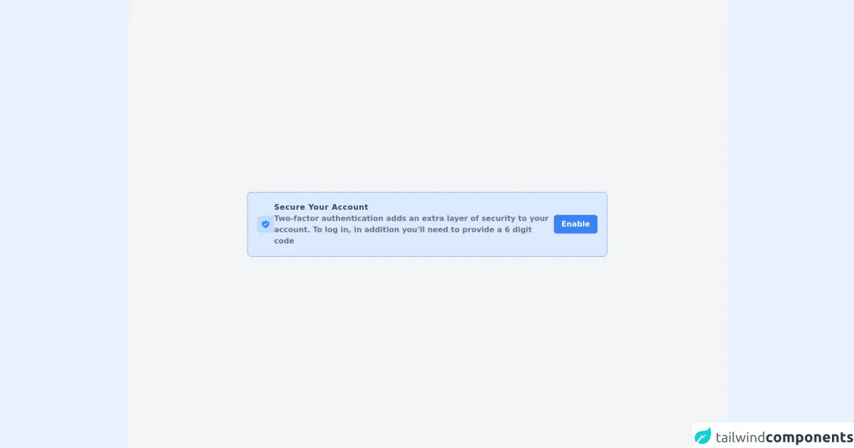
The preview of card UI component
Creating a card UI component with Tailwind CSS is easy. Here is a preview of what the final product will look like:
Free download of the card's source code
The source code of card UI component
To create a card UI component with Tailwind CSS, you will need to use a combination of HTML and CSS. Here is the source code that you can use as a starting point:
<div class="w-full min-h-screen bg-gray-100 flex justify-center items-center"><div class="w-3/5 bg-blue-100 rounded-lg shadow-sm p-5 border-dashed border border-blue-500 flex flex-col sm:flex-row justify-between items-center gap-2 sm:gap-0"><div class="flex flex-col sm:flex-row justify-start items-center gap-4"><div class="bg-blue-200 flex p-2 rounded-md"><svg xmlns="http://www.w3.org/2000/svg" class="h-5 w-5 text-blue-500" viewBox="0 0 20 20" fill="currentColor"><path fill-rule="evenodd" d="M2.166 4.999A11.954 11.954 0 0010 1.944 11.954 11.954 0 0017.834 5c.11.65.166 1.32.166 2.001 0 5.225-3.34 9.67-8 11.317C5.34 16.67 2 12.225 2 7c0-.682.057-1.35.166-2.001zm11.541 3.708a1 1 0 00-1.414-1.414L9 10.586 7.707 9.293a1 1 0 00-1.414 1.414l2 2a1 1 0 001.414 0l4-4z" clip-rule="evenodd"></path></svg></div><div class="text-center sm:text-left"><h1 class="text-gray-700 font-bold tracking-wider">Secure Your Account</h1><p class="text-gray-500 font-semibold">Two-factor authentication adds an extra layer of security to your account. To log in, in addition you'll need to provide a 6 digit code</p></div></div><div><button class="bg-blue-500 py-2 px-4 text-white font-bold rounded-md hover:bg-blue-600">Enable</button></div></div></div>
How to create a card with Tailwind CSS?
Now that you have a basic understanding of what Tailwind CSS is and why it is useful, let's dive into the steps required to create a card UI component with Tailwind CSS.
Step 1: Set up your project
The first step is to set up your project. You can do this by creating a new HTML file and linking to the Tailwind CSS stylesheet. You can either download the stylesheet and link to it locally or use a CDN.
Step 2: Create the card container
The next step is to create the card container. This is the main container that will hold all the other elements of the card. You can create this container by using the div element and applying the bg-white, rounded-lg, and overflow-hidden classes to it.
Step 3: Create the card header
The card header is the top section of the card that usually contains a title or an image. You can create this section by using the div element and applying the bg-gray-200, px-4, py-2, and flex classes to it. You can also add an image or a title to this section by using the img or h2 element.
Step 4: Create the card body
The card body is the main section of the card that contains the main content. You can create this section by using the div element and applying the px-4 and py-2 classes to it. You can also add any additional content or elements to this section.
Step 5: Create the card footer
The card footer is the bottom section of the card that can contain additional information or actions that the user can take. You can create this section by using the div element and applying the bg-gray-200, px-4, py-2, and flex classes to it. You can also add any additional content or elements to this section.
Step 6: Add additional styles
Finally, you can add any additional styles or classes to the card UI component to customize it further. For example, you can change the background color, font size, or border radius by using the pre-defined classes provided by Tailwind CSS.
Conclusion
Creating a card UI component with Tailwind CSS is easy and efficient. By using pre-defined classes, you can quickly create complex UI components without having to write any custom CSS. I hope this article has been helpful in showing you how to create a card UI component with Tailwind CSS in just six simple steps.