- Published on
Ways To Make A Card With Tailwind CSS In 60 Minutes
- What is Tailwind CSS?
- The description of card UI component
- Why use Tailwind CSS to create a card UI component?
- The preview of card UI component
- The source code of card UI component
- How to create a card with Tailwind CSS?
- Conclusion
What is Tailwind CSS?
Tailwind CSS is a utility-first CSS framework that allows you to create custom designs without writing any CSS code. It provides a set of pre-defined classes that you can use to style your HTML elements. The framework is designed to be highly customizable, allowing you to create unique and responsive designs for your web applications.
The description of card UI component
A card UI component is a container that displays information in a structured and visually appealing way. It is commonly used to display content such as images, text, and links. A card typically has a header, body, and footer section. The header section usually contains a title or an image, while the body section contains the main content. The footer section may contain additional information or actions.
Why use Tailwind CSS to create a card UI component?
Tailwind CSS provides a set of pre-defined classes that you can use to create a card UI component quickly and easily. You don't need to write any CSS code, which saves you time and effort. Additionally, Tailwind CSS is highly customizable, allowing you to create unique designs that match your brand or application.
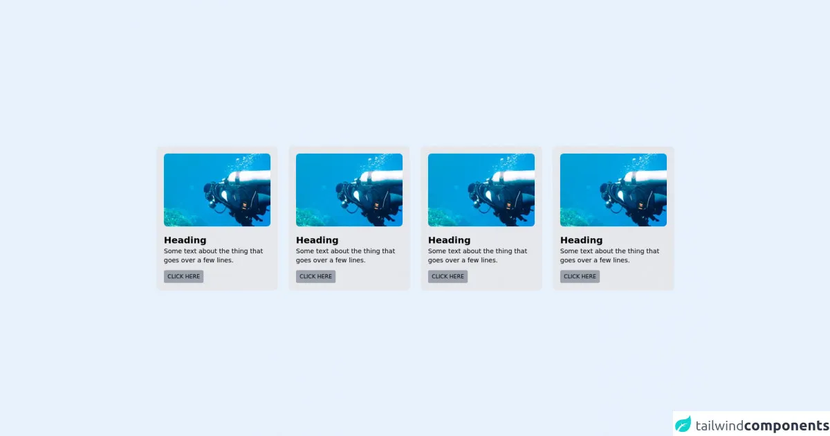
The preview of card UI component
Free download of the card's source code
The source code of card UI component
To create a card UI component with Tailwind CSS, you can use the following classes:
<div class="flex items-center justify-center w-screen min-h-screen p-10">
	<!-- Resice the preview panel to check the responsiveness -->

	<!-- Component Start -->
	<div class="grid xl:grid-cols-4 md:grid-cols-2 grid-cols-1 gap-2 max-w-6xl">
		<!-- Tile 1 -->
		<div class="flex flex-col bg-gray-200 rounded-lg p-4 m-2">
			<div class="h-40 bg-gray-400 rounded-lg" style="
            background-image: url(https://img.jakpost.net/c/2017/01/26/2017_01_26_20163_1485417604._large.jpg);
            ackground-repeat: no-repeat;
            background-attachment: cover;
            background-position: center;"></div>
			<div class="flex flex-col items-start mt-4">
				<h4 class="text-xl font-semibold">Heading</h4>
				<p class="text-sm">Some text about the thing that goes over a few lines.</p>
				<a class="p-2 leading-none rounded font-medium mt-3 bg-gray-400 text-xs uppercase" href="#">Click Here</a>
			</div>
		</div>
		<!-- Tile 2 -->
		<div class="flex flex-col bg-gray-200 rounded-lg p-4 m-2">
			<div class="h-40 bg-gray-400 rounded-lg" style="
            background-image: url(https://img.jakpost.net/c/2017/01/26/2017_01_26_20163_1485417604._large.jpg);
            ackground-repeat: no-repeat;
            background-attachment: cover;
            background-position: center;"></div>
			<div class="flex flex-col items-start mt-4">
				<h4 class="text-xl font-semibold">Heading</h4>
				<p class="text-sm">Some text about the thing that goes over a few lines.</p>
				<a class="p-2 leading-none rounded font-medium mt-3 bg-gray-400 text-xs uppercase" href="#">Click Here</a>
			</div>
		</div>
		<!-- Tile 3 -->
		<div class="flex flex-col bg-gray-200 rounded-lg p-4 m-2">
			<div class="h-40 bg-gray-400 rounded-lg" style="
            background-image: url(https://img.jakpost.net/c/2017/01/26/2017_01_26_20163_1485417604._large.jpg);
            ackground-repeat: no-repeat;
            background-attachment: cover;
            background-position: center;"></div>
			<div class="flex flex-col items-start mt-4">
				<h4 class="text-xl font-semibold">Heading</h4>
				<p class="text-sm">Some text about the thing that goes over a few lines.</p>
				<a class="p-2 leading-none rounded font-medium mt-3 bg-gray-400 text-xs uppercase" href="#">Click Here</a>
			</div>
		</div>
		<!-- Tile 4 -->
		<div class="flex flex-col bg-gray-200 rounded-lg p-4 m-2">
			<div class="h-40 bg-gray-400 rounded-lg" style="
            background-image: url(https://img.jakpost.net/c/2017/01/26/2017_01_26_20163_1485417604._large.jpg);
            ackground-repeat: no-repeat;
            background-attachment: cover;
            background-position: center;"></div>
			<div class="flex flex-col items-start mt-4">
				<h4 class="text-xl font-semibold">Heading</h4>
				<p class="text-sm">Some text about the thing that goes over a few lines.</p>
				<a class="p-2 leading-none rounded font-medium mt-3 bg-gray-400 text-xs uppercase" href="#">Click Here</a>
			</div>
		</div>
	</div>
	<!-- Component End  -->

</div>
How to create a card with Tailwind CSS?
- Start by creating a new HTML file and linking to the Tailwind CSS stylesheet.
<!DOCTYPE html>
<html>
  <head>
    <link rel="stylesheet" href="https://cdn.jsdelivr.net/npm/[email protected]/dist/tailwind.min.css">
  </head>
  <body>
    <!-- Your HTML code here -->
  </body>
</html>
- Create a container for the card UI component.
<div class="bg-white rounded-lg shadow-lg">
  <!-- Your card content here -->
</div>
- Add a header section to the card.
<div class="bg-white rounded-lg shadow-lg">
  <div class="p-4">
    <h2 class="text-xl font-bold mb-2">Card Title</h2>
  </div>
</div>
- Add a body section to the card.
<div class="bg-white rounded-lg shadow-lg">
  <div class="p-4">
    <h2 class="text-xl font-bold mb-2">Card Title</h2>
    <p class="text-gray-700 text-base">Card content goes here.</p>
  </div>
</div>
- Add a footer section to the card.
<div class="bg-white rounded-lg shadow-lg">
  <div class="p-4">
    <h2 class="text-xl font-bold mb-2">Card Title</h2>
    <p class="text-gray-700 text-base">Card content goes here.</p>
  </div>
  <div class="bg-gray-100 p-4">
    <button class="bg-blue-500 hover:bg-blue-700 text-white font-bold py-2 px-4 rounded">
      Button
    </button>
  </div>
</div>
- Customize the card UI component using Tailwind CSS classes.
Conclusion
In this article, we discussed how to create a card UI component with Tailwind CSS in 60 minutes. We learned that Tailwind CSS is a utility-first CSS framework that provides a set of pre-defined classes that you can use to create custom designs quickly and easily. We also learned that a card UI component is a container that displays information in a structured and visually appealing way. By following the steps outlined in this article, you can create a card UI component that matches your brand or application in no time.