- Published on
Learn How To Build A Card With Tailwind CSS from the Pros
- What is Tailwind CSS?
- The description of card UI component
- Why use Tailwind CSS to create a card UI component?
- The preview of card UI component
- The source code of card UI component
- How to create a card with Tailwind CSS?
- Conclusion
As a FrontEnd developer, you must have heard of Tailwind CSS, a utility-first CSS framework that helps you create custom designs without writing any CSS code. In this article, we will learn how to build a card UI component with Tailwind CSS from the pros.
What is Tailwind CSS?
Tailwind CSS is a utility-first CSS framework that helps you create custom designs without writing any CSS code. It provides a set of pre-defined classes that you can use to style your HTML elements. With Tailwind CSS, you can easily create responsive designs, and it also helps you to reduce the size of your CSS code.
The description of card UI component
A card UI component is a container that displays information in a structured way. It is commonly used to display product information, blog posts, or any other type of content. A card usually consists of a header, a body, and a footer. The header contains the title of the card, the body contains the content, and the footer contains additional information.
Why use Tailwind CSS to create a card UI component?
Tailwind CSS provides a set of pre-defined classes that you can use to create a card UI component quickly. It also provides responsive classes that help you to create a responsive design without writing any media queries. With Tailwind CSS, you can easily customize the design of your card UI component by changing the values of the pre-defined classes.
The preview of card UI component
To create a card UI component with Tailwind CSS, we will use the following classes:
bg-white: sets the background color of the card to white.rounded-lg: rounds the corners of the card.shadow-md: adds a shadow to the card.p-6: adds padding to the card.border: adds a border to the card.border-gray-200: sets the color of the border to gray.
Free download of the card's source code
The source code of card UI component
To create a card UI component with Tailwind CSS, you can use the following HTML code:
<div class="bg-white rounded-lg shadow-md p-6 border border-gray-200">
  <h2 class="text-lg font-medium text-gray-900">Card title</h2>
  <p class="mt-2 text-sm text-gray-500">Card description</p>
</div>
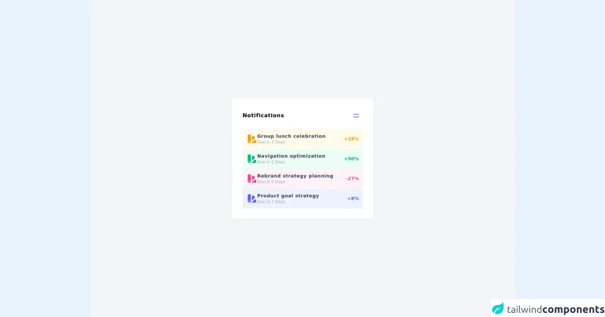
<div class="w-full min-h-screen bg-gray-100 flex justify-center items-center"><div class="w-2/6 bg-white rounded-lg shadow-sm p-8"><div class="flex justify-between items-center"><h1 class="font-extrabold tracking-wider">Notifications</h1><button class="hover:bg-blue-50 p-2 rounded-sm"><svg xmlns="http://www.w3.org/2000/svg" class="h-6 w-6 text-indigo-500" fill="none" viewBox="0 0 24 24" stroke="currentColor"><path stroke-linecap="round" stroke-linejoin="round" stroke-width="2" d="M4 8h16M4 16h16"></path></svg></button></div><div class="flex flex-col mt-5 gap-7 text-sm"><div class="bg-yellow-50 flex justify-between items-center p-3 rounded-sm shadow-sm"><div class="flex justify-start items-center gap-2"><svg xmlns="http://www.w3.org/2000/svg" class="h-8 w-8 text-yellow-500" viewBox="0 0 20 20" fill="currentColor"><path fill-rule="evenodd" d="M4 2a2 2 0 00-2 2v11a3 3 0 106 0V4a2 2 0 00-2-2H4zm1 14a1 1 0 100-2 1 1 0 000 2zm5-1.757l4.9-4.9a2 2 0 000-2.828L13.485 5.1a2 2 0 00-2.828 0L10 5.757v8.486zM16 18H9.071l6-6H16a2 2 0 012 2v2a2 2 0 01-2 2z" clip-rule="evenodd"></path></svg><div><p class="text-gray-700 font-bold tracking-wider">Group lunch celebration</p><p class="text-gray-400 text-xs">Due in 2 Days</p></div></div><span class="font-bold text-yellow-500">+28%</span></div><div class="bg-green-50 flex justify-between items-center p-3 rounded-sm shadow-sm"><div class="flex justify-start items-center gap-2"><svg xmlns="http://www.w3.org/2000/svg" class="h-8 w-8 text-green-500" viewBox="0 0 20 20" fill="currentColor"><path fill-rule="evenodd" d="M4 2a2 2 0 00-2 2v11a3 3 0 106 0V4a2 2 0 00-2-2H4zm1 14a1 1 0 100-2 1 1 0 000 2zm5-1.757l4.9-4.9a2 2 0 000-2.828L13.485 5.1a2 2 0 00-2.828 0L10 5.757v8.486zM16 18H9.071l6-6H16a2 2 0 012 2v2a2 2 0 01-2 2z" clip-rule="evenodd"></path></svg><div><p class="text-gray-700 font-bold tracking-wider">Navigation optimization</p><p class="text-gray-400 text-xs">Due in 2 Days</p></div></div><span class="font-bold text-green-500">+50%</span></div><div class="bg-pink-50 flex justify-between items-center p-3 rounded-sm shadow-sm"><div class="flex justify-start items-center gap-2"><svg xmlns="http://www.w3.org/2000/svg" class="h-8 w-8 text-pink-500" viewBox="0 0 20 20" fill="currentColor"><path fill-rule="evenodd" d="M4 2a2 2 0 00-2 2v11a3 3 0 106 0V4a2 2 0 00-2-2H4zm1 14a1 1 0 100-2 1 1 0 000 2zm5-1.757l4.9-4.9a2 2 0 000-2.828L13.485 5.1a2 2 0 00-2.828 0L10 5.757v8.486zM16 18H9.071l6-6H16a2 2 0 012 2v2a2 2 0 01-2 2z" clip-rule="evenodd"></path></svg><div><p class="text-gray-700 font-bold tracking-wider">Rebrand strategy planning</p><p class="text-gray-400 text-xs">Due in 5 Days</p></div></div><span class="font-bold text-pink-500">-27%</span></div><div class="bg-indigo-50 flex justify-between items-center p-3 rounded-sm shadow-sm"><div class="flex justify-start items-center gap-2"><svg xmlns="http://www.w3.org/2000/svg" class="h-8 w-8 text-indigo-500" viewBox="0 0 20 20" fill="currentColor"><path fill-rule="evenodd" d="M4 2a2 2 0 00-2 2v11a3 3 0 106 0V4a2 2 0 00-2-2H4zm1 14a1 1 0 100-2 1 1 0 000 2zm5-1.757l4.9-4.9a2 2 0 000-2.828L13.485 5.1a2 2 0 00-2.828 0L10 5.757v8.486zM16 18H9.071l6-6H16a2 2 0 012 2v2a2 2 0 01-2 2z" clip-rule="evenodd"></path></svg><div><p class="text-gray-700 font-bold tracking-wider">Product goal strategy</p><p class="text-gray-400 text-xs">Due in 7 Days</p></div></div><span class="font-bold text-indigo-500">+8%</span></div></div></div></div>
How to create a card with Tailwind CSS?
To create a card UI component with Tailwind CSS, follow these steps:
- Create a new HTML file and add the following code:
<!DOCTYPE html>
<html lang="en">
<head>
  <meta charset="UTF-8">
  <title>Card UI Component</title>
  <link rel="stylesheet" href="https://cdn.jsdelivr.net/npm/[email protected]/dist/tailwind.min.css">
</head>
<body>
  <div class="bg-gray-100 min-h-screen">
    <div class="max-w-md mx-auto pt-12">
      <div class="bg-white rounded-lg shadow-md p-6 border border-gray-200">
        <h2 class="text-lg font-medium text-gray-900">Card title</h2>
        <p class="mt-2 text-sm text-gray-500">Card description</p>
      </div>
    </div>
  </div>
</body>
</html>
Open the HTML file in your browser, and you will see a card UI component with a title and a description.
To customize the design of the card, you can change the values of the pre-defined classes. For example, you can change the background color of the card by using the
bg-red-500class:
<div class="bg-red-500 rounded-lg shadow-md p-6 border border-gray-200">
- You can also add additional elements to the card, such as an image or a button. For example, you can add an image to the card by using the
w-fullandh-48classes:
<div class="bg-white rounded-lg shadow-md p-6 border border-gray-200">
  <img class="w-full h-48 object-cover" src="https://via.placeholder.com/640x480.png" alt="Card image">
  <h2 class="mt-4 text-lg font-medium text-gray-900">Card title</h2>
  <p class="mt-2 text-sm text-gray-500">Card description</p>
  <button class="mt-4 bg-blue-500 hover:bg-blue-700 text-white font-bold py-2 px-4 rounded">
    Button
  </button>
</div>
- Open the HTML file in your browser, and you will see a card UI component with an image, a title, a description, and a button.
Conclusion
In this article, we have learned how to build a card UI component with Tailwind CSS from the pros. We have seen how Tailwind CSS provides a set of pre-defined classes that you can use to create a custom design quickly. We have also seen how you can customize the design of your card UI component by changing the values of the pre-defined classes. With Tailwind CSS, you can easily create responsive designs without writing any CSS code.