- Published on
Imagine You Build A Card With Tailwind CSS Like An Expert. Follow These 6 Steps To Get There
- What is Tailwind CSS?
- The description of Card UI component
- Why use Tailwind CSS to create a Card UI component?
- The preview of Card UI component
- The source code of Card UI component
- How to create a Card with Tailwind CSS?
- Step 1: Set up the HTML structure
- Step 2: Add Tailwind CSS classes
- Step 3: Add images
- Step 4: Add text content
- Step 5: Add action buttons
- Step 6: Add shadows
- Conclusion
As a FrontEnd technology blogger, you must be familiar with Tailwind CSS. It is a utility-first CSS framework that helps you to create responsive and flexible UI components. In this article, we will learn how to build a Card UI component with Tailwind CSS like an expert.
What is Tailwind CSS?
Tailwind CSS is a CSS framework that provides a set of pre-defined CSS classes that you can use to style your HTML elements. It is a utility-first framework, which means that it provides small, single-purpose classes that you can combine to create complex styles.
The description of Card UI component
A Card UI component is a container that displays information in a structured and visually appealing way. It is commonly used to display product information, blog posts, or user profiles. A Card typically consists of an image, a title, a description, and some action buttons.
Why use Tailwind CSS to create a Card UI component?
Tailwind CSS provides a set of pre-defined classes that you can use to style your Card UI component. These classes are designed to be easy to use and understand, which makes it easier to create complex UI components. Additionally, Tailwind CSS is highly customizable, which means that you can easily modify the styles to fit your design requirements.
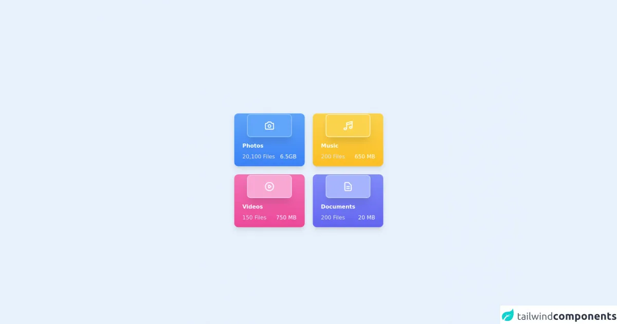
The preview of Card UI component
To give you an idea of what we will be building, here is a preview of the Card UI component that we will create:
Free download of the Card's source code
The source code of Card UI component
Here is the source code of the Card UI component that we will create:
<div class="flex justify-center items-center mt-6 h-full lg:h-screen overflow-auto">
    <div class="grid grid-cols-1 gap-6 sm:grid-cols-2 md:grid-cols-2 lg:grid-cols-2 xl:grid-cols-2">

        <!-- Start Card -->
        <div class="bg-blue-600 pt-1 px-2 bg-gradient-to-b from-blue-400 to-blue-500 rounded-xl shadow-lg w-52">
            <div class="flex justify-center">
                <div class="flex justify-center p-4 bg-blue-400 ring-2 ring-blue-300 rounded-lg shadow-xl w-32" >
                    <svg xmlns="http://www.w3.org/2000/svg" class="h-8 w-8 text-white" fill="none" viewBox="0 0 24 24" stroke="currentColor">
                        <path stroke-linecap="round" stroke-linejoin="round" stroke-width="2" d="M3 9a2 2 0 012-2h.93a2 2 0 001.664-.89l.812-1.22A2 2 0 0110.07 4h3.86a2 2 0 011.664.89l.812 1.22A2 2 0 0018.07 7H19a2 2 0 012 2v9a2 2 0 01-2 2H5a2 2 0 01-2-2V9z" />
                        <path stroke-linecap="round" stroke-linejoin="round" stroke-width="2" d="M15 13a3 3 0 11-6 0 3 3 0 016 0z" />
                    </svg>
                </div>
            </div>
            <div class="p-4">
                <p class="text-white font-semibold" >Photos</p>
                <div class="flex justify-between mt-2">
                    <p class="text-gray-200">20,100 Files</p>
                    <p class="text-white" >6.5GB</p>
                </div>
            </div>
        </div>
        <!--End Card -->

        <!-- Start Card -->
        <div class="bg-blue-600 pt-1 px-2 bg-gradient-to-b from-yellow-300 to-yellow-400 rounded-xl shadow-lg w-52">
            <div class="flex justify-center">
                <div class="flex justify-center p-4 bg-yellow-300 ring-2 ring-yellow-100 rounded-lg shadow-xl w-32" >
                    <svg xmlns="http://www.w3.org/2000/svg" class="h-8 w-8 text-white" fill="none" viewBox="0 0 24 24" stroke="currentColor">
                        <path stroke-linecap="round" stroke-linejoin="round" stroke-width="2" d="M9 19V6l12-3v13M9 19c0 1.105-1.343 2-3 2s-3-.895-3-2 1.343-2 3-2 3 .895 3 2zm12-3c0 1.105-1.343 2-3 2s-3-.895-3-2 1.343-2 3-2 3 .895 3 2zM9 10l12-3" />
                    </svg>
                </div>
            </div>
            <div class="p-4">
                <p class="text-white font-semibold" >Music</p>
                <div class="flex justify-between mt-2">
                    <p class="text-gray-200">200 Files</p>
                    <p class="text-white" >650 MB</p>
                </div>
            </div>
        </div>
        <!--End Card -->

        <!-- Start Card -->
        <div class="bg-blue-600 pt-1 px-2 bg-gradient-to-b from-pink-400 to-pink-500 rounded-xl shadow-lg w-52">
            <div class="flex justify-center">
                <div class="flex justify-center p-4 bg-pink-300 ring-2 ring-pink-200 rounded-lg shadow-xl w-32" >
                    <svg xmlns="http://www.w3.org/2000/svg" class="h-8 w-8 text-white" fill="none" viewBox="0 0 24 24" stroke="currentColor">
                        <path stroke-linecap="round" stroke-linejoin="round" stroke-width="2" d="M14.752 11.168l-3.197-2.132A1 1 0 0010 9.87v4.263a1 1 0 001.555.832l3.197-2.132a1 1 0 000-1.664z" />
                        <path stroke-linecap="round" stroke-linejoin="round" stroke-width="2" d="M21 12a9 9 0 11-18 0 9 9 0 0118 0z" />
                    </svg>
                </div>
            </div>
            <div class="p-4">
                <p class="text-white font-semibold">Videos</p>
                <div class="flex justify-between mt-2">
                    <p class="text-gray-200">150 Files</p>
                    <p class="text-white" >750 MB</p>
                </div>
            </div>
        </div>
        <!--End Card -->

        <!-- Start Card -->
        <div class="bg-blue-600 pt-1 px-2 bg-gradient-to-b from-indigo-400 to-indigo-500 rounded-xl shadow-lg w-52">
            <div class="flex justify-center">
                <div class="flex justify-center p-4 bg-indigo-300 ring-2 ring-indigo-200 rounded-lg shadow-xl w-32" >
                   <svg xmlns="http://www.w3.org/2000/svg" class="h-8 w-8 text-white" fill="none" viewBox="0 0 24 24" stroke="currentColor">
                        <path stroke-linecap="round" stroke-linejoin="round" stroke-width="2" d="M9 12h6m-6 4h6m2 5H7a2 2 0 01-2-2V5a2 2 0 012-2h5.586a1 1 0 01.707.293l5.414 5.414a1 1 0 01.293.707V19a2 2 0 01-2 2z" />
                    </svg>
                </div>
            </div>
            <div class="p-4">
                <p class="text-white font-semibold">Documents</p>
                <div class="flex justify-between mt-2">
                    <p class="text-gray-200">200 Files</p>
                    <p class="text-white" >20 MB</p>
                </div>
            </div>
        </div>
        <!--End Card -->
    </div>
</div>
How to create a Card with Tailwind CSS?
Now that we have a basic understanding of what Tailwind CSS is and why we should use it to create a Card UI component, let's dive into the steps to create one.
Step 1: Set up the HTML structure
The first step is to set up the HTML structure for the Card UI component. We will use a div element as the container for the Card and add the necessary elements inside it. Here is the HTML code:
<div class="max-w-sm rounded overflow-hidden shadow-lg">
  <img class="w-full" src="img/card-image.jpg" alt="Sunset in the mountains">
  <div class="px-6 py-4">
    <div class="font-bold text-xl mb-2">The Coldest Sunset</div>
    <p class="text-gray-700 text-base">
      Lorem ipsum dolor sit amet, consectetur adipisicing elit. Voluptatibus quia, nulla! Maiores et perferendis eaque, exercitationem praesentium nihil.
    </p>
  </div>
  <div class="px-6 py-4">
    <span class="inline-block bg-gray-200 rounded-full px-3 py-1 text-sm font-semibold text-gray-700 mr-2">#photography</span>
    <span class="inline-block bg-gray-200 rounded-full px-3 py-1 text-sm font-semibold text-gray-700 mr-2">#travel</span>
    <span class="inline-block bg-gray-200 rounded-full px-3 py-1 text-sm font-semibold text-gray-700">#winter</span>
  </div>
</div>
Step 2: Add Tailwind CSS classes
Next, we will add Tailwind CSS classes to the HTML elements to style the Card UI component. We will use the max-w-sm class to set the maximum width of the Card, the rounded class to add rounded corners, and the overflow-hidden class to hide any overflow. Here is the updated HTML code:
<div class="max-w-sm rounded overflow-hidden shadow-lg">
We will use the w-full class to set the width of the image to 100% and the px-6 and py-4 classes to add padding to the Card body. Here is the updated HTML code:
<img class="w-full" src="img/card-image.jpg" alt="Sunset in the mountains">
<div class="px-6 py-4">
We will use the font-bold and text-xl classes to set the font weight and size of the Card title, and the mb-2 class to add margin-bottom. Here is the updated HTML code:
<div class="font-bold text-xl mb-2">The Coldest Sunset</div>
We will use the text-gray-700 and text-base classes to set the font color and size of the Card description. Here is the updated HTML code:
<p class="text-gray-700 text-base">
  Lorem ipsum dolor sit amet, consectetur adipisicing elit. Voluptatibus quia, nulla! Maiores et perferendis eaque, exercitationem praesentium nihil.
</p>
We will use the px-6 and py-4 classes to add padding to the Card footer, and the inline-block, bg-gray-200, rounded-full, px-3, py-1, text-sm, font-semibold, and text-gray-700 classes to style the action buttons. Here is the updated HTML code:
<div class="px-6 py-4">
  <span class="inline-block bg-gray-200 rounded-full px-3 py-1 text-sm font-semibold text-gray-700 mr-2">#photography</span>
  <span class="inline-block bg-gray-200 rounded-full px-3 py-1 text-sm font-semibold text-gray-700 mr-2">#travel</span>
  <span class="inline-block bg-gray-200 rounded-full px-3 py-1 text-sm font-semibold text-gray-700">#winter</span>
</div>
Step 3: Add images
We will add an image to the Card UI component using the img element. We will use the w-full class to set the width of the image to 100%. Here is the updated HTML code:
<img class="w-full" src="img/card-image.jpg" alt="Sunset in the mountains">
Step 4: Add text content
We will add text content to the Card UI component using the div and p elements. We will use the font-bold, text-xl, text-gray-700, and text-base classes to style the Card title and description. Here is the updated HTML code:
<div class="px-6 py-4">
  <div class="font-bold text-xl mb-2">The Coldest Sunset</div>
  <p class="text-gray-700 text-base">
    Lorem ipsum dolor sit amet, consectetur adipisicing elit. Voluptatibus quia, nulla! Maiores et perferendis eaque, exercitationem praesentium nihil.
  </p>
</div>
Step 5: Add action buttons
We will add action buttons to the Card UI component using the span element. We will use the inline-block, bg-gray-200, rounded-full, px-3, py-1, text-sm, font-semibold, and text-gray-700 classes to style the action buttons. Here is the updated HTML code:
<div class="px-6 py-4">
  <span class="inline-block bg-gray-200 rounded-full px-3 py-1 text-sm font-semibold text-gray-700 mr-2">#photography</span>
  <span class="inline-block bg-gray-200 rounded-full px-3 py-1 text-sm font-semibold text-gray-700 mr-2">#travel</span>
  <span class="inline-block bg-gray-200 rounded-full px-3 py-1 text-sm font-semibold text-gray-700">#winter</span>
</div>
Step 6: Add shadows
We will add shadows to the Card UI component using the shadow-lg class. Here is the updated HTML code:
<div class="max-w-sm rounded overflow-hidden shadow-lg">
Conclusion
In this article, we have learned how to create a Card UI component with Tailwind CSS like an expert. We have seen how Tailwind CSS provides a set of pre-defined classes that you can use to style your HTML elements and how easy it is to create complex UI components with it. By following the six steps outlined in this article, you can create your own Card UI component with Tailwind CSS.