- Published on
Practical Guide: Make A Product Card With Tailwind CSS
- What is Tailwind CSS?
- The description of Product Card UI component
- Why use Tailwind CSS to create a Product Card UI component?
- The preview of Product Card UI component
- The source code of Product Card UI component
- How to create a Product Card with Tailwind CSS?
- Step 1: Set up your HTML structure
- Step 2: Style the Product Card using Tailwind CSS
- Step 3: Add the Product Card to your website or application
- Conclusion
In this article, we will guide you through the process of creating a Product Card UI component using Tailwind CSS. We will explain what Tailwind CSS is, why it's a great choice for creating UI components, and provide a step-by-step guide on how to create a Product Card using this framework.
What is Tailwind CSS?
Tailwind CSS is a utility-first CSS framework that provides a set of pre-defined classes to style HTML elements. It allows you to quickly and easily create custom designs without writing any CSS code. The framework is highly customizable, and you can easily modify the default styles to match your design requirements.
The description of Product Card UI component
A Product Card is a UI component that displays information about a product, such as its name, price, and image. It is commonly used in e-commerce websites and applications to showcase products to potential customers. A typical Product Card includes a product image, product name, product description, and a call-to-action button.
Why use Tailwind CSS to create a Product Card UI component?
Tailwind CSS provides a set of pre-defined classes that can be used to create a Product Card UI component quickly and easily. The framework's utility-first approach allows you to style the component without writing any custom CSS code. Additionally, Tailwind CSS is highly customizable, so you can easily modify the default styles to match your design requirements.
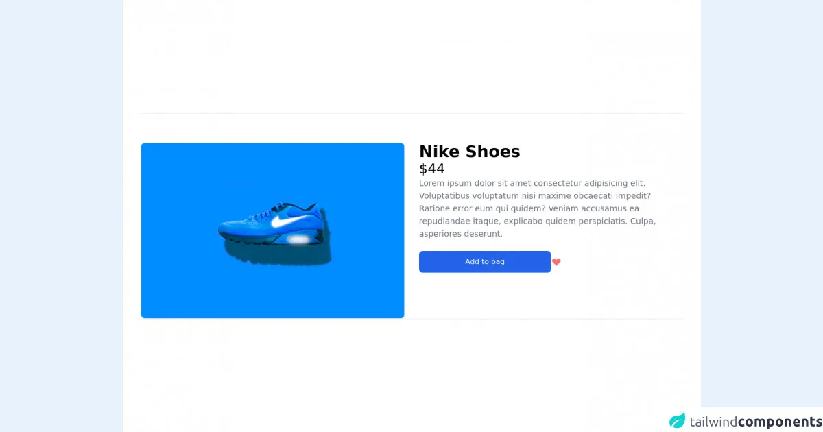
The preview of Product Card UI component
To give you an idea of what the final Product Card UI component will look like, here is a preview:
Free download of the Product Card's source code
The source code of Product Card UI component
Here is the source code for the Product Card UI component:
<main class="flex items-center p-10 w-full h-full bg-white">
	<div class="border-t border-b pt-16 grid grid-cols-2 gap-8">
		<div class="flex flex-col justify-start">
			<div class="flex flex-col w-full object-cover h-4/6 justify-items-start border rounded-lg overflow-hidden"
				style="min-heigth:320px">
				<img class="w-full h-full object-cover" src='https://images.unsplash.com/photo-1515955656352-a1fa3ffcd111?ixid=MnwxMjA3fDB8MHxwaG90by1wYWdlfHx8fGVufDB8fHx8&ixlib=rb-1.2.1&auto=format&fit=crop&w=750&q=80' alt='nike shoes' >
            </div>
			</div>
			<div class="flex flex-col">
				<div class="flex flex-col gap-4">
					<h1 class="capitalize text-4xl font-extrabold">Nike shoes</h1>
					<h2 class="text-3xl">$44</h2>
					<p class="text-lg text-gray-500	">Lorem ipsum dolor sit amet consectetur adipisicing elit.
						Voluptatibus voluptatum nisi maxime obcaecati impedit? Ratione error eum qui quidem? Veniam
						accusamus ea repudiandae itaque, explicabo quidem perspiciatis. Culpa, asperiores deserunt.</p>
					<div class="flex items-center gap-4 my-6 cursor-pointer ">
						<div class="bg-blue-600 px-5 py-3 text-white rounded-lg w-2/4 text-center">Add to bag</div>
						<svg xmlns="http://www.w3.org/2000/svg" class="h-6 w-6 text-red-400" viewBox="0 0 20 20"
							fill="currentColor">
							<path fill-rule="evenodd"
								d="M3.172 5.172a4 4 0 015.656 0L10 6.343l1.172-1.171a4 4 0 115.656 5.656L10 17.657l-6.828-6.829a4 4 0 010-5.656z"
								clip-rule="evenodd" />
						</svg>
					</div>
				</div>
			</div>
		</div>
</main>
How to create a Product Card with Tailwind CSS?
Now that we have covered the basics, let's dive into the step-by-step guide on how to create a Product Card UI component using Tailwind CSS.
Step 1: Set up your HTML structure
The first step is to set up the HTML structure for the Product Card. Here is an example of what the HTML structure should look like:
<div class="max-w-sm rounded overflow-hidden shadow-lg">
  <img class="w-full" src="product-image.jpg" alt="Product Image">
  <div class="px-6 py-4">
    <div class="font-bold text-xl mb-2">Product Name</div>
    <p class="text-gray-700 text-base">Product Description</p>
  </div>
  <div class="px-6 pt-4 pb-2">
    <button class="bg-blue-500 hover:bg-blue-700 text-white font-bold py-2 px-4 rounded">
      Add to Cart
    </button>
  </div>
</div>
Step 2: Style the Product Card using Tailwind CSS
Next, we will use Tailwind CSS classes to style the Product Card. Here is an example of what the CSS code should look like:
/* Set the width of the Product Card */
.max-w-sm {
  max-width: 18rem;
}

/* Style the product image */
.img {
  height: 10rem;
  object-fit: cover;
}

/* Style the Product Card header */
.font-bold {
  font-weight: 700;
}

.text-xl {
  font-size: 1.25rem;
  line-height: 1.75rem;
}

/* Style the Product Card description */
.text-gray-700 {
  color: #4a5568;
}

/* Style the Add to Cart button */
.bg-blue-500 {
  background-color: #4299e1;
}

.hover\:bg-blue-700:hover {
  background-color: #2b6cb0;
}

.text-white {
  color: #fff;
}

.font-bold {
  font-weight: 700;
}

.py-2 {
  padding-top: 0.5rem;
  padding-bottom: 0.5rem;
}

.px-4 {
  padding-left: 1rem;
  padding-right: 1rem;
}

.rounded {
  border-radius: 0.25rem;
}

/* Style the Product Card container */
.rounded {
  border-radius: 0.25rem;
}

.overflow-hidden {
  overflow: hidden;
}

.shadow-lg {
  box-shadow: 0 10px 15px -3px rgba(0, 0, 0, 0.1),
    0 4px 6px -2px rgba(0, 0, 0, 0.05);
}
Step 3: Add the Product Card to your website or application
Finally, you can add the Product Card to your website or application by copying and pasting the HTML and CSS code into your project.
Conclusion
In this article, we have provided a practical guide on how to create a Product Card UI component using Tailwind CSS. We have explained what Tailwind CSS is, why it's a great choice for creating UI components, and provided a step-by-step guide on how to create a Product Card using this framework. With this guide, you should be able to create a beautiful and functional Product Card for your e-commerce website or application.