- Published on
Build A Buttons Pills With Tailwind CSS Like A Pro With The Help Of These 6 Tips
- What is Tailwind CSS?
- The description of Buttons Pills ui component
- Why use Tailwind CSS to create a Buttons Pills ui component?
- The preview of Buttons Pills ui component.
- The source code of Buttons Pills ui component.
- How to create a Buttons Pills with Tailwind CSS?
- 1. Use the flexbox utility classes
- 2. Use the rounded utility classes
- 3. Use the border utility classes
- 4. Use the text and background color utility classes
- 5. Use the hover and active utility classes
- 6. Use the focus utility classes
- Conclusion
What is Tailwind CSS?
Tailwind CSS is a utility-first CSS framework that allows developers to quickly build custom user interfaces. It provides a set of pre-defined classes that can be used to style HTML elements, making it easier to create responsive designs. With Tailwind CSS, developers can focus on building the functionality of their application rather than spending time on styling.
The description of Buttons Pills ui component
Buttons Pills are a popular UI component used in web applications. They are typically used to display a set of options that a user can select from. Buttons Pills are a set of buttons that are grouped together and have a pill-like shape. They are commonly used for filters, tags, and categories.
Why use Tailwind CSS to create a Buttons Pills ui component?
Tailwind CSS provides a set of pre-defined classes that can be used to style HTML elements. This makes it easy to create Buttons Pills without having to write custom CSS. Additionally, Tailwind CSS is highly customizable, which means that developers can easily modify the default styles to match their application's design.
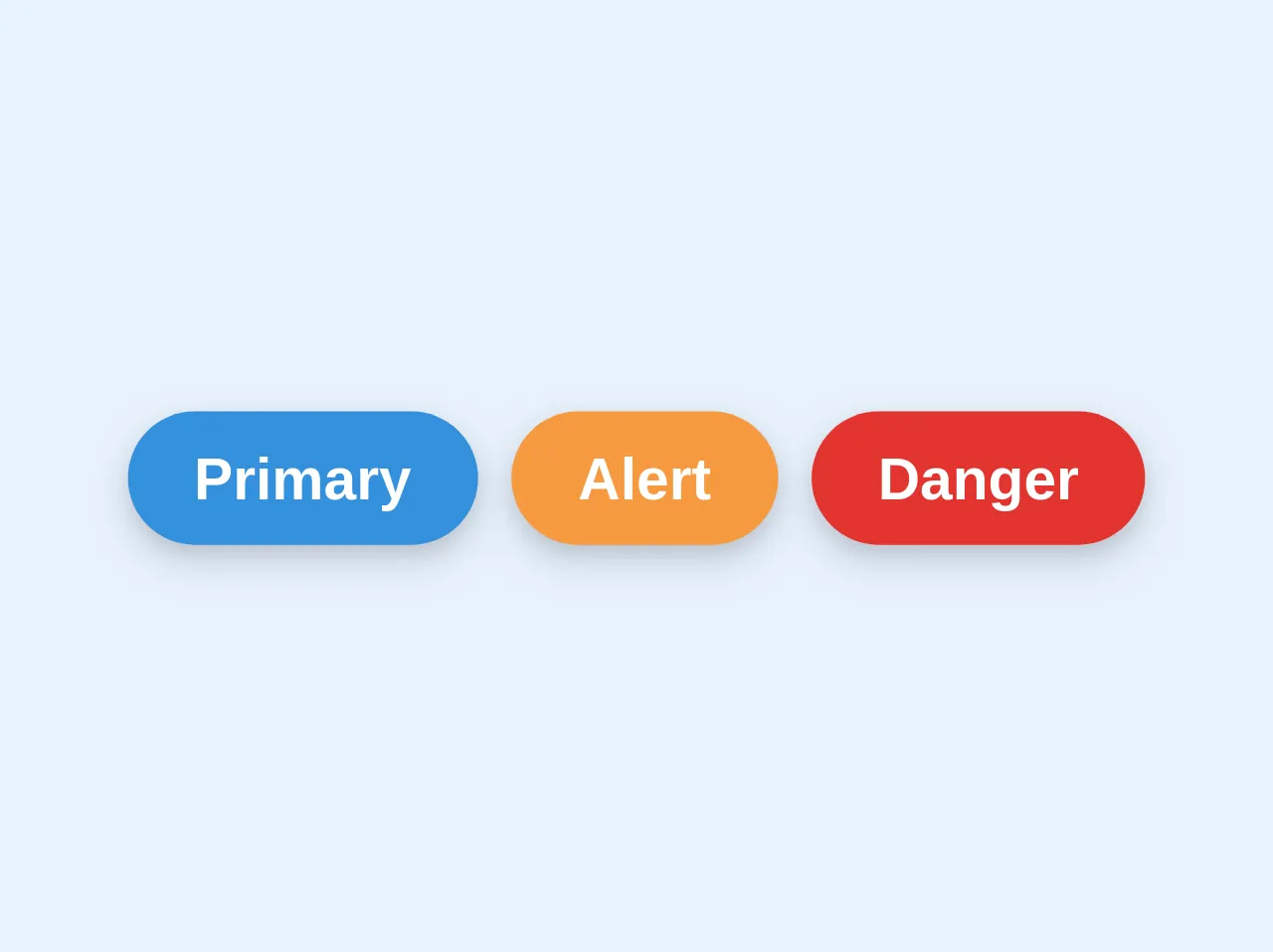
The preview of Buttons Pills ui component.
Buttons Pills are a popular UI component used in web applications. They are typically used to display a set of options that a user can select from. Buttons Pills are a set of buttons that are grouped together and have a pill-like shape. They are commonly used for filters, tags, and categories.
Free download of the Buttons Pills's source code
The source code of Buttons Pills ui component.
Buttons Pills can be easily created using Tailwind CSS. The following code shows how to create a set of Buttons Pills using HTML and Tailwind CSS classes.
<div class="justify-center my-8 select-none flex">
  <button class="py-2 px-4 shadow-md no-underline rounded-full bg-blue text-white font-sans font-semibold text-sm border-blue btn-primary hover:text-white hover:bg-blue-light focus:outline-none active:shadow-none mr-2">Primary</button>
  <button class="py-2 px-4 shadow-md no-underline rounded-full bg-orange text-white font-sans font-semibold text-sm border-orange btn-primary hover:text-white hover:bg-orange-light focus:outline-none active:shadow-none mr-2">Alert</button>
  <button class="py-2 px-4 shadow-md no-underline rounded-full bg-red text-white font-sans font-semibold text-sm border-red btn-primary hover:text-white hover:bg-red-light focus:outline-none active:shadow-none">Danger</button>
</div>
How to create a Buttons Pills with Tailwind CSS?
Creating Buttons Pills with Tailwind CSS is easy. Here are six tips to help you build Buttons Pills like a pro.
1. Use the flexbox utility classes
Tailwind CSS provides a set of flexbox utility classes that can be used to create Buttons Pills. The flex class is used to create a flex container, and the flex-wrap class is used to wrap the Buttons Pills to the next line when the container width is exceeded.
<div class="flex flex-wrap">
  <!-- Buttons Pills go here -->
</div>
2. Use the rounded utility classes
To give the Buttons Pills a pill-like shape, use the rounded-full class. This class rounds the corners of the element to create a circle. Additionally, use the rounded-l and rounded-r classes to round the left and right corners of the first and last buttons, respectively.
<button class="rounded-l-full rounded-r-full">Button 1</button>
<button class="rounded-l-none rounded-r-none">Button 2</button>
<button class="rounded-l-none rounded-r-full">Button 3</button>
3. Use the border utility classes
To create a border around the Buttons Pills, use the border class. Additionally, use the border-gray-300 class to set the color of the border.
<div class="border border-gray-300">
  <!-- Buttons Pills go here -->
</div>
4. Use the text and background color utility classes
To set the text and background color of the Buttons Pills, use the text-* and bg-* classes. The text-white class is used to set the text color to white.
<button class="bg-blue-500 text-white">Button 1</button>
<button class="bg-red-500 text-white">Button 2</button>
<button class="bg-green-500 text-white">Button 3</button>
5. Use the hover and active utility classes
To add hover and active effects to the Buttons Pills, use the hover:* and active:* classes. The hover:bg-blue-700 class is used to set the background color to blue when the button is hovered over.
<button class="bg-blue-500 hover:bg-blue-700 active:bg-blue-900 text-white">Button 1</button>
<button class="bg-red-500 hover:bg-red-700 active:bg-red-900 text-white">Button 2</button>
<button class="bg-green-500 hover:bg-green-700 active:bg-green-900 text-white">Button 3</button>
6. Use the focus utility classes
To add focus effects to the Buttons Pills, use the focus:* classes. The focus:outline-none class is used to remove the default outline that appears when the button is focused.
<button class="bg-blue-500 hover:bg-blue-700 active:bg-blue-900 focus:outline-none text-white">Button 1</button>
<button class="bg-red-500 hover:bg-red-700 active:bg-red-900 focus:outline-none text-white">Button 2</button>
<button class="bg-green-500 hover:bg-green-700 active:bg-green-900 focus:outline-none text-white">Button 3</button>
Conclusion
Buttons Pills are a popular UI component used in web applications. With Tailwind CSS, creating Buttons Pills is easy and customizable. By using the flexbox, rounded, border, text and background color, hover and active, and focus utility classes, developers can build Buttons Pills like a pro.