- Published on
What You Need To Create A Buttons / Inputs / Alerts With Tailwind CSS
- What is Tailwind CSS?
- The description of Buttons / Inputs / Alerts ui component
- Why use Tailwind CSS to create a Buttons / Inputs / Alerts ui component?
- The preview of Buttons / Inputs / Alerts ui component.
- The source code of Buttons / Inputs / Alerts ui component.
- How to create a Buttons / Inputs / Alerts with Tailwind CSS?
- Conclusion.
What is Tailwind CSS?
Tailwind CSS is a utility-first CSS framework that provides pre-defined classes to style HTML elements. It is designed to make it easy to create custom designs without writing any CSS code from scratch. Tailwind CSS is gaining popularity among developers because it is highly customizable, responsive, and easy to use.
The description of Buttons / Inputs / Alerts ui component
Buttons, inputs, and alerts are essential user interface components in web development. Buttons are used to trigger an action, inputs are used to collect user input, and alerts are used to display important information to the user. These components are used in almost every web application, and it is essential to have a consistent and visually appealing design for them.
Why use Tailwind CSS to create a Buttons / Inputs / Alerts ui component?
Tailwind CSS provides pre-defined classes for buttons, inputs, and alerts, making it easy to create a consistent and visually appealing design. It also provides responsive classes that make it easy to create designs that are optimized for different screen sizes. Tailwind CSS is highly customizable, and it allows developers to create custom designs without writing any CSS code from scratch.
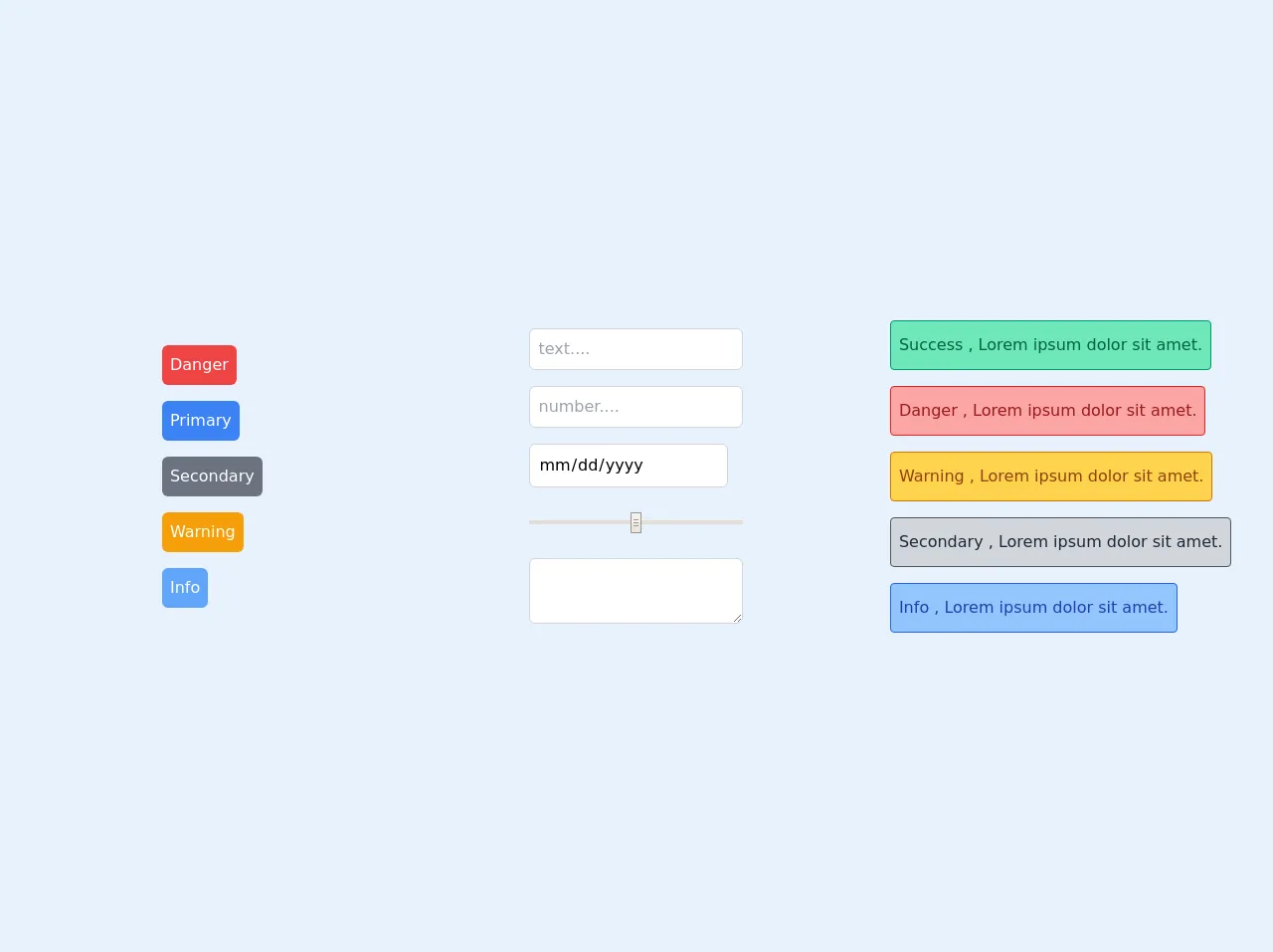
The preview of Buttons / Inputs / Alerts ui component.
To create buttons, inputs, and alerts with Tailwind CSS, we can use the pre-defined classes provided by the framework. Here is a preview of what the buttons, inputs, and alerts will look like:
Free download of the Buttons / Inputs / Alerts's source code
Buttons:
- Primary Button
- Secondary Button
- Danger Button
Inputs:
- Text Input
- Password Input
- Checkbox
- Radio Button
Alerts:
- Success Alert
- Warning Alert
- Error Alert
The source code of Buttons / Inputs / Alerts ui component.
To create buttons, inputs, and alerts with Tailwind CSS, we need to use the pre-defined classes provided by the framework. Here is the source code for the buttons, inputs, and alerts:
<!-- This is an example component -->
<div class="grid grid-cols-1 md:grid-cols-3 place-items-center h-screen w-screen">
  <div role="buttons" class="flex flex-col items-baseline">
    <button class="p-2 my-2 bg-red-500 text-white rounded-md focus:outline-none focus:ring-2 ring-red-300 ring-offset-2">Danger</button>
    <button class="p-2 my-2 bg-blue-500 text-white rounded-md focus:outline-none focus:ring-2 ring-blue-300 ring-offset-2">Primary</button>
    <button class="p-2 my-2 bg-gray-500 text-white rounded-md focus:outline-none focus:ring-2 ring-gray-300 ring-offset-2">Secondary</button>
    <button class="p-2 my-2 bg-yellow-500 text-white rounded-md focus:outline-none focus:ring-2 ring-yellow-300 ring-offset-2">Warning</button>
    <button class="p-2 my-2 bg-blue-400 text-white rounded-md focus:outline-none focus:ring-2 ring-blue-200 ring-offset-2">Info</button>
  </div>
  <div role="inputs" class="flex flex-col items-baseline">
    <input type="text" placeholder="text...." class="border border-gray-300 p-2 my-2 rounded-md focus:outline-none focus:ring-2 ring-blue-200" />
    <input type="number" placeholder="number...." class="border border-gray-300 p-2 my-2 rounded-md focus:outline-none focus:ring-2 ring-blue-200" />
    <input type="date" placeholder="date...." class="border border-gray-300 p-2 my-2 rounded-md focus:outline-none focus:ring-2 ring-blue-200" />
    <input type="range" placeholder="range...." class="border w-full app border-gray-300 p-2 my-2 rounded-md focus:outline-none" />
    <textarea type="range" placeholder="range...." class="border w-full app border-gray-300 p-2 my-2 rounded-md focus:outline-none focus:ring-2 ring-blue-200"> </textarea>
  </div>
  <div role="alert" class="flex flex-col items-baseline">
    <div class="py-3 px-2 my-2 bg-green-300 text-green-800 rounded border border-green-600">Success , Lorem ipsum dolor sit amet.</div>
    <div class="py-3 px-2 my-2 bg-red-300 text-red-800 rounded border border-red-600">Danger , Lorem ipsum dolor sit amet.</div>
    <div class="py-3 px-2 my-2 bg-yellow-300 text-yellow-800 rounded border border-yellow-600">Warning , Lorem ipsum dolor sit amet.</div>
    <div class="py-3 px-2 my-2 bg-gray-300 text-gray-800 rounded border border-gray-600">Secondary , Lorem ipsum dolor sit amet.</div>
    <div class="py-3 px-2 my-2 bg-blue-300 text-blue-800 rounded border border-blue-600">Info , Lorem ipsum dolor sit amet.</div>
  </div>
</div>
How to create a Buttons / Inputs / Alerts with Tailwind CSS?
To create buttons, inputs, and alerts with Tailwind CSS, we need to follow these steps:
- Add the Tailwind CSS stylesheet to the HTML file.
- Use the pre-defined classes provided by Tailwind CSS to style the buttons, inputs, and alerts.
- Customize the design by adding additional classes or modifying existing classes.
Here is an example of how to create a primary button with Tailwind CSS:
<button class="bg-blue-500 hover:bg-blue-700 text-white font-bold py-2 px-4 rounded">
  Primary Button
</button>
In this example, we are using the bg-blue-500 class to set the background color of the button to blue, the hover:bg-blue-700 class to set the background color to a darker shade of blue when the button is hovered over, the text-white class to set the text color to white, the font-bold class to set the font weight to bold, the py-2 class to set the padding on the top and bottom of the button to 2, the px-4 class to set the padding on the left and right of the button to 4, and the rounded class to add rounded corners to the button.
Conclusion.
In conclusion, Tailwind CSS is a powerful CSS framework that makes it easy to create buttons, inputs, and alerts with consistent and visually appealing designs. By using the pre-defined classes provided by Tailwind CSS, developers can create custom designs without writing any CSS code from scratch. Tailwind CSS is highly customizable and responsive, making it an excellent choice for creating user interface components in web development.