- Published on
Surprisingly Effective Ways To Create A Buttons-shapes-variants With Tailwind CSS
- What is Tailwind CSS?
- The description of buttons-shapes-variants ui component
- Why use Tailwind CSS to create a buttons-shapes-variants ui component?
- The preview of buttons-shapes-variants ui component
- The source code of buttons-shapes-variants ui component
- How to create a buttons-shapes-variants with Tailwind CSS?
- Step 1: Install Tailwind CSS
- Step 2: Create a CSS file
- Step 3: Define the button's shape
- Step 4: Define the button's size
- Step 5: Define the button's color
- Step 6: Add button variants
- Conclusion
What is Tailwind CSS?
Tailwind CSS is a utility-first CSS framework that provides a set of pre-defined classes to create styles for your web application. It is a highly customizable framework that allows developers to create unique designs without writing any custom CSS.
The description of buttons-shapes-variants ui component
Buttons-shapes-variants are an essential part of any user interface. They are used to trigger actions, navigate to different pages, and perform other functions. A well-designed button can improve the user experience and make the application more intuitive.
Why use Tailwind CSS to create a buttons-shapes-variants ui component?
Tailwind CSS provides a set of pre-defined classes that can be used to create buttons-shapes-variants quickly and easily. These classes can be customized to match the design of your application. Using Tailwind CSS can save a lot of time and effort compared to writing custom CSS.
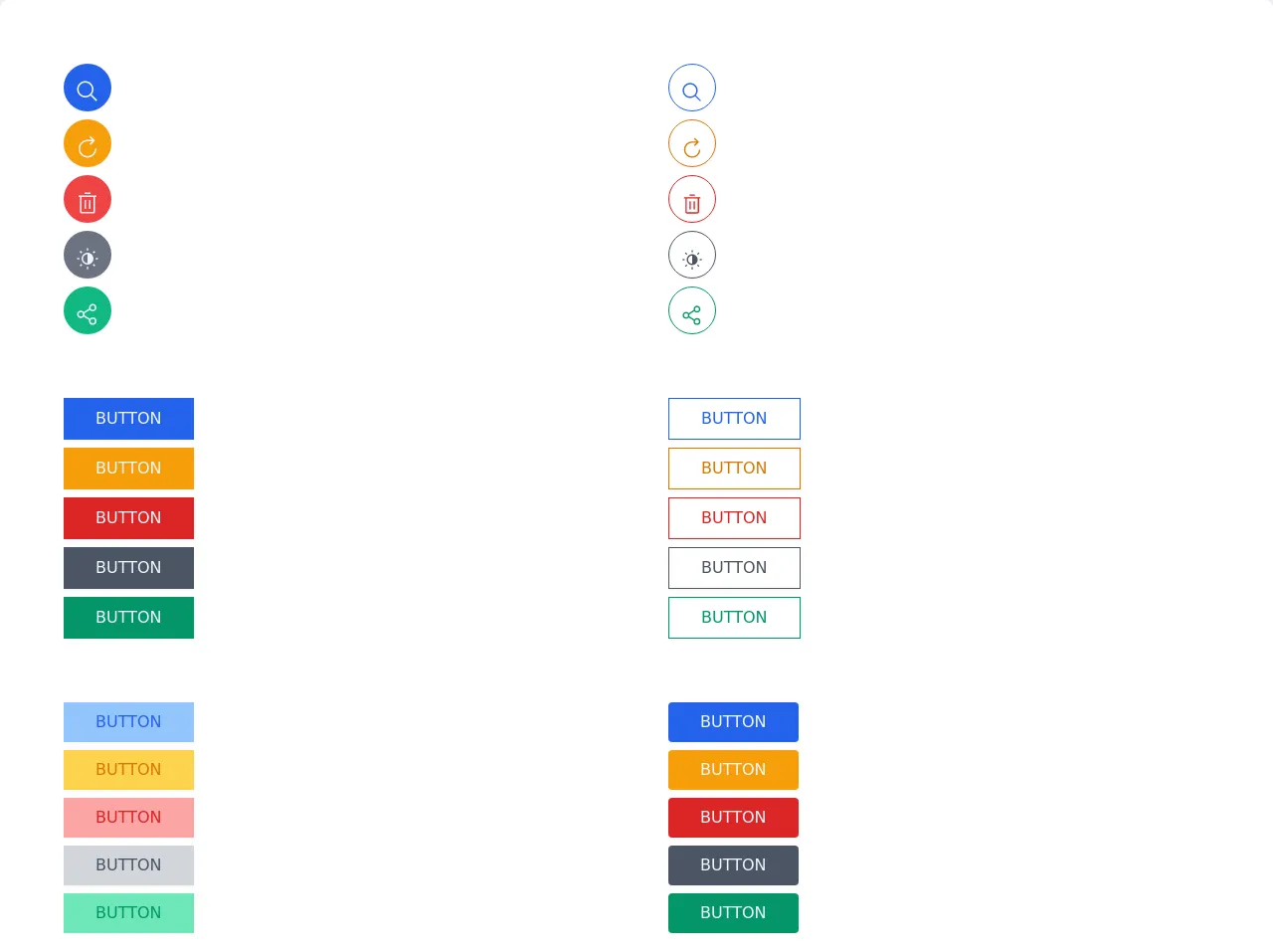
The preview of buttons-shapes-variants ui component
Buttons-shapes-variants can be designed in various shapes, sizes, and colors. They can be flat, raised, or outlined. The preview of buttons-shapes-variants created with Tailwind CSS can be seen in the following image.
Free download of the buttons-shapes-variants's source code
The source code of buttons-shapes-variants ui component
The source code for creating buttons-shapes-variants with Tailwind CSS is straightforward. It involves defining the button's shape, size, and color using pre-defined classes. The code for creating buttons-shapes-variants with Tailwind CSS can be seen in the following code block.
<!-- This is an example component -->
<div class="w-full">
	<div class='grid gap-16 grid-cols-2 w-full bg-white shadow-lg rounded-lg p-16 overflow-hidden mx-auto'>


		<div class="grid gap-2">

			<button class="uppercase p-3 flex items-center bg-blue-600 text-blue-50 max-w-max shadow-sm hover:shadow-lg rounded-full w-12 h-12 ">
				<svg width="32" height="32"  viewBox="0 0 32 32" style="transform: rotate(360deg);"><path d="M29 27.586l-7.552-7.552a11.018 11.018 0 1 0-1.414 1.414L27.586 29zM4 13a9 9 0 1 1 9 9a9.01 9.01 0 0 1-9-9z" fill="currentColor"></path></svg>
			</button>

			<button class="uppercase p-3 flex items-center bg-yellow-500 text-blue-50 max-w-max shadow-sm hover:shadow-lg rounded-full w-12 h-12 ">
				<svg  width="32" height="32" preserveAspectRatio="xMidYMid meet" viewBox="0 0 32 32" style="transform: rotate(360deg);"><path d="M26 18A10 10 0 1 1 16 8h6.182l-3.584 3.585L20 13l6-6l-6-6l-1.402 1.414L22.185 6H16a12 12 0 1 0 12 12z" fill="currentColor"></path></svg>
				</button>
			<button class="uppercase p-3 flex items-center bg-red-500 text-blue-50 max-w-max shadow-sm hover:shadow-lg rounded-full w-12 h-12 ">
			<svg width="32" height="32" preserveAspectRatio="xMidYMid meet" viewBox="0 0 32 32" style="transform: rotate(360deg);"><path d="M12 12h2v12h-2z" fill="currentColor"></path><path d="M18 12h2v12h-2z" fill="currentColor"></path><path d="M4 6v2h2v20a2 2 0 0 0 2 2h16a2 2 0 0 0 2-2V8h2V6zm4 22V8h16v20z" fill="currentColor"></path><path d="M12 2h8v2h-8z" fill="currentColor"></path></svg>
					</button>
			<button class="uppercase p-3 flex items-center bg-gray-500 text-blue-50 max-w-max shadow-sm hover:shadow-lg rounded-full w-12 h-12 ">
<svg  width="32" height="32" preserveAspectRatio="xMidYMid meet" viewBox="0 0 32 32" style="transform: rotate(360deg);"><path d="M15 2h2v3h-2z" fill="currentColor"></path><path d="M27 15h3v2h-3z" fill="currentColor"></path><path d="M15 27h2v3h-2z" fill="currentColor"></path><path d="M2 15h3v2H2z" fill="currentColor"></path><path d="M5.45 6.884l1.414-1.415l2.121 2.122l-1.414 1.414z" fill="currentColor"></path><path d="M23 7.58l2.121-2.12l1.414 1.414l-2.121 2.121z" fill="currentColor"></path><path d="M23.002 24.416l1.415-1.414l2.12 2.122l-1.413 1.414z" fill="currentColor"></path><path d="M5.47 25.13L7.59 23L9 24.42l-2.12 2.12l-1.41-1.41z" fill="currentColor"></path><path d="M16 8a8 8 0 1 0 8 8a8 8 0 0 0-8-8zm0 14a6 6 0 0 1 0-12z" fill="currentColor"></path></svg>
					</button>
			<button class="uppercase p-3 flex items-center bg-green-500 text-blue-50 max-w-max shadow-sm hover:shadow-lg rounded-full w-12 h-12 ">
				<svg  width="32" height="32"  viewBox="0 0 32 32" style="transform: rotate(360deg);"><path d="M23 20a5 5 0 0 0-3.89 1.89l-7.31-4.57a4.46 4.46 0 0 0 0-2.64l7.31-4.57A5 5 0 1 0 18 7a4.79 4.79 0 0 0 .2 1.32l-7.31 4.57a5 5 0 1 0 0 6.22l7.31 4.57A4.79 4.79 0 0 0 18 25a5 5 0 1 0 5-5zm0-16a3 3 0 1 1-3 3a3 3 0 0 1 3-3zM7 19a3 3 0 1 1 3-3a3 3 0 0 1-3 3zm16 9a3 3 0 1 1 3-3a3 3 0 0 1-3 3z" fill="currentColor"></path></svg>					</button>
		</div>

			<div class="grid gap-2">

			<button class="uppercase p-3 flex items-center border border-blue-600 text-blue-600 max-w-max shadow-sm hover:shadow-lg rounded-full w-12 h-12 ">
				<svg width="32" height="32"  viewBox="0 0 32 32" style="transform: rotate(360deg);"><path d="M29 27.586l-7.552-7.552a11.018 11.018 0 1 0-1.414 1.414L27.586 29zM4 13a9 9 0 1 1 9 9a9.01 9.01 0 0 1-9-9z" fill="currentColor"></path></svg>
			</button>

			<button class="uppercase p-3 flex items-center border border-yellow-600 text-yellow-600 max-w-max shadow-sm hover:shadow-lg rounded-full w-12 h-12 ">
				<svg  width="32" height="32" preserveAspectRatio="xMidYMid meet" viewBox="0 0 32 32" style="transform: rotate(360deg);"><path d="M26 18A10 10 0 1 1 16 8h6.182l-3.584 3.585L20 13l6-6l-6-6l-1.402 1.414L22.185 6H16a12 12 0 1 0 12 12z" fill="currentColor"></path></svg>
				</button>
			<button class="uppercase p-3 flex items-center  border border-red-600 text-red-600 max-w-max shadow-sm hover:shadow-lg rounded-full w-12 h-12 ">
			<svg width="32" height="32" preserveAspectRatio="xMidYMid meet" viewBox="0 0 32 32" style="transform: rotate(360deg);"><path d="M12 12h2v12h-2z" fill="currentColor"></path><path d="M18 12h2v12h-2z" fill="currentColor"></path><path d="M4 6v2h2v20a2 2 0 0 0 2 2h16a2 2 0 0 0 2-2V8h2V6zm4 22V8h16v20z" fill="currentColor"></path><path d="M12 2h8v2h-8z" fill="currentColor"></path></svg>
					</button>
			<button class="uppercase p-3 flex items-center  border border-gray-600 text-gray-600 max-w-max shadow-sm hover:shadow-lg rounded-full w-12 h-12 ">
<svg  width="32" height="32" preserveAspectRatio="xMidYMid meet" viewBox="0 0 32 32" style="transform: rotate(360deg);"><path d="M15 2h2v3h-2z" fill="currentColor"></path><path d="M27 15h3v2h-3z" fill="currentColor"></path><path d="M15 27h2v3h-2z" fill="currentColor"></path><path d="M2 15h3v2H2z" fill="currentColor"></path><path d="M5.45 6.884l1.414-1.415l2.121 2.122l-1.414 1.414z" fill="currentColor"></path><path d="M23 7.58l2.121-2.12l1.414 1.414l-2.121 2.121z" fill="currentColor"></path><path d="M23.002 24.416l1.415-1.414l2.12 2.122l-1.413 1.414z" fill="currentColor"></path><path d="M5.47 25.13L7.59 23L9 24.42l-2.12 2.12l-1.41-1.41z" fill="currentColor"></path><path d="M16 8a8 8 0 1 0 8 8a8 8 0 0 0-8-8zm0 14a6 6 0 0 1 0-12z" fill="currentColor"></path></svg>
					</button>
			<button class="uppercase p-3 flex items-center  border border-green-600 text-green-600 max-w-max shadow-sm hover:shadow-lg rounded-full w-12 h-12 ">
				<svg  width="32" height="32"  viewBox="0 0 32 32" style="transform: rotate(360deg);"><path d="M23 20a5 5 0 0 0-3.89 1.89l-7.31-4.57a4.46 4.46 0 0 0 0-2.64l7.31-4.57A5 5 0 1 0 18 7a4.79 4.79 0 0 0 .2 1.32l-7.31 4.57a5 5 0 1 0 0 6.22l7.31 4.57A4.79 4.79 0 0 0 18 25a5 5 0 1 0 5-5zm0-16a3 3 0 1 1-3 3a3 3 0 0 1 3-3zM7 19a3 3 0 1 1 3-3a3 3 0 0 1-3 3zm16 9a3 3 0 1 1 3-3a3 3 0 0 1-3 3z" fill="currentColor"></path></svg>					</button>
		</div>
		<div class="grid gap-2">

			<button class="uppercase px-8 py-2 bg-blue-600 text-blue-50 max-w-max shadow-sm hover:shadow-lg">button</button>
			<button class="uppercase px-8 py-2 bg-yellow-500 text-blue-50 max-w-max shadow-sm hover:shadow-lg">button</button>
			<button class="uppercase px-8 py-2 bg-red-600 text-blue-50 max-w-max shadow-sm hover:shadow-lg">button</button>
			<button class="uppercase px-8 py-2 bg-gray-600 text-blue-50 max-w-max shadow-sm hover:shadow-lg">button</button>
			<button class="uppercase px-8 py-2 bg-green-600 text-blue-50 max-w-max shadow-sm hover:shadow-lg">button</button>

		</div>
		<div class="grid gap-2">
			<button class="uppercase px-8 py-2 border border-blue-600 text-blue-600 max-w-max shadow-sm hover:shadow-lg">button</button>
			<button class="uppercase px-8 py-2 border border-yellow-600 text-yellow-600 max-w-max shadow-sm hover:shadow-lg">button</button>
			<button class="uppercase px-8 py-2 border border-red-600 text-red-600 max-w-max shadow-sm hover:shadow-lg">button</button>
			<button class="uppercase px-8 py-2 border border-gray-600 text-gray-600 max-w-max shadow-sm hover:shadow-lg">button</button>
			<button class="uppercase px-8 py-2 border border-green-600 text-green-600 max-w-max shadow-sm hover:shadow-lg">button</button>

		</div>
		<div class="grid gap-2">

			<button class="uppercase px-8 py-2 bg-blue-300 text-blue-600 max-w-max shadow-sm hover:shadow-lg">button</button>
			<button class="uppercase px-8 py-2 bg-yellow-300 text-yellow-600 max-w-max shadow-sm hover:shadow-lg">button</button>
			<button class="uppercase px-8 py-2 bg-red-300 text-red-600 max-w-max shadow-sm hover:shadow-lg">button</button>
			<button class="uppercase px-8 py-2 bg-gray-300 text-gray-600 max-w-max shadow-sm hover:shadow-lg">button</button>
			<button class="uppercase px-8 py-2 bg-green-300 text-green-600 max-w-max shadow-sm hover:shadow-lg">button</button>

		</div>
		<div class="grid gap-2">

			<button class="uppercase px-8 py-2 rounded bg-blue-600 text-blue-50 max-w-max shadow-sm hover:shadow-lg">button</button>
			<button class="uppercase px-8 py-2 rounded bg-yellow-500 text-blue-50 max-w-max shadow-sm hover:shadow-lg">button</button>
			<button class="uppercase px-8 py-2 rounded bg-red-600 text-blue-50 max-w-max shadow-sm hover:shadow-lg">button</button>
			<button class="uppercase px-8 py-2 rounded bg-gray-600 text-blue-50 max-w-max shadow-sm hover:shadow-lg">button</button>
			<button class="uppercase px-8 py-2 rounded bg-green-600 text-blue-50 max-w-max shadow-sm hover:shadow-lg">button</button>

		</div>
		<div class="grid gap-2">
			<button class="uppercase px-8 py-2 rounded border border-blue-600 text-blue-600 max-w-max shadow-sm hover:shadow-lg">button</button>
			<button class="uppercase px-8 py-2 rounded border border-yellow-600 text-yellow-600 max-w-max shadow-sm hover:shadow-lg">button</button>
			<button class="uppercase px-8 py-2 rounded border border-red-600 text-red-600 max-w-max shadow-sm hover:shadow-lg">button</button>
			<button class="uppercase px-8 py-2 rounded border border-gray-600 text-gray-600 max-w-max shadow-sm hover:shadow-lg">button</button>
			<button class="uppercase px-8 py-2 rounded border border-green-600 text-green-600 max-w-max shadow-sm hover:shadow-lg">button</button>

		</div>
		<div class="grid gap-2">

			<button class="uppercase px-8 py-2 rounded bg-blue-300 text-blue-600 max-w-max shadow-sm hover:shadow-lg">button</button>
			<button class="uppercase px-8 py-2 rounded bg-yellow-300 text-yellow-600 max-w-max shadow-sm hover:shadow-lg">button</button>
			<button class="uppercase px-8 py-2 rounded bg-red-300 text-red-600 max-w-max shadow-sm hover:shadow-lg">button</button>
			<button class="uppercase px-8 py-2 rounded bg-gray-300 text-gray-600 max-w-max shadow-sm hover:shadow-lg">button</button>
			<button class="uppercase px-8 py-2 rounded bg-green-300 text-green-600 max-w-max shadow-sm hover:shadow-lg">button</button>

		</div>

		<div class="grid gap-2">

			<button class="uppercase px-8 py-2 rounded-full bg-blue-600 text-blue-50 max-w-max shadow-sm hover:shadow-lg">button</button>
			<button class="uppercase px-8 py-2 rounded-full bg-yellow-500 text-blue-50 max-w-max shadow-sm hover:shadow-lg">button</button>
			<button class="uppercase px-8 py-2 rounded-full bg-red-600 text-blue-50 max-w-max shadow-sm hover:shadow-lg">button</button>
			<button class="uppercase px-8 py-2 rounded-full bg-gray-600 text-blue-50 max-w-max shadow-sm hover:shadow-lg">button</button>
			<button class="uppercase px-8 py-2 rounded-full bg-green-600 text-blue-50 max-w-max shadow-sm hover:shadow-lg">button</button>

		</div>
		<div class="grid gap-2">
			<button class="uppercase px-8 py-2 rounded-full border border-blue-600 text-blue-600 max-w-max shadow-sm hover:shadow-lg">button</button>
			<button class="uppercase px-8 py-2 rounded-full border border-yellow-600 text-yellow-600 max-w-max shadow-sm hover:shadow-lg">button</button>
			<button class="uppercase px-8 py-2 rounded-full border border-red-600 text-red-600 max-w-max shadow-sm hover:shadow-lg">button</button>
			<button class="uppercase px-8 py-2 rounded-full border border-gray-600 text-gray-600 max-w-max shadow-sm hover:shadow-lg">button</button>
			<button class="uppercase px-8 py-2 rounded-full border border-green-600 text-green-600 max-w-max shadow-sm hover:shadow-lg">button</button>

		</div>
		<div class="grid gap-2">

			<button class="uppercase px-8 py-2 rounded-full bg-blue-300 text-blue-600 max-w-max shadow-sm hover:shadow-lg">button</button>
			<button class="uppercase px-8 py-2 rounded-full bg-yellow-300 text-yellow-600 max-w-max shadow-sm hover:shadow-lg">button</button>
			<button class="uppercase px-8 py-2 rounded-full bg-red-300 text-red-600 max-w-max shadow-sm hover:shadow-lg">button</button>
			<button class="uppercase px-8 py-2 rounded-full bg-gray-300 text-gray-600 max-w-max shadow-sm hover:shadow-lg">button</button>
			<button class="uppercase px-8 py-2 rounded-full bg-green-300 text-green-600 max-w-max shadow-sm hover:shadow-lg">button</button>

		</div>


	</div>
</div>
</div>
How to create a buttons-shapes-variants with Tailwind CSS?
Creating buttons-shapes-variants with Tailwind CSS involves the following steps:
Step 1: Install Tailwind CSS
The first step is to install Tailwind CSS in your project. You can do this by using npm or Yarn.
npm install tailwindcss
Step 2: Create a CSS file
Create a CSS file in your project and import Tailwind CSS.
@import 'tailwindcss/base';
@import 'tailwindcss/components';
@import 'tailwindcss/utilities';
Step 3: Define the button's shape
To define the button's shape, use the rounded class. The rounded class can be used to create buttons with rounded corners.
<button class="rounded">Button</button>
Step 4: Define the button's size
To define the button's size, use the px and py classes. The px class can be used to set the button's horizontal padding, and the py class can be used to set the button's vertical padding.
<button class="px-4 py-2">Button</button>
Step 5: Define the button's color
To define the button's color, use the bg and text classes. The bg class can be used to set the button's background color, and the text class can be used to set the button's text color.
<button class="px-4 py-2 bg-blue-500 text-white">Button</button>
Step 6: Add button variants
Tailwind CSS provides several button variants, including flat, raised, and outlined. To add a button variant, use the hover: and focus: classes.
<button class="px-4 py-2 bg-blue-500 text-white rounded hover:bg-blue-700 focus:bg-blue-700">Button</button>
Conclusion
Creating buttons-shapes-variants with Tailwind CSS is a straightforward process. Tailwind CSS provides a set of pre-defined classes that can be used to create buttons with different shapes, sizes, and colors. Using Tailwind CSS can save a lot of time and effort compared to writing custom CSS. With Tailwind CSS, developers can create unique designs without sacrificing performance or maintainability.