- Published on
Here Are 6 Ways To Create A Button With Font Awesome With Tailwind CSS
- What is Tailwind CSS?
- The description of Button with Font Awesome ui component
- Why use Tailwind CSS to create a Button with Font Awesome ui component?
- The preview of Button with Font Awesome ui component.
- The source code of Button with Font Awesome ui component.
- How to create a Button with Font Awesome with Tailwind CSS?
- 1. Basic Button
- 2. Button with Icon on the Left
- 3. Button with Icon on the Right
- 4. Button with Only Icon
- 5. Button with Different Icon
- 6. Button with Custom Color
- Conclusion
What is Tailwind CSS?
Tailwind CSS is a utility-first CSS framework that allows you to create custom designs without having to write any CSS code. It provides a set of pre-defined classes that you can use to style your HTML elements. With Tailwind CSS, you can create responsive designs, custom color schemes, and much more.
The description of Button with Font Awesome ui component
Buttons are one of the most commonly used UI components in web development. They are used to trigger an action, such as submitting a form or navigating to a new page. Font Awesome is a popular icon library that provides a wide range of icons that you can use in your web projects. By combining Font Awesome with Tailwind CSS, you can create beautiful buttons with icons in just a few lines of code.
Why use Tailwind CSS to create a Button with Font Awesome ui component?
Tailwind CSS provides a set of pre-defined classes that you can use to style your HTML elements. This makes it easy to create custom designs without having to write any CSS code. Font Awesome provides a wide range of icons that you can use in your web projects. By combining these two tools, you can create beautiful buttons with icons in just a few lines of code.
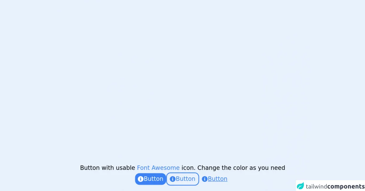
The preview of Button with Font Awesome ui component.
In this section, we will preview what the Button with Font Awesome ui component will look like.
Free download of the Button with Font Awesome's source code
The source code of Button with Font Awesome ui component.
In this section, we will provide the source code for creating a Button with Font Awesome ui component.
<head>
    <link rel="stylesheet" href="https://use.fontawesome.com/releases/v5.15.4/css/all.css" integrity="sha384-DyZ88mC6Up2uqS4h/KRgHuoeGwBcD4Ng9SiP4dIRy0EXTlnuz47vAwmeGwVChigm" crossorigin="anonymous">
</head>
<div class="flex flex-col items-center justify-center gap-4 ">
    <p>
        Button with usable <a class="text-blue-500" href="https://fontawesome.com/v5.15/icons?d=gallery&p=2&m=free">Font Awesome</a> icon. Change the color as you need
    </p>
    <div title="Button" class="flex flex-wrap justify-center items-center gap-2">
        <button type="Primary Block" class="flex flex-row items-center content-center justify-start gap-1 h-sm px-2 py-1 rounded-xl text-white bg-blue-500 active:text-gray-100 active:bg-blue-600 active:ring-0 focus:ring-offset-2 focus:ring">
            <div class="fas fa-info-circle"></div>
            <p class="">Button</p>
        </button>
        <button type="Primary Outline" class="flex flex-row items-center content-center justify-start gap-1 h-sm px-2 py-1 rounded-xl border-2 border-blue-500 text-blue-500 active:border-blue-600 active:text-blue-600 active:bg-blue-50 active:ring-0 focus:ring-offset-2 focus:ring">
            <div class="fas fa-info-circle"></div>
            <p class="">Button</p>
        </button>
        <button type="Primary Underline" class="flex flex-row items-center content-center justify-start gap-1 h-sm px-2 py-1 rounded-xl text-blue-500 focus:text-blue-600">
            <div class="fas fa-info-circle"></div>
            <p class="underline">Button</p>
        </button>
    </div>
</div>
How to create a Button with Font Awesome with Tailwind CSS?
Here are 6 ways to create a Button with Font Awesome with Tailwind CSS:
1. Basic Button
The basic button is the simplest way to create a button with Font Awesome and Tailwind CSS. To create a basic button, you can use the following code:
<button class="bg-blue-500 hover:bg-blue-700 text-white font-bold py-2 px-4 rounded">
  <i class="fa fa-user"></i> Button Text
</button>
2. Button with Icon on the Left
To create a button with an icon on the left, you can use the following code:
<button class="bg-blue-500 hover:bg-blue-700 text-white font-bold py-2 px-4 rounded">
  <i class="fa fa-user"></i> Button Text
</button>
3. Button with Icon on the Right
To create a button with an icon on the right, you can use the following code:
<button class="bg-blue-500 hover:bg-blue-700 text-white font-bold py-2 px-4 rounded">
  Button Text <i class="fa fa-user"></i>
</button>
4. Button with Only Icon
To create a button with only an icon, you can use the following code:
<button class="bg-blue-500 hover:bg-blue-700 text-white font-bold py-2 px-4 rounded">
  <i class="fa fa-user"></i>
</button>
5. Button with Different Icon
To create a button with a different icon, you can replace the "fa fa-user" class with the class of the desired icon. For example, to use a "fa fa-envelope" icon, you can use the following code:
<button class="bg-blue-500 hover:bg-blue-700 text-white font-bold py-2 px-4 rounded">
  <i class="fa fa-envelope"></i> Button Text
</button>
6. Button with Custom Color
To create a button with a custom color, you can replace the "bg-blue-500" class with the class of the desired color. For example, to use a green color, you can use the following code:
<button class="bg-green-500 hover:bg-green-700 text-white font-bold py-2 px-4 rounded">
  <i class="fa fa-user"></i> Button Text
</button>
Conclusion
In this article, we have discussed how to create a Button with Font Awesome with Tailwind CSS. We have provided 6 different ways to create a button with an icon and custom styling. By using Tailwind CSS and Font Awesome, you can create beautiful buttons with icons in just a few lines of code.