- Published on
Learn How To Create A Button With Icon With Tailwind CSS Like an Expert
- What is Tailwind CSS?
- The description of Button with icon ui component
- Why use Tailwind CSS to create a Button with icon ui component?
- The preview of Button with icon ui component.
- The source code of Button with icon ui component.
- How to create a Button with icon with Tailwind CSS?
- Conclusion
In the world of web development, creating a button with an icon is a common task that requires a lot of effort. But with the help of Tailwind CSS, it becomes very easy to create a button with an icon. In this article, we will learn how to create a button with an icon using Tailwind CSS.
What is Tailwind CSS?
Tailwind CSS is a utility-first CSS framework that allows you to quickly build custom user interfaces. It provides a set of pre-defined CSS classes that you can use to create a responsive and mobile-first design. With Tailwind CSS, you can easily create complex layouts and components without writing any custom CSS.
The description of Button with icon ui component
A button with an icon is a user interface component that is commonly used in web applications. It consists of a button element with an icon that represents an action or function. The icon is usually placed on the left or right side of the button text.
Why use Tailwind CSS to create a Button with icon ui component?
Tailwind CSS provides a set of pre-defined CSS classes that you can use to create a button with an icon. This saves you a lot of time and effort that would otherwise be spent on writing custom CSS. With Tailwind CSS, you can easily customize the button's size, color, font, and other properties.
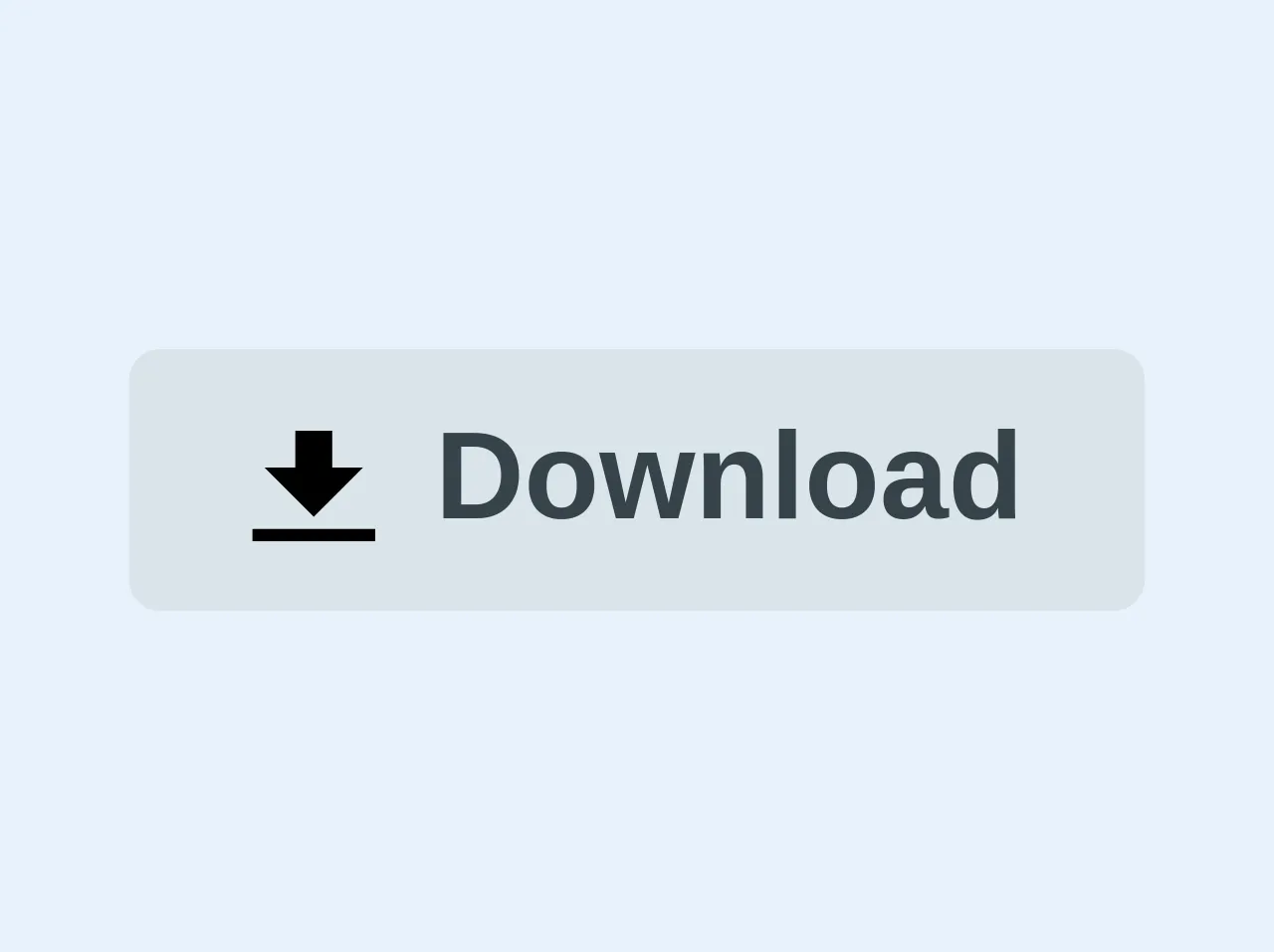
The preview of Button with icon ui component.
To create a button with an icon using Tailwind CSS, we will use the following HTML code:
<button class="bg-blue-500 hover:bg-blue-700 text-white font-bold py-2 px-4 rounded">
  <i class="fa fa-user"></i> {{__placeholder1__}}
</button>
Free download of the Button with icon's source code
The source code of Button with icon ui component.
To create a button with an icon using Tailwind CSS, we will use the following HTML code:
<button class="bg-blue-500 hover:bg-blue-700 text-white font-bold py-2 px-4 rounded">
  <i class="fa fa-user"></i> Sign In
</button>
<button class="bg-grey-light hover:bg-grey text-grey-darkest font-bold py-2 px-4 rounded inline-flex items-center">
  <svg class="w-4 h-4 mr-2" xmlns="http://www.w3.org/2000/svg" viewBox="0 0 20 20"><path d="M13 8V2H7v6H2l8 8 8-8h-5zM0 18h20v2H0v-2z"/></svg>
  <span>Download</span>
</button>
How to create a Button with icon with Tailwind CSS?
To create a button with an icon using Tailwind CSS, follow these steps:
- Add the Tailwind CSS CDN to your HTML file.
<link href="https://cdn.jsdelivr.net/npm/tailwindcss@latest/dist/tailwind.min.css" rel="stylesheet">
- Add the button element to your HTML file.
<button class="bg-blue-500 hover:bg-blue-700 text-white font-bold py-2 px-4 rounded">
  <i class="fa fa-user"></i> Sign In
</button>
- Customize the button's properties using Tailwind CSS classes.
<button class="bg-blue-500 hover:bg-blue-700 text-white font-bold py-2 px-4 rounded">
  <i class="fa fa-user"></i> Sign In
</button>
In the above code, we have added the bg-blue-500 class to set the button's background color to blue. We have also added the hover:bg-blue-700 class to change the background color of the button when the mouse hovers over it. The text-white class sets the text color to white, and the font-bold class makes the text bold. The py-2 and px-4 classes set the padding of the button, and the rounded class makes the button's corners rounded.
- Add an icon to the button using Font Awesome.
<button class="bg-blue-500 hover:bg-blue-700 text-white font-bold py-2 px-4 rounded">
  <i class="fa fa-user"></i> Sign In
</button>
In the above code, we have added the Font Awesome icon class fa fa-user to the i element. This adds a user icon to the left of the button text.
- Customize the icon using Tailwind CSS classes.
<button class="bg-blue-500 hover:bg-blue-700 text-white font-bold py-2 px-4 rounded">
  <i class="fa fa-user mr-2"></i> Sign In
</button>
In the above code, we have added the mr-2 class to the i element. This adds a margin of 2 pixels to the right of the icon, which separates it from the button text.
Conclusion
In this article, we have learned how to create a button with an icon using Tailwind CSS. We have seen how Tailwind CSS provides a set of pre-defined CSS classes that you can use to create a responsive and mobile-first design. With Tailwind CSS, you can easily customize the button's size, color, font, and other properties. We hope this article has been helpful to you in creating your own button with an icon using Tailwind CSS.