- Published on
Best Ways To Make A Button With Counter With Tailwind CSS
- What is Tailwind CSS?
- The description of Button with counter ui component
- Why use Tailwind CSS to create a Button with counter ui component?
- The preview of Button with counter ui component
- The source code of Button with counter ui component
- How to create a Button with counter with Tailwind CSS?
- Conclusion
In today's world, where everything is digital, buttons play a vital role in user interface design. Buttons with counters are becoming increasingly popular as they provide users with a way to keep track of their activities. In this article, we will discuss the best ways to make a button with a counter using Tailwind CSS.
What is Tailwind CSS?
Tailwind CSS is a utility-first CSS framework that provides a set of pre-defined classes to create custom designs quickly. It is a low-level framework that allows developers to create designs that are easy to maintain and scale. Tailwind CSS comes with a lot of pre-defined classes that can be used to create different UI components.
The description of Button with counter ui component
A button with a counter is a UI component that displays a button with a counter that keeps track of the number of clicks on the button. This UI component is commonly used in e-commerce websites, social media platforms, and other web applications.
Why use Tailwind CSS to create a Button with counter ui component?
Tailwind CSS provides a set of pre-defined classes that can be used to create a button with a counter UI component quickly. These classes can be customized to match the design requirements of the application. Tailwind CSS also provides responsive design classes that can be used to create a responsive button with a counter UI component.
The preview of Button with counter ui component
To create a button with a counter UI component using Tailwind CSS, we will use the following classes:
- bg-blue-500: Sets the background color of the button to blue.
- text-white: Sets the text color of the button to white.
- px-4: Sets the padding of the button to 4 pixels.
- py-2: Sets the padding of the button to 2 pixels.
- rounded: Sets the border radius of the button to the default value.
- inline-flex: Sets the display property of the button to inline-flex.
- items-center: Centers the items inside the button.
- space-x-2: Sets the space between the button and the counter to 2 pixels.
- text-lg: Sets the font size of the counter to large.
Free download of the Button with counter's source code
The source code of Button with counter ui component
To create a button with a counter UI component using Tailwind CSS, we will use the following HTML and CSS code:
<div class="inline-flex items-center">
  <button class="bg-blue-500 text-white px-4 py-2 rounded">
    Click Me
  </button>
  <div class="bg-gray-200 px-2 py-1 rounded text-lg">
    0
  </div>
</div>
.space-x-2 > * + * {
  margin-left: 0.5rem;
}
<div>
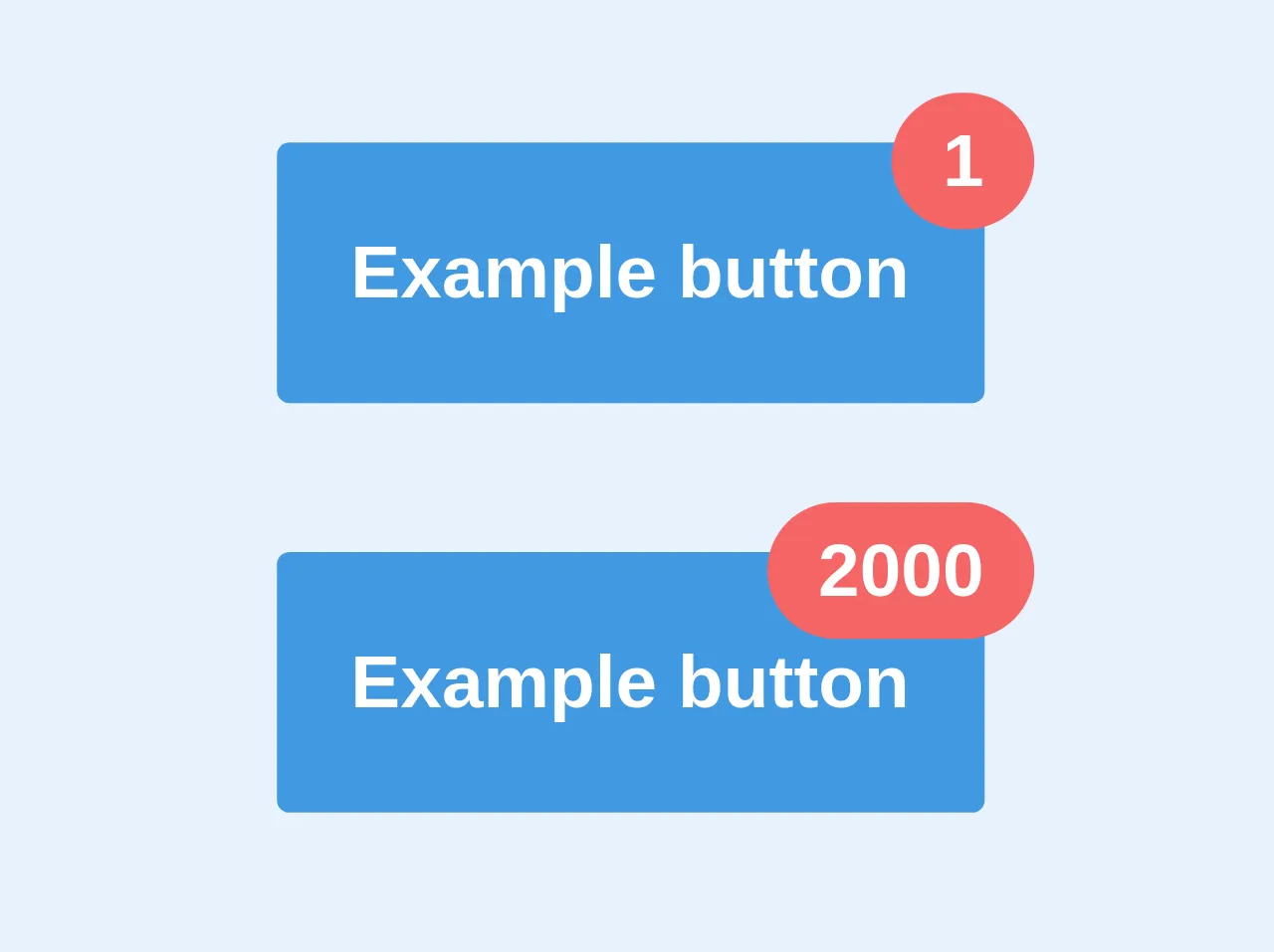
<button class='relative bg-blue-500 text-white p-6 rounded text-2xl font-bold overflow-visible'>
Example button
<div class="absolute top-0 right-0 -mt-4 -mr-4 px-4 py-1 bg-red-500 rounded-full">1</div>
</button>
<br/><br/><br/>
<button class='relative bg-blue-500 text-white p-6 rounded text-2xl font-bold overflow-visible'>
Example button
<div class="absolute top-0 right-0 -mt-4 -mr-4 px-4 py-1 bg-red-500 rounded-full">2000</div>
</button>
</div>
How to create a Button with counter with Tailwind CSS?
To create a button with a counter UI component using Tailwind CSS, follow these steps:
- Create a new HTML file and add the following code:
<!DOCTYPE html>
<html lang="en">
  <head>
    <meta charset="UTF-8" />
    <meta name="viewport" content="width=device-width, initial-scale=1.0" />
    <meta http-equiv="X-UA-Compatible" content="ie=edge" />
    <title>Button with Counter</title>
    <link rel="stylesheet" href="https://cdnjs.cloudflare.com/ajax/libs/tailwindcss/2.2.7/tailwind.min.css" />
  </head>
  <body>
    <div class="inline-flex items-center">
      <button class="bg-blue-500 text-white px-4 py-2 rounded">
        Click Me
      </button>
      <div class="bg-gray-200 px-2 py-1 rounded text-lg">
        0
      </div>
    </div>
  </body>
</html>
Open the HTML file in a web browser to see the button with the counter UI component.
To customize the UI component, you can modify the classes used in the HTML code. For example, you can change the background color of the button by changing the
bg-blue-500class tobg-red-500.
Conclusion
In conclusion, Tailwind CSS provides a set of pre-defined classes that can be used to create a button with a counter UI component quickly. This UI component is commonly used in e-commerce websites, social media platforms, and other web applications. By using Tailwind CSS, developers can create responsive and customizable UI components that are easy to maintain and scale.