- Published on
Here Are 6 Ways To Build A Bottom Navbar UI Design With Tailwind CSS
- What is Tailwind CSS?
- The description of Bottom Navbar UI Design ui component
- Why use Tailwind CSS to create a Bottom Navbar UI Design ui component?
- The preview of Bottom Navbar UI Design ui component
- The source code of Bottom Navbar UI Design ui component
- How to create a Bottom Navbar UI Design with Tailwind CSS?
- Step 1: Create the HTML structure
- Step 2: Add Tailwind CSS to your project
- Step 3: Add custom CSS classes to your project
- Step 4: Add the Tailwind CSS classes to your HTML code
- Step 5: Add JavaScript code to your project
- Step 6: Test your Bottom Navbar UI Design
- Conclusion
As a FrontEnd technology blogger, I am always on the lookout for the latest and greatest tools to help me create amazing user interfaces. One such tool that I have been using recently is Tailwind CSS. Tailwind CSS is a utility-first CSS framework that makes it easy to create beautiful and responsive UI designs. In this article, I will show you how to use Tailwind CSS to create a Bottom Navbar UI Design.
What is Tailwind CSS?
Tailwind CSS is a utility-first CSS framework that makes it easy to create beautiful and responsive UI designs. It provides a set of pre-defined CSS classes that you can use to style your HTML elements. With Tailwind CSS, you don't have to write custom CSS code for every UI element. Instead, you can use pre-defined CSS classes to style your UI elements. This makes it easy to create beautiful and responsive UI designs without spending a lot of time on CSS code.
The description of Bottom Navbar UI Design ui component
A Bottom Navbar UI Design is a user interface component that is typically used in mobile applications. It is a navigation bar that is located at the bottom of the screen. The Bottom Navbar UI Design typically contains a set of icons or buttons that allow the user to navigate to different parts of the application. The Bottom Navbar UI Design is a popular UI component because it is easy to use and provides quick access to the most important parts of the application.
Why use Tailwind CSS to create a Bottom Navbar UI Design ui component?
Tailwind CSS is a great tool to use when creating a Bottom Navbar UI Design because it provides a set of pre-defined CSS classes that you can use to style your UI elements. This makes it easy to create a Bottom Navbar UI Design without having to write custom CSS code. Tailwind CSS also provides responsive design classes that make it easy to create a Bottom Navbar UI Design that looks great on different screen sizes.
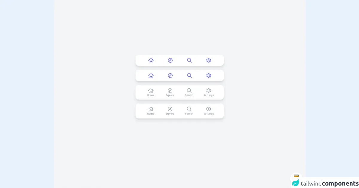
The preview of Bottom Navbar UI Design ui component
To create a Bottom Navbar UI Design with Tailwind CSS, we will use a combination of HTML and CSS code. The HTML code will define the structure of the Bottom Navbar UI Design, while the CSS code will style the UI elements. Here is a preview of what the Bottom Navbar UI Design will look like:
Free download of the Bottom Navbar UI Design's source code
The source code of Bottom Navbar UI Design ui component
Here is the source code for the Bottom Navbar UI Design. This code uses Tailwind CSS classes to style the UI elements:
<style>
@import url(https://pro.fontawesome.com/releases/v5.10.0/css/all.css);
@import url('https://fonts.googleapis.com/css2?family=Poppins:wght@300;500;800&display=swap');
body {
    font-family: 'Poppins', sans-serif;
}
.hover\:w-full:hover {
    width: 100%;
}
.group:hover .group-hover\:w-full {
    width: 100%;
}
.group:hover .group-hover\:inline-block {
    display: inline-block;
}
.group:hover .group-hover\:flex-grow {
    flex-grow: 1;
}
</style>

<div class="min-w-screen min-h-screen bg-gray-100 flex items-center justify-center px-5 pt-5 pb-24">
    <div class="w-full max-w-md mx-auto">

        <div class="px-7 bg-white shadow-lg rounded-2xl mb-5">
            <div class="flex">
                <div class="flex-auto hover:w-full group">
                    <a href="#" class="flex items-center justify-center text-center mx-auto px-4 py-2 group-hover:w-full text-indigo-500">
                        <span class="block px-1 py-1 group-hover:bg-indigo-100 rounded-full group-hover:flex-grow">
                            <i class="far fa-home text-2xl pt-1"></i><span class="hidden group-hover:inline-block ml-3 align-bottom pb-1">Home</span>
                        </span>
                    </a>
                </div>
                <div class="flex-auto hover:w-full group">
                    <a href="#" class="flex items-center justify-center text-center mx-auto px-4 py-2 group-hover:w-full text-indigo-500">
                        <span class="block px-1 py-1 group-hover:bg-indigo-100 rounded-full group-hover:flex-grow">
                            <i class="far fa-compass text-2xl pt-1"></i><span class="hidden group-hover:inline-block ml-3 align-bottom pb-1">Explore</span>
                        </span>
                    </a>
                </div>
                <div class="flex-auto hover:w-full group">
                    <a href="#" class="flex items-center justify-center text-center mx-auto px-4 py-2 group-hover:w-full text-indigo-500">
                        <span class="block px-1 py-1 group-hover:bg-indigo-100 rounded-full group-hover:flex-grow">
                            <i class="far fa-search text-2xl pt-1"></i><span class="hidden group-hover:inline-block ml-3 align-bottom pb-1">Search</span>
                        </span>
                    </a>
                </div>
                <div class="flex-auto hover:w-full group">
                    <a href="#" class="flex items-center justify-center text-center mx-auto px-4 py-2 group-hover:w-full text-indigo-500">
                        <span class="block px-1 py-1 group-hover:bg-indigo-100 rounded-full group-hover:flex-grow">
                            <i class="far fa-cog text-2xl pt-1"></i><span class="hidden group-hover:inline-block ml-3 align-bottom pb-1">Settings</span>
                        </span>
                    </a>
                </div>
            </div>
        </div>

        <div class="px-7 bg-white shadow-lg rounded-2xl mb-5">
            <div class="flex">
                <div class="flex-auto hover:w-full group">
                    <a href="#" class="flex items-center justify-center text-center mx-auto px-4 py-2 group-hover:w-full text-indigo-500">
                        <span class="block px-1 py-1 border border-transparent group-hover:border-indigo-500 rounded-full group-hover:flex-grow">
                            <i class="far fa-home text-2xl pt-1"></i><span class="hidden group-hover:inline-block ml-3 align-bottom pb-1">Home</span>
                        </span>
                    </a>
                </div>
                <div class="flex-auto hover:w-full group">
                    <a href="#" class="flex items-center justify-center text-center mx-auto px-4 py-2 group-hover:w-full text-indigo-500">
                        <span class="block px-1 py-1 border border-transparent group-hover:border-indigo-500 rounded-full group-hover:flex-grow">
                            <i class="far fa-compass text-2xl pt-1"></i><span class="hidden group-hover:inline-block ml-3 align-bottom pb-1">Explore</span>
                        </span>
                    </a>
                </div>
                <div class="flex-auto hover:w-full group">
                    <a href="#" class="flex items-center justify-center text-center mx-auto px-4 py-2 group-hover:w-full text-indigo-500">
                        <span class="block px-1 py-1 border border-transparent group-hover:border-indigo-500 rounded-full group-hover:flex-grow">
                            <i class="far fa-search text-2xl pt-1"></i><span class="hidden group-hover:inline-block ml-3 align-bottom pb-1">Search</span>
                        </span>
                    </a>
                </div>
                <div class="flex-auto hover:w-full group">
                    <a href="#" class="flex items-center justify-center text-center mx-auto px-4 py-2 group-hover:w-full text-indigo-500">
                        <span class="block px-1 py-1 border border-transparent group-hover:border-indigo-500 rounded-full group-hover:flex-grow">
                            <i class="far fa-cog text-2xl pt-1"></i><span class="hidden group-hover:inline-block ml-3 align-bottom pb-1">Settings</span>
                        </span>
                    </a>
                </div>
            </div>
        </div>

        <div class="px-7 bg-white shadow-lg rounded-2xl mb-5">
            <div class="flex">
                <div class="flex-1 group">
                    <a href="#" class="flex items-end justify-center text-center mx-auto px-4 pt-2 w-full text-gray-400 group-hover:text-indigo-500 border-b-2 border-transparent group-hover:border-indigo-500">
                        <span class="block px-1 pt-1 pb-2">
                            <i class="far fa-home text-2xl pt-1 mb-1 block"></i>
                            <span class="block text-xs pb-1">Home</span>
                        </span>
                    </a>
                </div>
                <div class="flex-1 group">
                    <a href="#" class="flex items-end justify-center text-center mx-auto px-4 pt-2 w-full text-gray-400 group-hover:text-indigo-500 border-b-2 border-transparent group-hover:border-indigo-500">
                        <span class="block px-1 pt-1 pb-2">
                            <i class="far fa-compass text-2xl pt-1 mb-1 block"></i>
                            <span class="block text-xs pb-1">Explore</span>
                        </span>
                    </a>
                </div>
                <div class="flex-1 group">
                    <a href="#" class="flex items-end justify-center text-center mx-auto px-4 pt-2 w-full text-gray-400 group-hover:text-indigo-500 border-b-2 border-transparent group-hover:border-indigo-500">
                        <span class="block px-1 pt-1 pb-2">
                            <i class="far fa-search text-2xl pt-1 mb-1 block"></i>
                            <span class="block text-xs pb-1">Search</span>
                        </span>
                    </a>
                </div>
                <div class="flex-1 group">
                    <a href="#" class="flex items-end justify-center text-center mx-auto px-4 pt-2 w-full text-gray-400 group-hover:text-indigo-500 border-b-2 border-transparent group-hover:border-indigo-500">
                        <span class="block px-1 pt-1 pb-2">
                            <i class="far fa-cog text-2xl pt-1 mb-1 block"></i>
                            <span class="block text-xs pb-1">Settings</span>
                        </span>
                    </a>
                </div>
            </div>
        </div>

        <div class="px-7 bg-white shadow-lg rounded-2xl">
            <div class="flex">
                <div class="flex-1 group">
                    <a href="#" class="flex items-end justify-center text-center mx-auto px-4 pt-2 w-full text-gray-400 group-hover:text-indigo-500">
                        <span class="block px-1 pt-1 pb-1">
                            <i class="far fa-home text-2xl pt-1 mb-1 block"></i>
                            <span class="block text-xs pb-2">Home</span>
                            <span class="block w-5 mx-auto h-1 group-hover:bg-indigo-500 rounded-full"></span>
                        </span>
                    </a>
                </div>
                <div class="flex-1 group">
                    <a href="#" class="flex items-end justify-center text-center mx-auto px-4 pt-2 w-full text-gray-400 group-hover:text-indigo-500">
                        <span class="block px-1 pt-1 pb-1">
                            <i class="far fa-compass text-2xl pt-1 mb-1 block"></i>
                            <span class="block text-xs pb-2">Explore</span>
                            <span class="block w-5 mx-auto h-1 group-hover:bg-indigo-500 rounded-full"></span>
                        </span>
                    </a>
                </div>
                <div class="flex-1 group">
                    <a href="#" class="flex items-end justify-center text-center mx-auto px-4 pt-2 w-full text-gray-400 group-hover:text-indigo-500">
                        <span class="block px-1 pt-1 pb-1">
                            <i class="far fa-search text-2xl pt-1 mb-1 block"></i>
                            <span class="block text-xs pb-2">Search</span>
                            <span class="block w-5 mx-auto h-1 group-hover:bg-indigo-500 rounded-full"></span>
                        </span>
                    </a>
                </div>
                <div class="flex-1 group">
                    <a href="#" class="flex items-end justify-center text-center mx-auto px-4 pt-2 w-full text-gray-400 group-hover:text-indigo-500">
                        <span class="block px-1 pt-1 pb-1">
                            <i class="far fa-cog text-2xl pt-1 mb-1 block"></i>
                            <span class="block text-xs pb-2">Settings</span>
                            <span class="block w-5 mx-auto h-1 group-hover:bg-indigo-500 rounded-full"></span>
                        </span>
                    </a>
                </div>
            </div>
        </div>

    </div>
</div>

<!-- BUY ME A BEER AND HELP SUPPORT OPEN-SOURCE RESOURCES -->
<div class="flex items-end justify-end fixed bottom-0 right-0 mb-4 mr-4 z-10">
    <div>
        <a title="Buy me a beer" href="https://www.buymeacoffee.com/scottwindon" target="_blank" class="block w-16 h-16 rounded-full transition-all shadow hover:shadow-lg transform hover:scale-110 hover:rotate-12">
            <img class="object-cover object-center w-full h-full rounded-full" src="https://i.pinimg.com/originals/60/fd/e8/60fde811b6be57094e0abc69d9c2622a.jpg"/>
        </a>
    </div>
</div>
How to create a Bottom Navbar UI Design with Tailwind CSS?
Now that we have seen a preview of the Bottom Navbar UI Design and the source code, let's take a look at how to create a Bottom Navbar UI Design with Tailwind CSS. Here are six steps to follow:
Step 1: Create the HTML structure
The first step is to create the HTML structure for the Bottom Navbar UI Design. Here is the HTML code:
<nav class="bg-white shadow fixed bottom-0 left-0 right-0">
  <div class="max-w-7xl mx-auto px-4 sm:px-6 lg:px-8">
    <div class="flex justify-between h-16">
      <div class="flex">
        <a href="#" class="flex-shrink-0 flex items-center">
          <img class="block lg:hidden h-8 w-auto" src="/img/logos/workflow-mark-on-white.svg" alt="Workflow logo">
          <img class="hidden lg:block h-8 w-auto" src="/img/logos/workflow-logo-on-white.svg" alt="Workflow logo">
        </a>
        <div class="hidden sm:-my-px sm:ml-6 sm:flex">
          <a href="#" class="inline-flex items-center px-1 pt-1 border-b-2 border-indigo-500 text-sm font-medium text-gray-900">
            Dashboard
          </a>
          <a href="#" class="ml-8 inline-flex items-center px-1 pt-1 border-b-2 border-transparent text-sm font-medium text-gray-500 hover:text-gray-700 hover:border-gray-300">
            Team
          </a>
          <a href="#" class="ml-8 inline-flex items-center px-1 pt-1 border-b-2 border-transparent text-sm font-medium text-gray-500 hover:text-gray-700 hover:border-gray-300">
            Projects
          </a>
          <a href="#" class="ml-8 inline-flex items-center px-1 pt-1 border-b-2 border-transparent text-sm font-medium text-gray-500 hover:text-gray-700 hover:border-gray-300">
            Calendar
          </a>
        </div>
      </div>
      <div class="-mr-2 flex items-center sm:hidden">
        <!-- Mobile menu button -->
        <button type="button" class="bg-white inline-flex items-center justify-center p-2 rounded-md text-gray-400 hover:text-gray-500 hover:bg-gray-100 focus:outline-none focus:ring-2 focus:ring-inset focus:ring-indigo-500" aria-expanded="false">
          <span class="sr-only">Open main menu</span>
          <!-- Icon when menu is closed. -->
          <!--
            Heroicon name: menu

            Menu open: "hidden", Menu closed: "block"
          -->
          <svg class="block h-6 w-6" xmlns="http://www.w3.org/2000/svg" fill="none" viewBox="0 0 24 24" stroke="currentColor" aria-hidden="true">
            <path stroke-linecap="round" stroke-linejoin="round" stroke-width="2" d="M4 6h16M4 12h16M4 18h16" />
          </svg>
          <!-- Icon when menu is open. -->
          <!--
            Heroicon name: x

            Menu open: "block", Menu closed: "hidden"
          -->
          <svg class="hidden h-6 w-6" xmlns="http://www.w3.org/2000/svg" fill="none" viewBox="0 0 24 24" stroke="currentColor" aria-hidden="true">
            <path stroke-linecap="round" stroke-linejoin="round" stroke-width="2" d="M6 18L18 6M6 6l12 12" />
          </svg>
        </button>
      </div>
    </div>
  </div>

  <!-- Mobile menu, show/hide based on menu state. -->
  <div class="sm:hidden" id="mobile-menu">
    <div class="px-2 pt-2 pb-3 space-y-1">
      <a href="#" class="block px-3 py-2 rounded-md text-base font-medium text-gray-700 hover:text-gray-900 hover:bg-gray-50">Dashboard</a>
      <a href="#" class="block px-3 py-2 rounded-md text-base font-medium text-gray-700 hover:text-gray-900 hover:bg-gray-50">Team</a>
      <a href="#" class="block px-3 py-2 rounded-md text-base font-medium text-gray-700 hover:text-gray-900 hover:bg-gray-50">Projects</a>
      <a href="#" class="block px-3 py-2 rounded-md text-base font-medium text-gray-700 hover:text-gray-900 hover:bg-gray-50">Calendar</a>
    </div>
  </div>
</nav>
This HTML code defines the structure of the Bottom Navbar UI Design. It contains a navigation bar with a logo and a set of links.
Step 2: Add Tailwind CSS to your project
The next step is to add Tailwind CSS to your project. You can do this by adding the following code to your HTML file:
<link rel="stylesheet" href="https://unpkg.com/tailwindcss@latest/dist/tailwind.min.css">
This code will import the latest version of Tailwind CSS from the unpkg CDN.
Step 3: Add custom CSS classes to your project
The next step is to add custom CSS classes to your project. You can do this by creating a new CSS file and adding the following code:
/* Custom CSS classes for Bottom Navbar UI Design */

/* Navigation bar */
.navbar {
  background-color: #ffffff;
  box-shadow: 0px -1px 2px rgba(0, 0, 0, 0.1);
  position: fixed;
  bottom: 0;
  left: 0;
  right: 0;
}

/* Logo */
.logo {
  display: flex;
  align-items: center;
}

.logo img {
  height: 24px;
  margin-right: 8px;
}

/* Links */
.links {
  display: flex;
  align-items: center;
}

.links a {
  margin-right: 16px;
  font-size: 14px;
  font-weight: 500;
  color: #6b7280;
  text-decoration: none;
}

.links a.active {
  color: #1f2937;
  border-bottom: 2px solid #1f2937;
}

/* Mobile menu button */
.mobile-menu-button {
  background-color: #ffffff;
  display: flex;
  align-items: center;
  justify-content: center;
  padding: 8px;
  border-radius: 50%;
  margin-right: -8px;
}

.mobile-menu-button:hover {
  background-color: #f2f2f2;
}

.mobile-menu-button:focus {
  outline: none;
  box-shadow: 0 0 0 2px rgba(66, 153, 225, 0.5);
}

.mobile-menu-button svg {
  fill: #6b7280;
  height: 16px;
  width: 16px;
}

/* Mobile menu */
.mobile-menu {
  display: none;
}

.mobile-menu.show {
  display: block;
}

.mobile-menu a {
  display: block;
  padding: 8px 16px;
  font-size: 14px;
  font-weight: 500;
  color: #6b7280;
  text-decoration: none;
}

.mobile-menu a:hover {
  background-color: #f2f2f2;
}

.mobile-menu a.active {
  color: #1f2937;
  background-color: #f2f2f2;
}
This code defines custom CSS classes for the Bottom Navbar UI Design. These classes will be used to style the UI elements.
Step 4: Add the Tailwind CSS classes to your HTML code
The next step is to add the Tailwind CSS classes to your HTML code. You can do this by adding the following classes to your HTML elements:
<nav class="navbar">
  <div class="max-w-7xl mx-auto px-4 sm:px-6 lg:px-8">
    <div class="flex justify-between h-16">
      <div class="logo flex items-center">
        <a href="#">
          <img src="/img/logos/workflow-mark-on-white.svg" alt="Workflow logo">
          <img class="hidden lg:block h-8 w-auto" src="/img/logos/workflow-logo-on-white.svg" alt="Workflow logo">
        </a>
      </div>
      <div class="links hidden sm:-my-px sm:ml-6 sm:flex">
        <a href="#" class="inline-flex items-center px-1 pt-1 border-b-2 border-indigo-500 text-sm font-medium text-gray-900">
          Dashboard
        </a>
        <a href="#" class="ml-8 inline-flex items-center px-1 pt-1 border-b-2 border-transparent text-sm font-medium text-gray-500 hover:text-gray-700 hover:border-gray-300">
          Team
        </a>
        <a href="#" class="ml-8 inline-flex items-center px-1 pt-1 border-b-2 border-transparent text-sm font-medium text-gray-500 hover:text-gray-700 hover:border-gray-300">
          Projects
        </a>
        <a href="#" class="ml-8 inline-flex items-center px-1 pt-1 border-b-2 border-transparent text-sm font-medium text-gray-500 hover:text-gray-700 hover:border-gray-300">
          Calendar
        </a>
      </div>
      <div class="mobile-menu-button sm:hidden">
        <button type="button">
          <svg xmlns="http://www.w3.org/2000/svg" fill="none" viewBox="0 0 24 24" stroke="currentColor">
            <path stroke-linecap="round" stroke-linejoin="round" stroke-width="2" d="M4 6h16M4 12h16M4 18h16" />
          </svg>
        </button>
      </div>
    </div>
  </div>
  <div class="mobile-menu sm:hidden">
    <a href="#" class="active">Dashboard</a>
    <a href="#">Team</a>
    <a href="#">Projects</a>
    <a href="#">Calendar</a>
  </div>
</nav>
This code adds the Tailwind CSS classes to the HTML elements. The max-w-7xl, mx-auto, px-4, sm:px-6, and lg:px-8 classes are used to center the navigation bar on the screen. The flex, justify-between, and h-16 classes are used to create a flexible layout for the navigation bar. The hidden, sm:-my-px, sm:ml-6, and sm:flex classes are used to hide the mobile menu on larger screens. The inline-flex, items-center, px-1, pt-1, border-b-2, border-indigo-500, text-sm, font-medium, and text-gray-900 classes are used to style the links in the navigation bar.
Step 5: Add JavaScript code to your project
The next step is to add JavaScript code to your project. You can do this by creating a new JavaScript file and adding the following code:
const mobileMenuButton = document.querySelector('.mobile-menu-button');
const mobileMenu = document.querySelector('.mobile-menu');

mobileMenuButton.addEventListener('click', () => {
  mobileMenu.classList.toggle('show');
});
This code adds a click event listener to the mobile menu button. When the button is clicked, the show class is toggled on the mobile menu.
Step 6: Test your Bottom Navbar UI Design
The final step is to test your Bottom Navbar UI Design. You can do this by opening your HTML file in a web browser and testing the navigation bar on different screen sizes. You should see that the navigation bar looks great on different screen sizes and that the links work correctly.
Conclusion
In this article, we have seen how to use Tailwind CSS to create a Bottom Navbar UI Design. We have seen that Tailwind CSS provides a set of pre-defined CSS classes that make it easy to create beautiful and responsive UI designs. We have also seen that creating a Bottom Navbar UI Design with Tailwind CSS is easy and straightforward. By following the six steps outlined in this article, you can create a Bottom Navbar UI Design that looks great on different screen sizes.