- Published on
6 Ideas To Help You Create A Bottom Icon Navigation Menu With Tailwind CSS Like A Pro
- What is Tailwind CSS?
- The description of Bottom Icon Navigation Menu UI component
- Why use Tailwind CSS to create a Bottom Icon Navigation Menu UI component?
- The preview of Bottom Icon Navigation Menu UI component
- The source code of Bottom Icon Navigation Menu UI component
- How to create a Bottom Icon Navigation Menu with Tailwind CSS?
- Step 1: Set up the HTML structure
- Step 2: Style the container element
- Step 3: Style the anchor elements
- Conclusion
In this article, we will explore how to create a Bottom Icon Navigation Menu UI component with Tailwind CSS. We will discuss what Tailwind CSS is, the benefits of using it to create UI components, and provide a step-by-step guide on how to create a Bottom Icon Navigation Menu with Tailwind CSS.
What is Tailwind CSS?
Tailwind CSS is a utility-first CSS framework that allows you to quickly and easily style your HTML elements using pre-defined classes. It provides a wide range of pre-defined classes that can be used to create complex UI components without writing custom CSS.
The description of Bottom Icon Navigation Menu UI component
A Bottom Icon Navigation Menu is a UI component that is commonly used in mobile applications. It consists of a horizontal bar at the bottom of the screen that contains icons representing different sections of the application. When a user taps on an icon, they are taken to the corresponding section of the application.
Why use Tailwind CSS to create a Bottom Icon Navigation Menu UI component?
Tailwind CSS provides a wide range of pre-defined classes that can be used to create complex UI components without writing custom CSS. This makes it easier and faster to create UI components, and also ensures that the components are consistent across the application.
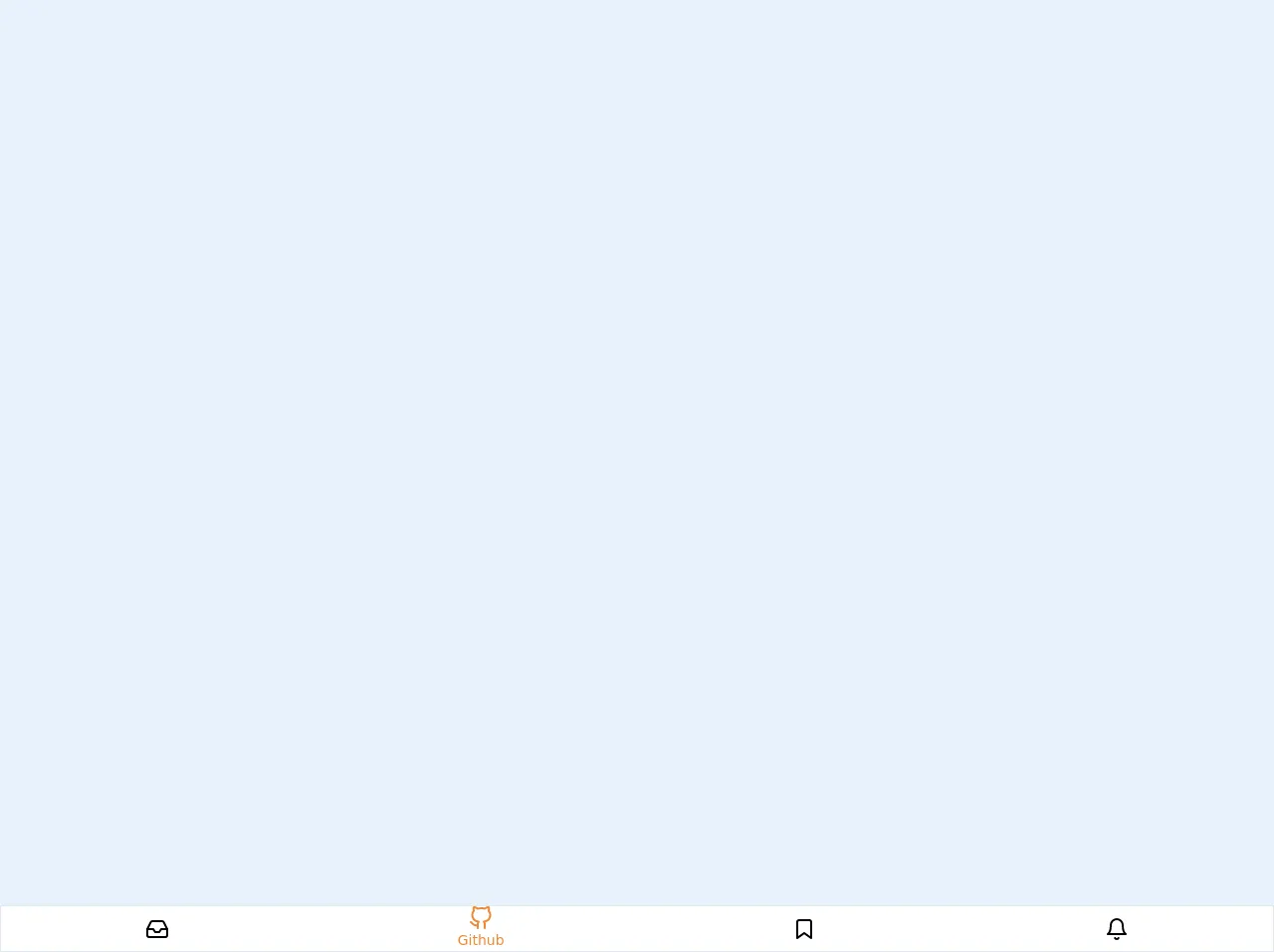
The preview of Bottom Icon Navigation Menu UI component
To create a Bottom Icon Navigation Menu, we will use a horizontal bar at the bottom of the screen that contains icons representing different sections of the application. When a user taps on an icon, they are taken to the corresponding section of the application.
Free download of the Bottom Icon Navigation Menu's source code
The source code of Bottom Icon Navigation Menu UI component
To create a Bottom Icon Navigation Menu, we will use HTML and CSS. We will define a container element that contains the icons, and use CSS to style the container and the icons.
<nav class="fixed bottom-0 w-full border bg-white flex overflow-x-auto">
	<a
		href="."
		class="flex flex-col flex-grow items-center justify-center
		overflow-hidden whitespace-no-wrap text-sm transition-colors duration-100
		ease-in-out hover:bg-gray-200 focus:text-orange-500">

		<svg
			xmlns="http://www.w3.org/2000/svg"
			width="24"
			height="24"
			viewBox="0 0 24 24"
			fill="none"
			stroke="currentColor"
			stroke-width="2"
			stroke-linecap="round"
			stroke-linejoin="round">
			<polyline points="22 12 16 12 14 15 10 15 8 12 2 12"></polyline>
			<path
				d="M5.45 5.11L2 12v6a2 2 0 0 0 2 2h16a2 2 0 0 0
				2-2v-6l-3.45-6.89A2 2 0 0 0 16.76 4H7.24a2 2 0 0 0-1.79 1.11z"></path>
		</svg>

		<span class="hidden text-sm capitalize">Inbox</span>
	</a>

	<a
		href="."
		class="flex flex-col flex-grow items-center justify-center
		overflow-hidden whitespace-no-wrap text-sm transition-colors duration-100
		ease-in-out hover:bg-gray-200 text-orange-500">

		<svg
			xmlns="http://www.w3.org/2000/svg"
			width="24"
			height="24"
			viewBox="0 0 24 24"
			fill="none"
			stroke="currentColor"
			stroke-width="2"
			stroke-linecap="round"
			stroke-linejoin="round"
			class="feather feather-github">
			<path
				d="M9 19c-5 1.5-5-2.5-7-3m14 6v-3.87a3.37 3.37 0 0
				0-.94-2.61c3.14-.35 6.44-1.54 6.44-7A5.44 5.44 0 0 0 20 4.77 5.07
				5.07 0 0 0 19.91 1S18.73.65 16 2.48a13.38 13.38 0 0 0-7 0C6.27.65
				5.09 1 5.09 1A5.07 5.07 0 0 0 5 4.77a5.44 5.44 0 0 0-1.5 3.78c0
				5.42 3.3 6.61 6.44 7A3.37 3.37 0 0 0 9 18.13V22"></path>
		</svg>

		<span class="text-sm capitalize">github</span>
	</a>

	<a
		href="."
		class="flex flex-col flex-grow items-center justify-center
		overflow-hidden whitespace-no-wrap text-sm transition-colors duration-100
		ease-in-out hover:bg-gray-200 focus:text-orange-500">

		<svg
			xmlns="http://www.w3.org/2000/svg"
			width="24"
			height="24"
			viewBox="0 0 24 24"
			fill="none"
			stroke="currentColor"
			stroke-width="2"
			stroke-linecap="round"
			stroke-linejoin="round"
			class="feather feather-bookmark">
			<path d="M19 21l-7-5-7 5V5a2 2 0 0 1 2-2h10a2 2 0 0 1 2 2z"></path>
		</svg>

		<span class="hidden text-sm capitalize">bookmark</span>
	</a>

	<a
		href="."
		class="flex flex-col flex-grow items-center justify-center
		overflow-hidden whitespace-no-wrap text-sm transition-colors duration-100
		ease-in-out hover:bg-gray-200 focus:text-orange-500">

		<svg
			xmlns="http://www.w3.org/2000/svg"
			width="24"
			height="24"
			viewBox="0 0 24 24"
			fill="none"
			stroke="currentColor"
			stroke-width="2"
			stroke-linecap="round"
			stroke-linejoin="round"
			class="feather feather-bell">
			<path d="M18 8A6 6 0 0 0 6 8c0 7-3 9-3 9h18s-3-2-3-9"></path>
			<path d="M13.73 21a2 2 0 0 1-3.46 0"></path>
		</svg>

		<span class="hidden text-sm capitalize">Bell</span>
	</a>

</nav>
How to create a Bottom Icon Navigation Menu with Tailwind CSS?
Here are the steps to create a Bottom Icon Navigation Menu with Tailwind CSS:
Step 1: Set up the HTML structure
The first step is to set up the HTML structure for the Bottom Icon Navigation Menu. We will define a container element that contains the icons. Here is the HTML code:
<div class="bottom-icon-nav">
  <a href="#" class="bottom-icon-nav-item">
    <i class="fas fa-home"></i>
    <span>Home</span>
  </a>
  <a href="#" class="bottom-icon-nav-item">
    <i class="fas fa-search"></i>
    <span>Search</span>
  </a>
  <a href="#" class="bottom-icon-nav-item">
    <i class="fas fa-user"></i>
    <span>Profile</span>
  </a>
</div>
In this code, we have defined a container element with the class bottom-icon-nav, and three anchor elements with the class bottom-icon-nav-item. Each anchor element contains an icon and a label.
Step 2: Style the container element
The next step is to style the container element. We will use the flex and justify-between classes to make the container element a flex container with space between the items. We will also use the fixed class to position the container element at the bottom of the screen. Here is the CSS code:
.bottom-icon-nav {
  position: fixed;
  bottom: 0;
  left: 0;
  right: 0;
  display: flex;
  justify-content: space-between;
  padding: 1rem;
  background-color: #fff;
  box-shadow: 0 -1px 3px rgba(0, 0, 0, 0.1);
}
In this code, we have used the position: fixed property to position the container element at the bottom of the screen, and the bottom: 0, left: 0, and right: 0 properties to make it full-width. We have also used the display: flex and justify-content: space-between properties to make the container element a flex container with space between the items. Finally, we have added some padding, a background color, and a box shadow to the container element.
Step 3: Style the anchor elements
The final step is to style the anchor elements. We will use the flex and flex-col classes to make the anchor elements flex containers with a column layout. We will also use the items-center class to center the items vertically, and the text-gray-500 class to set the color of the label text. Here is the CSS code:
.bottom-icon-nav-item {
  display: flex;
  flex-direction: column;
  align-items: center;
  color: #bfbfbf;
  font-size: 0.9rem;
  text-decoration: none;
}

.bottom-icon-nav-item i {
  font-size: 1.2rem;
  margin-bottom: 0.2rem;
}

.bottom-icon-nav-item.active {
  color: #000;
}

.bottom-icon-nav-item.active i {
  color: #000;
}
In this code, we have used the display: flex and flex-direction: column properties to make the anchor elements flex containers with a column layout. We have also used the align-items: center property to center the items vertically, and the color: #bfbfbf property to set the color of the label text. Finally, we have added some styles for the active state of the anchor elements.
Conclusion
In this article, we have discussed how to create a Bottom Icon Navigation Menu UI component with Tailwind CSS. We have explored what Tailwind CSS is, the benefits of using it to create UI components, and provided a step-by-step guide on how to create a Bottom Icon Navigation Menu with Tailwind CSS. By following these steps, you can create a Bottom Icon Navigation Menu that is consistent across your application and easy to maintain.