- Published on
Practical Guide: Build A Bottom And Header Nav Responsive. With Tailwind CSS
- What is Tailwind CSS?
- The description of Bottom and Header Nav responsive. ui component
- Why use Tailwind CSS to create a Bottom and Header Nav responsive. ui component?
- The preview of Bottom and Header Nav responsive. ui component.
- The source code of Bottom and Header Nav responsive. ui component.
- How to create a Bottom and Header Nav responsive. with Tailwind CSS?
- Conclusion
In today's world, responsive web design is a must-have feature for any website. With the increasing number of mobile users, it is essential to create a website that can adapt to different screen sizes. One of the essential components of a responsive website is the navigation menu. In this article, we will discuss how to create a responsive bottom and header navigation menu using Tailwind CSS.
What is Tailwind CSS?
Tailwind CSS is a utility-first CSS framework that allows you to create responsive and customizable user interfaces. It provides a set of pre-defined classes that you can use to style your HTML elements. With Tailwind CSS, you can create a responsive website without writing any custom CSS.
The description of Bottom and Header Nav responsive. ui component
The bottom and header navigation menu is a common UI component used in many websites. The header navigation menu is usually placed at the top of the page, while the bottom navigation menu is placed at the bottom of the page. The bottom navigation menu is especially useful for mobile users, as it is easier to access with one hand.
Why use Tailwind CSS to create a Bottom and Header Nav responsive. ui component?
Tailwind CSS provides a set of pre-defined classes that you can use to create a responsive bottom and header navigation menu. It also allows you to customize the appearance of your navigation menu without writing any custom CSS. With Tailwind CSS, you can create a responsive navigation menu quickly and easily.
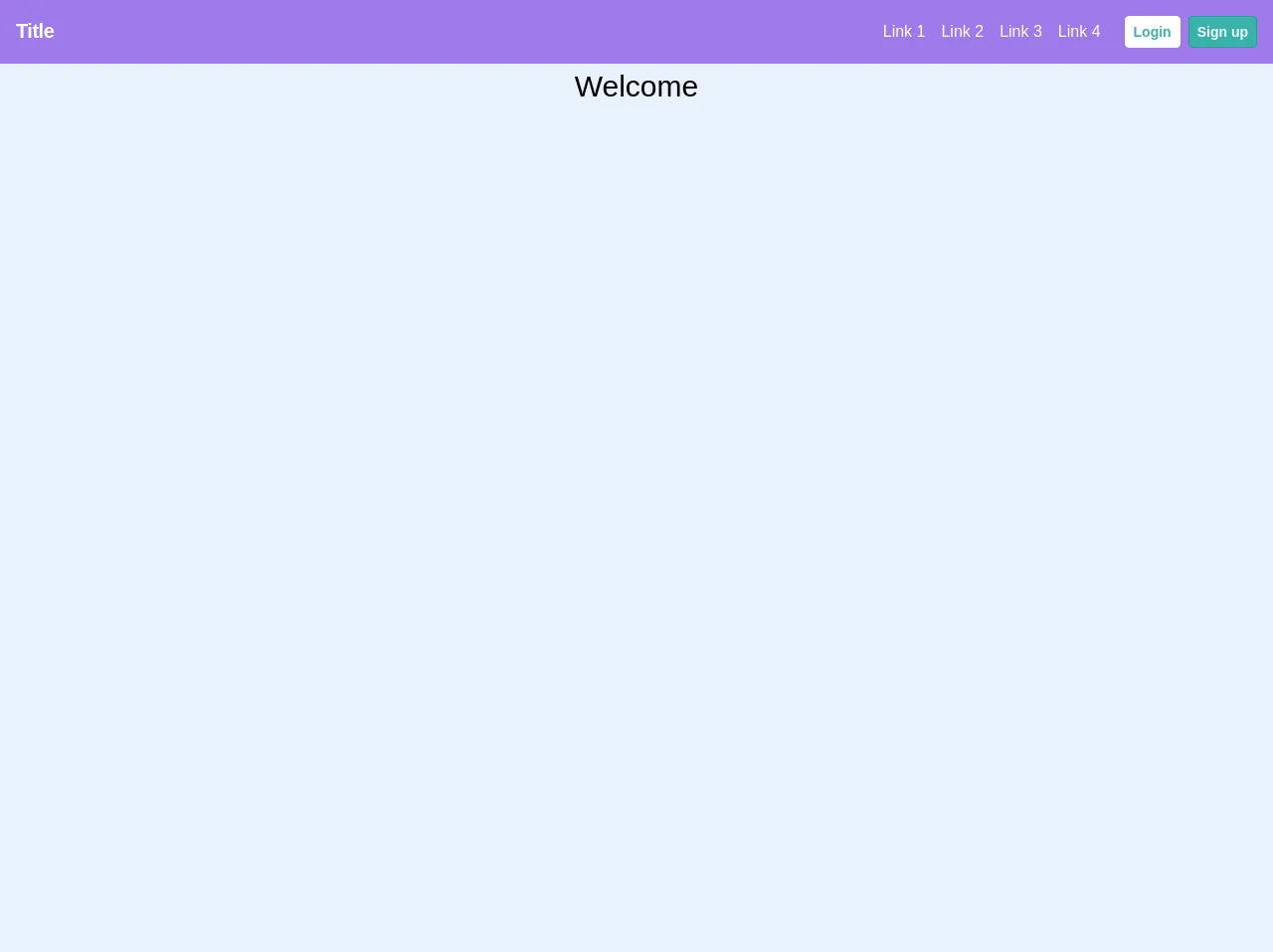
The preview of Bottom and Header Nav responsive. ui component.
To create a bottom and header navigation menu, we will use Tailwind CSS. The navigation menu will be responsive and will adapt to different screen sizes. Here is a preview of what the navigation menu will look like:
Free download of the Bottom and Header Nav responsive.'s source code
The source code of Bottom and Header Nav responsive. ui component.
To create the bottom and header navigation menu, we will use HTML and Tailwind CSS. Here is the source code for the navigation menu:
<!-- This is an example component -->
<div class="w-full h-screen">
  <header class="bg-teal-400">
    <nav class="flex justify-between w-full bg-purple-500 text-white p-4">
      <a href="/"><span class="font-semibold text-xl tracking-tight">Title</span></a>
        <div class="md:items-center md:w-auto flex">
          <div class="md:flex hidden">
            <a class="block md:text-white mr-4" href="/link">Link 1</a>
            <a class="block md:text-white mr-4" href="/link">Link 2</a>
            <a class="block md:text-white mr-4" href="/link">Link 3</a>
            <a class="block md:text-white mr-4" href="/link">Link 4</a>
          </div>
          <div class="flex text-sm" v-else>
          	<a class="p-2 ml-2 bg-white text-teal-500 font-semibold leading-none border border-gray-100 rounded hover:border-transparent hover:bg-gray-100" href="/auth/signin">Login</a>
            <a class="p-2 ml-2 bg-teal-500 text-gray-100 font-semibold leading-none border border-teal-600 rounded hover:border-transparent hover:bg-teal-600" href="/auth/signup">Sign up</a>
          </div>
        </div>
    </nav>
  </header>
  <main class="flex justify-center items-center">
    <h1 class="text-3xl text-center">Welcome</h1>
  </main>
  <div class="bottomNav fixed bottom-0 w-full">
    <nav style="border:1px solid blue" class="md:hidden bottom-0 w-full bg-gray-700 text-xs">
      <ul class="flex justify-around items-center text-white text-center opacity-75 text-lg font-bold">
        <li class="p-4 hover:bg-gray-500">
          <a href="/link">
            <span>Link 1</span>
            <svg class="h-6 w-6 fill-current mx-auto" viewBox="0 0 20 20">
              <path d="M14 8a4 4 0 1 0-8 0v7h8V8zM8.027 2.332A6.003 6.003 0 0 0 4 8v6l-3 2v1h18v-1l-3-2V8a6.003 6.003 0 0 0-4.027-5.668 2 2 0 1 0-3.945 0zM12 18a2 2 0 1 1-4 0h4z" fill-rule="evenodd" />
            </svg>
           </a>
        </li>
        <li class="p-4 hover:bg-gray-500">
          <a href="/link">
            <span>Link 2</span>
            <svg class="h-6 w-6 fill-current mx-auto" viewBox="0 0 20 20">
              <path d="M14 8a4 4 0 1 0-8 0v7h8V8zM8.027 2.332A6.003 6.003 0 0 0 4 8v6l-3 2v1h18v-1l-3-2V8a6.003 6.003 0 0 0-4.027-5.668 2 2 0 1 0-3.945 0zM12 18a2 2 0 1 1-4 0h4z" fill-rule="evenodd" />
            </svg>
          </a>
        </li>
        <li class="p-4 hover:bg-gray-500">
          <a href="/link">
            <span>Link 3</span>
            <svg class="h-6 w-6 fill-current mx-auto" viewBox="0 0 20 20">
              <path d="M14 8a4 4 0 1 0-8 0v7h8V8zM8.027 2.332A6.003 6.003 0 0 0 4 8v6l-3 2v1h18v-1l-3-2V8a6.003 6.003 0 0 0-4.027-5.668 2 2 0 1 0-3.945 0zM12 18a2 2 0 1 1-4 0h4z" fill-rule="evenodd" />
            </svg>
          </a>
        </li>
        <li class="p-4 hover:bg-gray-500">
          <a href="/link">
            <span>Link 4</span>
            <svg class="h-6 w-6 fill-current mx-auto" viewBox="0 0 20 20">
              <path d="M14 8a4 4 0 1 0-8 0v7h8V8zM8.027 2.332A6.003 6.003 0 0 0 4 8v6l-3 2v1h18v-1l-3-2V8a6.003 6.003 0 0 0-4.027-5.668 2 2 0 1 0-3.945 0zM12 18a2 2 0 1 1-4 0h4z" fill-rule="evenodd" />
            </svg>
          </a>
        </li>
      </ul>
    </nav>
  </div>
</div>
How to create a Bottom and Header Nav responsive. with Tailwind CSS?
To create a responsive bottom and header navigation menu with Tailwind CSS, follow these steps:
- Create a new HTML file and add the following code:
<!DOCTYPE html>
<html lang="en">
<head>
    <meta charset="UTF-8">
    <meta name="viewport" content="width=device-width, initial-scale=1.0">
    <title>Responsive Navigation Menu</title>
    <link rel="stylesheet" href="https://cdn.jsdelivr.net/npm/[email protected]/dist/tailwind.min.css">
</head>
<body>
    <header class="bg-gray-800">
        <nav class="container mx-auto px-4 sm:px-6 lg:px-8 flex items-center justify-between h-16">
            <div class="flex items-center">
                <a href="#" class="text-white font-bold text-xl">Logo</a>
            </div>
            <div class="hidden md:block">
                <ul class="flex items-center">
                    <li><a href="#" class="text-white hover:text-gray-200 px-3 py-2">Home</a></li>
                    <li><a href="#" class="text-white hover:text-gray-200 px-3 py-2">About</a></li>
                    <li><a href="#" class="text-white hover:text-gray-200 px-3 py-2">Contact</a></li>
                </ul>
            </div>
            <div class="md:hidden">
                <button class="text-white hover:text-gray-200 focus:outline-none focus:text-gray-200" aria-label="toggle menu">
                    <svg viewBox="0 0 24 24" class="h-6 w-6 fill-current">
                        <path fill-rule="evenodd" d="M3 18h18v-2H3v2zm0-5h18v-2H3v2zm0-7v2h18V6H3z"></path>
                    </svg>
                </button>
            </div>
        </nav>
    </header>
    <nav class="bg-gray-800 md:hidden">
        <div class="px-2 py-3">
            <a href="#" class="block text-white font-bold text-xl mb-2">Logo</a>
            <ul>
                <li><a href="#" class="text-white hover:text-gray-200 py-2">Home</a></li>
                <li><a href="#" class="text-white hover:text-gray-200 py-2">About</a></li>
                <li><a href="#" class="text-white hover:text-gray-200 py-2">Contact</a></li>
            </ul>
        </div>
    </nav>
    <main class="container mx-auto px-4 sm:px-6 lg:px-8 py-8">
        <h1 class="text-2xl font-bold mb-4">Welcome to my website</h1>
        <p class="mb-4">Lorem ipsum dolor sit amet, consectetur adipiscing elit. Sed euismod, sapien eget bibendum bibendum, augue nisl ultricies lacus, vel bibendum ipsum risus eu dolor. Sed auctor, nisl eget ullamcorper malesuada, velit sapien aliquet est, vel feugiat nunc sapien ut nibh. Sed nec mi nec quam commodo commodo. Sed sit amet quam vel nunc bibendum bibendum. Vivamus in nisi ut velit lacinia commodo. Sed euismod, sapien eget bibendum bibendum, augue nisl ultricies lacus, vel bibendum ipsum risus eu dolor. Sed auctor, nisl eget ullamcorper malesuada, velit sapien aliquet est, vel feugiat nunc sapien ut nibh. Sed nec mi nec quam commodo commodo. Sed sit amet quam vel nunc bibendum bibendum. Vivamus in nisi ut velit lacinia commodo.</p>
        <p class="mb-4">Lorem ipsum dolor sit amet, consectetur adipiscing elit. Sed euismod, sapien eget bibendum bibendum, augue nisl ultricies lacus, vel bibendum ipsum risus eu dolor. Sed auctor, nisl eget ullamcorper malesuada, velit sapien aliquet est, vel feugiat nunc sapien ut nibh. Sed nec mi nec quam commodo commodo. Sed sit amet quam vel nunc bibendum bibendum. Vivamus in nisi ut velit lacinia commodo. Sed euismod, sapien eget bibendum bibendum, augue nisl ultricies lacus, vel bibendum ipsum risus eu dolor. Sed auctor, nisl eget ullamcorper malesuada, velit sapien aliquet est, vel feugiat nunc sapien ut nibh. Sed nec mi nec quam commodo commodo. Sed sit amet quam vel nunc bibendum bibendum. Vivamus in nisi ut velit lacinia commodo.</p>
    </main>
</body>
</html>
In the code above, we have created a header navigation menu and a bottom navigation menu. The header navigation menu is visible on screens larger than
md, while the bottom navigation menu is visible on screens smaller thanmd.We have used Tailwind CSS classes to style the navigation menu. For example, we have used the
bg-gray-800class to set the background color of the navigation menu to gray.We have also used the
hiddenandblockclasses to show and hide the navigation menu based on the screen size.We have used the
flexanditems-centerclasses to center the logo and the navigation links.We have used the
text-whiteandhover:text-gray-200classes to set the color of the text and the hover color of the links.We have used the
px-3andpy-2classes to set the padding of the links.We have used the
focus:outline-noneclass to remove the outline when the button is focused.We have used the
fill-currentclass to fill the SVG icon with the current color.
Conclusion
In this article, we have discussed how to create a responsive bottom and header navigation menu using Tailwind CSS. We have seen how Tailwind CSS provides a set of pre-defined classes that you can use to style your HTML elements. We have also seen how to use these classes to create a responsive navigation menu that adapts to different screen sizes. With Tailwind CSS, you can create a responsive website quickly and easily.