- Published on
Imagine You Create A Block With Tailwind CSS Like An Expert. Follow These 6 Steps To Get There
- What is Tailwind CSS?
- The description of block UI component
- Why use Tailwind CSS to create a block UI component?
- The preview of block UI component
- The source code of block UI component
- How to create a block with Tailwind CSS?
- Step 1: Set up a new project
- Step 2: Define the container element
- Step 3: Add content to the container
- Step 4: Customize the appearance
- Step 5: Make it responsive
- Step 6: Add animations
- Conclusion
As a FrontEnd developer, you may have heard of Tailwind CSS. It is a utility-first CSS framework that helps you quickly create responsive and customizable UI components. In this article, we will guide you through the process of creating a block UI component using Tailwind CSS.
What is Tailwind CSS?
Tailwind CSS is a utility-first CSS framework that provides a set of pre-defined CSS classes to help you style your HTML elements. It is designed to be highly customizable and flexible, allowing you to create unique and responsive UI components quickly.
The description of block UI component
A block UI component is a rectangular element that can be used to display information, images, or other content. It is commonly used in web design to create sections or containers for different types of content.
Why use Tailwind CSS to create a block UI component?
Tailwind CSS provides a set of pre-defined CSS classes that can be used to create a block UI component quickly and easily. It also allows you to customize the component's appearance and behavior using its utility classes, making it highly flexible and responsive.
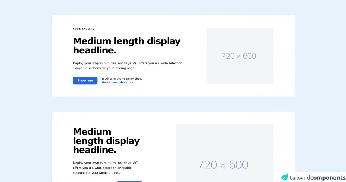
The preview of block UI component
To create a block UI component using Tailwind CSS, you can start by defining a container element with a set width and height. You can then add content to the container using Tailwind's text and image classes. Here is an example of what a block UI component might look like:
Free download of the block's source code
The source code of block UI component
To create the block UI component shown in the preview section, you can use the following HTML and Tailwind CSS classes:
<section class="text-blueGray-700 bg-white mt-20">
    <div class="container flex flex-col items-center px-5 py-16 mx-auto md:flex-row lg:px-28">
        <div class="flex flex-col items-start mb-16 text-left lg:flex-grow md:w-1/2 lg:pr-24 md:pr-16 md:mb-0">
            <h2 class="mb-8 text-xs font-semibold tracking-widest text-black uppercase title-font"> Your tagline </h2>
            <h1 class="mb-8 text-2xl font-black tracking-tighter text-black md:text-5xl title-font"> Medium length display headline. </h1>
            <p class="mb-8 text-base leading-relaxed text-left text-blueGray-600 "> Deploy your mvp in minutes, not days. WT offers you a a wide selection swapable sections for your landing page. </p>
            <div class="flex flex-col justify-center lg:flex-row">
                <button class="flex items-center px-6 py-2 mt-auto font-semibold text-white transition duration-500 ease-in-out transform bg-blue-600 rounded-lg hover:bg-blue-700 focus:shadow-outline focus:outline-none focus:ring-2 ring-offset-current ring-offset-2"> Show me </button>
                <p class="mt-2 text-sm text-left text-blueGray-600 md:ml-6 md:mt-0"> It will take you to candy shop. <br class="hidden lg:block">
                <a href="#" class="inline-flex items-center font-semibold text-blue-600 md:mb-2 lg:mb-0 hover:text-black " title="read more"> Read more about it » </a>
                </p>
            </div>
        </div>
        <div class="w-full lg:w-1/3 lg:max-w-lg md:w-1/2">
            <img class="object-cover object-center rounded-lg " alt="hero" src="https://dummyimage.com/720x600/F3F4F7/8693ac">
        </div>
    </div>
</section>

<section class="text-blueGray-700 bg-white mt-20">
    <div class="container flex flex-col items-center px-5 py-16 mx-auto  md:flex-row lg:px-28">
        <div class="flex flex-col items-start w-full pt-0 mb-16 text-left  lg:flex-grow md:w-1/2 xl:mr-20 md:pr-24 md:mb-0">
        <h1 class="mb-8 text-2xl font-black tracking-tighter text-black  md:text-5xl title-font"> Medium length display headline. </h1>
        <p class="mb-8 text-base leading-relaxed text-left text-blueGray-600"> Deploy your mvp in minutes, not days. WT offers you a a wide selection swapable sections for your landing page. </p>
        <div class="flex flex-col w-full gap-2 md:justify-start md:flex-row">
            <input class="flex-grow w-full px-4 py-3 mb-4 text-base text-black transition ease-in-out transform rounded-lg  duration-650 lg:w-auto bg-blueGray-200 focus:outline-none focus:border-purple-500 sm:mb-0 focus:bg-white focus:shadow-outline focus:ring-2 ring-offset-current ring-offset-2" placeholder="Your Email" type="email">
            <button class="flex items-center px-6 py-3 mt-auto font-semibold text-white transition duration-500 ease-in-out transform bg-blue-600 rounded-lg  hover:bg-blue-700 focus:shadow-outline focus:outline-none focus:ring-2 ring-offset-current ring-offset-2"> Subscribe </button>
        </div>
        <p class="w-full mt-2 mb-8 text-sm text-left text-blueGray-600"> I got 99 problems and blocks ain't one. </p>
        </div>
        <div class="w-full lg:w-5/6 lg:max-w-lg md:w-1/2">
        <img class="object-cover object-center rounded-lg" alt="hero" src="https://dummyimage.com/720x600/F3F4F7/8693ac">
        </div>
    </div>
</section>
How to create a block with Tailwind CSS?
Now that we have seen what a block UI component looks like and why we should use Tailwind CSS to create it, let's dive into the steps to create it.
Step 1: Set up a new project
To get started, you will need to set up a new project with Tailwind CSS. You can do this by following the instructions on the Tailwind CSS website.
Step 2: Define the container element
The first step in creating a block UI component is to define the container element. You can do this by adding a div element with a set width and height. For example:
<div class="w-64 h-64"></div>
This will create a container element with a width and height of 64 pixels.
Step 3: Add content to the container
Once you have defined the container element, you can add content to it using Tailwind's text and image classes. For example:
<div class="w-64 h-64 bg-gray-100 p-4">
  <h2 class="text-lg font-bold mb-2">Title</h2>
  <p class="text-gray-700 mb-4">Lorem ipsum dolor sit amet, consectetur adipiscing elit.</p>
  <img src="image.jpg" alt="Image" class="w-full h-auto">
</div>
This will add a title, paragraph, and image to the container element.
Step 4: Customize the appearance
Tailwind CSS provides a set of utility classes that you can use to customize the appearance of your block UI component. For example, you can change the background color, font size, and padding using the bg-, text-, and p- classes respectively. Here is an example:
<div class="w-64 h-64 bg-blue-500 p-4">
  <h2 class="text-lg font-bold text-white mb-2">Title</h2>
  <p class="text-white mb-4">Lorem ipsum dolor sit amet, consectetur adipiscing elit.</p>
  <img src="image.jpg" alt="Image" class="w-full h-auto">
</div>
This will change the background color to blue, the font color to white, and the padding to 4 pixels.
Step 5: Make it responsive
Tailwind CSS also provides a set of responsive utility classes that you can use to make your block UI component responsive. For example, you can change the width and height of the container element on different screen sizes using the w- and h- classes with responsive prefixes. Here is an example:
<div class="w-64 h-64 sm:w-96 sm:h-96 bg-blue-500 p-4">
  <h2 class="text-lg font-bold text-white mb-2">Title</h2>
  <p class="text-white mb-4">Lorem ipsum dolor sit amet, consectetur adipiscing elit.</p>
  <img src="image.jpg" alt="Image" class="w-full h-auto">
</div>
This will change the width and height of the container element to 96 pixels on small screens.
Step 6: Add animations
Finally, you can add animations to your block UI component using Tailwind's animation classes. For example, you can add a fade-in animation using the opacity and duration classes. Here is an example:
<div class="w-64 h-64 sm:w-96 sm:h-96 bg-blue-500 p-4 opacity-0 animate-fade-in">
  <h2 class="text-lg font-bold text-white mb-2">Title</h2>
  <p class="text-white mb-4">Lorem ipsum dolor sit amet, consectetur adipiscing elit.</p>
  <img src="image.jpg" alt="Image" class="w-full h-auto">
</div>
This will add a fade-in animation to the container element when it appears on the screen.
Conclusion
In this article, we have shown you how to create a block UI component using Tailwind CSS. We have covered the benefits of using Tailwind CSS, the preview and source code of the component, and the steps to create it. With these steps, you can create your own block UI component with ease and customize it to fit your needs. Happy coding!