- Published on
6 Tips To Make A Blob Footer Card With Tailwind CSS
- What is Tailwind CSS?
- The description of Blob Footer Card ui component
- Why use Tailwind CSS to create a Blob Footer Card ui component?
- The preview of Blob Footer Card ui component.
- The source code of Blob Footer Card ui component.
- How to create a Blob Footer Card with Tailwind CSS?
- 1. Create the HTML structure
- 2. Style the card
- 3. Style the blob-shaped footer
- 4. Add text to the footer
- 5. Add a button to the card
- Conclusion
What is Tailwind CSS?
Tailwind CSS is a utility-first CSS framework that provides a set of pre-defined classes to create responsive and customizable designs. It allows developers to quickly build user interfaces without writing any custom CSS. With Tailwind CSS, you can create complex layouts and designs with ease.
The description of Blob Footer Card ui component
A Blob Footer Card is a UI component that consists of a card with a blob-shaped footer. The blob shape adds a unique touch to the design and makes it stand out from other UI components. The Blob Footer Card is a great way to display information about a product or service.
Why use Tailwind CSS to create a Blob Footer Card ui component?
Tailwind CSS provides a set of pre-defined classes that can be used to create complex designs with ease. It allows developers to focus on the functionality of the UI component rather than the design. With Tailwind CSS, you can create a Blob Footer Card in a few simple steps.
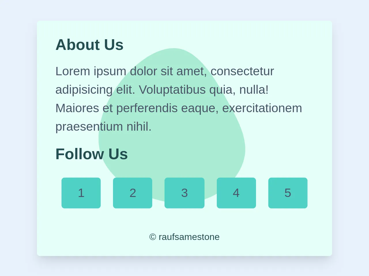
The preview of Blob Footer Card ui component.
To create a Blob Footer Card, we will use Tailwind CSS. The card will have a blob-shaped footer with some text and a button. The preview of the Blob Footer Card is shown below.
Free download of the Blob Footer Card's source code
The source code of Blob Footer Card ui component.
To create a Blob Footer Card, we will use HTML and Tailwind CSS. The source code of the Blob Footer Card is shown below.
<svg class="z-0 absolute" xmlns="http://www.w3.org/2000/svg" width="300" height="300" viewBox="0 0 600 600">
  <g transform="translate(300,300)">
    <path d="M108.7,-102.8C139.7,-47.8,163,-2.6,157.3,41.4C151.6,85.4,117,128.3,71.9,150.5C26.8,172.7,-28.9,174.2,-85.4,155.4C-141.9,136.6,-199.1,97.6,-217.2,42.6C-235.3,-12.3,-214.2,-83.2,-171.5,-140.9C-128.7,-198.7,-64.4,-243.3,-12.8,-233.2C38.8,-223,77.7,-157.9,108.7,-102.8Z" fill="#7adcb58c"/>
  </g>
</svg>
<div class="flex flex-row bg-teal-100 rounded">
  <div class="relative z-2 max-w-sm rounded overflow-hidden shadow-lg">
   <div class="px-6 py-4">
    <div class="relative text-teal-900 font-bold text-xl mb-2">About Us</div>
    <p class="text-gray-700 text-base z-234 ">
      Lorem ipsum dolor sit amet, consectetur adipisicing elit. Voluptatibus quia, nulla! Maiores et perferendis eaque, exercitationem praesentium nihil.
    </p>
 <div class="text-teal-900 font-bold text-xl mt-2 mb-2">Follow Us</div>
   <div class=" flex flex-wrap  justify-">
  	 <div class="rounded w-auto flex-1 text-gray-700 text-center bg-teal-400 hover:bg-teal-600 px-4 py-2 m-2">1</div>
 	 <div class="rounded w-auto flex-1 text-gray-700 text-center bg-teal-400 hover:bg-teal-600 px-4 py-2 m-2">2</div>
 	 <div class="rounded w-auto flex-1 text-gray-700 text-center bg-teal-400 hover:bg-teal-600 px-4 py-2 m-2">3</div>
 	 <div class="rounded w-auto flex-1 text-gray-700 text-center bg-teal-400 hover:bg-teal-600 px-4 py-2 m-2">4</div>
 	 <div class="rounded w-auto flex-1 text-gray-700 text-center bg-teal-400 hover:bg-teal-600 px-4 py-2 m-2">5</div>
   </div>
 <div class="text-xs text-center text-teal-900  mt-5 ">© raufsamestone</div>
How to create a Blob Footer Card with Tailwind CSS?
To create a Blob Footer Card with Tailwind CSS, follow the steps below.
1. Create the HTML structure
The first step is to create the HTML structure of the Blob Footer Card. We will use a div element to create the card and a div element to create the blob-shaped footer. The HTML code is shown below.
<div class="card">
  <div class="card-body">
    <h5 class="card-title">Card title</h5>
    <p class="card-text">Some quick example text to build on the card title and make up the bulk of the card's content.</p>
    <a href="#" class="btn btn-primary">Go somewhere</a>
  </div>
  <div class="blob-footer"></div>
</div>
2. Style the card
The next step is to style the card using Tailwind CSS classes. We will use the bg-white, rounded-lg, shadow-md, and p-4 classes to create a white background, rounded corners, a shadow, and some padding for the card. The CSS code is shown below.
.card {
  background-color: #fff;
  border-radius: 0.5rem;
  box-shadow: 0 4px 6px rgba(0, 0, 0, 0.1);
  padding: 1rem;
}
3. Style the blob-shaped footer
The next step is to style the blob-shaped footer using Tailwind CSS classes. We will use the bg-blue-500, rounded-full, h-16, w-16, and absolute classes to create a blue background, a circular shape, a height and width of 16 pixels, and absolute positioning for the footer. We will also use the bottom-0 and right-0 classes to position the footer at the bottom right corner of the card. The CSS code is shown below.
.blob-footer {
  background-color: #3b82f6;
  border-radius: 50% 50% 0 0;
  height: 4rem;
  width: 4rem;
  position: absolute;
  bottom: 0;
  right: 0;
}
4. Add text to the footer
The next step is to add some text to the footer. We will use the text-white, text-center, pt-2, and text-lg classes to create white text, center alignment, some padding, and a large font size for the text. The CSS code is shown below.
.blob-footer::before {
  content: "Footer";
  color: #fff;
  position: absolute;
  top: 50%;
  left: 50%;
  transform: translate(-50%, -50%);
  font-size: 1.5rem;
}
5. Add a button to the card
The final step is to add a button to the card. We will use the btn and btn-primary classes to create a blue button with white text. The HTML code is shown below.
<a href="#" class="btn btn-primary">Go somewhere</a>
Conclusion
In this article, we have learned how to create a Blob Footer Card with Tailwind CSS. We have used pre-defined classes to create a unique UI component that can be used to display information about a product or service. With Tailwind CSS, you can create complex designs with ease and focus on the functionality of the UI component.