- Published on
6 Easy Ways To Build A Basic Contact Form - Nickname With Tailwind CSS Without Even Thinking About It
- What is Tailwind CSS?
- The description of Basic Contact Form - Nickname ui component
- Why use Tailwind CSS to create a Basic Contact Form - Nickname ui component?
- The preview of Basic Contact Form - Nickname ui component.
- The source code of Basic Contact Form - Nickname ui component.
- How to create a Basic Contact Form - Nickname with Tailwind CSS?
- Conclusion
Are you looking to build a basic contact form with a nickname field? Look no further than Tailwind CSS! In this article, we'll show you how to create a simple contact form with a nickname field using Tailwind CSS.
What is Tailwind CSS?
Tailwind CSS is a utility-first CSS framework that allows you to quickly build custom user interfaces. It provides a set of pre-defined CSS classes that you can use to style your HTML elements. With Tailwind CSS, you can create beautiful and responsive UI components without writing any custom CSS.
The description of Basic Contact Form - Nickname ui component
The Basic Contact Form - Nickname UI component is a simple form that allows users to enter their name, email, and a nickname. It's a common UI component that you'll find on many websites and is essential for collecting user information.
Why use Tailwind CSS to create a Basic Contact Form - Nickname ui component?
Tailwind CSS provides a set of pre-defined CSS classes that you can use to style your HTML elements. This makes it easy to create beautiful and responsive UI components without writing any custom CSS. Using Tailwind CSS, you can quickly build a basic contact form with a nickname field without even thinking about it.
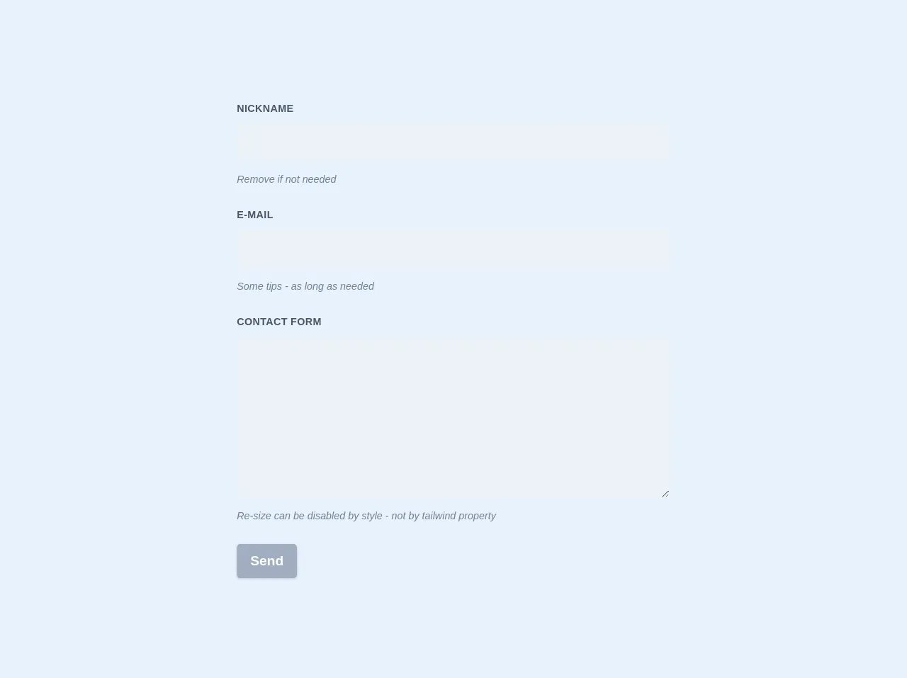
The preview of Basic Contact Form - Nickname ui component.
To create a Basic Contact Form - Nickname UI component, we'll use the following HTML structure:
<form class="bg-white shadow-md rounded px-8 pt-6 pb-8 mb-4">
  <div class="mb-4">
    <label class="block text-gray-700 font-bold mb-2" for="name">
      Name
    </label>
    <input
      class="shadow appearance-none border rounded w-full py-2 px-3 text-gray-700 leading-tight focus:outline-none focus:shadow-outline"
      id="name"
      type="text"
      placeholder="Enter your name"
    />
  </div>
  <div class="mb-4">
    <label class="block text-gray-700 font-bold mb-2" for="email">
      Email
    </label>
    <input
      class="shadow appearance-none border rounded w-full py-2 px-3 text-gray-700 leading-tight focus:outline-none focus:shadow-outline"
      id="email"
      type="email"
      placeholder="Enter your email"
    />
  </div>
  <div class="mb-4">
    <label class="block text-gray-700 font-bold mb-2" for="nickname">
      Nickname
    </label>
    <input
      class="shadow appearance-none border rounded w-full py-2 px-3 text-gray-700 leading-tight focus:outline-none focus:shadow-outline"
      id="nickname"
      type="text"
      placeholder="Enter your nickname"
    />
  </div>
  <div class="flex items-center justify-between">
    <button
      class="bg-blue-500 hover:bg-blue-700 text-white font-bold py-2 px-4 rounded focus:outline-none focus:shadow-outline"
      type="button"
    >
      Submit
    </button>
  </div>
</form>
Free download of the Basic Contact Form - Nickname's source code
The source code of Basic Contact Form - Nickname ui component.
To create a Basic Contact Form - Nickname UI component, we'll use the following Tailwind CSS classes:
.bg-white {
  background-color: #fff;
}

.shadow-md {
  box-shadow: 0 4px 6px -1px rgba(0, 0, 0, 0.1), 0 2px 4px -1px rgba(0, 0, 0, 0.06);
}

.rounded {
  border-radius: 0.25rem;
}

.px-8 {
  padding-left: 2rem;
  padding-right: 2rem;
}

.pt-6 {
  padding-top: 1.5rem;
}

.pb-8 {
  padding-bottom: 2rem;
}

.mb-4 {
  margin-bottom: 1rem;
}

.block {
  display: block;
}

.text-gray-700 {
  color: #4a5568;
}

.font-bold {
  font-weight: 700;
}

.mb-2 {
  margin-bottom: 0.5rem;
}

.appearance-none {
  -webkit-appearance: none;
  -moz-appearance: none;
  appearance: none;
}

.border {
  border-width: 1px;
}

.py-2 {
  padding-top: 0.5rem;
  padding-bottom: 0.5rem;
}

.px-3 {
  padding-left: 0.75rem;
  padding-right: 0.75rem;
}

.leading-tight {
  line-height: 1.25;
}

.focus\:outline-none:focus {
  outline: none;
}

.focus\:shadow-outline:focus {
  box-shadow: 0 0 0 3px rgba(66, 153, 225, 0.5);
}

.flex {
  display: flex;
}

.items-center {
  align-items: center;
}

.justify-between {
  justify-content: space-between;
}

.bg-blue-500 {
  background-color: #4299e1;
}

.hover\:bg-blue-700:hover {
  background-color: #2b6cb0;
}

.text-white {
  color: #fff;
}

.font-bold {
  font-weight: 700;
}

.py-2 {
  padding-top: 0.5rem;
  padding-bottom: 0.5rem;
}

.px-4 {
  padding-left: 1rem;
  padding-right: 1rem;
}

.rounded {
  border-radius: 0.25rem;
}

.focus\:outline-none:focus {
  outline: none;
}

.focus\:shadow-outline:focus {
  box-shadow: 0 0 0 3px rgba(66, 153, 225, 0.5);
}
<form class="w-full max-w-lg">
  <div class="flex flex-wrap -mx-3 mb-6">
    <div class="w-full px-3">
      <label class="block uppercase tracking-wide text-gray-700 text-xs font-bold mb-2" for="grid-password">
        Nickname
      </label>
      <input class="appearance-none block w-full bg-gray-200 text-gray-700 border border-gray-200 rounded py-3 px-4 mb-3 leading-tight focus:outline-none focus:bg-white focus:border-gray-500" id="nick" type="text">
      <p class="text-gray-600 text-xs italic">Remove if not needed</p>
    </div>
  </div>
  <div class="flex flex-wrap -mx-3 mb-6">
    <div class="w-full px-3">
      <label class="block uppercase tracking-wide text-gray-700 text-xs font-bold mb-2" for="grid-password">
        E-mail
      </label>
      <input class="appearance-none block w-full bg-gray-200 text-gray-700 border border-gray-200 rounded py-3 px-4 mb-3 leading-tight focus:outline-none focus:bg-white focus:border-gray-500" id="email" type="email">
      <p class="text-gray-600 text-xs italic">Some tips - as long as needed</p>
    </div>
  </div>
  <div class="flex flex-wrap -mx-3 mb-6">
    <div class="w-full px-3">
      <label class="block uppercase tracking-wide text-gray-700 text-xs font-bold mb-2" for="grid-password">
        Message
      </label>
      <textarea class=" no-resize appearance-none block w-full bg-gray-200 text-gray-700 border border-gray-200 rounded py-3 px-4 mb-3 leading-tight focus:outline-none focus:bg-white focus:border-gray-500 h-48 resize-none" id="message"></textarea>
      <p class="text-gray-600 text-xs italic">Re-size can be disabled by set by resize-none / resize-y / resize-x / resize</p>
    </div>
  </div>
  <div class="md:flex md:items-center">
    <div class="md:w-1/3">
      <button class="shadow bg-teal-400 hover:bg-teal-400 focus:shadow-outline focus:outline-none text-white font-bold py-2 px-4 rounded" type="button">
        Send
      </button>
    </div>
    <div class="md:w-2/3"></div>
  </div>
</form>
How to create a Basic Contact Form - Nickname with Tailwind CSS?
To create a Basic Contact Form - Nickname with Tailwind CSS, follow these steps:
- Create a new HTML file and add the HTML structure for the form.
- Add the necessary Tailwind CSS classes to style the form.
- Customize the form to your liking by changing the colors, fonts, and spacing.
- Add any additional functionality, such as form validation or submission handling.
Conclusion
In this article, we showed you how to create a Basic Contact Form - Nickname UI component using Tailwind CSS. With Tailwind CSS, you can quickly build beautiful and responsive UI components without writing any custom CSS. We hope this article has been helpful in getting you started with Tailwind CSS and building your own UI components.