- Published on
Best Ways To Make A Basic Contact Form With Tailwind CSS
- What is Tailwind CSS?
- The description of Basic Contact Form ui component
- Why use Tailwind CSS to create a Basic Contact Form ui component?
- The preview of Basic Contact Form ui component.
- The source code of Basic Contact Form ui component.
- How to create a Basic Contact Form with Tailwind CSS?
- Conclusion
Are you looking to create a basic contact form for your website? Tailwind CSS is a great tool to use for creating a simple and stylish contact form. In this article, we will discuss the best ways to make a basic contact form with Tailwind CSS.
What is Tailwind CSS?
Tailwind CSS is a utility-first CSS framework that allows developers to quickly and easily create custom designs without having to write custom CSS. It provides a set of pre-defined classes that can be used to style HTML elements. Tailwind CSS is highly customizable, and developers can use it to create unique designs that fit their specific needs.
The description of Basic Contact Form ui component
A basic contact form is a simple form that allows users to send messages to the website owner. It typically includes fields for the user's name, email address, and message. Basic contact forms are essential for businesses and websites that want to provide a way for users to contact them.
Why use Tailwind CSS to create a Basic Contact Form ui component?
Tailwind CSS is a great tool for creating a basic contact form because it provides a set of pre-defined classes that can be used to style the form. This makes it easy to create a simple and stylish contact form without having to write custom CSS.
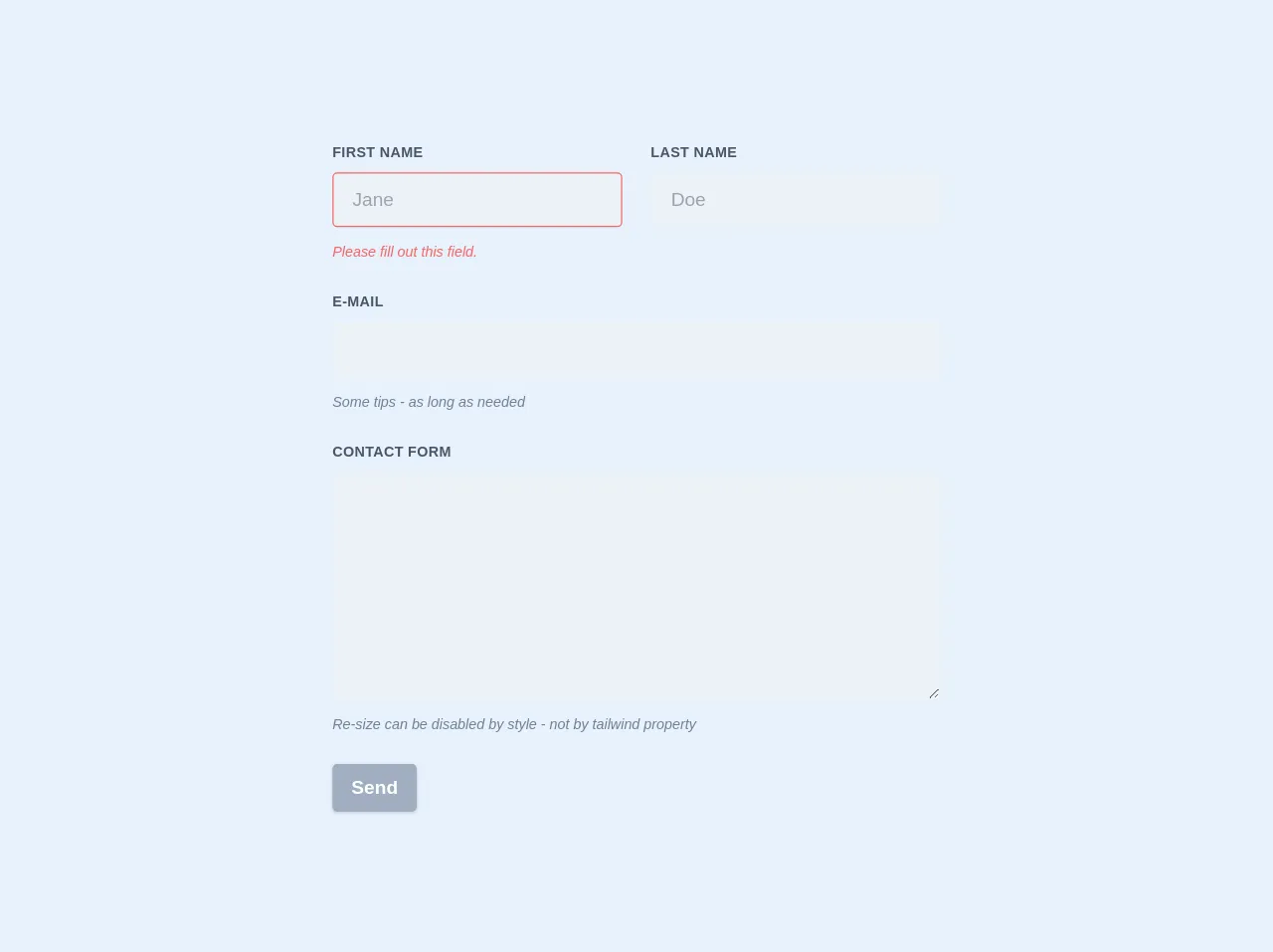
The preview of Basic Contact Form ui component.
To create a basic contact form with Tailwind CSS, we will use a simple HTML form and style it using Tailwind CSS classes. The resulting form will look something like this:
Free download of the Basic Contact Form's source code
The source code of Basic Contact Form ui component.
To create the basic contact form, we will use the following HTML code:
<form class="w-full max-w-lg">
  <div class="flex flex-wrap -mx-3 mb-6">
    <div class="w-full md:w-1/2 px-3 mb-6 md:mb-0">
      <label class="block uppercase tracking-wide text-gray-700 text-xs font-bold mb-2" for="grid-first-name">
        First Name
      </label>
      <input class="appearance-none block w-full bg-gray-200 text-gray-700 border border-red-500 rounded py-3 px-4 mb-3 leading-tight focus:outline-none focus:bg-white" id="grid-first-name" type="text" placeholder="Jane">
      <p class="text-red-500 text-xs italic">Please fill out this field.</p>
    </div>
    <div class="w-full md:w-1/2 px-3">
      <label class="block uppercase tracking-wide text-gray-700 text-xs font-bold mb-2" for="grid-last-name">
        Last Name
      </label>
      <input class="appearance-none block w-full bg-gray-200 text-gray-700 border border-gray-200 rounded py-3 px-4 leading-tight focus:outline-none focus:bg-white focus:border-gray-500" id="grid-last-name" type="text" placeholder="Doe">
    </div>
  </div>
  <div class="flex flex-wrap -mx-3 mb-6">
    <div class="w-full px-3">
      <label class="block uppercase tracking-wide text-gray-700 text-xs font-bold mb-2" for="grid-password">
        E-mail
      </label>
      <input class="appearance-none block w-full bg-gray-200 text-gray-700 border border-gray-200 rounded py-3 px-4 mb-3 leading-tight focus:outline-none focus:bg-white focus:border-gray-500" id="email" type="email">
      <p class="text-gray-600 text-xs italic">Some tips - as long as needed</p>
    </div>
  </div>
  <div class="flex flex-wrap -mx-3 mb-6">
    <div class="w-full px-3">
      <label class="block uppercase tracking-wide text-gray-700 text-xs font-bold mb-2" for="grid-password">
        Message
      </label>
      <textarea class=" no-resize appearance-none block w-full bg-gray-200 text-gray-700 border border-gray-200 rounded py-3 px-4 mb-3 leading-tight focus:outline-none focus:bg-white focus:border-gray-500 h-48 resize-none" id="message"></textarea>
      <p class="text-gray-600 text-xs italic">Re-size can be disabled by set by resize-none / resize-y / resize-x / resize</p>
    </div>
  </div>
  <div class="md:flex md:items-center">
    <div class="md:w-1/3">
      <button class="shadow bg-teal-400 hover:bg-teal-400 focus:shadow-outline focus:outline-none text-white font-bold py-2 px-4 rounded" type="button">
        Send
      </button>
    </div>
    <div class="md:w-2/3"></div>
  </div>
</form>
How to create a Basic Contact Form with Tailwind CSS?
To create a basic contact form with Tailwind CSS, follow these steps:
Create an HTML form with fields for the user's name, email address, and message.
Add Tailwind CSS classes to the form elements to style them.
Customize the form styling to fit your specific needs.
Here is an example of how to create a basic contact form with Tailwind CSS:
<form class="max-w-md mx-auto">
  <div class="mb-4">
    <label class="block text-gray-700 font-bold mb-2" for="name">
      Name
    </label>
    <input
      class="appearance-none border rounded w-full py-2 px-3 text-gray-700 leading-tight focus:outline-none focus:shadow-outline"
      id="name"
      type="text"
      placeholder="John Doe"
    />
  </div>
  <div class="mb-4">
    <label class="block text-gray-700 font-bold mb-2" for="email">
      Email
    </label>
    <input
      class="appearance-none border rounded w-full py-2 px-3 text-gray-700 leading-tight focus:outline-none focus:shadow-outline"
      id="email"
      type="email"
      placeholder="[email protected]"
    />
  </div>
  <div class="mb-6">
    <label class="block text-gray-700 font-bold mb-2" for="message">
      Message
    </label>
    <textarea
      class="appearance-none border rounded w-full py-2 px-3 text-gray-700 leading-tight focus:outline-none focus:shadow-outline"
      id="message"
      placeholder="Enter your message here"
    ></textarea>
  </div>
  <div class="flex items-center justify-center">
    <button
      class="bg-blue-500 hover:bg-blue-700 text-white font-bold py-2 px-4 rounded focus:outline-none focus:shadow-outline"
      type="button"
    >
      Send
    </button>
  </div>
</form>
In this example, we use the max-w-md and mx-auto classes to center the form on the page. We use the mb-4 and mb-6 classes to add margin to the form elements. We use the block, font-bold, and text-gray-700 classes to style the form labels. We use the appearance-none, border, rounded, w-full, py-2, px-3, text-gray-700, leading-tight, focus:outline-none, and focus:shadow-outline classes to style the form inputs and textarea. Finally, we use the bg-blue-500, hover:bg-blue-700, text-white, font-bold, py-2, px-4, rounded, focus:outline-none, and focus:shadow-outline classes to style the form button.
Conclusion
Creating a basic contact form with Tailwind CSS is a great way to add functionality to your website. Tailwind CSS provides a set of pre-defined classes that can be used to style HTML elements, making it easy to create a simple and stylish contact form without having to write custom CSS. By following the steps outlined in this article, you can create a basic contact form that fits your specific needs.