- Published on
How To Create A Basic Card With Tailwind CSS From Scratch
- What is Tailwind CSS?
- The description of Basic card ui component
- Why use Tailwind CSS to create a Basic card ui component?
- The preview of Basic card ui component.
- The source code of Basic card ui component.
- How to create a Basic card with Tailwind CSS?
- Conclusion.
What is Tailwind CSS?
Tailwind CSS is a utility-first CSS framework that makes it easy to create custom designs without writing any CSS. It provides a set of pre-defined classes that can be used to style HTML elements. Tailwind CSS is highly customizable and can be configured to match any design style.
The description of Basic card ui component
A basic card is a common UI component used to display content in a structured way. It typically contains a header, body, and footer section. The header section usually contains a title or image, while the body section contains the main content. The footer section can contain additional information or actions.
Why use Tailwind CSS to create a Basic card ui component?
Tailwind CSS provides a set of pre-defined classes that can be used to create a basic card UI component quickly and easily. It also allows for customization of the card's appearance, making it easy to match the design style of your website or application.
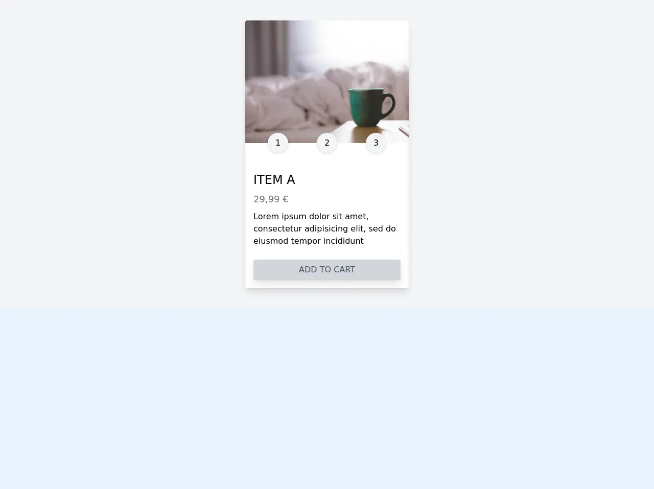
The preview of Basic card ui component.
To create a basic card UI component with Tailwind CSS, we will use the following classes: bg-white, rounded-lg, shadow-md, p-6, flex, flex-col, justify-between, and h-full. These classes will create a card with a white background, rounded corners, a shadow, and padding. The flex and flex-col classes will make the card's content stack vertically, and the justify-between class will evenly distribute the content between the header and footer sections.
Free download of the Basic card's source code
The source code of Basic card ui component.
To create a basic card UI component with Tailwind CSS, you can use the following HTML code:
<div class="container mx-auto bg-gray-100 py-10 flex justify-center">
<div class="bg-white w-80 shadow-lg cursor-pointer rounded transform hover:scale-105 duration-300 ease-in-out">
<div class="">
<img src="https://picsum.photos/400/300" alt="" class="rounded-t">
</div>
<div class="flex justify-around w-full transform -translate-y-5 px-4">
<div class="rounded-full shadow w-10 h-10 flex justify-center items-center bg-gray-100">
1
</div>
<div class="rounded-full shadow w-10 h-10 flex justify-center items-center bg-gray-100">
2
</div>
<div class="rounded-full shadow w-10 h-10 flex justify-center items-center bg-gray-100">
3
</div>
</div>
<div class="p-4">
<h2 class="text-2xl uppercase">Item a</h2>
<p class="font-light text-gray-500 text-lg my-2">29,99 €</p>
<p>Lorem ipsum dolor sit amet, consectetur adipisicing elit, sed do eiusmod tempor incididunt</p>
<a href="#" class="block bg-gray-300 py-2 px-2 text-gray-600 text-center rounded shadow-lg uppercase font-light mt-6 hover:bg-gray-400 hover:text-white duration-300 ease-in-out">Add to cart</a>
</div>
</div>
</div>
This code will create a basic card with a header, body, and footer section. You can customize the card's appearance by modifying the classes or adding additional styles.
How to create a Basic card with Tailwind CSS?
To create a basic card UI component with Tailwind CSS, follow these steps:
- Create a new HTML file and add the following code:
<div class="bg-white rounded-lg shadow-md p-6 flex flex-col justify-between h-full">
  <div class="text-lg font-bold">Card Title</div>
  <div class="text-gray-500 mt-2">Card Subtitle</div>
  <div class="mt-4 flex-grow">Card Content</div>
  <div class="text-gray-500 mt-4">Card Footer</div>
</div>
- Add the required Tailwind CSS classes to the HTML elements. The
bg-white,rounded-lg,shadow-md,p-6,flex,flex-col,justify-between, andh-fullclasses will create the basic card UI component.
<div class="bg-white rounded-lg shadow-md p-6 flex flex-col justify-between h-full">
  <div class="text-lg font-bold">Card Title</div>
  <div class="text-gray-500 mt-2">Card Subtitle</div>
  <div class="mt-4 flex-grow">Card Content</div>
  <div class="text-gray-500 mt-4">Card Footer</div>
</div>
- Customize the card's appearance by modifying the classes or adding additional styles. For example, you can change the background color by using the
bg-prefix classes, or change the font size by using thetext-prefix classes.
<div class="bg-blue-100 rounded-lg shadow-md p-6 flex flex-col justify-between h-full">
  <div class="text-2xl font-bold">Card Title</div>
  <div class="text-gray-500 mt-2">Card Subtitle</div>
  <div class="mt-4 flex-grow">Card Content</div>
  <div class="text-gray-500 mt-4">Card Footer</div>
</div>
- Save the HTML file and open it in a web browser to view the basic card UI component.
Conclusion.
In this article, we have learned how to create a basic card UI component with Tailwind CSS. We have seen how Tailwind CSS provides a set of pre-defined classes that can be used to create custom designs quickly and easily. We have also seen how to customize the card's appearance by modifying the classes or adding additional styles. With Tailwind CSS, creating custom UI components has never been easier.