- Published on
What You Need To Make A Badge With Tailwind CSS
- The description of Badge UI component
- Why use Tailwind CSS to create a Badge UI component?
- The preview of Badge UI component
- The source code of Badge UI component
- How to create a Badge with Tailwind CSS?
- Conclusion
Tailwind CSS is a utility-first CSS framework that provides a set of pre-defined classes to help you quickly build custom user interfaces. It allows you to create designs that are consistent and responsive across different devices and screen sizes.
The description of Badge UI component
A badge is a UI component that is commonly used to display a small amount of information, such as a notification count or a label. It is usually a small circle or rectangle that is placed on top of another element, such as a button or an avatar.
Why use Tailwind CSS to create a Badge UI component?
Tailwind CSS provides a set of pre-defined classes that can be used to create badges quickly and easily. It also allows you to customize the appearance of the badge by modifying the colors, sizes, and shapes of the elements.
Using Tailwind CSS to create a badge UI component also ensures that the design is consistent with the rest of the UI, as it follows the same design principles and uses the same color palette.
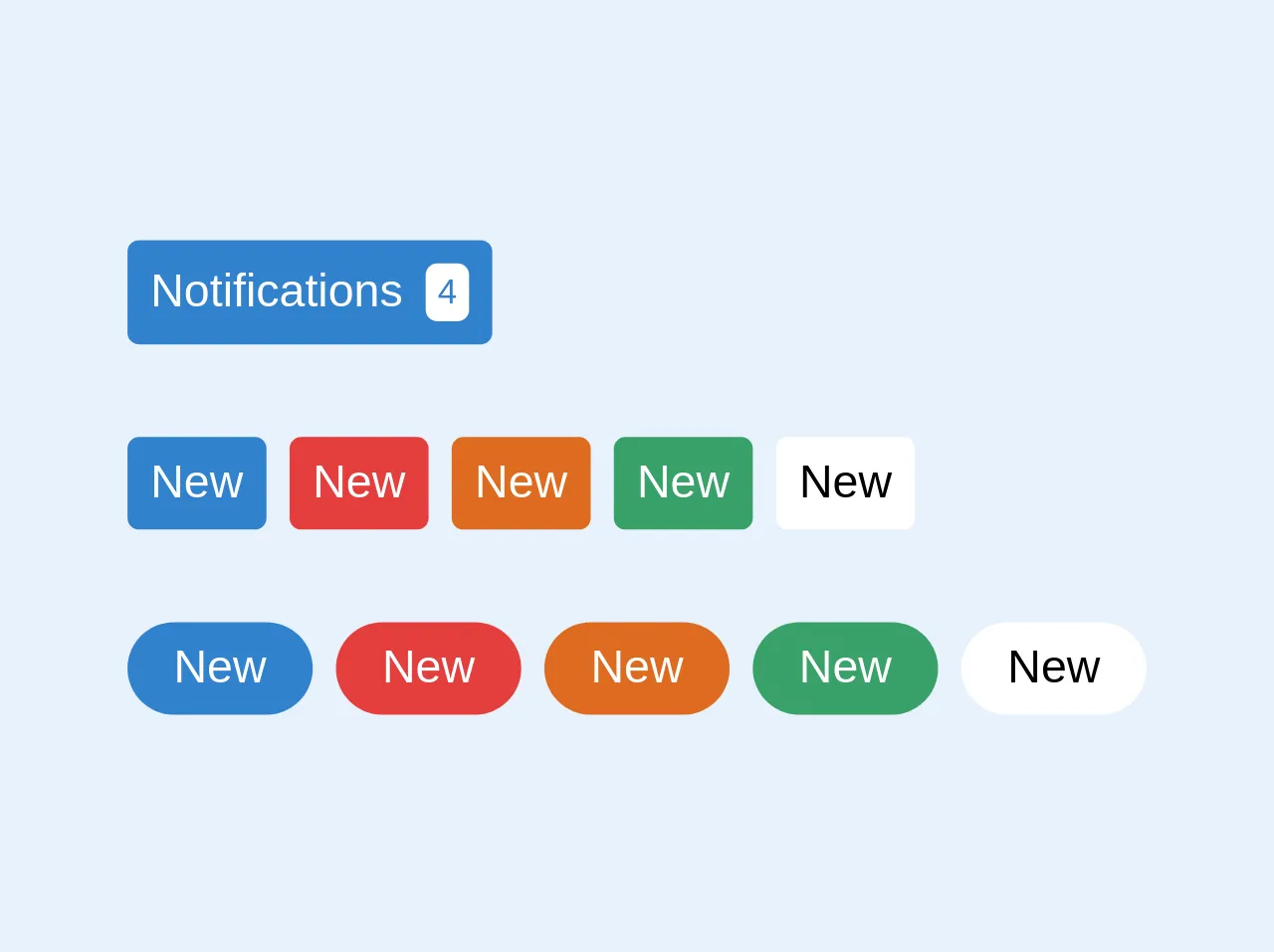
The preview of Badge UI component
To create a badge UI component with Tailwind CSS, you can use the bg-[color] and text-[color] classes to set the background and text color of the badge, respectively. You can also use the rounded-full class to create a circular badge.
Free download of the Badge's source code
The source code of Badge UI component
To create a badge UI component with Tailwind CSS, you can use the following HTML and CSS code:
<!-- This is an example component -->
<div class="flex flex-col">
  <div>
    <button
      type="button"
      class="flex items-center rounded bg-blue-600  p-2 leading-none text-white"
    >
      Notifications <span class="ml-2 rounded bg-white p-1 text-xs text-blue-600">4</span>
    </button>
  </div>
  <div class="mt-8 flex">
    <button
      type="button"
      class="mr-2 flex items-center rounded bg-blue-600  p-2 leading-none text-white"
    >
      New
    </button>
    <button
      type="button"
      class="mr-2 flex items-center rounded bg-red-600  p-2 leading-none text-white"
    >
      New
    </button>

    <button
      type="button"
      class="mr-2 flex items-center rounded bg-orange-600  p-2 leading-none text-white"
    >
      New
    </button>

    <button
      type="button"
      class="mr-2 flex items-center rounded bg-green-600  p-2 leading-none text-white"
    >
      New
    </button>

    <button type="button" class="flex items-center rounded bg-white  p-2 leading-none text-black">
      New
    </button>
  </div>

  <div class="mt-8 flex">
    <button
      type="button"
      class="mr-2 flex items-center rounded-full rounded bg-blue-600 p-2  px-4 leading-none text-white"
    >
      New
    </button>
    <button
      type="button"
      class="mr-2 flex items-center rounded-full rounded bg-red-600 p-2  px-4 leading-none text-white"
    >
      New
    </button>

    <button
      type="button"
      class="mr-2 flex items-center rounded-full rounded bg-orange-600 p-2  px-4 leading-none text-white"
    >
      New
    </button>

    <button
      type="button"
      class="mr-2 flex items-center rounded-full rounded bg-green-600 p-2  px-4 leading-none text-white"
    >
      New
    </button>

    <button
      type="button"
      class="flex items-center rounded-full rounded bg-white p-2  px-4 leading-none text-black"
    >
      New
    </button>
  </div>
</div>
How to create a Badge with Tailwind CSS?
To create a badge with Tailwind CSS, you can follow these steps:
- Create a container element for the badge, such as a
divor aspan. - Add the
inline-blockclass to the container element to make it an inline element. - Add the
px-2 py-1classes to the container element to add some padding to the badge. - Add the
rounded-fullclass to the container element to make it a circular badge. - Add the
bg-[color]class to the container element to set the background color of the badge. - Add the
text-[color]class to the container element to set the text color of the badge. - Add the content of the badge inside the container element, such as a number or a label.
Here is an example of how to create a badge with Tailwind CSS:
<div class="inline-block px-2 py-1 rounded-full bg-blue-500 text-white">
  3
</div>
This will create a circular badge with a blue background and white text, displaying the number 3.
You can also customize the size of the badge by adjusting the padding and font size of the container element. For example, you can use the px-1 py-0.5 text-xs classes to create a smaller badge:
<div class="inline-block px-1 py-0.5 rounded-full bg-red-500 text-white text-xs">
  New
</div>
This will create a smaller circular badge with a red background and white text, displaying the text "New".
Conclusion
In conclusion, Tailwind CSS is a powerful tool for creating UI components such as badges. It provides a set of pre-defined classes that can be used to create badges quickly and easily, while also allowing for customization and consistency with the rest of the UI. By following the steps outlined in this article, you can create beautiful and functional badges with Tailwind CSS.