- Published on
How to Create A Badged Buttons With Tailwind CSS?
- What is Tailwind CSS?
- The description of Badged Buttons ui component
- Why use Tailwind CSS to create a Badged Buttons ui component?
- The preview of Badged Buttons ui component
- The source code of Badged Buttons ui component
- How to create a Badged Buttons with Tailwind CSS?
- Conclusion
What is Tailwind CSS?
Tailwind CSS is a utility-first CSS framework that provides pre-defined classes to create custom designs easily and quickly. It allows developers to focus on the functionality and content of their website or application, rather than worrying about the design and layout.
The description of Badged Buttons ui component
Badged Buttons are a popular UI component used in web and mobile applications. They are buttons with a small badge or label attached to them, indicating some additional information or action. For example, a shopping cart button with a badge showing the number of items in the cart.
Why use Tailwind CSS to create a Badged Buttons ui component?
Tailwind CSS makes it easy to create Badged Buttons by providing pre-defined classes for styling and positioning elements. With Tailwind, you can quickly create a Badged Button without writing custom CSS or JavaScript.
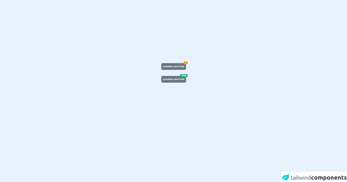
The preview of Badged Buttons ui component
Free download of the Badged Buttons's source code
The source code of Badged Buttons ui component
To create a Badged Button with Tailwind CSS, we will use the flex and items-center classes to align the button and badge horizontally. We will also use the bg-red-500 and text-white classes to style the badge.
<div class="h-sreen flex w-screen items-center justify-center p-8">
  <div class="flex flex-col space-y-10 self-center">
    <div>
      <button
        class="relative overflow-visible rounded-lg bg-gray-500 p-3 text-sm font-semibold uppercase tracking-tight text-white"
      >
        Example button
        <div class="absolute -top-3 -right-3 rounded-full bg-yellow-500 px-2.5 py-0.5 text-xs">
          1
        </div>
      </button>
    </div>

    <div>
      <button
        class="relative overflow-visible rounded-lg bg-gray-500 p-3 text-sm font-semibold uppercase tracking-tight text-white"
      >
        Example button
        <div class="absolute -top-3 -right-3 rounded-full bg-green-500 px-2.5 py-0.5 text-xs">
          2000
        </div>
      </button>
    </div>
  </div>
</div>
How to create a Badged Buttons with Tailwind CSS?
- First, we need to create a basic button using Tailwind CSS classes. We can use the
bg-blue-500,text-white,font-bold,py-2,px-4, androundedclasses to style the button.
<button class="bg-blue-500 text-white font-bold py-2 px-4 rounded">
  Button
</button>
- Next, we need to add the badge to the button. We can do this by wrapping the button and badge in a
divelement with theflexanditems-centerclasses. This will align the button and badge horizontally.
<div class="flex items-center">
  <button class="bg-blue-500 text-white font-bold py-2 px-4 rounded">
    Button
  </button>
  <span class="bg-red-500 text-white rounded-full px-2 py-1 ml-2 text-sm">1</span>
</div>
- Finally, we can style the badge using the
bg-red-500,text-white,rounded-full,px-2,py-1, andml-2classes. Thetext-smclass can be used to adjust the font size of the badge.
<div class="flex items-center">
  <button class="bg-blue-500 text-white font-bold py-2 px-4 rounded">
    Button
  </button>
  <span class="bg-red-500 text-white rounded-full px-2 py-1 ml-2 text-sm">1</span>
</div>
Conclusion
In this article, we have learned how to create a Badged Button with Tailwind CSS. By using pre-defined classes, we can quickly and easily create custom UI components without writing custom CSS or JavaScript. With Tailwind CSS, developers can focus on the functionality and content of their website or application, while still creating beautiful and responsive designs.