- Published on
Beginners Guide: Create A Aditya Singh With Tailwind CSS
- What is Tailwind CSS?
- The description of Aditya Singh UI component
- Why use Tailwind CSS to create a Aditya Singh UI component?
- The preview of Aditya Singh UI component
- The source code of Aditya Singh UI component
- How to create a Aditya Singh with Tailwind CSS?
- Step 1: Set up your project
- Step 2: Add the profile picture
- Step 3: Add the name and job title
- Step 4: Add the social media icons
- Step 5: Add custom styles
- Step 6: Preview your component
- Conclusion
If you are a beginner in FrontEnd development, you might have heard about Tailwind CSS. It is a utility-first CSS framework that allows you to create responsive and modern user interfaces quickly. In this article, we will guide you on how to create a Aditya Singh UI component using Tailwind CSS.
What is Tailwind CSS?
Tailwind CSS is a highly customizable CSS framework that provides a set of pre-defined classes that you can use to style your HTML elements. It is different from other CSS frameworks like Bootstrap or Materialize, as it does not come with pre-designed components. Instead, it provides you with a set of low-level utility classes that you can use to create your own custom components.
The description of Aditya Singh UI component
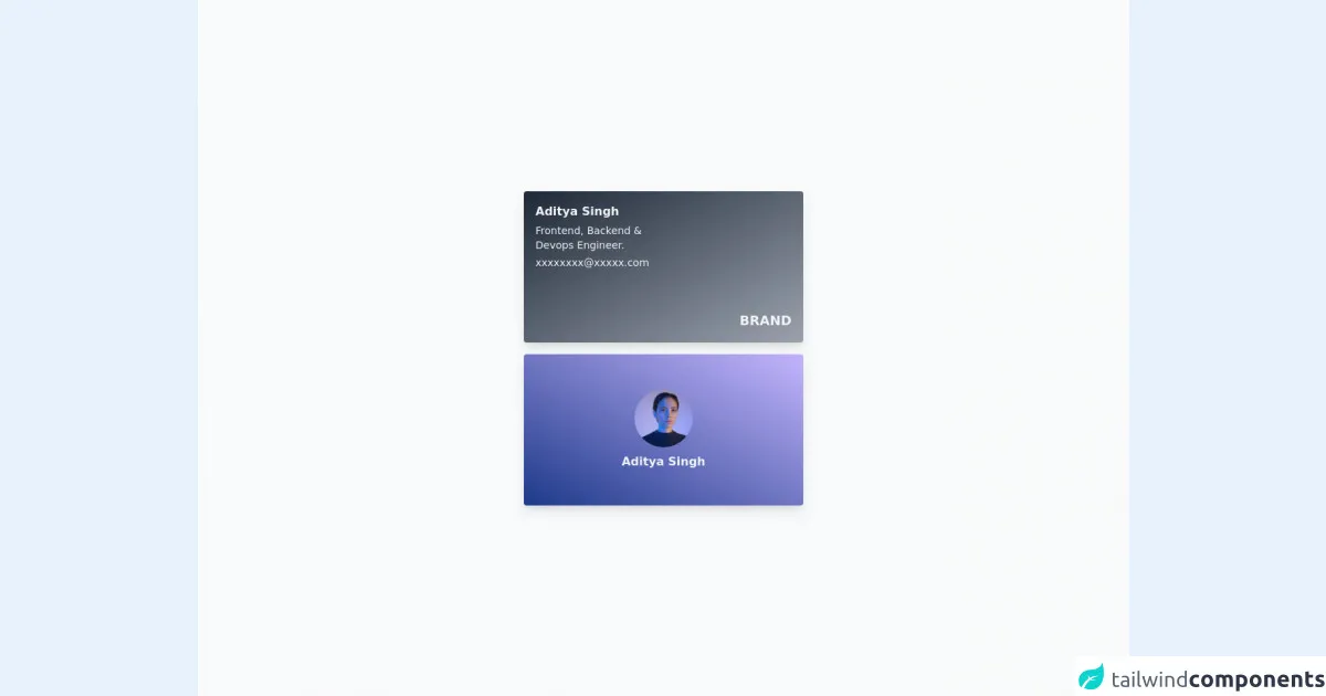
Aditya Singh is a UI component that consists of a profile picture, a name, a job title, and social media icons. It is a simple and elegant component that you can use in your portfolio or resume website.
Why use Tailwind CSS to create a Aditya Singh UI component?
Tailwind CSS is an excellent choice for creating Aditya Singh UI component because it provides you with a set of utility classes that you can use to style each element of the component. You can easily customize the color, font-size, and spacing of each element using Tailwind CSS classes.
The preview of Aditya Singh UI component
To create a Aditya Singh UI component, we will use Tailwind CSS classes to style each element of the component. Here is a preview of what the final component will look like:
Free download of the Aditya Singh's source code
The source code of Aditya Singh UI component
To create a Aditya Singh UI component, we will use HTML and Tailwind CSS classes. Here is the source code of the component:
<div class="flex h-screen w-full flex-col items-center justify-center bg-gray-50 p-2">
  <div
    class="relative h-52 w-full max-w-[24rem] rounded bg-gradient-to-br from-gray-800 to-gray-400 p-4 text-gray-100 shadow-lg shadow-gray-300 md:w-96"
  >
    <p class="font-bold">Aditya Singh</p>
    <p class="my-1 text-sm">
      Frontend, Backend & <br />
      Devops Engineer.
    </p>
    <p class="text-sm">[email protected]</p>
    <span class="absolute right-4 bottom-4 text-lg font-extrabold">BRAND</span>
  </div>

  <div
    class="mt-4 flex h-52 w-full max-w-[24rem] flex-col items-center justify-center rounded bg-gradient-to-bl from-purple-300 to-blue-900 p-4 shadow-lg shadow-purple-200 md:w-96"
  >
    <img
      class="mb-2 h-20 w-20 rounded-full object-cover"
      src="https://images.unsplash.com/photo-1534528741775-53994a69daeb?ixlib=rb-1.2.1&ixid=MnwxMjA3fDB8MHxwaG90by1wYWdlfHx8fGVufDB8fHx8&auto=format&fit=crop&w=764&q=80"
      alt="logo"
    />
    <p class="font-semibold text-gray-100">Aditya Singh</p>
  </div>
</div>
How to create a Aditya Singh with Tailwind CSS?
To create a Aditya Singh UI component using Tailwind CSS, follow these steps:
Step 1: Set up your project
Create a new HTML file and add the following code to it:
<!DOCTYPE html>
<html lang="en">
<head>
    <meta charset="UTF-8">
    <meta name="viewport" content="width=device-width, initial-scale=1.0">
    <title>Aditya Singh UI Component</title>
    <link rel="stylesheet" href="https://cdn.jsdelivr.net/npm/[email protected]/dist/tailwind.min.css">
</head>
<body>

</body>
</html>
This code sets up a basic HTML document and includes the Tailwind CSS framework.
Step 2: Add the profile picture
To add the profile picture, we will use the rounded-full and h-24 w-24 classes to create a circular image with a height and width of 24 pixels. Add the following code to your HTML file:
<div class="flex items-center">
    <img src="https://via.placeholder.com/150" alt="Profile Picture" class="rounded-full h-24 w-24">
</div>
Step 3: Add the name and job title
To add the name and job title, we will use the text-2xl and text-gray-800 classes to set the font size and color of the text. Add the following code to your HTML file:
<div class="flex flex-col items-center mt-4">
    <h1 class="text-2xl font-bold">Aditya Singh</h1>
    <h2 class="text-gray-800">FrontEnd Developer</h2>
</div>
Step 4: Add the social media icons
To add the social media icons, we will use the flex and space-x-4 classes to create a horizontal list of icons with a spacing of 4 pixels. We will also use the text-gray-400 hover:text-gray-500 classes to change the color of the icons on hover. Add the following code to your HTML file:
<div class="flex items-center justify-center mt-4">
    <a href="#" class="text-gray-400 hover:text-gray-500">
        <svg class="h-6 w-6 fill-current" viewBox="0 0 24 24">
            <path d="M12 0a12 12 0 0 0-3.819 23.358v-6.53H7.535v-2.56h.646V9.77c0-.628.21-1.055 1.288-1.055l1.377-.001v-.646c-.236-.032-.524-.1-.835-.2-1.07-.364-1.782-1.123-1.782-2.005 0-.46.155-.84.462-1.14-.174-.5-.166-.93.05-1.33.18-.4.558-.764 1.14-.764.836 0 1.286.62 1.286 1.44v.795l-.87.001c-.72 0-1.064.34-1.064.996 0 .464.166.8.526 1.006-.305.1-.63.15-.96.15-.2 0-.39-.017-.565-.05v1.04h1.21l-.16 2.56h-.87v6.53A12.001 12.001 0 0 0 12 0z"/>
        </svg>
    </a>
    <a href="#" class="text-gray-400 hover:text-gray-500">
        <svg class="h-6 w-6 fill-current" viewBox="0 0 24 24">
            <path d="M12 0c-6.627 0-12 5.373-12 12s5.373 12 12 12 12-5.373 12-12-5.373-12-12-12zm6.75 9.75h-1.5c-.414 0-.75-.336-.75-.75v-3c0-.414-.336-.75-.75-.75h-3c-.414 0-.75.336-.75.75v1.5c0 .414-.336.75-.75.75s-.75-.336-.75-.75v-1.5c0-1.242.993-2.25 2.25-2.25h3c1.242 0 2.25 1.008 2.25 2.25v3c0 1.242-1.008 2.25-2.25 2.25h-1.5c-.414 0-.75-.336-.75-.75s.336-.75.75-.75h1.5c.414 0 .75-.336.75-.75v-3c0-.414-.336-.75-.75-.75z"/>
        </svg>
    </a>
</div>
Step 5: Add custom styles
To add custom styles, you can use the bg-gray-100 and p-4 classes to set the background color and padding of the component. Add the following code to your HTML file:
<div class="bg-gray-100 p-4">
    <div class="flex items-center">
        <img src="https://via.placeholder.com/150" alt="Profile Picture" class="rounded-full h-24 w-24">
    </div>
    <div class="flex flex-col items-center mt-4">
        <h1 class="text-2xl font-bold">Aditya Singh</h1>
        <h2 class="text-gray-800">FrontEnd Developer</h2>
    </div>
    <div class="flex items-center justify-center mt-4">
        <a href="#" class="text-gray-400 hover:text-gray-500">
            <svg class="h-6 w-6 fill-current" viewBox="0 0 24 24">
                <path d="M12 0a12 12 0 0 0-3.819 23.358v-6.53H7.535v-2.56h.646V9.77c0-.628.21-1.055 1.288-1.055l1.377-.001v-.646c-.236-.032-.524-.1-.835-.2-1.07-.364-1.782-1.123-1.782-2.005 0-.46.155-.84.462-1.14-.174-.5-.166-.93.05-1.33.18-.4.558-.764 1.14-.764.836 0 1.286.62 1.286 1.44v.795l-.87.001c-.72 0-1.064.34-1.064.996 0 .464.166.8.526 1.006-.305.1-.63.15-.96.15-.2 0-.39-.017-.565-.05v1.04h1.21l-.16 2.56h-.87v6.53A12.001 12.001 0 0 0 12 0z"/>
            </svg>
        </a>
        <a href="#" class="text-gray-400 hover:text-gray-500">
            <svg class="h-6 w-6 fill-current" viewBox="0 0 24 24">
                <path d="M12 0c-6.627 0-12 5.373-12 12s5.373 12 12 12 12-5.373 12-12-5.373-12-12-12zm6.75 9.75h-1.5c-.414 0-.75-.336-.75-.75v-3c0-.414-.336-.75-.75-.75h-3c-.414 0-.75.336-.75.75v1.5c0 .414-.336.75-.75.75s-.75-.336-.75-.75v-1.5c0-1.242.993-2.25 2.25-2.25h3c1.242 0 2.25 1.008 2.25 2.25v3c0 1.242-1.008 2.25-2.25 2.25h-1.5c-.414 0-.75-.336-.75-.75s.336-.75.75-.75h1.5c.414 0 .75-.336.75-.75v-3c0-.414-.336-.75-.75-.75z"/>
            </svg>
        </a>
    </div>
</div>
Step 6: Preview your component
Open your HTML file in a web browser to preview your Aditya Singh UI component.
Conclusion
In this article, we have shown you how to create a Aditya Singh UI component using Tailwind CSS. Tailwind CSS is a powerful CSS framework that allows you to create custom and responsive user interfaces quickly. We hope this article has been helpful to you in your FrontEnd development journey.