- Published on
Most Effective Ways To Build A Action Panel With Link With Tailwind CSS
- What is Tailwind CSS?
- The description of action panel with link ui component
- Why use Tailwind CSS to create an action panel with link ui component?
- The preview of action panel with link ui component
- The source code of action panel with link ui component
- How to create an action panel with link with Tailwind CSS?
- Conclusion
As a FrontEnd technology blogger, it is important to stay up-to-date with the latest technologies and trends. One such trend is the use of Tailwind CSS to create user interface components. In this article, we will explore the most effective ways to build an action panel with link using Tailwind CSS.
What is Tailwind CSS?
Tailwind CSS is a utility-first CSS framework that allows developers to rapidly build custom user interfaces. The framework provides a set of pre-defined CSS classes that can be used to style HTML elements. This approach allows developers to focus on the functionality of their application, rather than spending time on styling.
The description of action panel with link ui component
An action panel with link is a user interface component that is commonly used in web applications. It typically consists of a set of buttons or links that allow users to perform specific actions. The action panel is usually positioned at the top or bottom of the page and is often used to provide quick access to frequently used features.
Why use Tailwind CSS to create an action panel with link ui component?
Tailwind CSS provides a number of benefits when it comes to building user interface components. Firstly, it allows developers to rapidly prototype and build custom components without having to write custom CSS. Secondly, the framework provides a consistent set of styles that can be used across an entire application, ensuring a cohesive user experience. Finally, Tailwind CSS is highly customizable, allowing developers to easily modify the look and feel of their components.
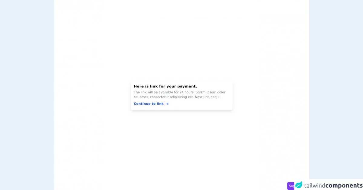
The preview of action panel with link ui component
To create an action panel with link using Tailwind CSS, we will use a combination of HTML and CSS. The resulting component will be a simple, yet effective way to provide users with quick access to frequently used features.
Free download of the action panel with link's source code
The source code of action panel with link ui component
To create an action panel with link using Tailwind CSS, we will use a combination of HTML and CSS. The resulting component will be a simple, yet effective way to provide users with quick access to frequently used features.
<section class="flex min-h-screen items-center justify-center bg-white px-4">
<div class="w-full max-w-lg rounded-lg p-4 shadow-lg">
<h3 class="text-lg font-semibold tracking-wide">Here is link for your payment.</h3>
<p class="my-1 text-gray-500">
The link will be available for 24 hours. Lorem ipsum dolor sit, amet, consectetur adipisicing
elit. Nesciunt, sequi!
</p>
<div class="mt-2">
<a href="#" class="inline-flex items-center font-semibold tracking-wide text-blue-700">
<span class="hover:underline"> Continue to link </span>
<span class="ml-2 text-xl">→</span>
</a>
</div>
</div>
</section>
<!-- support me by buying a coffee -->
<a
href="https://www.buymeacoffee.com/danimai"
target="_blank"
class="fixed right-0 bottom-0 rounded-lg bg-purple-600 p-2 text-white"
>
Support me
</a>
How to create an action panel with link with Tailwind CSS?
To create an action panel with link using Tailwind CSS, we will follow these steps:
- Create a new HTML file and add the following code:
<div class="flex justify-end bg-gray-100 py-4 px-6">
  <a href="#" class="text-gray-600 hover:text-gray-800 mr-4">Link 1</a>
  <a href="#" class="text-gray-600 hover:text-gray-800 mr-4">Link 2</a>
  <a href="#" class="text-gray-600 hover:text-gray-800">Link 3</a>
</div>
In the code above, we have created a
divelement with aflexclass, which allows us to position the links horizontally. We have also added ajustify-endclass to align the links to the right of the container. Thebg-gray-100class sets the background color of the container to light gray, while thepy-4andpx-6classes set the padding of the container.Inside the
divelement, we have added threeaelements, each with ahrefattribute and atext-gray-600class. Thetext-gray-600class sets the color of the links to gray. We have also added ahover:text-gray-800class to each link, which changes the color of the links to dark gray when the user hovers over them. Finally, we have added amr-4class to the first two links, which adds a margin to the right of the links to separate them.Save the HTML file and open it in a web browser. You should see the action panel with link component displayed at the top of the page.
Conclusion
In this article, we have explored the most effective ways to build an action panel with link using Tailwind CSS. We have seen how Tailwind CSS can be used to rapidly prototype and build custom user interface components, and how it provides a consistent set of styles that can be used across an entire application. By following the steps outlined in this article, you can easily create an action panel with link using Tailwind CSS and provide users with quick access to frequently used features.