- Published on
Ways To Build A Admin Dashboard Cards With Tailwind CSS In 60 Minutes
- What is Tailwind CSS?
- The description of Admin dashboard Cards UI component
- Why use Tailwind CSS to create an Admin dashboard Cards UI component?
- The preview of Admin dashboard Cards UI component
- The source code of Admin dashboard Cards UI component
- How to create an Admin dashboard Cards with Tailwind CSS?
- Step 1: Create the HTML structure
- Step 2: Style the HTML elements using Tailwind CSS classes
- Step 3: Add dynamic data using a templating engine
- Conclusion
As a FrontEnd technology blogger, it is important to stay up-to-date with the latest trends and technologies. One such technology that has gained a lot of popularity in recent times is Tailwind CSS. Tailwind CSS is a utility-first CSS framework that makes it easy to create responsive and customizable UI components. In this article, we will explore how to use Tailwind CSS to create an Admin dashboard Cards UI component in just 60 minutes.
What is Tailwind CSS?
Tailwind CSS is a utility-first CSS framework that provides a set of pre-defined CSS classes that can be used to style HTML elements. It is designed to make it easy to create responsive and customizable UI components without writing any custom CSS code. Tailwind CSS is gaining popularity among developers due to its ease of use and flexibility.
The description of Admin dashboard Cards UI component
Admin dashboard Cards UI component is a common UI element used in web applications to display information in a visually appealing way. Admin dashboard Cards are usually used to display important data such as sales, revenue, and user statistics. Admin dashboard Cards UI component is a critical component of any web application that requires data visualization.
Why use Tailwind CSS to create an Admin dashboard Cards UI component?
Tailwind CSS provides a set of pre-defined CSS classes that can be used to create responsive and customizable UI components. Using Tailwind CSS, we can quickly create an Admin dashboard Cards UI component without writing any custom CSS code. Tailwind CSS also provides a lot of utility classes that can be used to style the UI components in a granular way.
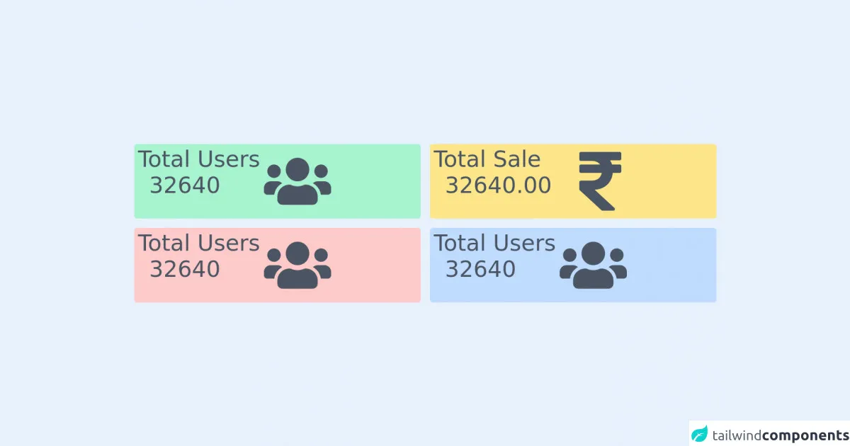
The preview of Admin dashboard Cards UI component
Admin dashboard Cards UI component is a visually appealing way to display important data. With Tailwind CSS, we can quickly create a responsive and customizable Admin dashboard Cards UI component.
Free download of the Admin dashboard Cards's source code
The source code of Admin dashboard Cards UI component
To create an Admin dashboard Cards UI component with Tailwind CSS, we need to write HTML and CSS code. The HTML code defines the structure of the UI component, while the CSS code styles the UI component.
<div class="grid w-full grid-cols-3 gap-5 p-4 lg:grid-cols-2">
  <div class="rounded-md bg-green-200 py-2 ">
    <div class="flex">
      <div>
        <h2 class="whitespace-no-wrap px-2 text-base text-gray-600 md:text-2xl lg:text-5xl">
          Total Users
        </h2>
        <h2 class="ltext-base px-4 py-2 text-gray-600 md:text-2xl lg:px-8 lg:text-5xl">32640</h2>
      </div>
      <div class="flex items-center justify-center">
        <svg
          class="h-10 w-10 text-gray-600 md:h-20 md:w-20 lg:h-36 lg:w-36 "
          fill="currentColor"
          xmlns="http://www.w3.org/2000/svg"
          viewBox="0 0 640 512"
        >
          <path
            d="M96 224c35.3 0 64-28.7 64-64s-28.7-64-64-64-64 28.7-64 64 28.7 64 64 64zm448 0c35.3 0 64-28.7 64-64s-28.7-64-64-64-64 28.7-64 64 28.7 64 64 64zm32 32h-64c-17.6 0-33.5 7.1-45.1 18.6 40.3 22.1 68.9 62 75.1 109.4h66c17.7 0 32-14.3 32-32v-32c0-35.3-28.7-64-64-64zm-256 0c61.9 0 112-50.1 112-112S381.9 32 320 32 208 82.1 208 144s50.1 112 112 112zm76.8 32h-8.3c-20.8 10-43.9 16-68.5 16s-47.6-6-68.5-16h-8.3C179.6 288 128 339.6 128 403.2V432c0 26.5 21.5 48 48 48h288c26.5 0 48-21.5 48-48v-28.8c0-63.6-51.6-115.2-115.2-115.2zm-223.7-13.4C161.5 263.1 145.6 256 128 256H64c-35.3 0-64 28.7-64 64v32c0 17.7 14.3 32 32 32h65.9c6.3-47.4 34.9-87.3 75.2-109.4z"
          ></path>
        </svg>
      </div>
    </div>
  </div>
  <div class="rounded-md bg-yellow-200 py-2 ">
    <div class="flex">
      <div>
        <h2 class="whitespace-no-wrap px-2 text-base text-gray-600 md:text-2xl lg:text-5xl">
          Total Sale
        </h2>
        <h2 class="ltext-base px-4 py-2 text-gray-600 md:text-2xl lg:px-8 lg:text-5xl">32640.00</h2>
      </div>
      <div class="flex items-center justify-center">
        <svg
          class="h-10 w-10 text-gray-600 md:h-20 md:w-20 lg:h-36 lg:w-36 "
          fill="currentColor"
          xmlns="http://www.w3.org/2000/svg"
          viewBox="0 0 320 512"
        >
          <!-- Font Awesome Free 5.15.3 by @fontawesome - https://fontawesome.com License - https://fontawesome.com/license/free (Icons: CC BY 4.0, Fonts: SIL OFL 1.1, Code: MIT License) -->
          <path
            d="M308 96c6.627 0 12-5.373 12-12V44c0-6.627-5.373-12-12-12H12C5.373 32 0 37.373 0 44v44.748c0 6.627 5.373 12 12 12h85.28c27.308 0 48.261 9.958 60.97 27.252H12c-6.627 0-12 5.373-12 12v40c0 6.627 5.373 12 12 12h158.757c-6.217 36.086-32.961 58.632-74.757 58.632H12c-6.627 0-12 5.373-12 12v53.012c0 3.349 1.4 6.546 3.861 8.818l165.052 152.356a12.001 12.001 0 0 0 8.139 3.182h82.562c10.924 0 16.166-13.408 8.139-20.818L116.871 319.906c76.499-2.34 131.144-53.395 138.318-127.906H308c6.627 0 12-5.373 12-12v-40c0-6.627-5.373-12-12-12h-58.69c-3.486-11.541-8.28-22.246-14.252-32H308z"
          ></path>
        </svg>
      </div>
    </div>
  </div>
  <div class="rounded-md bg-red-200 py-2 ">
    <div class="flex">
      <div>
        <h2 class="whitespace-no-wrap px-2 text-base text-gray-600 md:text-2xl lg:text-5xl">
          Total Users
        </h2>
        <h2 class="ltext-base px-4 py-2 text-gray-600 md:text-2xl lg:px-8 lg:text-5xl">32640</h2>
      </div>
      <div class="flex items-center justify-center">
        <svg
          class="h-10 w-10 text-gray-600 md:h-20 md:w-20 lg:h-36 lg:w-36 "
          fill="currentColor"
          xmlns="http://www.w3.org/2000/svg"
          viewBox="0 0 640 512"
        >
          <!-- Font Awesome Free 5.15.3 by @fontawesome - https://fontawesome.com License - https://fontawesome.com/license/free (Icons: CC BY 4.0, Fonts: SIL OFL 1.1, Code: MIT License) -->
          <path
            d="M96 224c35.3 0 64-28.7 64-64s-28.7-64-64-64-64 28.7-64 64 28.7 64 64 64zm448 0c35.3 0 64-28.7 64-64s-28.7-64-64-64-64 28.7-64 64 28.7 64 64 64zm32 32h-64c-17.6 0-33.5 7.1-45.1 18.6 40.3 22.1 68.9 62 75.1 109.4h66c17.7 0 32-14.3 32-32v-32c0-35.3-28.7-64-64-64zm-256 0c61.9 0 112-50.1 112-112S381.9 32 320 32 208 82.1 208 144s50.1 112 112 112zm76.8 32h-8.3c-20.8 10-43.9 16-68.5 16s-47.6-6-68.5-16h-8.3C179.6 288 128 339.6 128 403.2V432c0 26.5 21.5 48 48 48h288c26.5 0 48-21.5 48-48v-28.8c0-63.6-51.6-115.2-115.2-115.2zm-223.7-13.4C161.5 263.1 145.6 256 128 256H64c-35.3 0-64 28.7-64 64v32c0 17.7 14.3 32 32 32h65.9c6.3-47.4 34.9-87.3 75.2-109.4z"
          ></path>
        </svg>
      </div>
    </div>
  </div>
  <div class="rounded-md bg-blue-200 py-2 ">
    <div class="flex">
      <div>
        <h2 class="whitespace-no-wrap px-2 text-base text-gray-600 md:text-2xl lg:text-5xl">
          Total Users
        </h2>
        <h2 class="ltext-base px-4 py-2 text-gray-600 md:text-2xl lg:px-8 lg:text-5xl">32640</h2>
      </div>
      <div class="flex items-center justify-center">
        <svg
          class="h-10 w-10 text-gray-600 md:h-20 md:w-20 lg:h-36 lg:w-36 "
          fill="currentColor"
          xmlns="http://www.w3.org/2000/svg"
          viewBox="0 0 640 512"
        >
          <!-- Font Awesome Free 5.15.3 by @fontawesome - https://fontawesome.com License - https://fontawesome.com/license/free (Icons: CC BY 4.0, Fonts: SIL OFL 1.1, Code: MIT License) -->
          <path
            d="M96 224c35.3 0 64-28.7 64-64s-28.7-64-64-64-64 28.7-64 64 28.7 64 64 64zm448 0c35.3 0 64-28.7 64-64s-28.7-64-64-64-64 28.7-64 64 28.7 64 64 64zm32 32h-64c-17.6 0-33.5 7.1-45.1 18.6 40.3 22.1 68.9 62 75.1 109.4h66c17.7 0 32-14.3 32-32v-32c0-35.3-28.7-64-64-64zm-256 0c61.9 0 112-50.1 112-112S381.9 32 320 32 208 82.1 208 144s50.1 112 112 112zm76.8 32h-8.3c-20.8 10-43.9 16-68.5 16s-47.6-6-68.5-16h-8.3C179.6 288 128 339.6 128 403.2V432c0 26.5 21.5 48 48 48h288c26.5 0 48-21.5 48-48v-28.8c0-63.6-51.6-115.2-115.2-115.2zm-223.7-13.4C161.5 263.1 145.6 256 128 256H64c-35.3 0-64 28.7-64 64v32c0 17.7 14.3 32 32 32h65.9c6.3-47.4 34.9-87.3 75.2-109.4z"
          ></path>
        </svg>
      </div>
    </div>
  </div>
</div>
How to create an Admin dashboard Cards with Tailwind CSS?
To create an Admin dashboard Cards UI component with Tailwind CSS, we need to follow the below steps:
Step 1: Create the HTML structure
We start by creating the HTML structure for the Admin dashboard Cards UI component. The HTML structure consists of a container element that holds the Card elements. Each Card element contains a header, body, and footer.
Step 2: Style the HTML elements using Tailwind CSS classes
After creating the HTML structure, we can use Tailwind CSS classes to style the HTML elements. We can use utility classes to set the background color, text color, font size, padding, margin, and border of the Card elements.
Step 3: Add dynamic data using a templating engine
To display dynamic data in the Admin dashboard Cards UI component, we can use a templating engine such as Handlebars.js. We can pass the data to the templating engine, which will generate the HTML code for the Cards.
Conclusion
In this article, we explored how to use Tailwind CSS to create an Admin dashboard Cards UI component in just 60 minutes. We discussed the benefits of using Tailwind CSS and how it can make it easy to create responsive and customizable UI components. We also provided a preview of the Admin dashboard Cards UI component and the source code. With Tailwind CSS, creating UI components has never been easier.