- Published on
A Complete Guide To Make A A Minimal Simple Modal That Still Looks Good With Tailwind CSS
- What is Tailwind CSS?
- The description of A minimal simple modal that still looks good ui component
- Why use Tailwind CSS to create a A minimal simple modal that still looks good ui component?
- The preview of A minimal simple modal that still looks good ui component.
- The source code of A minimal simple modal that still looks good ui component.
- How to create a A minimal simple modal that still looks good with Tailwind CSS?
- Conclusion
What is Tailwind CSS?
Tailwind CSS is a utility-first CSS framework that provides a set of pre-defined CSS classes that can be used to style your HTML elements. It allows you to quickly build custom user interfaces without having to write any CSS from scratch. Tailwind CSS is highly customizable and allows you to create your own classes to suit your needs.
The description of A minimal simple modal that still looks good ui component
A modal is a user interface component that displays content on top of the current page. It is used to provide additional information or to prompt the user for an action. A minimal simple modal is a modal that has a clean and simple design, without any unnecessary elements. It should be easy to use and should not distract the user from the main content of the page.
Why use Tailwind CSS to create a A minimal simple modal that still looks good ui component?
Tailwind CSS provides a set of pre-defined CSS classes that can be used to create a minimal simple modal. It allows you to quickly style your modal without having to write any CSS from scratch. Tailwind CSS is highly customizable, which means you can easily modify the default styles to suit your needs.
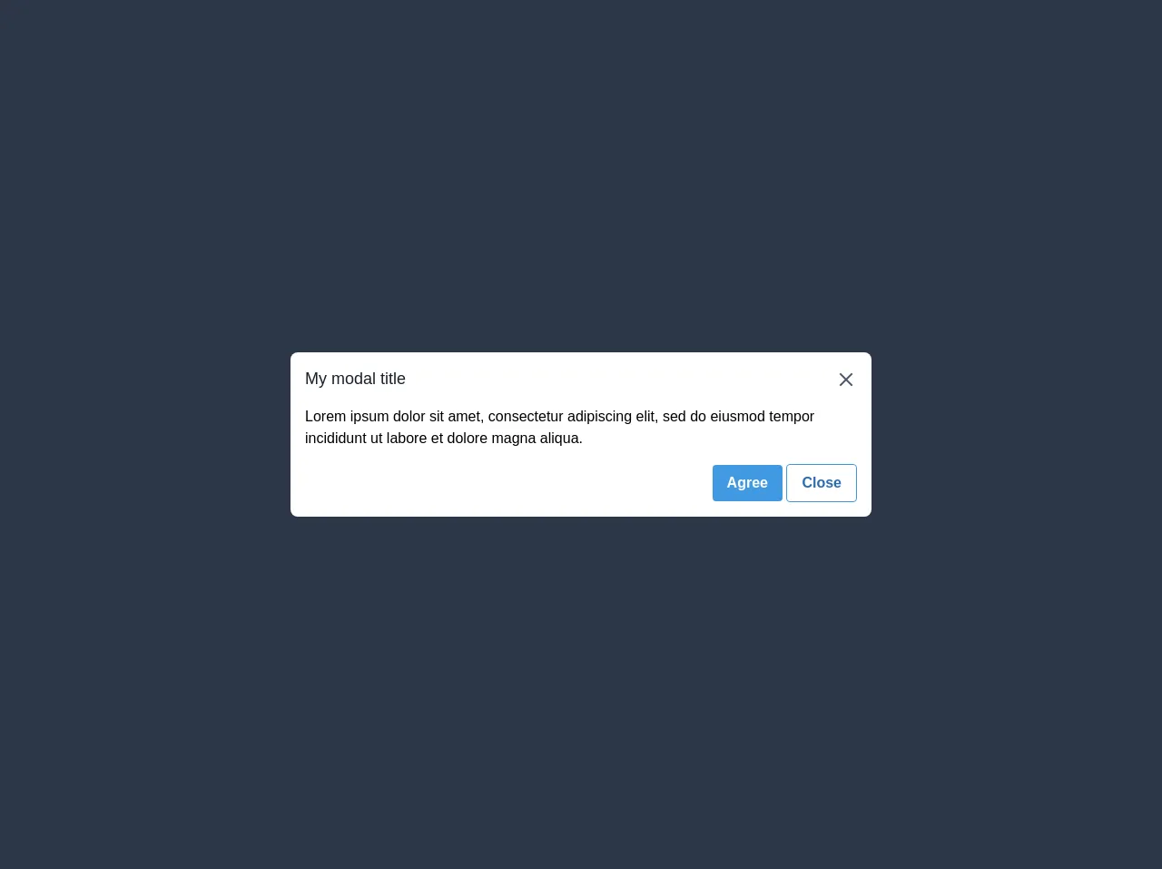
The preview of A minimal simple modal that still looks good ui component.
To create a minimal simple modal with Tailwind CSS, we will use the following classes:
fixed: This class is used to position the modal at a fixed position on the screen.inset-0: This class is used to set the top, right, bottom and left properties to 0, which means the modal will cover the entire screen.z-50: This class is used to set the z-index property to 50, which means the modal will appear on top of all other elements on the page.bg-white: This class is used to set the background color of the modal to white.rounded-lg: This class is used to add rounded corners to the modal.shadow-lg: This class is used to add a shadow to the modal, which gives it a 3D effect.p-6: This class is used to add padding to the modal content.
Free download of the A minimal simple modal that still looks good's source code
The source code of A minimal simple modal that still looks good ui component.
To create a minimal simple modal with Tailwind CSS, you can use the following HTML and CSS code:
<div class="fixed inset-0 z-50 flex items-center justify-center">
  <div class="bg-white rounded-lg shadow-lg p-6">
    <h2 class="text-2xl font-bold mb-4">Modal Title</h2>
    <p class="mb-4">Modal content goes here...</p>
    <button class="bg-blue-500 hover:bg-blue-700 text-white font-bold py-2 px-4 rounded">
      Close
    </button>
  </div>
</div>
/* No CSS required */
<div class="fixed left-0 bottom-0 flex h-full w-full items-center justify-center bg-gray-800">
  <div class="w-1/2 rounded-lg bg-white">
    <div class="flex flex-col items-start p-4">
      <div class="flex w-full items-center">
        <div class="text-lg font-medium text-gray-900">My modal title</div>
        <svg
          class="ml-auto h-6 w-6 cursor-pointer fill-current text-gray-700"
          xmlns="http://www.w3.org/2000/svg"
          viewBox="0 0 18 18"
        >
          <path
            d="M14.53 4.53l-1.06-1.06L9 7.94 4.53 3.47 3.47 4.53 7.94 9l-4.47 4.47 1.06 1.06L9 10.06l4.47 4.47 1.06-1.06L10.06 9z"
          />
        </svg>
      </div>
      <hr />
      <div class="">
        Lorem ipsum dolor sit amet, consectetur adipiscing elit, sed do eiusmod tempor incididunt ut
        labore et dolore magna aliqua.
      </div>
      <hr />
      <div class="ml-auto">
        <button class="rounded bg-blue-500 py-2 px-4 font-bold text-white hover:bg-blue-700">
          Agree
        </button>
        <button
          class="rounded border border-blue-500 bg-transparent py-2 px-4 font-semibold text-blue-700 hover:border-transparent hover:bg-gray-500 hover:text-white"
        >
          Close
        </button>
      </div>
    </div>
  </div>
</div>
How to create a A minimal simple modal that still looks good with Tailwind CSS?
To create a minimal simple modal with Tailwind CSS, you can follow these steps:
- Create a new HTML file and add the following code:
<!DOCTYPE html>
<html lang="en">
  <head>
    <meta charset="UTF-8" />
    <meta name="viewport" content="width=device-width, initial-scale=1.0" />
    <title>Minimal Simple Modal</title>
    <link
      rel="stylesheet"
      href="https://cdn.jsdelivr.net/npm/[email protected]/dist/tailwind.min.css"
    />
  </head>
  <body>
    <button
      class="bg-blue-500 hover:bg-blue-700 text-white font-bold py-2 px-4 rounded"
    >
      Open Modal
    </button>

    <div
      class="fixed inset-0 z-50 flex items-center justify-center"
      style="display: none"
    >
      <div class="bg-white rounded-lg shadow-lg p-6">
        <h2 class="text-2xl font-bold mb-4">Modal Title</h2>
        <p class="mb-4">Modal content goes here...</p>
        <button
          class="bg-blue-500 hover:bg-blue-700 text-white font-bold py-2 px-4 rounded"
        >
          Close
        </button>
      </div>
    </div>

    <script>
      const openModalButton = document.querySelector("button");
      const modal = document.querySelector(".fixed");

      openModalButton.addEventListener("click", () => {
        modal.style.display = "flex";
      });

      modal.addEventListener("click", (event) => {
        if (event.target === modal) {
          modal.style.display = "none";
        }
      });
    </script>
  </body>
</html>
In the HTML code, we have added a button that will open the modal when clicked. We have also added the HTML code for the modal, but we have set the
displayproperty tononeso that it is hidden by default.We have added a script tag at the end of the body to handle the opening and closing of the modal. When the button is clicked, we set the
displayproperty of the modal toflexto show it. When the user clicks outside the modal, we set thedisplayproperty back tononeto hide it.Save the HTML file and open it in your web browser. Click the "Open Modal" button to see the modal in action.
Conclusion
In this article, we have learned how to create a minimal simple modal that still looks good with Tailwind CSS. We have seen how Tailwind CSS provides a set of pre-defined CSS classes that can be used to style the modal, and how it allows you to quickly build custom user interfaces without having to write any CSS from scratch. We have also seen how to use JavaScript to handle the opening and closing of the modal. With this knowledge, you can create your own custom modals that fit your needs.