- Published on
Beginners Guide: Make A A Popup Box! With Tailwind CSS
- What is Tailwind CSS?
- The description of A Popup Box! UI component
- Why use Tailwind CSS to create a Popup Box! UI component?
- The preview of A Popup Box! UI component
- The source code of A Popup Box! UI component
- How to create a Popup Box! with Tailwind CSS?
- Step 1: Set up the HTML structure
- Step 2: Style the Popup Box! with Tailwind CSS
- Step 3: Add JavaScript to show and hide the Popup Box!
- Conclusion
As a beginner in FrontEnd technology, you might have come across the term Tailwind CSS. If you haven't, don't worry, we'll explain it in this article. In this guide, we'll walk you through the process of creating a Popup Box! UI component using Tailwind CSS.
What is Tailwind CSS?
Tailwind CSS is a utility-first CSS framework that allows you to quickly design and build responsive websites. It provides pre-defined classes that you can use to style your HTML elements without having to write custom CSS. Tailwind CSS is designed to be highly customizable, which makes it a popular choice among developers.
The description of A Popup Box! UI component
A Popup Box! is a UI component that displays a message or content in a modal window. It is commonly used to show notifications, alerts, or confirmations to users. Popup boxes can be triggered by clicking a button or link, or by a timed event.
Why use Tailwind CSS to create a Popup Box! UI component?
Tailwind CSS provides a wide range of pre-defined classes that can be used to create complex UI components with minimal effort. This makes it an ideal choice for creating a Popup Box! UI component. Additionally, Tailwind CSS is highly customizable, which means that you can easily modify the styles to match the design of your website.
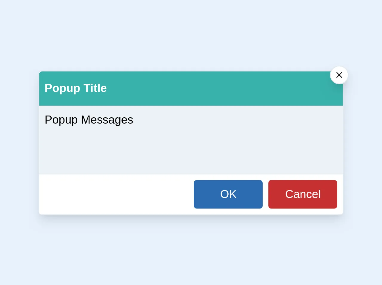
The preview of A Popup Box! UI component
To create a Popup Box! UI component, we'll use Tailwind CSS to style the modal window. The Popup Box! will have a header, body, and footer section. The header will contain a title, the body will contain the content, and the footer will contain buttons to close the Popup Box!.
Free download of the A Popup Box!'s source code
The source code of A Popup Box! UI component
To create the Popup Box! UI component, we'll use HTML and Tailwind CSS. The HTML will define the structure of the Popup Box!, and the Tailwind CSS classes will be used to style the component.
<div class="w-1/2 rounded border bg-white shadow-lg md:w-1/3">
  <div class="rounded-t bg-teal-500">
    <div class="relative flex py-3 px-2">
      <span class="text-sm font-semibold text-white md:text-base">Popup Title</span>
      <div
        class="absolute right-0 top-0 z-10 -mr-2 -mt-2 cursor-pointer rounded-full border bg-white p-1 p-2 shadow-lg"
      >
        <img src="https://image.flaticon.com/icons/svg/151/151882.svg"/ class="w-2 h-2">
      </div>
    </div>
  </div>
  <div class="h-24 border-b bg-gray-200 p-2 text-sm md:text-base">
    <p>Popup Messages</p>
  </div>
  <div class="flex justify-end rounded-b p-2">
    <button
      class="mr-2 w-24 rounded bg-blue-700 py-1 px-2 text-white hover:bg-blue-600 focus:outline-none md:py-2 md:px-3"
    >
      OK
    </button>
    <button
      class="w-24 rounded bg-red-700 py-1 px-2 text-white hover:bg-red-600 focus:outline-none md:py-2 md:px-3"
    >
      Cancel
    </button>
  </div>
</div>
How to create a Popup Box! with Tailwind CSS?
Now that we have an idea of what a Popup Box! UI component is and why we should use Tailwind CSS to create it, let's dive into the process of creating the Popup Box!.
Step 1: Set up the HTML structure
The first step is to set up the HTML structure of the Popup Box!. We'll use a div element with a class of "popup-box" to wrap the entire component. Inside the popup-box div, we'll create three sections: header, body, and footer.
<div class="popup-box">
<div class="popup-box-header">
<h2 class="popup-box-title">Popup Box Title</h2>
<button class="popup-box-close">×</button>
</div>
<div class="popup-box-body">
<p>Popup Box Content</p>
</div>
<div class="popup-box-footer">
<button class="popup-box-button">Close</button>
</div>
</div>
Step 2: Style the Popup Box! with Tailwind CSS
Next, we'll use Tailwind CSS to style the Popup Box!. We'll start by setting the position of the popup-box div to absolute, which will allow us to position it in the center of the screen. We'll also set the z-index to 9999, which will ensure that the Popup Box! appears on top of other elements on the page.
.popup-box {
  position: absolute;
  top: 50%;
  left: 50%;
  transform: translate(-50%, -50%);
  z-index: 9999;
}
Next, we'll style the header section of the Popup Box!. We'll set the background color to gray, the font size to 1.5rem, and the text color to white. We'll also add some padding to the header section to create some space between the content and the edge of the Popup Box!.
.popup-box-header {
  background-color: gray;
  color: white;
  font-size: 1.5rem;
  padding: 1rem;
}
We'll also style the title and close button in the header section. We'll set the font size of the title to 1.5rem and the font size of the close button to 2rem. We'll also set the color of the close button to white and add some padding to create some space between the button and the edge of the Popup Box!.
.popup-box-title {
  font-size: 1.5rem;
}

.popup-box-close {
  color: white;
  font-size: 2rem;
  padding: 0.5rem;
}
Next, we'll style the body section of the Popup Box!. We'll set the font size to 1rem and add some padding to create some space between the content and the edge of the Popup Box!.
.popup-box-body {
  font-size: 1rem;
  padding: 1rem;
}
Finally, we'll style the footer section of the Popup Box!. We'll set the background color to gray, the font size to 1rem, and the text color to white. We'll also add some padding to the footer section to create some space between the content and the edge of the Popup Box!.
.popup-box-footer {
  background-color: gray;
  color: white;
  font-size: 1rem;
  padding: 1rem;
}
Step 3: Add JavaScript to show and hide the Popup Box!
The final step is to add JavaScript to show and hide the Popup Box!. We'll add an event listener to the button that triggers the Popup Box!. When the button is clicked, we'll add a class of "show" to the popup-box div, which will display the Popup Box!. We'll also add an event listener to the close button in the header section. When the close button is clicked, we'll remove the class of "show" from the popup-box div, which will hide the Popup Box!.
const popupBox = document.querySelector(".popup-box");
const popupBoxButton = document.querySelector(".popup-box-button");
const popupBoxClose = document.querySelector(".popup-box-close");

popupBoxButton.addEventListener("click", () => {
  popupBox.classList.add("show");
});

popupBoxClose.addEventListener("click", () => {
  popupBox.classList.remove("show");
});
Conclusion
In this article, we've walked you through the process of creating a Popup Box! UI component using Tailwind CSS. We've explained what Tailwind CSS is, why it's a good choice for creating UI components, and how to create a Popup Box! using HTML, CSS, and JavaScript. We hope this guide has been helpful, and we encourage you to continue exploring Tailwind CSS and other FrontEnd technologies.