- Published on
Advanced Guide: Build A 3 Crisp Cards With Tailwind CSS
- What is Tailwind CSS?
- The description of 3 Crisp Cards UI component
- Why use Tailwind CSS to create a 3 Crisp Cards UI component?
- The preview of 3 Crisp Cards UI component
- The source code of 3 Crisp Cards UI component
- How to create a 3 Crisp Cards with Tailwind CSS?
- Step 1: Create the HTML structure
- Step 2: Add the Tailwind CSS CDN link
- Step 3: Add the necessary CSS classes
- Step 4: Customize the component's design
- Step 5: Add JavaScript code
- Conclusion
In this advanced guide, we will learn how to build a 3 Crisp Cards UI component using Tailwind CSS. We will cover what Tailwind CSS is, the description of the 3 Crisp Cards UI component, why we should use Tailwind CSS to create it, the preview and source code of the component, and finally, how to create it step by step.
What is Tailwind CSS?
Tailwind CSS is a utility-first CSS framework that provides a set of pre-defined CSS classes to style your HTML elements. It allows you to quickly and easily create custom designs without writing any CSS code. Tailwind CSS is highly customizable and can be used with any front-end framework or library.
The description of 3 Crisp Cards UI component
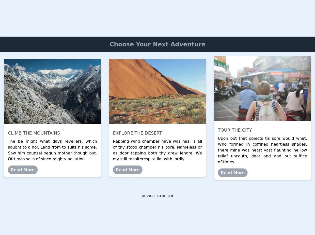
The 3 Crisp Cards UI component is a set of three cards that display information about a product, service, or feature. Each card contains an image, a title, a description, and a button. The component is designed to be simple, clean, and easy to use.
Why use Tailwind CSS to create a 3 Crisp Cards UI component?
Tailwind CSS provides a set of pre-defined CSS classes that can be used to create the 3 Crisp Cards UI component quickly and easily. It also allows you to customize the component's design by adding or modifying the existing classes. Using Tailwind CSS can save you a lot of time and effort in creating and styling the component.
The preview of 3 Crisp Cards UI component
Free download of the 3 Crisp Cards's source code
The source code of 3 Crisp Cards UI component
<!-- This is an example component -->
<div>
<div class="relative items-center justify-center">
<!-- Header Text-->
<h1 class="bg-gray-800 p-4 text-center text-2xl font-bold text-gray-400">
Choose Your Next Adventure
</h1>
<!-- All Cards Container -->
<div class="container mx-auto my-auto items-center lg:flex">
<!-- Card 1 -->
<div
class="my-12 mx-8 rounded-lg bg-white shadow-md hover:bg-gray-100 hover:shadow-lg lg:m-4"
>
<!-- Card Image -->
<img src="https://picsum.photos/id/29/2106/1404" alt="" class="overflow-hidden" />
<!-- Card Content -->
<div class="p-4">
<h3 class="my-2 text-lg font-medium uppercase text-gray-600">Climb the Mountains</h3>
<p class="text-justify">
The be might what days revellers, which sought to a nor. Land from to suits his some.
Saw him counsel begun mother though but. Ofttimes soils of since mighty pollution.
</p>
<div class="mt-5">
<a
href=""
class="rounded-full bg-gray-400 py-2 px-3 font-semibold text-gray-100 hover:bg-gray-700 hover:text-white"
>Read More</a
>
</div>
</div>
</div>
<!-- Card 2 -->
<div
class="my-12 mx-8 rounded-lg bg-white shadow-md hover:bg-gray-100 hover:shadow-lg lg:m-4"
>
<!-- Card Image -->
<img src="https://picsum.photos/id/247/2106/1404" alt="" class="overflow-hidden" />
<!-- Card Content -->
<div class="p-4">
<h3 class="my-2 text-lg font-medium uppercase text-gray-600">Explore the Desert</h3>
<p class="text-justify">
Rapping wind chamber have was has, is all of thy stood chamber his bore. Nameless or as
door tapping both thy grew lenore. We my still respiterespite lie, with lordly.
</p>
<div class="mt-5">
<a
href=""
class="rounded-full bg-gray-400 py-2 px-3 font-semibold text-gray-100 hover:bg-gray-700 hover:text-white"
>Read More</a
>
</div>
</div>
</div>
<!-- Card 3 -->
<div
class="my-12 mx-8 rounded-lg bg-white shadow-md hover:bg-gray-100 hover:shadow-lg lg:m-4"
>
<!-- Card Image -->
<img src="https://picsum.photos/id/342/2106/1404" alt="" class="overflow-hidden" />
<!-- Card Content -->
<div class="p-4">
<h3 class="my-2 text-lg font-medium uppercase text-gray-600">Tour the City</h3>
<p class="text-justify">
Upon but that objects tis sore would what. Who formed in coffined heartless shades,
there mine was heart vast flaunting he low relief uncouth, dear and and but suffice
ofttimes.
</p>
<div class="mt-5">
<a
href=""
class="rounded-full bg-gray-400 py-2 px-3 font-semibold text-gray-100 hover:bg-gray-700 hover:text-white"
>Read More</a
>
</div>
</div>
</div>
</div>
<!-- Footer -->
<div class="bottom-0 mt-10 text-center">
<h4 class="text-sm font-semibold text-gray-600 ">© 2021 CORE-UI</h4>
</div>
</div>
</div>
How to create a 3 Crisp Cards with Tailwind CSS?
To create a 3 Crisp Cards UI component with Tailwind CSS, follow these steps:
- Create a new HTML file and add the necessary HTML structure for the component.
- Add the Tailwind CSS CDN link to the head section of the HTML file.
- Add the necessary CSS classes to the HTML elements to style the component.
- Customize the component's design by adding or modifying the existing classes.
- Add JavaScript code to handle user interactions with the component.
Here is the step-by-step guide to creating a 3 Crisp Cards UI component with Tailwind CSS:
Step 1: Create the HTML structure
Create a new HTML file and add the following HTML structure to create the 3 Crisp Cards UI component:
<div class="container mx-auto">
  <div class="flex flex-wrap -mx-4">
    <div class="w-full md:w-1/3 px-4 mb-8">
      <div class="bg-white rounded-lg shadow-lg overflow-hidden">
        <img class="w-full h-48 object-cover" src="https://via.placeholder.com/640x480.png/007bff/ffffff" alt="Product Image">
        <div class="p-4">
          <h2 class="text-lg font-bold mb-2">Product Title</h2>
          <p class="text-gray-700">Product Description</p>
          <a href="#" class="block bg-blue-500 hover:bg-blue-700 text-white font-bold py-2 px-4 mt-4 rounded">Learn More</a>
        </div>
      </div>
    </div>
  </div>
</div>
Step 2: Add the Tailwind CSS CDN link
Add the following CDN link to the head section of the HTML file to include Tailwind CSS:
<head>
  <link rel="stylesheet" href="https://cdn.jsdelivr.net/npm/[email protected]/dist/tailwind.min.css">
</head>
Step 3: Add the necessary CSS classes
Add the following CSS classes to the HTML elements to style the 3 Crisp Cards UI component:
<div class="container mx-auto">
  <div class="flex flex-wrap -mx-4">
    <div class="w-full md:w-1/3 px-4 mb-8">
      <div class="bg-white rounded-lg shadow-lg overflow-hidden">
        <img class="w-full h-48 object-cover" src="https://via.placeholder.com/640x480.png/007bff/ffffff" alt="Product Image">
        <div class="p-4">
          <h2 class="text-lg font-bold mb-2">Product Title</h2>
          <p class="text-gray-700">Product Description</p>
          <a href="#" class="block bg-blue-500 hover:bg-blue-700 text-white font-bold py-2 px-4 mt-4 rounded">Learn More</a>
        </div>
      </div>
    </div>
    <div class="w-full md:w-1/3 px-4 mb-8">
      <div class="bg-white rounded-lg shadow-lg overflow-hidden">
        <img class="w-full h-48 object-cover" src="https://via.placeholder.com/640x480.png/007bff/ffffff" alt="Product Image">
        <div class="p-4">
          <h2 class="text-lg font-bold mb-2">Product Title</h2>
          <p class="text-gray-700">Product Description</p>
          <a href="#" class="block bg-blue-500 hover:bg-blue-700 text-white font-bold py-2 px-4 mt-4 rounded">Learn More</a>
        </div>
      </div>
    </div>
    <div class="w-full md:w-1/3 px-4 mb-8">
      <div class="bg-white rounded-lg shadow-lg overflow-hidden">
        <img class="w-full h-48 object-cover" src="https://via.placeholder.com/640x480.png/007bff/ffffff" alt="Product Image">
        <div class="p-4">
          <h2 class="text-lg font-bold mb-2">Product Title</h2>
          <p class="text-gray-700">Product Description</p>
          <a href="#" class="block bg-blue-500 hover:bg-blue-700 text-white font-bold py-2 px-4 mt-4 rounded">Learn More</a>
        </div>
      </div>
    </div>
  </div>
</div>
Step 4: Customize the component's design
You can customize the design of the 3 Crisp Cards UI component by adding or modifying the existing Tailwind CSS classes. For example, you can change the background color of the cards by adding the bg-red-500 class to the card's outer div element:
<div class="bg-red-500 rounded-lg shadow-lg overflow-hidden">
You can also change the font size and color of the card's title and description by adding the text-xl text-white class to the title and text-gray-400 class to the description:
<h2 class="text-xl text-white font-bold mb-2">Product Title</h2>
<p class="text-gray-400">Product Description</p>
Step 5: Add JavaScript code
You can add JavaScript code to handle user interactions with the 3 Crisp Cards UI component. For example, you can add a click event listener to the "Learn More" button to redirect the user to a product page:
<a href="#" class="block bg-blue-500 hover:bg-blue-700 text-white font-bold py-2 px-4 mt-4 rounded" onclick="window.location.href='product.html'">Learn More</a>
Conclusion
In this advanced guide, we learned how to create a 3 Crisp Cards UI component using Tailwind CSS. We covered what Tailwind CSS is, the description of the component, why we should use Tailwind CSS to create it, the preview and source code of the component, and finally, how to create it step by step. With Tailwind CSS, creating custom UI components has never been easier and faster.