- Published on
How To Make A 3D Button With Tailwind CSS From Scratch
- What is Tailwind CSS?
- The description of 3D button ui component
- Why use Tailwind CSS to create a 3D button ui component?
- The preview of 3D button ui component.
- The source code of 3D button ui component.
- How to create a 3D button with Tailwind CSS?
- Conclusion
What is Tailwind CSS?
Tailwind CSS is a utility-first CSS framework that provides a set of pre-defined classes for building user interfaces. It allows developers to rapidly create responsive and customizable designs without having to write custom CSS. Tailwind CSS is gaining popularity among developers due to its simplicity and flexibility.
The description of 3D button ui component
A 3D button is a user interface component that appears to be raised or pressed into the screen, giving it a three-dimensional look. It is a popular design element used in web and mobile applications to draw attention to important actions or links.
Why use Tailwind CSS to create a 3D button ui component?
Tailwind CSS provides a set of pre-defined classes that can be used to quickly create a 3D button without having to write custom CSS. This saves time and effort, allowing developers to focus on other aspects of their project.
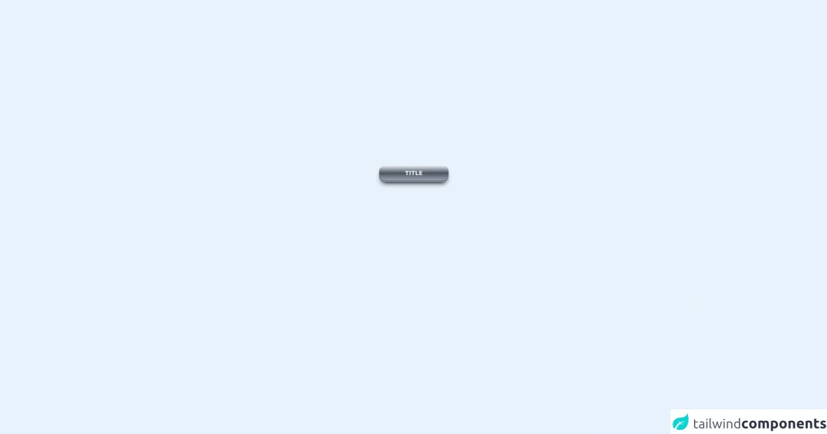
The preview of 3D button ui component.
To create a 3D button with Tailwind CSS, we will use the transform and box-shadow properties to give it a three-dimensional look. Here is a preview of what the 3D button will look like:
Free download of the 3D button's source code
The source code of 3D button ui component.
To create a 3D button with Tailwind CSS, we will use the following HTML and CSS code:
<div class="flex w-full justify-center">
  <a
    href="#"
    @endif
    class="flex w-48 transform justify-center rounded-2xl border-b-4 border-gray-500 bg-gradient-to-t from-gray-400 via-gray-600 to-gray-200 px-4 py-2 text-gray-100 transition  duration-200 ease-in-out hover:translate-y-px hover:border-b-2 "
    style="-webkit-box-shadow: 0px 10px 13px -7px #000000, 5px 5px 15px 8px rgba(0,0,0,0);
			box-shadow: 0px 10px 13px -7px #000000, 5px 5px 15px 5px rgba(0,0,0,0);"
  >
    <span class="font-bold"> TITLE</span>
  </a>
</div>
Explanation of the code:
- The
buttonelement is used to create the button. - The
bg-blue-500class sets the background color of the button to blue. - The
hover:bg-blue-700class sets the background color of the button to a darker shade of blue when the button is hovered over. - The
text-whiteclass sets the text color of the button to white. - The
font-boldclass sets the font weight of the button text to bold. - The
py-2andpx-4classes set the padding of the button to 2 units on the y-axis and 4 units on the x-axis. - The
roundedclass sets the border radius of the button to make it rounded. - The
transformclass is used to apply a 3D transformation to the button. - The
transitionclass is used to apply a smooth transition effect when the button is hovered over. - The
duration-200class sets the duration of the transition effect to 200 milliseconds. - The
shadow-mdclass sets a medium-sized shadow on the button to give it a 3D effect. - The
hover:shadow-lgclass sets a larger shadow on the button when it is hovered over to enhance the 3D effect.
How to create a 3D button with Tailwind CSS?
To create a 3D button with Tailwind CSS, follow these steps:
- Create a new HTML file and add the following code:
<!DOCTYPE html>
<html>
<head>
  <title>3D Button with Tailwind CSS</title>
  <link rel="stylesheet" href="https://cdn.jsdelivr.net/npm/[email protected]/dist/tailwind.min.css">
</head>
<body>
  <button class="bg-blue-500 hover:bg-blue-700 text-white font-bold py-2 px-4 rounded transform transition duration-200 shadow-md hover:shadow-lg">
  </button>
</body>
</html>
Save the file with a
.htmlextension and open it in a web browser. You should see a blue button with white text.Replace the button string with the text you want to display on the button.
Customize the button by modifying the Tailwind CSS classes. For example, you can change the background color by changing the
bg-blue-500class tobg-red-500.Save the file and refresh the web browser to see the changes.
Conclusion
In this article, we have learned how to create a 3D button with Tailwind CSS. Tailwind CSS provides a set of pre-defined classes that can be used to quickly create responsive and customizable designs. The 3D button is a popular design element used in web and mobile applications to draw attention to important actions or links. With Tailwind CSS, creating a 3D button is easy and can be done in just a few steps.