- Published on
What You Need To Build A Working Tabs - With Bottom Border With Tailwind CSS
- The description of Working Tabs - With Bottom Border ui component
- Why use Tailwind CSS to create a Working Tabs - With Bottom Border ui component?
- The preview of Working Tabs - With Bottom Border ui component.
- The source code of Working Tabs - With Bottom Border ui component.
- How to create a Working Tabs - With Bottom Border with Tailwind CSS?
- Step 1: Set up your HTML structure
- Step 2: Style your tabs
- Step 3: Add interactivity with JavaScript
- Conclusion
Tailwind CSS is a utility-first CSS framework that provides a set of pre-defined classes to help you quickly build custom user interfaces. It allows you to create complex layouts and designs without writing any custom CSS code. Tailwind CSS is highly customizable and can be used with any front-end framework or library.
The description of Working Tabs - With Bottom Border ui component
Working Tabs - With Bottom Border is a common user interface component used in many web applications. It is used to display multiple sections of content on a single page, allowing users to switch between them easily. The tabs are usually displayed at the top of the content, but in this case, we will be creating tabs with a bottom border.
Why use Tailwind CSS to create a Working Tabs - With Bottom Border ui component?
Tailwind CSS provides a set of pre-defined classes that make it easy to create complex user interfaces. It allows you to quickly prototype and build custom designs without writing any custom CSS code. Using Tailwind CSS to create a Working Tabs - With Bottom Border ui component will save you time and effort, and ensure that your design is consistent and responsive.
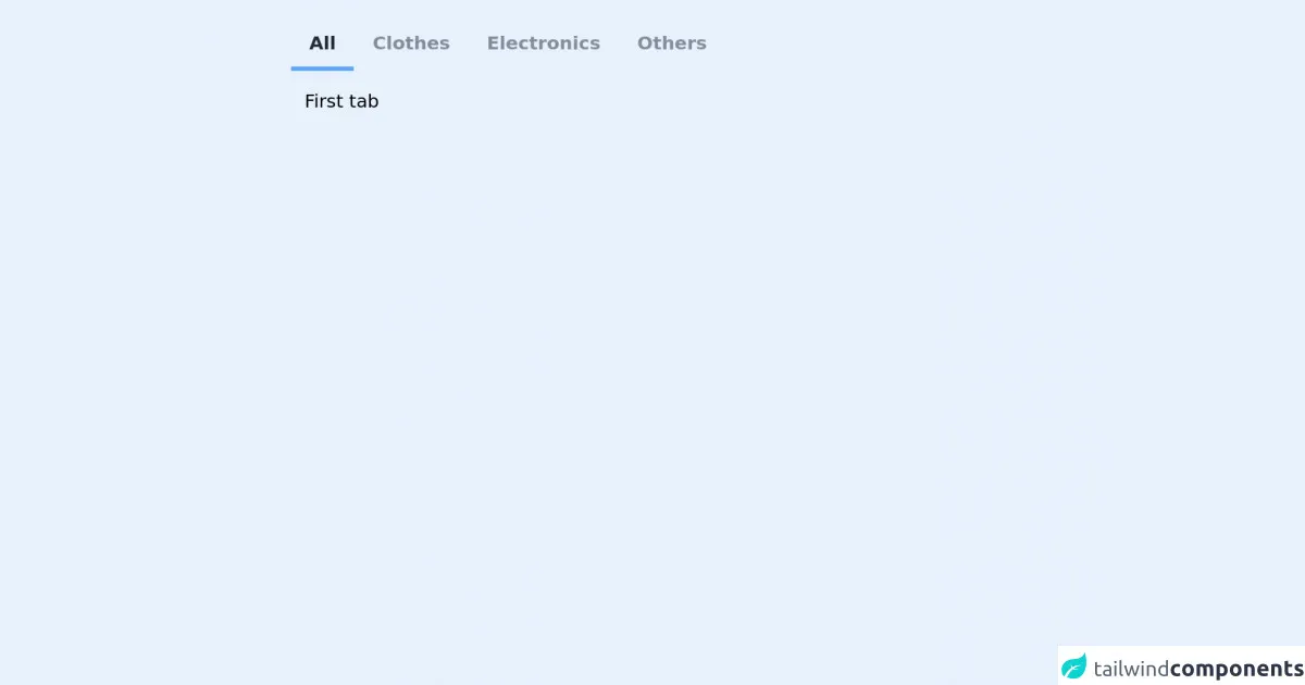
The preview of Working Tabs - With Bottom Border ui component.
In this section, we will preview the Working Tabs - With Bottom Border ui component that we will be creating.
Free download of the Working Tabs - With Bottom Border's source code
The source code of Working Tabs - With Bottom Border ui component.
In this section, we will provide the source code for the Working Tabs - With Bottom Border ui component that we have created.
<div class="w-1/2 mx-auto mt-4  rounded">
                        <!-- Tabs -->
                        <ul id="tabs" class="inline-flex w-full px-1 pt-2 ">
                          <li class="px-4 py-2 -mb-px font-semibold text-gray-800 border-b-2 border-blue-400 rounded-t opacity-50"><a id="default-tab" href="#first">All</a></li>
                          <li class="px-4 py-2 font-semibold text-gray-800 rounded-t opacity-50"><a href="#second">Clothes</a></li>
                          <li class="px-4 py-2 font-semibold text-gray-800 rounded-t opacity-50"><a href="#third">Electronics</a></li>
                          <li class="px-4 py-2 font-semibold text-gray-800 rounded-t opacity-50"><a href="#fourth">Others</a></li>
                        </ul>

                        <!-- Tab Contents -->
                        <div id="tab-contents">
                          <div id="first" class="p-4">
                            First tab
                          </div>
                          <div id="second" class="hidden p-4">
                            Second tab
                          </div>
                          <div id="third" class="hidden p-4">
                            Third tab
                          </div>
                          <div id="fourth" class="hidden p-4">
                            Fourth tab
                          </div>
                        </div>
                      </div>

                <script>
                    let tabsContainer = document.querySelector("#tabs");

let tabTogglers = tabsContainer.querySelectorAll("a");
console.log(tabTogglers);

tabTogglers.forEach(function(toggler) {
  toggler.addEventListener("click", function(e) {
    e.preventDefault();

    let tabName = this.getAttribute("href");

    let tabContents = document.querySelector("#tab-contents");

    for (let i = 0; i < tabContents.children.length; i++) {

      tabTogglers[i].parentElement.classList.remove("border-blue-400", "border-b",  "-mb-px", "opacity-100");  tabContents.children[i].classList.remove("hidden");
      if ("#" + tabContents.children[i].id === tabName) {
        continue;
      }
      tabContents.children[i].classList.add("hidden");

    }
    e.target.parentElement.classList.add("border-blue-400", "border-b-4", "-mb-px", "opacity-100");
  });
});

document.getElementById("default-tab").click();

                </script>
How to create a Working Tabs - With Bottom Border with Tailwind CSS?
To create a Working Tabs - With Bottom Border ui component with Tailwind CSS, follow these steps:
Step 1: Set up your HTML structure
The first step is to set up your HTML structure. Create a container element that will hold your tabs and content. Inside the container, create a set of tab elements and content elements. The tab elements should be clickable and correspond to the content elements.
<div class="container mx-auto">
  <div class="flex justify-center">
    <div class="w-full">
      <div class="flex border-b border-gray-300">
        <div class="px-4 py-2 text-gray-600 font-semibold border-b-2 border-blue-500">
          Tab 1
        </div>
        <div class="px-4 py-2 text-gray-500 hover:text-gray-600 cursor-pointer">
          Tab 2
        </div>
        <div class="px-4 py-2 text-gray-500 hover:text-gray-600 cursor-pointer">
          Tab 3
        </div>
      </div>
      <div class="p-4">
        <div>
          Content for Tab 1
        </div>
        <div class="hidden">
          Content for Tab 2
        </div>
        <div class="hidden">
          Content for Tab 3
        </div>
      </div>
    </div>
  </div>
</div>
Step 2: Style your tabs
The next step is to style your tabs. We will use Tailwind CSS classes to add some basic styling to our tabs. We will add a bottom border to the active tab to indicate which tab is currently selected.
.tab-active {
  border-bottom: 2px solid #3182ce;
}
Step 3: Add interactivity with JavaScript
The final step is to add interactivity to our tabs. We will use JavaScript to toggle the active class on the tab and content elements when a tab is clicked.
const tabs = document.querySelectorAll('.tab');
const contents = document.querySelectorAll('.content');

tabs.forEach((tab, index) => {
  tab.addEventListener('click', () => {
    tabs.forEach((tab) => {
      tab.classList.remove('tab-active');
    });
    contents.forEach((content) => {
      content.classList.add('hidden');
    });
    tab.classList.add('tab-active');
    contents[index].classList.remove('hidden');
  });
});
Conclusion
In this article, we have learned how to create a Working Tabs - With Bottom Border ui component with Tailwind CSS. We have seen how Tailwind CSS can be used to quickly prototype and build custom user interfaces. We have also seen how JavaScript can be used to add interactivity to our tabs. With these skills, you can create custom user interfaces that are responsive, consistent, and easy to use.