- Published on
6 Easy Ways To Build A Wysiwyg Editor With Tailwind CSS
- What is Tailwind CSS?
- The description of Wysiwyg Editor ui component
- Why use Tailwind CSS to create a Wysiwyg Editor ui component?
- The preview of Wysiwyg Editor ui component.
- The source code of Wysiwyg Editor ui component.
- How to create a Wysiwyg Editor with Tailwind CSS?
- Step 1: Set up your HTML
- Step 2: Add Tailwind CSS classes
- Step 3: Add JavaScript
- Conclusion
As a FrontEnd technology blogger, it's important to keep up with the latest trends in web development. One of the most popular CSS frameworks right now is Tailwind CSS. It's a utility-first CSS framework that makes it easy to create responsive and customizable UI components. In this article, we'll explore how to build a Wysiwyg Editor with Tailwind CSS.
What is Tailwind CSS?
Tailwind CSS is a utility-first CSS framework that provides a set of pre-defined classes that you can use to style your HTML elements. It's different from other CSS frameworks like Bootstrap or Foundation because it doesn't have any pre-built components. Instead, it provides a set of utility classes that you can use to create your own custom components.
The description of Wysiwyg Editor ui component
A Wysiwyg Editor is a user interface component that allows users to edit content visually, as if they were editing a document in a word processor. Wysiwyg stands for "what you see is what you get", which means that the content you see in the editor is exactly what you'll get when you publish it.
Why use Tailwind CSS to create a Wysiwyg Editor ui component?
Tailwind CSS makes it easy to create custom UI components because it provides a set of utility classes that you can use to style your HTML elements. This means that you don't have to write custom CSS for every component you create, which can save you a lot of time and effort.
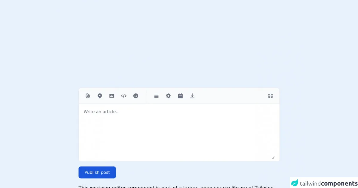
The preview of Wysiwyg Editor ui component.
To create a Wysiwyg Editor with Tailwind CSS, you can use a combination of HTML, CSS, and JavaScript. Here's a preview of what the final component will look like:
Free download of the Wysiwyg Editor's source code
The source code of Wysiwyg Editor ui component.
To create the Wysiwyg Editor, you'll need to use a combination of HTML, CSS, and JavaScript. Here's the source code for the component:
<link rel="stylesheet" href="https://unpkg.com/[email protected]/dist/flowbite.min.css" />

<!-- This is an example component -->
<div class="max-w-2xl mx-auto">

	<form>
    <div class="mb-4 w-full bg-gray-50 rounded-lg border border-gray-200 dark:bg-gray-700 dark:border-gray-600">
        <div class="flex justify-between items-center py-2 px-3 border-b dark:border-gray-600">
            <div class="flex flex-wrap items-center divide-gray-200 sm:divide-x dark:divide-gray-600">
                <div class="flex items-center space-x-1 sm:pr-4">
                    <button type="button" class="p-2 text-gray-500 rounded cursor-pointer hover:text-gray-900 hover:bg-gray-100 dark:text-gray-400 dark:hover:text-white dark:hover:bg-gray-600">
                        <svg class="w-5 h-5" fill="currentColor" viewBox="0 0 20 20" xmlns="http://www.w3.org/2000/svg"><path fill-rule="evenodd" d="M8 4a3 3 0 00-3 3v4a5 5 0 0010 0V7a1 1 0 112 0v4a7 7 0 11-14 0V7a5 5 0 0110 0v4a3 3 0 11-6 0V7a1 1 0 012 0v4a1 1 0 102 0V7a3 3 0 00-3-3z" clip-rule="evenodd"></path></svg>
                    </button>
                    <button type="button" class="p-2 text-gray-500 rounded cursor-pointer hover:text-gray-900 hover:bg-gray-100 dark:text-gray-400 dark:hover:text-white dark:hover:bg-gray-600">
                        <svg class="w-5 h-5" fill="currentColor" viewBox="0 0 20 20" xmlns="http://www.w3.org/2000/svg"><path fill-rule="evenodd" d="M5.05 4.05a7 7 0 119.9 9.9L10 18.9l-4.95-4.95a7 7 0 010-9.9zM10 11a2 2 0 100-4 2 2 0 000 4z" clip-rule="evenodd"></path></svg>
                    </button>
                    <button type="button" class="p-2 text-gray-500 rounded cursor-pointer hover:text-gray-900 hover:bg-gray-100 dark:text-gray-400 dark:hover:text-white dark:hover:bg-gray-600">
                        <svg class="w-5 h-5" fill="currentColor" viewBox="0 0 20 20" xmlns="http://www.w3.org/2000/svg"><path fill-rule="evenodd" d="M4 3a2 2 0 00-2 2v10a2 2 0 002 2h12a2 2 0 002-2V5a2 2 0 00-2-2H4zm12 12H4l4-8 3 6 2-4 3 6z" clip-rule="evenodd"></path></svg>
                    </button>
                    <button type="button" class="p-2 text-gray-500 rounded cursor-pointer hover:text-gray-900 hover:bg-gray-100 dark:text-gray-400 dark:hover:text-white dark:hover:bg-gray-600">
                        <svg class="w-5 h-5" fill="currentColor" viewBox="0 0 20 20" xmlns="http://www.w3.org/2000/svg"><path fill-rule="evenodd" d="M12.316 3.051a1 1 0 01.633 1.265l-4 12a1 1 0 11-1.898-.632l4-12a1 1 0 011.265-.633zM5.707 6.293a1 1 0 010 1.414L3.414 10l2.293 2.293a1 1 0 11-1.414 1.414l-3-3a1 1 0 010-1.414l3-3a1 1 0 011.414 0zm8.586 0a1 1 0 011.414 0l3 3a1 1 0 010 1.414l-3 3a1 1 0 11-1.414-1.414L16.586 10l-2.293-2.293a1 1 0 010-1.414z" clip-rule="evenodd"></path></svg>
                    </button>
                    <button type="button" class="p-2 text-gray-500 rounded cursor-pointer hover:text-gray-900 hover:bg-gray-100 dark:text-gray-400 dark:hover:text-white dark:hover:bg-gray-600">
                        <svg class="w-5 h-5" fill="currentColor" viewBox="0 0 20 20" xmlns="http://www.w3.org/2000/svg"><path fill-rule="evenodd" d="M10 18a8 8 0 100-16 8 8 0 000 16zM7 9a1 1 0 100-2 1 1 0 000 2zm7-1a1 1 0 11-2 0 1 1 0 012 0zm-.464 5.535a1 1 0 10-1.415-1.414 3 3 0 01-4.242 0 1 1 0 00-1.415 1.414 5 5 0 007.072 0z" clip-rule="evenodd"></path></svg>
                    </button>
                </div>
                <div class="flex flex-wrap items-center space-x-1 sm:pl-4">
                    <button type="button" class="p-2 text-gray-500 rounded cursor-pointer hover:text-gray-900 hover:bg-gray-100 dark:text-gray-400 dark:hover:text-white dark:hover:bg-gray-600">
                        <svg class="w-5 h-5" fill="currentColor" viewBox="0 0 20 20" xmlns="http://www.w3.org/2000/svg"><path fill-rule="evenodd" d="M3 4a1 1 0 011-1h12a1 1 0 110 2H4a1 1 0 01-1-1zm0 4a1 1 0 011-1h12a1 1 0 110 2H4a1 1 0 01-1-1zm0 4a1 1 0 011-1h12a1 1 0 110 2H4a1 1 0 01-1-1zm0 4a1 1 0 011-1h12a1 1 0 110 2H4a1 1 0 01-1-1z" clip-rule="evenodd"></path></svg>
                    </button>
                    <button type="button" class="p-2 text-gray-500 rounded cursor-pointer hover:text-gray-900 hover:bg-gray-100 dark:text-gray-400 dark:hover:text-white dark:hover:bg-gray-600">
                        <svg class="w-5 h-5" fill="currentColor" viewBox="0 0 20 20" xmlns="http://www.w3.org/2000/svg"><path fill-rule="evenodd" d="M11.49 3.17c-.38-1.56-2.6-1.56-2.98 0a1.532 1.532 0 01-2.286.948c-1.372-.836-2.942.734-2.106 2.106.54.886.061 2.042-.947 2.287-1.561.379-1.561 2.6 0 2.978a1.532 1.532 0 01.947 2.287c-.836 1.372.734 2.942 2.106 2.106a1.532 1.532 0 012.287.947c.379 1.561 2.6 1.561 2.978 0a1.533 1.533 0 012.287-.947c1.372.836 2.942-.734 2.106-2.106a1.533 1.533 0 01.947-2.287c1.561-.379 1.561-2.6 0-2.978a1.532 1.532 0 01-.947-2.287c.836-1.372-.734-2.942-2.106-2.106a1.532 1.532 0 01-2.287-.947zM10 13a3 3 0 100-6 3 3 0 000 6z" clip-rule="evenodd"></path></svg>
                    </button>
                    <button type="button" class="p-2 text-gray-500 rounded cursor-pointer hover:text-gray-900 hover:bg-gray-100 dark:text-gray-400 dark:hover:text-white dark:hover:bg-gray-600">
                        <svg class="w-5 h-5" fill="currentColor" viewBox="0 0 20 20" xmlns="http://www.w3.org/2000/svg"><path fill-rule="evenodd" d="M6 2a1 1 0 00-1 1v1H4a2 2 0 00-2 2v10a2 2 0 002 2h12a2 2 0 002-2V6a2 2 0 00-2-2h-1V3a1 1 0 10-2 0v1H7V3a1 1 0 00-1-1zm0 5a1 1 0 000 2h8a1 1 0 100-2H6z" clip-rule="evenodd"></path></svg>
                    </button>
                    <button type="button" class="p-2 text-gray-500 rounded cursor-pointer hover:text-gray-900 hover:bg-gray-100 dark:text-gray-400 dark:hover:text-white dark:hover:bg-gray-600">
                        <svg class="w-5 h-5" fill="currentColor" viewBox="0 0 20 20" xmlns="http://www.w3.org/2000/svg"><path fill-rule="evenodd" d="M3 17a1 1 0 011-1h12a1 1 0 110 2H4a1 1 0 01-1-1zm3.293-7.707a1 1 0 011.414 0L9 10.586V3a1 1 0 112 0v7.586l1.293-1.293a1 1 0 111.414 1.414l-3 3a1 1 0 01-1.414 0l-3-3a1 1 0 010-1.414z" clip-rule="evenodd"></path></svg>
                    </button>
                </div>
            </div>
            <button type="button" data-tooltip-target="tooltip-fullscreen" class="p-2 text-gray-500 rounded cursor-pointer sm:ml-auto hover:text-gray-900 hover:bg-gray-100 dark:text-gray-400 dark:hover:text-white dark:hover:bg-gray-600">
                <svg class="w-5 h-5" fill="currentColor" viewBox="0 0 20 20" xmlns="http://www.w3.org/2000/svg"><path fill-rule="evenodd" d="M3 4a1 1 0 011-1h4a1 1 0 010 2H6.414l2.293 2.293a1 1 0 11-1.414 1.414L5 6.414V8a1 1 0 01-2 0V4zm9 1a1 1 0 010-2h4a1 1 0 011 1v4a1 1 0 01-2 0V6.414l-2.293 2.293a1 1 0 11-1.414-1.414L13.586 5H12zm-9 7a1 1 0 012 0v1.586l2.293-2.293a1 1 0 111.414 1.414L6.414 15H8a1 1 0 010 2H4a1 1 0 01-1-1v-4zm13-1a1 1 0 011 1v4a1 1 0 01-1 1h-4a1 1 0 010-2h1.586l-2.293-2.293a1 1 0 111.414-1.414L15 13.586V12a1 1 0 011-1z" clip-rule="evenodd"></path></svg>
            </button>
            <div id="tooltip-fullscreen" role="tooltip" class="inline-block absolute invisible z-10 py-2 px-3 text-sm font-medium text-white bg-gray-900 rounded-lg shadow-sm opacity-0 transition-opacity duration-300 tooltip dark:bg-gray-700">
                Show full screen
                <div class="tooltip-arrow" data-popper-arrow></div>
            </div>
        </div>
        <div class="py-2 px-4 bg-white rounded-b-lg dark:bg-gray-800">
            <label for="editor" class="sr-only">Publish post</label>
            <textarea id="editor" rows="8" class="block px-0 w-full text-sm text-gray-800 bg-white border-0 dark:bg-gray-800 focus:ring-0 dark:text-white dark:placeholder-gray-400" placeholder="Write an article..." required></textarea>
        </div>
    </div>
    <button type="submit" class="inline-flex items-center px-5 py-2.5 text-sm font-medium text-center text-white bg-blue-700 rounded-lg focus:ring-4 focus:ring-blue-200 dark:focus:ring-blue-900 hover:bg-blue-800">
        Publish post
    </button>
    </form>

	<p class="mt-5">This wysiwyg editor component is part of a larger, open-source library of Tailwind CSS components. Learn
		more
		by going to the official <a class="text-blue-600 hover:underline"
			href="https://flowbite.com/docs/getting-started/introduction/" target="_blank">Flowbite Documentation</a>.
	</p>
    <script src="https://unpkg.com/[email protected]/dist/flowbite.js"></script>
</div>
How to create a Wysiwyg Editor with Tailwind CSS?
Now that you've seen what the final component will look like and have the source code, let's go through the steps to create the Wysiwyg Editor with Tailwind CSS.
Step 1: Set up your HTML
The first step is to set up your HTML. You'll need to create a container element for the editor and add a contenteditable attribute to make it editable. Here's an example:
<div class="wysiwyg-editor" contenteditable="true">
  <p>Start typing here...</p>
</div>
Step 2: Add Tailwind CSS classes
Next, you'll need to add Tailwind CSS classes to style your HTML elements. Here are some classes you can use:
<div class="wysiwyg-editor p-4 bg-white border border-gray-300 rounded shadow-sm" contenteditable="true">
  <p class="mb-4">Start typing here...</p>
</div>
Step 3: Add JavaScript
Finally, you'll need to add some JavaScript to handle user input and update the content of the editor. Here's an example:
const editor = document.querySelector('.wysiwyg-editor');

editor.addEventListener('input', () => {
  const content = editor.innerHTML;
  console.log(content);
});
This code listens for input events on the editor element and logs the content to the console.
Conclusion
In this article, we've explored how to build a Wysiwyg Editor with Tailwind CSS. We've seen how Tailwind CSS can make it easy to create custom UI components by providing a set of utility classes. By following the steps outlined in this article, you can create your own Wysiwyg Editor and customize it to fit your needs.