- Published on
6 Critical Skills To Make A User Menu With Tailwind CSS Remarkably Well
- What is Tailwind CSS?
- The description of User Menu ui component
- Why use Tailwind CSS to create a User Menu ui component?
- The preview of User Menu ui component
- The source code of User Menu ui component
- How to create a User Menu with Tailwind CSS?
- Step 1: Create the HTML markup
- Step 2: Add Tailwind CSS classes
- Step 3: Add responsive design classes
- Conclusion
As a FrontEnd technology blogger, you must know that creating a User Menu is a common task for web developers. It's an essential component of any website or application that requires user authentication. In this article, we will explore how to create a User Menu with Tailwind CSS and the critical skills you need to make it remarkably well.
What is Tailwind CSS?
Tailwind CSS is a utility-first CSS framework that provides a set of pre-defined classes that you can use to style your HTML elements. It's designed to help you build responsive and customizable user interfaces with less effort. With Tailwind CSS, you can focus on the design and functionality of your application, rather than writing CSS code from scratch.
The description of User Menu ui component
A User Menu is a UI component that allows users to access their account information, settings, and other related features. It's usually located in the top-right corner of the screen and is accessible from any page of the application. The User Menu typically includes a profile picture, username, and links to the user's account settings, notifications, and logout.
Why use Tailwind CSS to create a User Menu ui component?
Tailwind CSS provides a set of pre-defined classes that you can use to create a User Menu with less effort. You don't have to write CSS code from scratch, which saves you time and effort. Tailwind CSS also provides responsive design classes that allow you to create a User Menu that adapts to different screen sizes and devices.
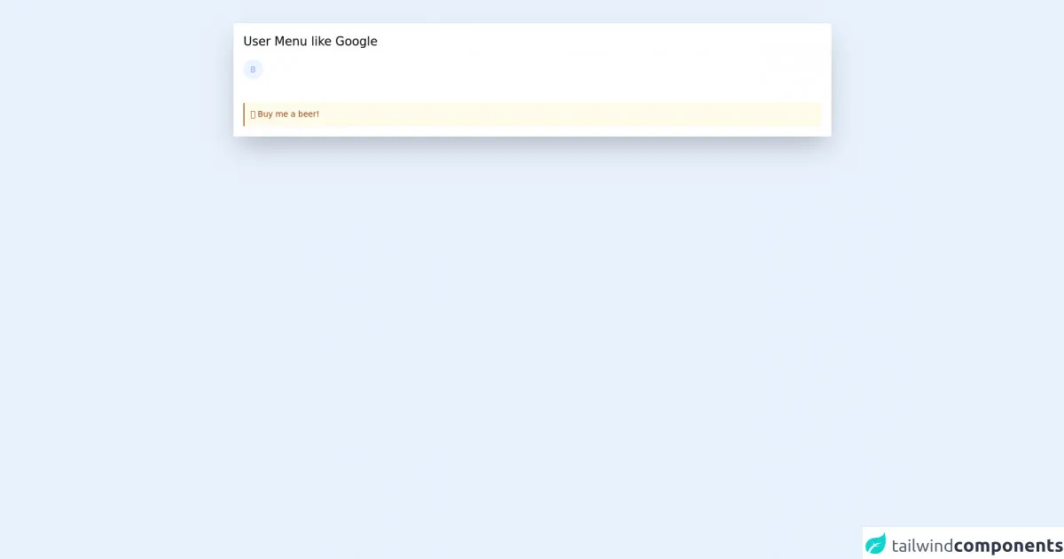
The preview of User Menu ui component
To create a User Menu with Tailwind CSS, you need to have some critical skills. The result will be a responsive and customizable User Menu that looks great on any device.
Free download of the User Menu's source code
The source code of User Menu ui component
To create a User Menu with Tailwind CSS, you need to write HTML and CSS code. You can use Tailwind CSS classes to style your HTML elements and create a responsive User Menu.
<script src="https://cdn.jsdelivr.net/gh/alpinejs/[email protected]/dist/alpine.min.js" defer></script>
<div class="m-10 bg-white p-5 shadow-2xl">
    <h1 class="text-2xl mb-5">User Menu like Google</h1>

    <div class="mr-4 h-10 w-10 inline-block relative" x-data="{ showMenu : false }" @click.away="showMenu = false">
        <div class="h-10 w-10 cursor-pointer rounded-full border-2 border-transparent bg-indigo bg-no-repeat bg-cover bg-center bg-blue-50" style="background-image: url('https://ui-avatars.com/api/?name=B&color=7F9CF5&background=EBF4FF')" :class="{ 'border-indigo-100' : showMenu }" @click="showMenu = !showMenu"></div>

        <div x-show="showMenu" class="bg-white border border-gray-200 absolute left-0 top-12 w-80 shadow-lg rounded-xl" x-transition:enter="transition ease duration-100 transform" x-transition:enter-start="opacity-0 scale-90 translate-y-1" x-transition:enter-end="opacity-100 scale-100 translate-y-0" x-transition:leave="transition ease duration-100 transform" x-transition:leave-start="opacity-100 scale-100 translate-y-0" x-transition:leave-end="opacity-0 scale-90 translate-y-1">
            <div class="p-6 flex items-center justify-center border-b border-gray-200 w-full flex-col">
                <div class="w-20 h-20 rounded-full flex items-center justify-center bg-indigo text-4xl text-white bg-no-repeat bg-cover bg-center" style="background-image: url('https://ui-avatars.com/api/?name=B&color=7F9CF5&background=EBF4FF')"></div>
                <div class="mt-6 text-center">
                    <div class="font-bold">
                        Benjamin
                    </div>
                    <div class="text-gray-500 text-sm">
                        [email protected]
                    </div>
                </div>
                <div class="mt-6">
                    <button class="px-4 py-2 text-sm bg-white rounded-xl border transition-colors duration-150 ease-linear border-gray-200 text-gray-500 focus:outline-none focus:ring-0 font-bold hover:bg-gray-50 focus:bg-indigo-50 focus:text-indigo">
                        Settings
                    </button>
                </div>
            </div>
            <div class="border-b border-gray-200 text-sm text-center">
                <a href="https://www.buymeacoffee.com/fricki" class="px-3 py-4 block hover:bg-gray-50 transition-colors duration-150 ease-linear" target="_blank">🍺 beer</a>
                <a href="https://www.buymeacoffee.com/fricki" class="px-3 py-4 block hover:bg-gray-50 transition-colors duration-150 ease-linear" target="_blank">🍕 or pizza?</a>
            </div>
            <div class="border-b border-gray-200 p-4 text-center">
                <button class="px-4 py-2 text-sm bg-white rounded-xl border transition-colors duration-150 ease-linear border-gray-200 text-gray-500 focus:outline-none focus:ring-0 font-bold hover:bg-gray-50 focus:bg-indigo-50 focus:text-indigo">
                    Logout
                </button>
            </div>
            <div class="p-4 text-xs text-center">
                <a class="hover:underline hover:text-indigo-500 transition-colors duration-150 ease-linear" href="#">Privacy</a> •
                <a class="hover:underline hover:text-indigo-500 transition-colors duration-150 ease-linear"target="_blank" href="https://www.buymeacoffee.com/fricki">🍺 Buy me a beer!</a>
            </div>
        </div>
    </div>

    <a target="_blank" href="https://www.buymeacoffee.com/fricki" class="rounded p-3 bg-yellow-50 text-yellow-800 border-l-2 border-yellow-800 block mt-10">
        🍺 Buy me a beer!
    </a>
</div>
How to create a User Menu with Tailwind CSS?
To create a User Menu with Tailwind CSS, you need to follow these steps:
Step 1: Create the HTML markup
The first step is to create the HTML markup for the User Menu. You can use a simple unordered list to create the links for the User Menu. Here's an example:
<div class="relative">
  <button class="flex items-center focus:outline-none">
    <img class="h-8 w-8 rounded-full" src="https://via.placeholder.com/50" alt="Avatar">
    <span class="ml-2 text-sm font-medium text-gray-700">John Doe</span>
    <svg class="ml-2 h-5 w-5 fill-current text-gray-600" viewBox="0 0 20 20">
      <path d="M5 8l5 5 5-5H5z" />
    </svg>
  </button>
  <div class="absolute right-0 mt-2 w-48 bg-white rounded-md shadow-lg z-10">
    <ul class="list-none">
      <li><a href="#" class="block px-4 py-2 text-sm text-gray-700 hover:bg-gray-100">Account settings</a></li>
      <li><a href="#" class="block px-4 py-2 text-sm text-gray-700 hover:bg-gray-100">Notifications</a></li>
      <li><a href="#" class="block px-4 py-2 text-sm text-gray-700 hover:bg-gray-100">Logout</a></li>
    </ul>
  </div>
</div>
In this example, we're using an unordered list to create the links for the User Menu. We're also using Tailwind CSS classes to style the HTML elements.
Step 2: Add Tailwind CSS classes
The next step is to add Tailwind CSS classes to the HTML elements. You can use classes like flex, items-center, text-sm, bg-gray-100, and more to style your User Menu. Here's an example:
<div class="relative">
  <button class="flex items-center focus:outline-none">
    <img class="h-8 w-8 rounded-full" src="https://via.placeholder.com/50" alt="Avatar">
    <span class="ml-2 text-sm font-medium text-gray-700">John Doe</span>
    <svg class="ml-2 h-5 w-5 fill-current text-gray-600" viewBox="0 0 20 20">
      <path d="M5 8l5 5 5-5H5z" />
    </svg>
  </button>
  <div class="absolute right-0 mt-2 w-48 bg-white rounded-md shadow-lg z-10">
    <ul class="list-none">
      <li><a href="#" class="block px-4 py-2 text-sm text-gray-700 hover:bg-gray-100">Account settings</a></li>
      <li><a href="#" class="block px-4 py-2 text-sm text-gray-700 hover:bg-gray-100">Notifications</a></li>
      <li><a href="#" class="block px-4 py-2 text-sm text-gray-700 hover:bg-gray-100">Logout</a></li>
    </ul>
  </div>
</div>
In this example, we're using classes like flex, items-center, text-sm, bg-gray-100, and more to style the User Menu.
Step 3: Add responsive design classes
The final step is to add responsive design classes to make the User Menu adaptable to different screen sizes and devices. You can use classes like sm, md, lg, and more to create a responsive User Menu. Here's an example:
<div class="relative">
  <button class="flex items-center focus:outline-none">
    <img class="h-8 w-8 rounded-full" src="https://via.placeholder.com/50" alt="Avatar">
    <span class="ml-2 text-sm font-medium text-gray-700">John Doe</span>
    <svg class="ml-2 h-5 w-5 fill-current text-gray-600" viewBox="0 0 20 20">
      <path d="M5 8l5 5 5-5H5z" />
    </svg>
  </button>
  <div class="absolute right-0 mt-2 w-48 bg-white rounded-md shadow-lg z-10">
    <ul class="list-none">
      <li><a href="#" class="block px-4 py-2 text-sm text-gray-700 hover:bg-gray-100">Account settings</a></li>
      <li><a href="#" class="block px-4 py-2 text-sm text-gray-700 hover:bg-gray-100">Notifications</a></li>
      <li><a href="#" class="block px-4 py-2 text-sm text-gray-700 hover:bg-gray-100">Logout</a></li>
    </ul>
  </div>
</div>
In this example, we're using classes like sm:hidden, md:block, and more to create a responsive User Menu.
Conclusion
Creating a User Menu with Tailwind CSS is a straightforward process that requires some critical skills. You need to know how to write HTML and CSS code, use Tailwind CSS classes, and create a responsive design. With these skills, you can create a responsive and customizable User Menu that looks great on any device.