- Published on
Learn How To Create A User account menu with icons With Tailwind CSS from the Pros
- What is Tailwind CSS?
- The description of User account menu with icons ui component
- Why use Tailwind CSS to create a User account menu with icons ui component?
- The preview of User account menu with icons ui component
- The source code of User account menu with icons ui component
- How to create a User account menu with icons with Tailwind CSS?
- Step 1: Create the HTML structure
- Step 2: Style the UI component with Tailwind CSS
- Conclusion
As a FrontEnd technology blogger, I am always on the lookout for new and exciting ways to create user interfaces. One of the most popular CSS frameworks out there is Tailwind CSS. In this article, we will learn how to create a User account menu with icons using Tailwind CSS.
What is Tailwind CSS?
Tailwind CSS is a utility-first CSS framework that allows you to rapidly build custom user interfaces. It provides a set of pre-defined classes that you can use to style your HTML elements. With Tailwind CSS, you don't have to write custom CSS code from scratch, which saves you a lot of time and effort.
The description of User account menu with icons ui component
A User account menu with icons is a common UI component that you can find on many websites. It allows users to access their account settings, log out, or perform other actions related to their account. The User account menu with icons typically includes icons to make it easier for users to identify each option.
Why use Tailwind CSS to create a User account menu with icons ui component?
Tailwind CSS is an excellent choice for creating a User account menu with icons UI component for several reasons. First, Tailwind CSS provides a wide range of pre-defined classes that you can use to style your UI components. Second, Tailwind CSS is easy to use, even if you are new to CSS. Finally, Tailwind CSS allows you to create responsive UI components that work well on different screen sizes.
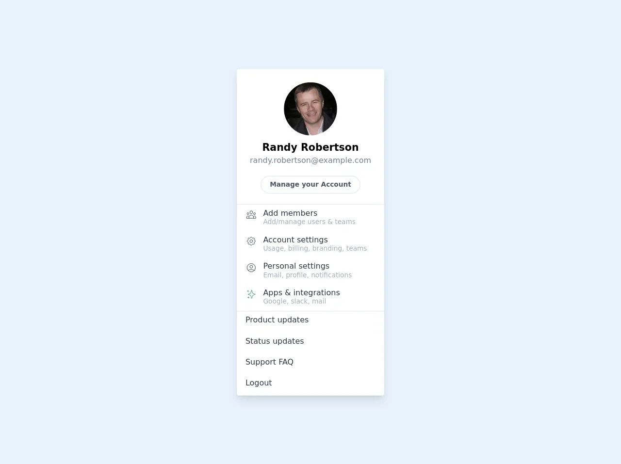
The preview of User account menu with icons ui component
To create a User account menu with icons UI component, we will use Tailwind CSS. The User account menu with icons UI component typically includes icons to make it easier for users to identify each option.
Free download of the User account menu with icons's source code
The source code of User account menu with icons ui component
To create a User account menu with icons UI component, we will use HTML and Tailwind CSS. The HTML code will define the structure of the UI component, while the Tailwind CSS classes will style it.
<!-- This is an example component -->
<div class="my-10">
<div class="bg-white rounded overflow-hidden shadow-lg">
<div class="text-center p-6 border-b">
<img
class="h-24 w-24 rounded-full mx-auto"
src="https://randomuser.me/api/portraits/men/24.jpg"
alt="Randy Robertson"
/>
<p class="pt-2 text-lg font-semibold">Randy Robertson</p>
<p class="text-sm text-gray-600">[email protected]</p>
<div class="mt-5">
<a
href="#"
class="border rounded-full py-2 px-4 text-xs font-semibold text-gray-700"
>
Manage your Account
</a>
</div>
</div>
<div class="border-b">
<a href="#" class="px-4 py-2 hover:bg-gray-100 flex">
<div class="text-gray-800">
<svg
fill="none"
stroke="currentColor"
strokeLinecap="round"
strokeLinejoin="round"
strokeWidth="1"
viewBox="0 0 24 24"
class="w-5 h-5"
>
<path d="M17 20h5v-2a3 3 0 00-5.356-1.857M17 20H7m10 0v-2c0-.656-.126-1.283-.356-1.857M7 20H2v-2a3 3 0 015.356-1.857M7 20v-2c0-.656.126-1.283.356-1.857m0 0a5.002 5.002 0 019.288 0M15 7a3 3 0 11-6 0 3 3 0 016 0zm6 3a2 2 0 11-4 0 2 2 0 014 0zM7 10a2 2 0 11-4 0 2 2 0 014 0z" />
</svg>
</div>
<div class="pl-3">
<p class="text-sm font-medium text-gray-800 leading-none">Add members</p>
<p class="text-xs text-gray-500">Add/manage users & teams</p>
</div>
</a>
<a href="#" class="px-4 py-2 hover:bg-gray-100 flex">
<div class="text-gray-800">
<svg
fill="none"
stroke="currentColor"
strokeLinecap="round"
strokeLinejoin="round"
strokeWidth="1"
viewBox="0 0 24 24"
class="w-5 h-5"
>
<path d="M10.325 4.317c.426-1.756 2.924-1.756 3.35 0a1.724 1.724 0 002.573 1.066c1.543-.94 3.31.826 2.37 2.37a1.724 1.724 0 001.065 2.572c1.756.426 1.756 2.924 0 3.35a1.724 1.724 0 00-1.066 2.573c.94 1.543-.826 3.31-2.37 2.37a1.724 1.724 0 00-2.572 1.065c-.426 1.756-2.924 1.756-3.35 0a1.724 1.724 0 00-2.573-1.066c-1.543.94-3.31-.826-2.37-2.37a1.724 1.724 0 00-1.065-2.572c-1.756-.426-1.756-2.924 0-3.35a1.724 1.724 0 001.066-2.573c-.94-1.543.826-3.31 2.37-2.37.996.608 2.296.07 2.572-1.065z" />
<path d="M15 12a3 3 0 11-6 0 3 3 0 016 0z" />
</svg>
</div>
<div class="pl-3">
<p class="text-sm font-medium text-gray-800 leading-none">Account settings</p>
<p class="text-xs text-gray-500">Usage, billing, branding, teams</p>
</div>
</a>
<a href="#" class="px-4 py-2 hover:bg-gray-100 flex">
<div class="text-gray-800">
<svg
fill="none"
stroke="currentColor"
strokeLinecap="round"
strokeLinejoin="round"
strokeWidth="1"
viewBox="0 0 24 24"
class="w-5 h-5"
>
<path d="M5.121 17.804A13.937 13.937 0 0112 16c2.5 0 4.847.655 6.879 1.804M15 10a3 3 0 11-6 0 3 3 0 016 0zm6 2a9 9 0 11-18 0 9 9 0 0118 0z" />
</svg>
</div>
<div class="pl-3">
<p class="text-sm font-medium text-gray-800 leading-none">Personal settings</p>
<p class="text-xs text-gray-500">Email, profile, notifications</p>
</div>
</a>
<a href="#" class="px-4 py-2 hover:bg-gray-100 flex">
<div class="text-green-600">
<svg
fill="none"
stroke="currentColor"
strokeLinecap="round"
strokeLinejoin="round"
strokeWidth="1"
viewBox="0 0 24 24"
class="w-5 h-5"
>
<path d="M5 3v4M3 5h4M6 17v4m-2-2h4m5-16l2.286 6.857L21 12l-5.714 2.143L13 21l-2.286-6.857L5 12l5.714-2.143L13 3z" />
</svg>
</div>
<div class="pl-3">
<p class="text-sm font-medium text-gray-800 leading-none">
Apps & integrations
</p>
<p class="text-xs text-gray-500">Google, slack, mail</p>
</div>
</a>
</div>
<div class="">
<a href="#" class="px-4 py-2 pb-4 hover:bg-gray-100 flex">
<p class="text-sm font-medium text-gray-800 leading-none">Product updates</p>
</a>
<a href="#" class="px-4 py-2 pb-4 hover:bg-gray-100 flex">
<p class="text-sm font-medium text-gray-800 leading-none">Status updates</p>
</a>
<a href="#" class="px-4 py-2 pb-4 hover:bg-gray-100 flex">
<p class="text-sm font-medium text-gray-800 leading-none">Support FAQ</p>
</a>
<a href="#" class="px-4 py-2 pb-4 hover:bg-gray-100 flex">
<p class="text-sm font-medium text-gray-800 leading-none">Logout</p>
</a>
</div>
</div>
</div>
How to create a User account menu with icons with Tailwind CSS?
To create a User account menu with icons using Tailwind CSS, we will follow these steps:
Step 1: Create the HTML structure
We will start by creating the HTML structure for the User account menu with icons UI component. Here is the HTML code:
<div class="relative">
  <button
    class="flex items-center focus:outline-none"
    id="user-menu"
    aria-haspopup="true"
  >
    <img
      class="h-8 w-8 rounded-full"
      src="https://via.placeholder.com/150"
      alt="Your profile picture"
    />
    <span class="ml-2 text-white font-medium">John Doe</span>
  </button>

  <div
    class="origin-top-right absolute right-0 mt-2 w-48 rounded-md shadow-lg py-1 bg-white ring-1 ring-black ring-opacity-5"
    role="menu"
    aria-orientation="vertical"
    aria-labelledby="user-menu"
  >
    <a
      href="#"
      class="block px-4 py-2 text-sm text-gray-700 hover:bg-gray-100"
      role="menuitem"
    >
      Your Profile
    </a>
    <a
      href="#"
      class="block px-4 py-2 text-sm text-gray-700 hover:bg-gray-100"
      role="menuitem"
    >
      Settings
    </a>
    <a
      href="#"
      class="block px-4 py-2 text-sm text-gray-700 hover:bg-gray-100"
      role="menuitem"
    >
      Sign out
    </a>
  </div>
</div>
The HTML code defines a div element that contains a button with an image and a text label. When the user clicks on the button, a dropdown menu appears that contains links to the user's profile, settings, and a sign-out option.
Step 2: Style the UI component with Tailwind CSS
Now that we have created the HTML structure, we can style the UI component with Tailwind CSS. Here is the CSS code:
/* Center the text vertically in the button */
button {
  line-height: 1.5;
}

/* Style the dropdown menu */
.dropdown-menu {
  display: none;
  position: absolute;
  right: 0;
  z-index: 1000;
  float: left;
  min-width: 10rem;
  padding: 0.5rem 0;
  margin: 0.125rem 0 0;
  font-size: 1rem;
  color: #212529;
  text-align: left;
  list-style: none;
  background-color: #fff;
  background-clip: padding-box;
  border: 1px solid rgba(0, 0, 0, 0.15);
  border-radius: 0.25rem;
}

/* Show the dropdown menu when the button is clicked */
button:focus + .dropdown-menu {
  display: block;
}

/* Style the links in the dropdown menu */
.dropdown-menu a {
  display: block;
  padding: 0.25rem 1.5rem;
  clear: both;
  font-weight: 400;
  color: #212529;
  text-align: inherit;
  white-space: nowrap;
  background-color: transparent;
  border: 0;
}

/* Style the links in the dropdown menu when hovered */
.dropdown-menu a:hover {
  background-color: #f8f9fa;
  color: #007bff;
}
The CSS code defines styles for the button, dropdown menu, and links in the menu. We use Tailwind CSS classes to style the HTML elements.
Conclusion
In this article, we learned how to create a User account menu with icons UI component using Tailwind CSS. We started by describing what Tailwind CSS is and why it is a good choice for creating UI components. Then, we provided a preview of the User account menu with icons UI component and the source code. Finally, we walked through the steps to create the UI component using HTML and Tailwind CSS. With Tailwind CSS, you can create beautiful and responsive UI components quickly and easily.