- Published on
Imagine You Build A uploader template With Tailwind CSS Like An Expert. Follow These 6 Steps To Get There
- What is Tailwind CSS?
- The Description of Uploader Template UI Component
- Why Use Tailwind CSS to Create a Uploader Template UI Component?
- The Preview of Uploader Template UI Component
- The Source Code of Uploader Template UI Component
- How to Create a Uploader Template with Tailwind CSS?
- Step 1: Install Tailwind CSS
- Step 2: Create a HTML File
- Step 3: Create a CSS File
- Step 4: Customize the Uploader Template
- Step 5: Add JavaScript
- Conclusion
Are you looking to create an uploader template UI component for your website or application? Look no further than Tailwind CSS. Tailwind CSS is a utility-first CSS framework that allows you to quickly and easily create custom UI components. In this article, we will guide you through the process of building an uploader template UI component with Tailwind CSS.
What is Tailwind CSS?
Tailwind CSS is a utility-first CSS framework that provides a set of pre-defined CSS classes that you can use to create custom UI components. It allows you to create complex layouts and designs without having to write custom CSS. Tailwind CSS is designed to be highly customizable, making it an ideal choice for creating custom UI components.
The Description of Uploader Template UI Component
An uploader template UI component is a user interface element that allows users to upload files to a website or application. It typically consists of a button or link that users can click to open a file selection dialog box. Once the user selects a file, the uploader component displays a progress bar or other indicator to show the status of the upload.
Why Use Tailwind CSS to Create a Uploader Template UI Component?
Tailwind CSS makes it easy to create custom UI components without having to write custom CSS. It provides a set of pre-defined CSS classes that you can use to style your components. This saves you time and effort, as you don't have to write CSS from scratch. Additionally, Tailwind CSS is highly customizable, allowing you to create unique designs that match your brand or website.
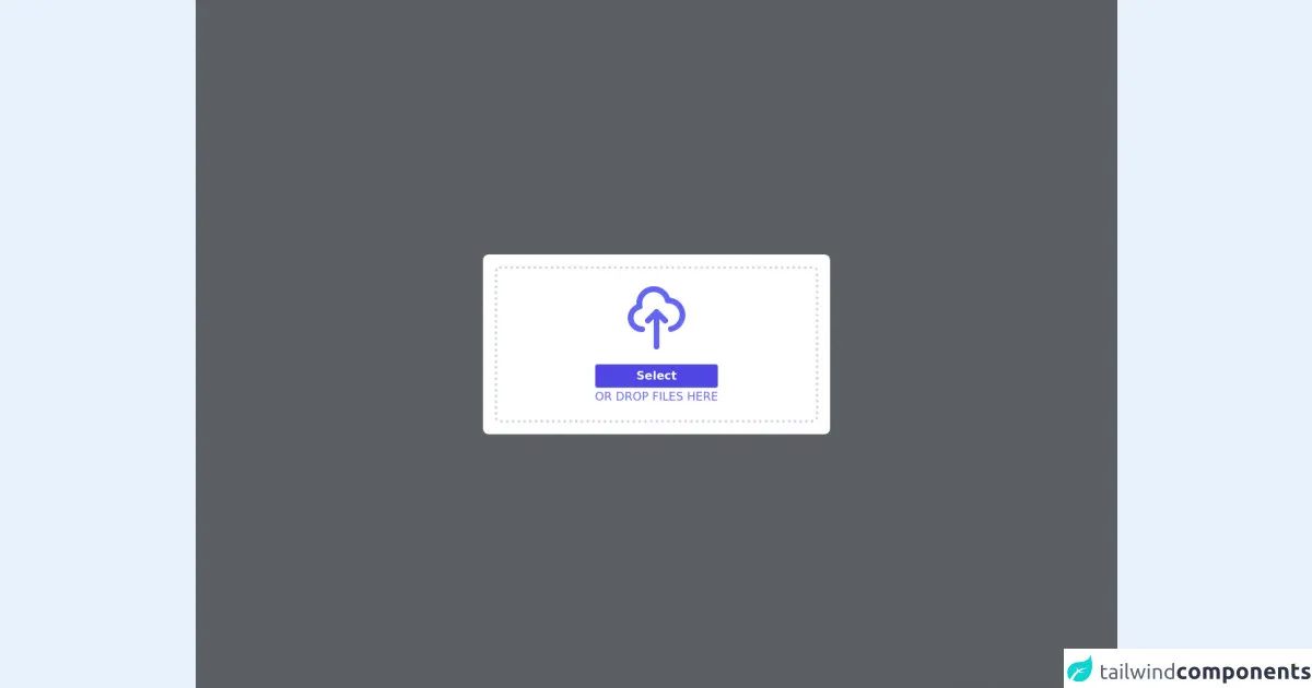
The Preview of Uploader Template UI Component
Creating an uploader template UI component with Tailwind CSS is easy. Here's a preview of what the final component will look like:
Free download of the uploader template's source code
The Source Code of Uploader Template UI Component
Here's the source code for the uploader template UI component:
<div class="fixed z-10 top-0 w-full h-full flex bg-black bg-opacity-60">
    <div class="extraOutline p-4 bg-white w-max bg-whtie m-auto rounded-lg">
        <div class="file_upload p-5 relative border-4 border-dotted border-gray-300 rounded-lg" style="width: 450px">
            <svg class="text-indigo-500 w-24 mx-auto mb-4" xmlns="http://www.w3.org/2000/svg" fill="none" viewBox="0 0 24 24" stroke="currentColor"><path stroke-linecap="round" stroke-linejoin="round" stroke-width="2" d="M7 16a4 4 0 01-.88-7.903A5 5 0 1115.9 6L16 6a5 5 0 011 9.9M15 13l-3-3m0 0l-3 3m3-3v12" /></svg>
            <div class="input_field flex flex-col w-max mx-auto text-center">
                <label>
                    <input class="text-sm cursor-pointer w-36 hidden" type="file" multiple />
                    <div class="text bg-indigo-600 text-white border border-gray-300 rounded font-semibold cursor-pointer p-1 px-3 hover:bg-indigo-500">Select</div>
                </label>

                <div class="title text-indigo-500 uppercase">or drop files here</div>
            </div>
        </div>
    </div>
</div>
How to Create a Uploader Template with Tailwind CSS?
Now that you understand the benefits of using Tailwind CSS to create a uploader template UI component, let's walk through the steps to create one.
Step 1: Install Tailwind CSS
The first step is to install Tailwind CSS. You can do this by adding the Tailwind CSS CDN to your HTML file or by installing it via npm. For this tutorial, we will assume that you are installing Tailwind CSS via npm.
To install Tailwind CSS via npm, run the following command:
npm install tailwindcss
Step 2: Create a HTML File
Next, create a new HTML file and add the following code:
<!DOCTYPE html>
<html>
  <head>
    <title>Uploader Template</title>
    <link rel="stylesheet" href="styles.css">
  </head>
  <body>
    <div class="flex items-center justify-center h-screen">
      <label for="file-upload" class="px-4 py-2 bg-blue-500 text-white rounded-md cursor-pointer hover:bg-blue-600">
        Upload File
      </label>
      <input id="file-upload" type="file" class="hidden">
    </div>
  </body>
</html>
This code creates a basic HTML file with a single button that users can click to upload a file.
Step 3: Create a CSS File
Next, create a new CSS file called styles.css and add the following code:
@tailwind base;
@tailwind components;
@tailwind utilities;
This code imports the base, components, and utilities styles from Tailwind CSS.
Step 4: Customize the Uploader Template
Now that you have the basic HTML and CSS files set up, you can customize the uploader template to match your brand or website. Here are some examples of customizations you can make:
- Change the background color of the button:
bg-red-500 - Change the text color of the button:
text-white - Change the font size of the button:
text-lg - Change the border radius of the button:
rounded-full - Change the hover color of the button:
hover:bg-red-600
Step 5: Add JavaScript
Finally, you can add JavaScript to handle the file upload. Here's an example of how to do this:
const fileUpload = document.getElementById('file-upload');

fileUpload.addEventListener('change', (event) => {
  const file = event.target.files[0];
  console.log(file);
});
This code adds an event listener to the file input element and logs the selected file to the console.
Conclusion
Creating a uploader template UI component with Tailwind CSS is easy and customizable. By following the steps outlined in this article, you can create a custom uploader template that matches your brand or website. With Tailwind CSS, you can save time and effort by using pre-defined CSS classes to style your components. Happy coding!