- Published on
A Complete Guide To Make A Twitter With Tailwind CSS
- What is Tailwind CSS?
- The description of Twitter UI component
- Why use Tailwind CSS to create a Twitter UI component?
- The preview of Twitter UI component
- The source code of Twitter UI component
- How to create a Twitter with Tailwind CSS?
- Conclusion
Are you looking to create a Twitter UI component for your website or project? Look no further than Tailwind CSS! In this guide, we will walk you through the process of creating a Twitter UI component using Tailwind CSS.
What is Tailwind CSS?
Tailwind CSS is a utility-first CSS framework that allows you to quickly and easily create custom designs without having to write custom CSS. It provides a set of pre-defined classes that you can use to style your HTML elements.
The description of Twitter UI component
Twitter is a popular social media platform that allows users to post short messages, known as tweets, to their followers. The Twitter UI component includes a header, a navigation bar, a feed of tweets, and a sidebar with trending topics.
Why use Tailwind CSS to create a Twitter UI component?
Tailwind CSS is the perfect tool for creating a Twitter UI component because it allows you to quickly and easily create custom designs without having to write custom CSS. With Tailwind CSS, you can easily create responsive designs that look great on any device.
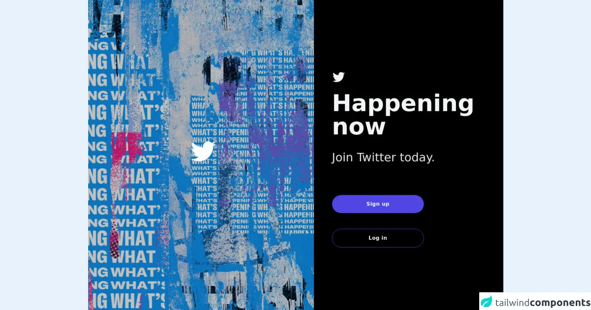
The preview of Twitter UI component
To create a Twitter UI component with Tailwind CSS, we will start by creating a header, a navigation bar, a feed of tweets, and a sidebar with trending topics.
Free download of the Twitter's source code
The source code of Twitter UI component
To create a Twitter UI component with Tailwind CSS, we will use HTML and Tailwind CSS classes to style our elements.
<div>
      <div class="relative min-h-screen  grid bg-black ">
        <div class="flex flex-col sm:flex-row items-center md:items-start sm:justify-center md:justify-start flex-auto min-w-0 ">
          <div
            class="relative sm:w-1/2 xl:w-3/5 bg-blue-500 h-full hidden md:flex flex-auto items-center justify-center p-10 overflow-hidden  text-white bg-no-repeat bg-cover relative" style="background-image: url(https://abs.twimg.com/sticky/illustrations/lohp_en_1302x955.png);">
            <div class="absolute bg-black  opacity-25 inset-0 z-0"></div>
            <div class="w-full  lg:max-w-2xl md:max-w-md z-10 items-center text-center ">
              <div class=" font-bold leading-tight mb-6 mx-auto w-full content-center items-center ">
                          <svg viewBox="0 0 24 24" class=" text-white ml-3 w-auto lg:h-20 h-15 inline" fill="currentColor">
            <g>
                <path d="M23.643 4.937c-.835.37-1.732.62-2.675.733.962-.576 1.7-1.49 2.048-2.578-.9.534-1.897.922-2.958 1.13-.85-.904-2.06-1.47-3.4-1.47-2.572 0-4.658 2.086-4.658 4.66 0 .364.042.718.12 1.06-3.873-.195-7.304-2.05-9.602-4.868-.4.69-.63 1.49-.63 2.342 0 1.616.823 3.043 2.072 3.878-.764-.025-1.482-.234-2.11-.583v.06c0 2.257 1.605 4.14 3.737 4.568-.392.106-.803.162-1.227.162-.3 0-.593-.028-.877-.082.593 1.85 2.313 3.198 4.352 3.234-1.595 1.25-3.604 1.995-5.786 1.995-.376 0-.747-.022-1.112-.065 2.062 1.323 4.51 2.093 7.14 2.093 8.57 0 13.255-7.098 13.255-13.254 0-.2-.005-.402-.014-.602.91-.658 1.7-1.477 2.323-2.41z">
                </path>
            </g>
        </svg>
              </div>
            </div>
          </div>
          <div
            class="md:flex md:items-center md:justify-left w-full sm:w-auto md:h-full xl:w-1/2 p-8  md:p-10 lg:p-14 sm:rounded-lg md:rounded-none "
          >
            <div class="max-w-xl w-full space-y-12">
              <div class="lg:text-left text-center">
                <h2 class="mt-6  font-bold text-gray-100">
                          <svg viewBox="0 0 24 24" class="h-10 w-auto inline" fill="currentColor">
            <g>
                <path d="M23.643 4.937c-.835.37-1.732.62-2.675.733.962-.576 1.7-1.49 2.048-2.578-.9.534-1.897.922-2.958 1.13-.85-.904-2.06-1.47-3.4-1.47-2.572 0-4.658 2.086-4.658 4.66 0 .364.042.718.12 1.06-3.873-.195-7.304-2.05-9.602-4.868-.4.69-.63 1.49-.63 2.342 0 1.616.823 3.043 2.072 3.878-.764-.025-1.482-.234-2.11-.583v.06c0 2.257 1.605 4.14 3.737 4.568-.392.106-.803.162-1.227.162-.3 0-.593-.028-.877-.082.593 1.85 2.313 3.198 4.352 3.234-1.595 1.25-3.604 1.995-5.786 1.995-.376 0-.747-.022-1.112-.065 2.062 1.323 4.51 2.093 7.14 2.093 8.57 0 13.255-7.098 13.255-13.254 0-.2-.005-.402-.014-.602.91-.658 1.7-1.477 2.323-2.41z">
                </path>
            </g>
        </svg>
                </h2>
                <h2 class="mt-6 text-7xl font-bold text-gray-100">
                  Happening now
                </h2>
                <p class="mt-10 text-4xl text-gray-200">Join Twitter today.</p>
              </div>
              <div class="flex flex-row justify-center items-center space-x-3"></div>

              <div>
                <button
                  type="submit"
                  class="lg:w-3/5 w-full flex justify-center text-gray-100 p-4   rounded-full tracking-wide font-bold  focus:outline-none focus:shadow-outline hover:bg-indigo-600 shadow-lg bg-indigo-600 cursor-pointer transition ease-in duration-300"
                >
                  Sign up
                </button>
              </div>
              <div>
                  <button
                    type="submit"
                    class="lg:w-3/5 w-full flex justify-center border-indigo-600 bg-transparent text-gray-100 p-4 border rounded-full tracking-wide font-semibold  focus:outline-none focus:shadow-outline hover:bg-gray-900 shadow-lg cursor-pointer transition ease-in duration-300"
                  >
                    Log in
                  </button>
              </div>
            </div>
          </div>
        </div>
      </div>
    </div>
How to create a Twitter with Tailwind CSS?
- Start by creating the HTML structure for your Twitter UI component. You can use the following code as a starting point:
<div class="flex flex-col h-screen">
  <header class="flex items-center justify-between bg-blue-500 p-4">
    <h1 class="text-white font-bold">Twitter</h1>
    <nav>
      <ul class="flex">
        <li><a href="#" class="text-white font-bold px-4 py-2">Home</a></li>
        <li><a href="#" class="text-white font-bold px-4 py-2">Notifications</a></li>
        <li><a href="#" class="text-white font-bold px-4 py-2">Messages</a></li>
      </ul>
    </nav>
  </header>
  <main class="flex-1 flex">
    <div class="w-3/4 bg-gray-200 p-4">
      <h2 class="text-2xl font-bold mb-4">Tweets</h2>
      <div class="border-b border-gray-400 mb-4"></div>
      <div class="tweet">
        <div class="flex items-center">
          <img src="https://via.placeholder.com/50" alt="Avatar" class="rounded-full mr-4">
          <div>
            <h3 class="font-bold">John Doe</h3>
            <p class="text-gray-600">@johndoe</p>
          </div>
        </div>
        <p class="mt-4">Lorem ipsum dolor sit amet, consectetur adipiscing elit. Sed euismod, sapien a porttitor feugiat, enim velit posuere nunc, vel aliquet enim nisl eu nisi.</p>
      </div>
    </div>
    <div class="w-1/4 bg-gray-300 p-4">
      <h2 class="text-2xl font-bold mb-4">Trending</h2>
      <ul>
        <li><a href="#" class="text-blue-500 font-bold">#tailwindcss</a></li>
        <li><a href="#" class="text-blue-500 font-bold">#webdevelopment</a></li>
        <li><a href="#" class="text-blue-500 font-bold">#javascript</a></li>
        <li><a href="#" class="text-blue-500 font-bold">#css</a></li>
      </ul>
    </div>
  </main>
</div>
Add Tailwind CSS classes to your HTML elements to style them. For example, you can use the
bg-blue-500class to set the background color of the header to blue, and thetext-whiteclass to set the text color to white.Continue adding Tailwind CSS classes to your HTML elements to style them as desired. For example, you can use the
flexclass to create a flexbox layout, thew-3/4class to set the width of the tweets feed to 75%, and themb-4class to add a margin bottom of 4 to the tweets feed.Preview your Twitter UI component to make sure it looks as desired. You can use the
npm run devcommand to start a development server and preview your component in a web browser.Once you are satisfied with your Twitter UI component, you can use it in your website or project by copying the HTML and CSS code into your project.
Conclusion
Creating a Twitter UI component with Tailwind CSS is a great way to quickly and easily create custom designs without having to write custom CSS. With Tailwind CSS, you can easily create responsive designs that look great on any device. We hope this guide has been helpful in showing you how to create a Twitter UI component with Tailwind CSS. Happy coding!