- Published on
6 Incredibly Easy Ways To Create A Social card With Tailwind CSS Better While Spending Less
- What is Tailwind CSS?
- The description of Social card ui component
- Why use Tailwind CSS to create a Social card ui component?
- The preview of Social card ui component
- The source code of Social card ui component
- How to create a Social card with Tailwind CSS?
- Step 1: Set up your HTML structure
- Step 2: Add the appropriate Tailwind CSS classes to your HTML elements
- Step 3: Customize your card's header
- Step 4: Customize your card's body
- Step 5: Customize your card's footer
- Step 6: Preview and refine your social card
- Conclusion
Are you looking for a way to create a beautiful and functional social card for your website or application? Look no further than Tailwind CSS! In this article, we'll explore what Tailwind CSS is, why it's the perfect tool for creating social cards, and how you can use it to create your own stunning social card in just a few easy steps.
What is Tailwind CSS?
Tailwind CSS is a utility-first CSS framework that allows you to quickly and easily create custom designs without writing any CSS code. With Tailwind CSS, you simply apply pre-defined classes to your HTML elements to style them as desired. This makes it an incredibly powerful tool for front-end developers who want to streamline their workflow and create beautiful, responsive designs with ease.
The description of Social card ui component
A social card is a UI component that displays information about a particular social media post, such as the post's author, date, and content. Social cards are commonly used on websites and applications that display social media content, such as news sites, blogs, and social media aggregators.
Why use Tailwind CSS to create a Social card ui component?
Tailwind CSS is the perfect tool for creating social cards because it allows you to easily style and customize each element of the card using pre-defined classes. This means you can quickly create a beautiful and functional social card without having to write any CSS code from scratch. Additionally, Tailwind CSS is highly customizable, which means you can easily tweak the design of your social card to match your brand or website's aesthetic.
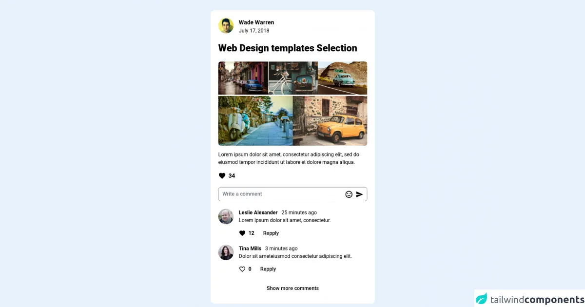
The preview of Social card ui component
Creating a social card with Tailwind CSS is incredibly easy. In just a few simple steps, you can create a beautiful and functional social card that will enhance the user experience of your website or application.
Free download of the Social card's source code
The source code of Social card ui component
To create a social card with Tailwind CSS, you simply need to add the appropriate classes to your HTML elements. Here's an example of what the HTML code for a basic social card might look like:
<link href="https://fonts.googleapis.com/css2?family=Roboto:wght@300;400;500;700;900&display=swap" rel="stylesheet" />

<style>
    @import url("https://fonts.googleapis.com/css2?family=Roboto:wght@300;400;500;700;900&display=swap");
    body{
        font-family: "Roboto", sans-serif;
    }
</style>

<!-- This is an example component -->
<div class='flex py-8 items-center justify-center min-h-screen from-teal-100 via-teal-300 to-teal-500 bg-gradient-to-br'>
    <article class="w-full max-w-lg mx-auto break-inside p-6 rounded-xl bg-white flex flex-col bg-clip-border">
        <div class="flex pb-6 items-center justify-between">
            <div class="flex">
                <a class="inline-block mr-4" href="#">
                <img class="rounded-full max-w-none w-12 h-12" src="https://randomuser.me/api/portraits/men/35.jpg" />
                </a>
                <div class="flex flex-col">
                <div>
                    <a class="inline-block text-lg font-bold" href="#">Wade Warren</a>
                </div>
                <div class="text-slate-500">
                    July 17, 2018
                </div>
                </div>
            </div>
        </div>
        <h2 class="text-3xl font-extrabold mb-2">Web Design templates Selection</h2>
        <div class="py-4">
            <div class="flex justify-between gap-1 mb-1">
                <a class="flex" href="#">
                    <img class="max-w-full rounded-tl-lg"
                    src="https://images.pexels.com/photos/92866/pexels-photo-92866.jpeg?auto=compress&cs=tinysrgb&dpr=2&h=750&w=1260" />
                </a>
                <a class="flex" href="#">
                    <img class="max-w-full"
                    src="https://images.pexels.com/photos/247929/pexels-photo-247929.jpeg?auto=compress&cs=tinysrgb&dpr=2&h=750&w=1260" />
                </a>
                <a class="flex" href="#">
                    <img class="max-w-full rounded-tr-lg"
                    src="https://images.pexels.com/photos/631522/pexels-photo-631522.jpeg?auto=compress&cs=tinysrgb&dpr=2&h=750&w=1260" />
                </a>
            </div>
            <div class="flex justify-between gap-1">
                <a class="flex" href="#">
                    <img class="max-w-full rounded-bl-lg"
                    src="https://images.pexels.com/photos/1429748/pexels-photo-1429748.jpeg?auto=compress&cs=tinysrgb&dpr=2&h=750&w=1260" />
                </a>
                <a class="flex" href="#">
                    <img class="max-w-full rounded-br-lg"
                    src="https://images.pexels.com/photos/69020/pexels-photo-69020.jpeg?auto=compress&cs=tinysrgb&dpr=2&h=750&w=1260" />
                </a>
            </div>
        </div>
        <p>
        Lorem ipsum dolor sit amet, consectetur adipiscing elit, sed do
        eiusmod tempor incididunt ut labore et dolore magna aliqua.
        </p>
        <div class="py-4">
        <a class="inline-flex items-center" href="#">
            <span class="mr-2">
            <svg class="fill-rose-600" style="width: 24px; height: 24px;" viewBox="0 0 24 24">
                <path
                d="M12,21.35L10.55,20.03C5.4,15.36 2,12.27 2,8.5C2,5.41 4.42,3 7.5,3C9.24,3 10.91,3.81 12,5.08C13.09,3.81 14.76,3 16.5,3C19.58,3 22,5.41 22,8.5C22,12.27 18.6,15.36 13.45,20.03L12,21.35Z">
                </path>
            </svg>
            </span>
            <span class="text-lg font-bold">34</span>
        </a>
        </div>
        <div class="relative">
        <input
            class="pt-2 pb-2 pl-3 w-full h-11 bg-slate-100 rounded-lg placeholder:text-slate-600 font-medium pr-20"
            type="text" placeholder="Write a comment" />
        <span class="flex absolute right-3 top-2/4 -mt-3 items-center">
            <svg class="mr-2" style="width: 26px; height: 26px;" viewBox="0 0 24 24">
            <path fill="currentColor"
                d="M20,12A8,8 0 0,0 12,4A8,8 0 0,0 4,12A8,8 0 0,0 12,20A8,8 0 0,0 20,12M22,12A10,10 0 0,1 12,22A10,10 0 0,1 2,12A10,10 0 0,1 12,2A10,10 0 0,1 22,12M10,9.5C10,10.3 9.3,11 8.5,11C7.7,11 7,10.3 7,9.5C7,8.7 7.7,8 8.5,8C9.3,8 10,8.7 10,9.5M17,9.5C17,10.3 16.3,11 15.5,11C14.7,11 14,10.3 14,9.5C14,8.7 14.7,8 15.5,8C16.3,8 17,8.7 17,9.5M12,17.23C10.25,17.23 8.71,16.5 7.81,15.42L9.23,14C9.68,14.72 10.75,15.23 12,15.23C13.25,15.23 14.32,14.72 14.77,14L16.19,15.42C15.29,16.5 13.75,17.23 12,17.23Z">
            </path>
            </svg>
            <svg class="fill-blue-500" style="width: 24px; height: 24px;" viewBox="0 0 24 24">
            <path d="M2,21L23,12L2,3V10L17,12L2,14V21Z"></path>
            </svg>
        </span>
        </div>
        <!-- Comments content -->
        <div class="pt-6">
        <!-- Comment row -->
        <div class="media flex pb-4">
            <a class="mr-4" href="#">
            <img class="rounded-full max-w-none w-12 h-12" src="https://randomuser.me/api/portraits/men/82.jpg" />
            </a>
            <div class="media-body">
            <div>
                <a class="inline-block text-base font-bold mr-2" href="#">Leslie Alexander</a>
                <span class="text-slate-500">25 minutes ago</span>
            </div>
            <p>Lorem ipsum dolor sit amet, consectetur.</p>
            <div class="mt-2 flex items-center">
                <a class="inline-flex items-center py-2 mr-3" href="#">
                <span class="mr-2">
                    <svg class="fill-rose-600" style="width: 22px; height: 22px;"
                    viewBox="0 0 24 24">
                    <path
                        d="M12,21.35L10.55,20.03C5.4,15.36 2,12.27 2,8.5C2,5.41 4.42,3 7.5,3C9.24,3 10.91,3.81 12,5.08C13.09,3.81 14.76,3 16.5,3C19.58,3 22,5.41 22,8.5C22,12.27 18.6,15.36 13.45,20.03L12,21.35Z">
                    </path>
                    </svg>
                </span>
                <span class="text-base font-bold">12</span>
                </a>
                <button class="py-2 px-4 font-medium hover:bg-slate-50 rounded-lg">
                Repply
                </button>
            </div>
            </div>
        </div>
        <!-- End comments row -->
        <!-- comments row -->
        <div class="media flex pb-4">
            <a class="inline-block mr-4" href="#">
            <img class="rounded-full max-w-none w-12 h-12" src="https://randomuser.me/api/portraits/women/76.jpg" />
            </a>
            <div class="media-body">
            <div>
                <a class="inline-block text-base font-bold mr-2" href="#">Tina Mills</a>
                <span class="text-slate-500">3 minutes ago</span>
            </div>
            <p>Dolor sit ameteiusmod consectetur adipiscing elit.</p>
            <div class="mt-2 flex items-center">
                <a class="inline-flex items-center py-2 mr-3" href="#">
                <span class="mr-2">
                    <svg class="fill-rose-600" style="width: 22px; height: 22px;"
                    viewBox="0 0 24 24">
                    <path
                        d="M12.1 18.55L12 18.65L11.89 18.55C7.14 14.24 4 11.39 4 8.5C4 6.5 5.5 5 7.5 5C9.04 5 10.54 6 11.07 7.36H12.93C13.46 6 14.96 5 16.5 5C18.5 5 20 6.5 20 8.5C20 11.39 16.86 14.24 12.1 18.55M16.5 3C14.76 3 13.09 3.81 12 5.08C10.91 3.81 9.24 3 7.5 3C4.42 3 2 5.41 2 8.5C2 12.27 5.4 15.36 10.55 20.03L12 21.35L13.45 20.03C18.6 15.36 22 12.27 22 8.5C22 5.41 19.58 3 16.5 3Z">
                    </path>
                    </svg>
                </span>
                <span class="text-base font-bold">0</span>
                </a>
                <button class="py-2 px-4 font-medium hover:bg-slate-50 rounded-lg">
                Repply
                </button>
            </div>
            </div>
        </div>
        <!-- End comments row -->
        <!-- More comments -->
        <div class="w-full">
            <a href="#"
            class="py-3 px-4 w-full block bg-slate-100 text-center rounded-lg font-medium hover:bg-slate-200 transition ease-in-out delay-75">Show
            more comments</a>
        </div>
        <!-- End More comments -->
        </div>
    <!-- End Comments content -->
    </article>
</div>
How to create a Social card with Tailwind CSS?
Now that you understand why Tailwind CSS is the perfect tool for creating social cards, let's dive into how you can actually create your own social card using Tailwind CSS. Here are six incredibly easy steps to get you started:
Step 1: Set up your HTML structure
To create a social card, you'll need to start by setting up the basic HTML structure of your card. This will typically involve creating a container element for your card, as well as separate elements for the card's header, body, and footer.
Step 2: Add the appropriate Tailwind CSS classes to your HTML elements
Once you've set up your HTML structure, you can start adding the appropriate Tailwind CSS classes to each of your HTML elements. For example, you might use the bg-white class to set the background color of your card to white, or the text-gray-700 class to set the text color of your card to a dark gray.
Step 3: Customize your card's header
Next, you'll want to customize your card's header to display information about the social media post. This might involve adding an image of the post's author, the author's name, and the date the post was published. To style these elements, you can use Tailwind CSS classes like rounded-full to create a circular image, or text-sm to set the font size of your text.
Step 4: Customize your card's body
After you've customized your card's header, you can move on to customizing the body of your card. This might involve displaying the content of the social media post, as well as any images or videos that were included in the post. To style these elements, you can use Tailwind CSS classes like p-4 to add padding to your card's body, or object-cover to ensure that images and videos are displayed at the correct aspect ratio.
Step 5: Customize your card's footer
Finally, you'll want to customize your card's footer to display any relevant information about the social media post, such as the number of likes or comments it has received. To style these elements, you can use Tailwind CSS classes like border-t to add a border to the top of your card's footer, or text-xs to set the font size of your text.
Step 6: Preview and refine your social card
Once you've customized all of the elements of your social card, you can preview it in your browser and make any necessary tweaks to the design. Because Tailwind CSS is so customizable, you can easily tweak the design of your social card until it looks exactly the way you want it to.
Conclusion
Creating a beautiful and functional social card doesn't have to be difficult or time-consuming. With Tailwind CSS, you can easily create a stunning social card in just a few easy steps, without having to write any CSS code from scratch. So why not give it a try and see how Tailwind CSS can enhance the user experience of your website or application?