- Published on
Create A Trello panel clone With Tailwind CSS Like A Pro With The Help Of These 6 Tips
- What is Tailwind CSS?
- The description of Trello panel clone ui component
- Why use Tailwind CSS to create a Trello panel clone ui component?
- The preview of Trello panel clone ui component
- The source code of Trello panel clone ui component
- How to create a Trello panel clone with Tailwind CSS?
- Step 1: Set up a new project
- Step 2: Create the HTML structure
- Step 3: Style the HTML elements with Tailwind CSS
- Step 4: Add interactivity with JavaScript
- Conclusion
What is Tailwind CSS?
Tailwind CSS is a utility-first CSS framework that helps you quickly build custom designs without writing any CSS code. It provides a set of pre-defined classes that you can use to style your HTML elements. With Tailwind CSS, you can create responsive and modern designs in a short amount of time.
The description of Trello panel clone ui component
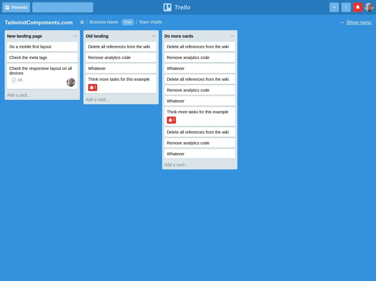
Trello is a popular project management tool that allows users to create boards, lists, and cards to organize tasks and projects. The Trello panel clone is a user interface component that mimics the look and feel of Trello's board view. It consists of a set of columns that represent different stages of a project, and each column contains a set of cards that represent individual tasks.
Why use Tailwind CSS to create a Trello panel clone ui component?
Tailwind CSS is a great choice for creating a Trello panel clone ui component for several reasons:
- Tailwind CSS provides a set of pre-defined classes that you can use to style your HTML elements, which makes it easy to create the complex layout of the Trello panel clone.
- Tailwind CSS is highly customizable, which means you can easily modify the default styles to match the look and feel of Trello's board view.
- Tailwind CSS is a lightweight framework, which means it won't slow down your website's performance.
The preview of Trello panel clone ui component
To create a Trello panel clone ui component, we need to create a set of columns and cards. Here's a preview of what the Trello panel clone looks like:
Free download of the Trello panel clone's source code
The source code of Trello panel clone ui component
To create a Trello panel clone ui component, we need to write some HTML and CSS code. Here's the source code for the Trello panel clone:
<div class="bg-blue w-full h-screen font-sans">
            <div class="flex p-2 bg-blue-dark items-center">
                <div class="hidden md:flex justify-start">
                    <button class="bg-blue-light rounded p-2 font-bold text-white text-sm mr-2 flex">
                        <svg class="fill-current text-white h-4 mr-2" xmlns="http://www.w3.org/2000/svg" viewBox="0 0 50 50"><path d="M41 4H9C6.24 4 4 6.24 4 9v32c0 2.76 2.24 5 5 5h32c2.76 0 5-2.24 5-5V9c0-2.76-2.24-5-5-5zM21 36c0 1.1-.9 2-2 2h-7c-1.1 0-2-.9-2-2V12c0-1.1.9-2 2-2h7c1.1 0 2 .9 2 2v24zm19-12c0 1.1-.9 2-2 2h-7c-1.1 0-2-.9-2-2V12c0-1.1.9-2 2-2h7c1.1 0 2 .9 2 2v12z"/></svg>
                        Pannels
                    </button>
                    <input type="text" class="bg-blue-light rounded p-2">
                </div>
                <div class="mx-0 md:mx-auto">
                    <h1 class="text-blue-lighter text-xl flex items-center font-sans italic">
                        <svg class="fill-current h-8 mr-2" xmlns="http://www.w3.org/2000/svg" viewBox="0 0 50 50"><path d="M41 4H9C6.24 4 4 6.24 4 9v32c0 2.76 2.24 5 5 5h32c2.76 0 5-2.24 5-5V9c0-2.76-2.24-5-5-5zM21 36c0 1.1-.9 2-2 2h-7c-1.1 0-2-.9-2-2V12c0-1.1.9-2 2-2h7c1.1 0 2 .9 2 2v24zm19-12c0 1.1-.9 2-2 2h-7c-1.1 0-2-.9-2-2V12c0-1.1.9-2 2-2h7c1.1 0 2 .9 2 2v12z"/></svg>
                        Trello
                    </h1>
                </div>
                <div class="flex items-center ml-auto">
                    <button class="bg-blue-light rounded h-8 w-8 font-bold text-white text-sm mr-2">+</button>
                    <button class="bg-blue-light rounded h-8 w-8 font-bold text-white text-sm mr-2">i</button>
                    <button class="bg-red rounded h-8 w-8 font-bold text-white text-sm mr-2">
                        <svg class="h-4 fill-current" xmlns="http://www.w3.org/2000/svg" viewBox="0 0 24 24"><path d="M12 2c-.8 0-1.5.7-1.5 1.5v.688C7.344 4.87 5 7.62 5 11v4.5l-2 2.313V19h18v-1.188L19 15.5V11c0-3.379-2.344-6.129-5.5-6.813V3.5c0-.8-.7-1.5-1.5-1.5zm-2 18c0 1.102.898 2 2 2 1.102 0 2-.898 2-2z"/></svg>
                    </button>
                    <img src="https://i.imgur.com/OZaT7jl.png" class="rounded-full" />
                </div>
            </div>
            <div class="flex m-4 justify-between">
                <div class="flex">
                    <h3 class="text-white mr-4">TailwindComponents.com</h3>
                    <ul class="list-reset text-white hidden md:flex">
                        <li><span class="font-bold text-lg px-2">☆</span></li>
                        <li><span class="border-l border-blue-lighter px-2 text-sm">Business Name</span> <span class="rounded-lg bg-blue-light text-xs px-2 py-1">Free</span></li>
                        <li><span class="border-l border-blue-lighter px-2 text-sm ml-2">Team Visible</span></li>
                    </ul>
                </div>
                <div class="text-white font-sm text-underlined hidden md:flex items-center underline">
                    <svg class="h-4 fill-current text-white cursor-pointer mr-2" xmlns="http://www.w3.org/2000/svg" viewBox="0 0 24 24"><path d="M5 10a1.999 1.999 0 1 0 0 4 1.999 1.999 0 1 0 0-4zm7 0a1.999 1.999 0 1 0 0 4 1.999 1.999 0 1 0 0-4zm7 0a1.999 1.999 0 1 0 0 4 1.999 1.999 0 1 0 0-4z"/></svg>
                    Show menu
                </div>
            </div>
            <div class="flex px-4 pb-8 items-start overflow-x-scroll">
                <div class="rounded bg-grey-light  flex-no-shrink w-64 p-2 mr-3">
                    <div class="flex justify-between py-1">
                        <h3 class="text-sm">New landing page</h3>
                        <svg class="h-4 fill-current text-grey-dark cursor-pointer" xmlns="http://www.w3.org/2000/svg" viewBox="0 0 24 24"><path d="M5 10a1.999 1.999 0 1 0 0 4 1.999 1.999 0 1 0 0-4zm7 0a1.999 1.999 0 1 0 0 4 1.999 1.999 0 1 0 0-4zm7 0a1.999 1.999 0 1 0 0 4 1.999 1.999 0 1 0 0-4z"/></svg>
                    </div>
                    <div class="text-sm mt-2">
                        <div class="bg-white p-2 rounded mt-1 border-b border-grey cursor-pointer hover:bg-grey-lighter">
                            Do a mobile first layout
                        </div>

                        <div class="bg-white p-2 rounded mt-1 border-b border-grey cursor-pointer hover:bg-grey-lighter">
                            Check the meta tags
                        </div>

                        <div class="bg-white p-2 rounded mt-1 border-b border-grey cursor-pointer hover:bg-grey-lighter">
                            Check the responsive layout on all devices
                            <div class="text-grey-darker mt-2 ml-2 flex justify-between items-start">
                                <span class="text-xs flex items-center">
                                    <svg class="h-4 fill-current mr-1" xmlns="http://www.w3.org/2000/svg" viewBox="0 0 50 50"><path d="M11 4c-3.855 0-7 3.145-7 7v28c0 3.855 3.145 7 7 7h28c3.855 0 7-3.145 7-7V11c0-3.855-3.145-7-7-7zm0 2h28c2.773 0 5 2.227 5 5v28c0 2.773-2.227 5-5 5H11c-2.773 0-5-2.227-5-5V11c0-2.773 2.227-5 5-5zm25.234 9.832l-13.32 15.723-8.133-7.586-1.363 1.465 9.664 9.015 14.684-17.324z"/></svg>
                                    3/5
                                </span>
                                <img src="https://i.imgur.com/OZaT7jl.png" class="rounded-full" />
                            </div>
                        </div>
                        <p class="mt-3 text-grey-dark">Add a card...</p>
                    </div>
                </div>
                <div class="rounded bg-grey-light flex-no-shrink w-64 p-2 mr-3">
                    <div class="flex justify-between py-1">
                        <h3 class="text-sm">Old landing</h3>
                        <svg class="h-4 fill-current text-grey-dark cursor-pointer" xmlns="http://www.w3.org/2000/svg" viewBox="0 0 24 24"><path d="M5 10a1.999 1.999 0 1 0 0 4 1.999 1.999 0 1 0 0-4zm7 0a1.999 1.999 0 1 0 0 4 1.999 1.999 0 1 0 0-4zm7 0a1.999 1.999 0 1 0 0 4 1.999 1.999 0 1 0 0-4z"/></svg>
                    </div>
                    <div class="text-sm mt-2">
                        <div class="bg-white p-2 rounded mt-1 border-b border-grey cursor-pointer hover:bg-grey-lighter">
                            Delete all references from the wiki
                        </div>

                        <div class="bg-white p-2 rounded mt-1 border-b border-grey cursor-pointer hover:bg-grey-lighter">
                            Remove analytics code
                        </div>

                        <div class="bg-white p-2 rounded mt-1 border-b border-grey cursor-pointer hover:bg-grey-lighter">
                            Whatever
                        </div>

                        <div class="bg-white p-2 rounded mt-1 border-b border-grey cursor-pointer hover:bg-grey-lighter">
                            <p>Think more tasks for this example</p>
                            <div class="bg-red rounded p-1 mt-2 inline-flex text-white text-xs">
                                <svg class="h-4 fill-current" xmlns="http://www.w3.org/2000/svg" viewBox="0 0 24 24"><path d="M12 2c-.8 0-1.5.7-1.5 1.5v.688C7.344 4.87 5 7.62 5 11v4.5l-2 2.313V19h18v-1.188L19 15.5V11c0-3.379-2.344-6.129-5.5-6.813V3.5c0-.8-.7-1.5-1.5-1.5zm-2 18c0 1.102.898 2 2 2 1.102 0 2-.898 2-2z"/></svg>
                                2
                            </div>
                        </div>
                        <p class="mt-3 text-grey-dark">Add a card...</p>
                    </div>
                </div>
                <div class="rounded bg-grey-light flex-no-shrink w-64 p-2 mr-3">
                    <div class="flex justify-between py-1">
                        <h3 class="text-sm">Do more cards</h3>
                        <svg class="h-4 fill-current text-grey-dark cursor-pointer" xmlns="http://www.w3.org/2000/svg" viewBox="0 0 24 24"><path d="M5 10a1.999 1.999 0 1 0 0 4 1.999 1.999 0 1 0 0-4zm7 0a1.999 1.999 0 1 0 0 4 1.999 1.999 0 1 0 0-4zm7 0a1.999 1.999 0 1 0 0 4 1.999 1.999 0 1 0 0-4z"/></svg>
                    </div>
                    <div class="text-sm mt-2">
                        <div class="bg-white p-2 rounded mt-1 border-b border-grey cursor-pointer hover:bg-grey-lighter">
                            Delete all references from the wiki
                        </div>

                        <div class="bg-white p-2 rounded mt-1 border-b border-grey cursor-pointer hover:bg-grey-lighter">
                            Remove analytics code
                        </div>

                        <div class="bg-white p-2 rounded mt-1 border-b border-grey cursor-pointer hover:bg-grey-lighter">
                            Whatever
                        </div>

                        <div class="bg-white p-2 rounded mt-1 border-b border-grey cursor-pointer hover:bg-grey-lighter">
                            <p>Think more tasks for this example</p>
                            <div class="bg-red rounded p-1 mt-2 inline-flex text-white text-xs">
                                <svg class="h-4 fill-current" xmlns="http://www.w3.org/2000/svg" viewBox="0 0 24 24"><path d="M12 2c-.8 0-1.5.7-1.5 1.5v.688C7.344 4.87 5 7.62 5 11v4.5l-2 2.313V19h18v-1.188L19 15.5V11c0-3.379-2.344-6.129-5.5-6.813V3.5c0-.8-.7-1.5-1.5-1.5zm-2 18c0 1.102.898 2 2 2 1.102 0 2-.898 2-2z"/></svg>
                                2
                            </div>
                        </div>

                        <div class="bg-white p-2 rounded mt-1 border-b border-grey cursor-pointer hover:bg-grey-lighter">
                            Delete all references from the wiki
                        </div>

                        <div class="bg-white p-2 rounded mt-1 border-b border-grey cursor-pointer hover:bg-grey-lighter">
                            Remove analytics code
                        </div>

                        <div class="bg-white p-2 rounded mt-1 border-b border-grey cursor-pointer hover:bg-grey-lighter">
                            Whatever
                        </div>
                        <p class="mt-3 text-grey-dark">Add a card...</p>
                    </div>
                </div>
            </div>
        </div>
How to create a Trello panel clone with Tailwind CSS?
Now that we understand what the Trello panel clone is and why we should use Tailwind CSS to create it, let's dive into the steps to create it.
Step 1: Set up a new project
First, we need to set up a new project. We can use any code editor of our choice. We also need to include the Tailwind CSS library in our project. We can either download it from the official website or use a CDN link.
Step 2: Create the HTML structure
Next, we need to create the HTML structure for the Trello panel clone. We need to create a container element that will hold all the columns. Inside the container, we need to create a set of columns that represent different stages of a project. Each column should contain a set of cards that represent individual tasks.
Step 3: Style the HTML elements with Tailwind CSS
Now that we have created the HTML structure, we need to style the elements using Tailwind CSS. We can use the pre-defined classes provided by Tailwind CSS to style the elements. For example, we can use the bg-gray-100 class to set the background color of a card to gray.
Step 4: Add interactivity with JavaScript
Finally, we can add interactivity to the Trello panel clone using JavaScript. We can add drag and drop functionality to the cards to allow users to move them between columns.
Conclusion
In conclusion, creating a Trello panel clone with Tailwind CSS is a great way to learn how to use the utility-first CSS framework. With the help of these 6 tips, you can create a Trello panel clone like a pro. Remember to keep the design simple and easy to use for the best user experience.